Feature overview

Discover hidden user insights with an ecosystem of tools

Know what your users are doing, what they need, and most importantly, what you need to convert them.
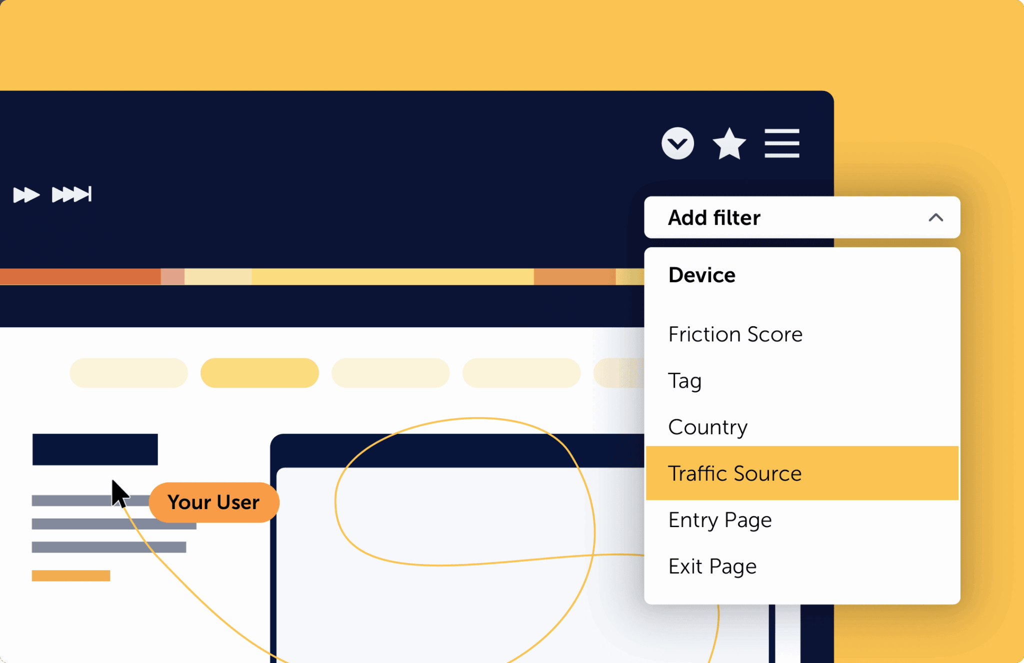
A website showing the session replay tool with its play-bar including buttons to pause, go back to previous recording or page, or go forward to next recording or page. Additionally it is highlighting on the recording timeline whether friction or interactions are detected during the recording.
Session replay
Watch and learn from actual user behavior

Actions speak louder than words. We show you every user journey, not just a sample, so you can resolve user frustrations without missing a beat. No need to review thousands of sessions, our Friction Scores zero-in on pain points so you know where to start.

Learn more about Watch and learn from actual user behavior
Six types of heatmaps
Draw conclusions with rich visualizations

See beyond clicks with six types of heat maps brimming deep with data. Visualize movement, scroll depth, attention, user geography, and even watch and engage live.

Track activity, uncover patterns, and improve your customer experience while respecting user anonymity.

Learn more Draw conclusions with rich visualizations
An online shop showcasing the Mouseflow click heatmap and the detection of amount of clicks, click-rage, and click-error.
Six types of heatmaps
See where your users are most likely to convert

Are users missing important elements like call to actions and special offers?

Movement heatmaps show you where visitors move their mouse and hold attention so you can figure out where to place critical conversion points.

Learn more See where your users are most likely to convert
A screen with a heatmap of movement of users on that page.
Six types of heatmaps
Figure out where you're losing user attention

Wondering why your visitors aren’t buying a product or subscribing to your newsletter?

Scroll heatmaps show you how far an average user scrolls your page and helps you visualize where to place important content to nudge them toward the next intended step of their journey (before they get bored and click out).


Learn more Figure out where you're losing user attention
A screen with a heatmap in a colour-gradient going from warm to cold colours in addition to percentages shown across the screen representing how many users scroll to that point.
Six types of heatmaps
See where users focus their attention

Attention heatmaps reveal how much time the average user spends on your content.

Knowing what content packs the biggest punch so you know exactly what content to cut and where to place call to actions to get as many views and conversions as possible.

Learn more See where users focus their attention
A screen with a heatmap in a colour-gradient going from warm to cold colours and a box showcasing attention insights such as the amount of users who viewed an area of the page, their average time and engagement.
Six types of heatmaps
Assess performance of dynamic elements

Rely on live heatmaps to see your dynamic content in action.

Live heatmaps work as an overlay on your live site so you can see how dynamic elements like sliders, drop down menus, and shopping carts are working in real time.

Learn more Assess performance of dynamic elements
An online store's website with an image slider indicating that with the live heatmap you can get insights about dynamic content on your page.
Six types of heatmaps
Visualize what regions to target

See exactly where your prospects are for more clever marketing or remarketing efforts.

Whether you want to establish yourself in a certain market or city or track user data from users interested in certain prodcuts – Geographical heat maps (or geo heat maps) show you exactly where to start.

Learn more Visualize what regions to target
A word map with a heatmap overlay together with a box indicating which countries a website's users come from in numbers and percentages.
Using Journeys to understand customer journey
User Journey Analytics
Get the full picture of your user's journey

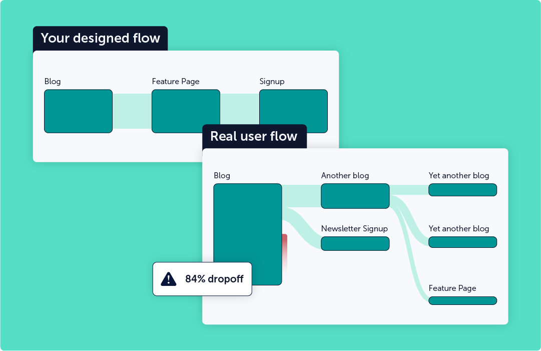
Identify unexpected drop-offs, increase conversions, and improve their user experience. Journeys give you a visual map of how your users flow – or don’t flow – through your pages.

Learn more Get the full picture of your user's journey
Three simplified web paªges including pricing, sign-up, and thank you pages show a typical funnel you want to analyse on a website together with a box showing amount of visits and conversions in this funnel and a button reading 'view full report'.
Conversion Funnels
Patch your leaky bucket - for good

Get better ROI from every funnel by using Mouseflow to improve your path-to-purchase and rescue at-risk conversions.

Dive in and start watching session recordings of dropped and converted users to optimize each phase of the customer journey.

Learn more Patch your leaky bucket - for good
A mobile browser screen showing a sign-up form with pop-up boxes indicating that Mouseflow has detected a form-interaction and other insights related to each form field such as the percentage of dropped users and failed submits.
Form analytics
Analyze and optimize forms field-by-field

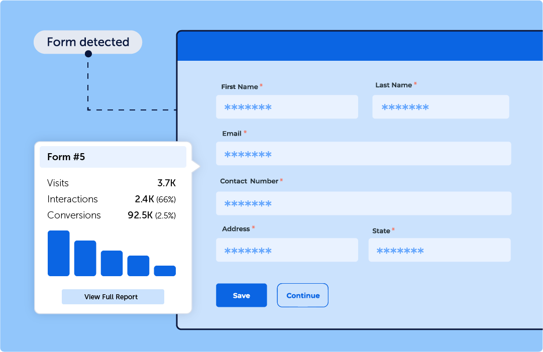
Form fatigue is real. Find out if it’s costing you conversions with  field-by-field analysis so you can uncover interaction issues and increase conversions all in one swoop (because sometimes it’s just TMI).

Learn more Analyze and optimize forms field-by-field
A screen showing an online shop and a user feedback popup asking if the user found the information they were looking for.
Feedback
Ask the right questions at the right time

Get feedback where and when it matters most. Our custom, interactive surveys allow you to target a specific audience in seconds.

Learn more Ask the right questions at the right time
Ready, set, go

Start optimizing your users' experience today

Start For Free Today
No credit card required