On your eCommerce store website, every 7 in 10 carts likely end up abandoned. At least, that’s the average online shopping cart abandonment rate in 2024, according to Statista. If only you could reduce that number…
And this statistic only reflects abandonment during checkout. In reality, users drop off at earlier stages as well, often at high rates. So, the numbers look even more depressing.
There are plenty of reasons for this, but most of them are connected with user experience (UX). We call these eCommerce website friction. And fortunately, this friction can be dealt with.
What Exactly Is eCommerce Friction?
eCommerce friction refers to points of frustration on an ecommerce website that cause users to hesitate or abandon whatever they were doing on that website.
Common eCommerce friction examples include slow-loading pages, unclear navigation, or elements that don’t work as expected. Friction is, perhaps, the main culprit behind cart abandonment.
In this post, we’ll explore the causes of eCommerce friction, how to identify it using tools like Mouseflow, and real-world examples of how brands addressed these issues to improve their conversion rates.
What Causes Friction on eCommerce Websites?
Friction can arise for several reasons, and understanding the common culprits is the first step toward resolving them. Common causes include:
Unclear navigation
Users struggle to find what they need due to poor site structure.
Examples:
- Overwhelming site menu.
- Not intuitive filter structure.
- Counterintuitive categorization.
Insufficient information
Even if the website is easy to navigate, the users may drop off if they don’t get the information about the product they are looking for. That mostly applies to product description pages (PDPs).
Examples:
- Insufficient or low quality product photos.
- Product pages lack dimensions, materials, or other important specifications.
- Unclear shipping costs or return policies.
Broken elements
Sometimes, something gets broken on your website and you don’t notice it, while the users do.
Examples:
- Coupon codes not working.
- Broken forms.
- Payment options not working correctly.
Slow loading times
Even if everything is working correctly, users might still drop off if something takes too long to load.
Examples/reasons:
- Heavy, underoptimized images.
- 3D product tours that take too long to load.
- Third-party analytics and tracking that prevent the page from loading.
Low trust levels
To buy from you, people need to trust you. According to Baymard, 25% of respondents mentioned that they abandoned websites because they didn’t trust them with their credit card information.
Examples/reasons:
- Missing security badges.
- Unfamiliar or inconvenient payment options.
- Lack of reviews and other social proof.
Complex checkout process
If the checkout process is too tedious or has some counterintuitive steps, users tend to get frustrated and leave.
Examples:
- Long forms that ask for too much information.
- Form-fields that don’t work correctly (like not accepting post codes from certain countries or areas).
- Too many payment options.
Direct and Indirect Friction
One other thing that’s good to know about friction is that there are two main types of it: direct and indirect friction.
- Direct friction: These are obvious blockers that stop users from completing their tasks. Examples include broken buttons, invalid coupon errors, or checkout bugs like disappearing carts (yes, that happens as well). Direct friction is often easier to spot, including automatic detection with tools like Mouseflow.
- Indirect friction: These are subtle, psychological, or behavioral hurdles that may not seem like a problem at first glance. For example, high shipping fees, overly complex navigation, or confusing UX elements can deter users from converting.
The problem here is that you won’t get a notification from any tool saying “hey, we’ve spotted high shipping fees on your site” or “hey, we’ve noticed that users are getting lost in the abundance of categories.” Automated detection does not apply to indirect friction. These friction events require deeper investigation, such as watching session replays or analyzing heatmaps.
Let’s get to addressing friction in a little more detail.

Friction Events
Behavior analytics tools like Mouseflow quantify some of the typical behaviors provoked by friction and detect those behaviors as friction events. That means that you can filter pages or sessions where users experienced a particular friction event and analyze them in-depth.
Mouseflow shows friction events as yellow icons on a session replay timeline
Each friction event highlights a specific type of frustration, helping you focus your efforts where they matter most. Here are the 7 types of friction events that Mouseflow can detect:
1. Click-rage
It triggers when a user repeatedly clicks on an element in a short time span. That’s a frustration signal.
Reasons for occurrence:
- A button or a link is unresponsive.
- Users mistakenly think a non-interactive element is clickable (e.g., a static image).
2. Click-error
Mouseflow records a click-error when a click or tap triggers a JavaScript error, indicating that a website element is malfunctioning.
Reasons for occurrence:
- Broken CTAs or forms.
- Dynamic elements failing to load properly.
3. Bounce
In Mouseflow, a bounce event happens when users navigate to a page, then quickly return to the previous one.
Reasons for occurrence:
- Accidental click.
- What the users saw on the page didn’t at all match their expectations.
4. Speed-browsing
Speed-browsing events occur when a user rapidly navigates through multiple pages.
Reasons for occurrence:
- Users are skimming for specific information but can’t find it.
- Pages lack clear content hierarchy.
5. 404 error
That one should be familiar to most, and since recently Mouseflow recognizes it as a standard friction event. A 404 error triggers when a user encounters a missing or broken page.
Reasons for occurrence:
- A link on your site directs users to a non-existent page.
- External traffic lands on outdated URLs.
6. Dead clicks
Dead clicks are logged when a user clicks on an element that appears interactive but does nothing.
Reasons for occurrence: :
- Images or text that look like links but aren’t.
- Broken navigation menus or placeholder content.
7. Custom friction
If you know of a typical behavior on your website that can be categorized as friction but doesn’t match any of the events above, you can set up custom friction events. Mouseflow offers customizable tags applied to unique website events defined by your team.
Examples:
- Invalid promo codes
- Failed login attempt.
You can set up notifications about friction events happening on your website to address issues as they occur.
How to Spot Friction on Your eCommerce Website
There’s a million and one reasons for eCommerce friction. It’s good to be aware of all of them, of course, but the real question is:
What exactly is causing friction on YOUR eCommerce site?
Because if you find the problems and figure out how to address them, many of those dropping off would instead stay and convert into happy customers.
This is where you need to put yourself in your users’ shoes and see your store the way they do. This can be done with session replays and heatmaps. Let’s discuss how to approach it.
1. Identify high drop-off pages
Whatever is causing friction on your website, it will have one symptom that is easy to track: users will drop off from the page where they experience those unbearable amounts of friction.
So, start with looking into your analytics tools and identifying pages with high drop-off rates. If you’re using Mouseflow, you can also look at the pages that generate a lot of bounce events (in Mouseflow, bounce means quickly going back instead of just dropping off).
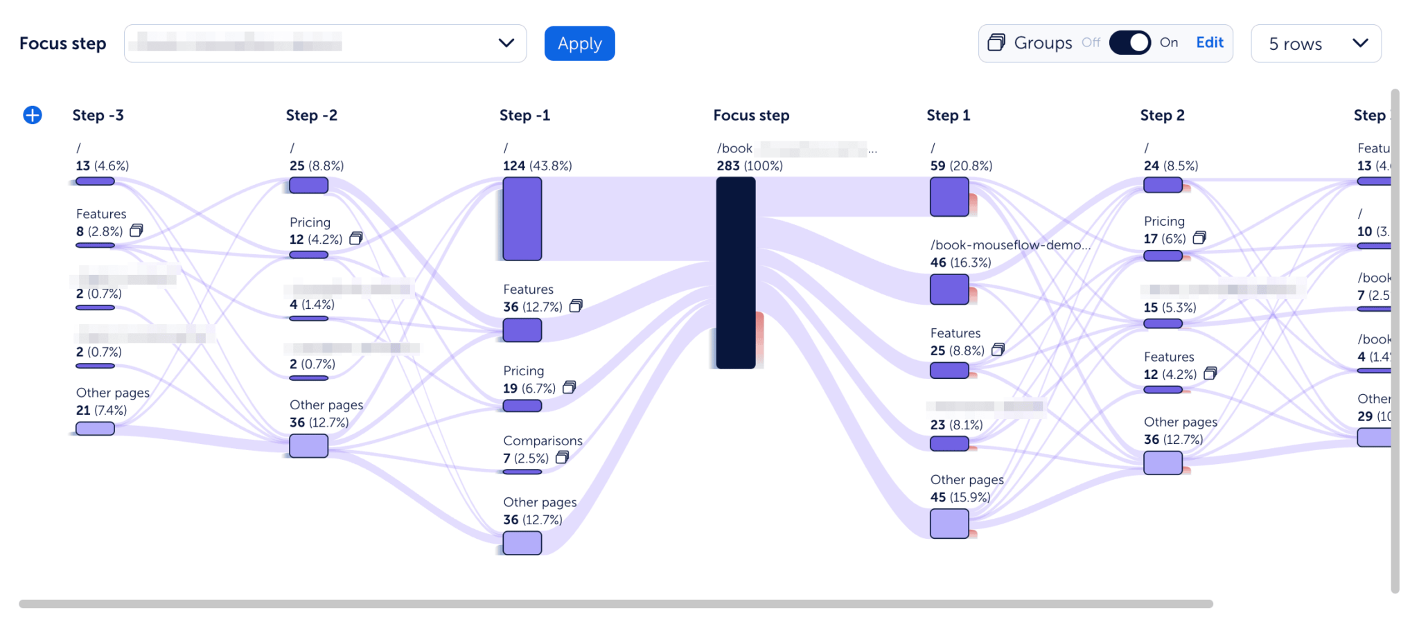
Mouseflow’s journey mapping tool can help a lot with identifying pages with high drop-off rate in a user’s journey (those red columns represent drop-offs)
These are some of the pages you should be looking into. And by looking, we mean diving deeper into heatmaps and session replays to identify the exact causes of friction. The other part comes from pages with a high friction score.
2. Identify pages with a high friction score
For each page on your website, Mouseflow offers a friction score based on friction events that the users have encountered. The higher the score, the more friction happens on the page.
So, go to heatmaps and sort the list by friction score. The pages with suspiciously high friction scores also deserve some attention from your side.
Another Mouseflow trick you could use is filtering the list of session replays by higher friction. Click “add filter”, choose “friction score” and select “unhappy” or “very unhappy”. Then, review the replays and see exactly what caused friction for the user. Perhaps you’ll get an idea about how to address it.
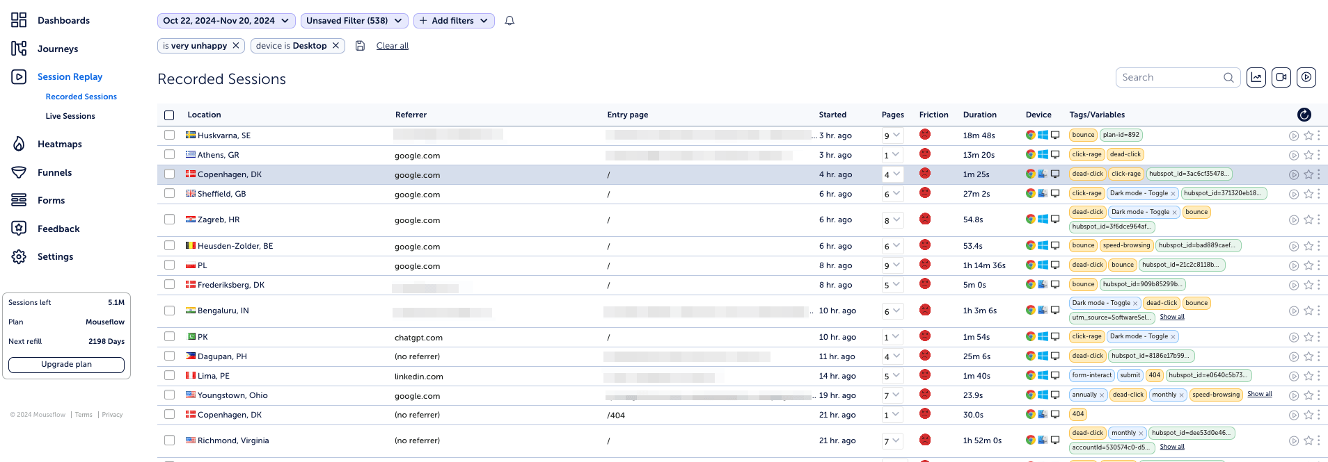
Session replays with high friction (see those unhappy emoji? That means there’s been a lot of frustration)
3. Set up custom friction events
While Mouseflow tracks common frustration points automatically, sometimes unique situations on your website require custom tracking. This is where custom friction events come in handy.
Custom friction events let you track specific issues tailored to your site’s needs. Here are the nine situations for which our customer success managers recommend setting up custom friction (if they apply to your site at all, of course):
- Users encountering an “invalid promo code” error during checkout.
- Carts appearing empty after users log back in or return to the site.
- High drop-off rates during account registration processes.
- Validation errors with fields like postal codes causing user frustration.
- Delivery fees changing unexpectedly during checkout.
- Failed payment attempts.
- Engagement with heavy features like 3D product tools or augmented reality (to understand if these heavy and expensive features add value).
- Repeated back-and-forth navigation due to confusing menus or filters (a signal of confusing navigation).
- Search queries resulting in “no results found” errors.
To do this, you’ll need to use Google Tag Manager integration to create a trigger for these specific events. Once set up, Mouseflow will log the custom friction events and display it on session replays and heatmaps, giving you detailed insights into how often and why this frustration occurs.
By setting up custom friction events, you can capture nuanced data and resolve pain points that may otherwise go unnoticed.
4. Run user tests
When it comes to uncovering friction, nothing beats real user feedback. So, running user tests can complement your analytics data by giving you a direct line to users’ thoughts, emotions, and expectations.
During a user test, ask participants to perform tasks like completing a checkout or finding a product using filters. Pay close attention to moments where they hesitate, backtrack, or express frustration. Combine these observations with other qualitative data like Mouseflow session replays to validate and better understand the problems they encountered.
User testing is especially valuable for identifying indirect friction, such as confusing layouts or unclear trust signals, that does not trigger automated friction events. When combined with Mouseflow data, user tests provide a complete picture of how to optimize your site for a smoother user experience.
Real Examples of eCommerce Friction and the Results of Reducing It
1. Example of dealing with friction on mobile
Luxury loungewear brand Derek Rose saw significant friction on mobile devices, including:
- Click rage on a location popup that wouldn’t close.
- Issues with a navigation menu leading to page reloads.
Solution:
- Redesigned the popup with clearer closing options.
- Simplified mobile navigation.
- Made technical improvements to speed up page loads.
Results:
- Mobile click rage dropped from 51% to 15%.
- Conversion rates increased by 37%.
For more details, read the Derek Rose case study.
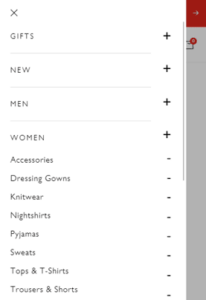 Mobile navigation: before |
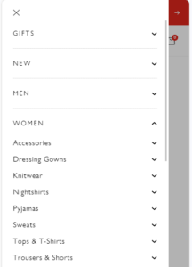 Mobile navigation: after |
2. Example of simplifying for a less tech-savvy audience
An eCommerce enterprise (which we can’t disclose yet) catering to users over 50 years old, identified key friction points:
- Customers abandoned checkout to search for promo codes.
- Overwhelming filter options caused confusion.
- Landing pages included non-clickable product images, frustrating users.
Solution:
- Displayed promo codes directly in the checkout flow.
- Streamlined filters for intuitive navigation.
- Made product images clickable.
Results:
- Reduced cart abandonment.
- Increased add-to-cart clicks and click-through rates.
- Enhanced user satisfaction by aligning the website with audience needs.
3. Example of dealing with checkout friction
Sensorem, a Swedish startup, used Mouseflow to address a low conversion rate and campaign traffic quality. When it comes to friction, they identified one important thing:
- A bug in the checkout flow that caused cart contents to disappear.
Solution:
- Redesigned the checkout flow and fixed the bug after identifying it through session replays.
Results:
- Conversion rate doubled within six months.
For more details, read the Sensorem case study.
Conclusion
Identifying and resolving friction is not just about fixing bugs—it’s about creating a seamless experience that helps users achieve their goals on your website. Removing frustration points on an eCommerce website can also do wonders to conversion rates, allowing you to hit and exceed revenue targets.
To successfully find and eliminate friction, you need to understand what could be the possible reasons for it and rely on behavior analytics to identify which types of friction are plaguing your website.
This guide gives you everything you need – from friction types to analytics tips and real examples – to start this process.
