Knowing how people navigate your website is powerful, but knowing exactly where they click is game-changing. That’s why click maps exist.
As one of Mouseflow’s seven website heatmap types, click heatmaps transform scattered click data into an intuitive visual guide that shows precisely which parts of your page draw attention and which areas fall flat.
Click heatmaps are part of a broader family of website heatmaps used to understand how visitors interact with pages. If you want a complete overview of how heatmaps work and the different types available, explore our guide to website heatmaps.
In this article, we’ll explain what click maps are, how they work, and why they’re crucial for creating smooth, high-converting digital experiences.
What Are Click Maps?
A click map is a type of heatmap that visualizes where users click on your web pages.
Think of it as a color-coded blueprint of user intent: each click is plotted on the page, and areas with high click activity light up in brighter, warmer colors. Areas with fewer clicks stay cooler and less visible.
This allows you to see, at a glance:
- Which buttons or links attract attention
- Where users mistakenly click (like non-clickable images or design elements)
- How users navigate menus, banners, and calls-to-action (CTAs)
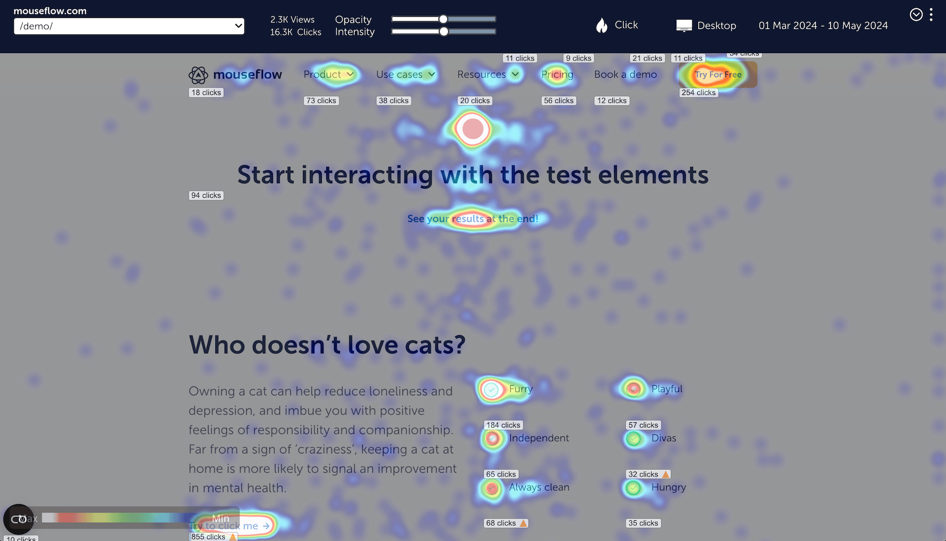
Mouseflow click heatmap example
Tools like Google Analytics tell you how many clicks you get. Click heatmaps show you where those clicks happen and whether users tried clicking things that aren’t even clickable. That’s the difference between knowing the numbers and truly understanding user behavior.
How Do Click Maps Work?
So how does a click heatmap actually come to life? Here’s what happens under the hood when you use Mouseflow:
Every click gets recorded
Whether it’s a tap on mobile or a mouse click on desktop, Mouseflow tracks every interaction on your site in real time.
Clicks get layered on a snapshot of your page
Mouseflow takes a static image of your page layout. Each click’s coordinates are plotted right where it happened.
Heat signatures emerge
Areas with more clicks glow in warm colors like red, orange, or yellow. Areas with fewer clicks stay cool, usually shades of blue or green.
That’s how click maps work technically—but there’s much more you can do with them.
You get filters and segmentation
Want to see clicks from mobile users only? Or compare new vs. returning visitors? Mouseflow lets you slice the data however you want.
Dynamic elements? We’ve got a heatmap for that!
Mouseflow’s Interactive Heatmaps work alongside click maps to capture clicks on dynamic elements—like popups, dropdowns, sliders, and sticky bars—that don’t exist in a static page snapshot. It’s the perfect way to see how users interact with modern, interactive content your standard click map might miss.
Mobile vs. Desktop Click Maps
Clicks aren’t the same everywhere. On desktop, users might explore menus, hover over tooltips, or aim for smaller clickable targets. On mobile, fingers are bigger—and so are frustrations with small or hidden elements. Mouseflow helps you spot these device-specific UX challenges so you can design experiences that work for everyone.
What Can You Learn From Click Maps?
Click maps might look like colorful art, but they’re one of the most practical tools you can use to improve your website. Here’s why:
Spot Missed Clicks (And Lost Revenue)
Click heatmaps show you if people are ignoring key elements, like “Add to Cart,” “Book a Demo,” or signup buttons. If a critical CTA sits in a cold spot, it’s costing you conversions. Click maps make it obvious and help you test new placements, designs, or messaging.
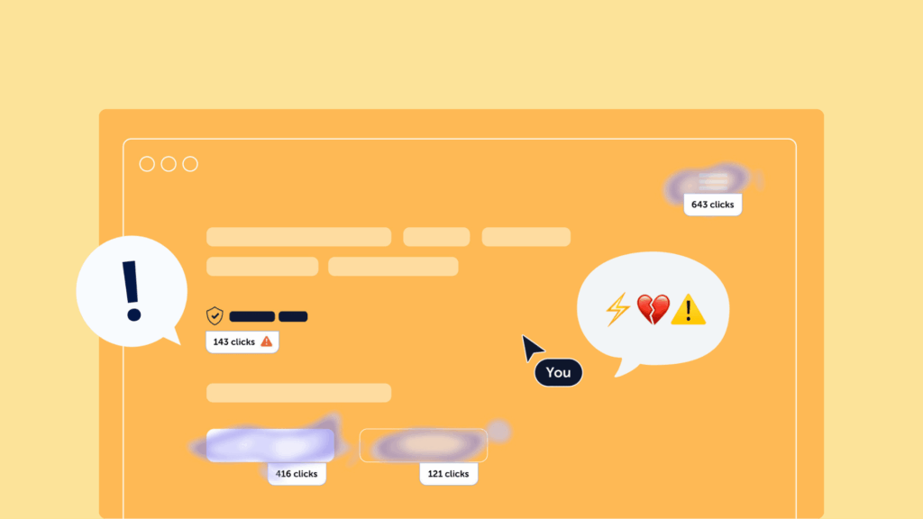
Find Frustration Fast
Ever seen someone hammer a button repeatedly? That’s called a rage click – a sign something’s broken, slow, or confusing. Click maps highlight clusters of rage clicks so you can fix technical glitches or rethink designs before users bounce.
Clean Up Dead Clicks and Distractions
Not everything that looks clickable… is clickable.
Mouse click heatmaps reveal when visitors waste clicks on images, design elements, or empty spaces. Those “dead clicks” mean confusion and a distracted user is less likely to convert.
A scenario that is often highlighted by click heatmaps is a user landing on the page and clicking a number of random non-clickable elements. Eventually, they give up and leave the site without converting. They actually want to convert; they just can’t figure out how.
Even in the less critical version where the user eventually finds the call-to-action and manages to click through, they are now less likely to convert. Research has found that websites not conforming to users’ mental models will frustrate the user. And frustrated users are less likely to purchase or sign up for your service.
On the bright side, you now know what to change to improve your conversion rate. This is an important step in optimizing your conversion funnel.
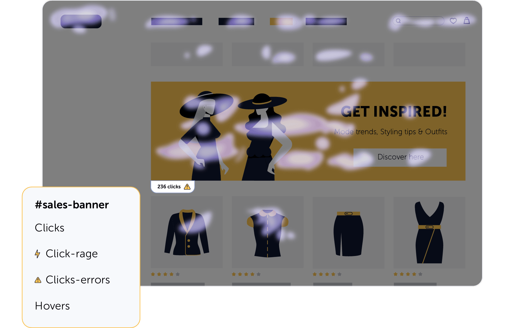
Example of click heatmap
Optimize Navigation Flows
Menus, filters, breadcrumbs, footers – navigation makes or breaks your UX.
Click maps show how users move through your page. Are they following your intended paths? Or clicking random elements while hunting for info? Clear visuals help you streamline journeys and keep users moving toward conversion.
Power Smarter A/B Testing
Planning an A/B test? Don’t guess what to try.
Click maps show you where users interact—and where they don’t—so you can design tests that actually solve real problems. Whether you’re tweaking button copy or repositioning a CTA, you’ll test with confidence.
Click heatmaps vs. Other Heatmap Types
Click maps are part of Mouseflow’s powerful heatmap suite, which includes seven different heatmaps, each revealing unique insights:
Scroll heatmaps → Show how far users scroll down a page.
Movement heatmaps → Visualize where users move their mouse.
Attention heatmaps → Indicate time spent focusing on page areas.
Geo heatmaps → Highlight traffic by geographical regions.
Interactive heatmaps → Track clicks on dynamic elements like menus, sliders, or tabs.
Friction heatmaps → pinpoint areas of frustration, like rage clicks or erratic movement.
Each heatmap type highlights different parts of user behavior. Combine them for a full picture of how people navigate and engage with your site.

How Click Maps Help Optimize Your Website
Click heatmaps are one of the fastest ways to improve your website’s performance. Here’s how they help:
- Improve Conversions: See whether CTAs are getting clicks. No clicks? Try repositioning, redesigning, or testing new messaging.
- Reduce Friction: Spot rage clicks or dead zones and fix issues before users give up.
- Prioritize UX Fixes: Identify which pages or elements deserve immediate attention based on real user interactions.
- Support A/B Testing: Click maps can show you what’s happening before and after changes—no more guessing what’s working.
- Squeeze More Value from Your Traffic: Boost ROI without pouring more money into ads by making existing pages more effective.
Find Out Why People Click (Or Don’t) with Mouseflow’s Full Toolkit
Click maps tell you where people click – or where they don’t. But that’s only part of the story. To truly understand why users behave the way they do, you need the bigger picture.
Click maps are brilliant at showing where people click – or where they don’t. But they only tell part of the story. To truly understand why users behave the way they do, you need the full picture.
That’s where Mouseflow’s other tools come in. Imagine your click map shows hardly any clicks on your “Buy Now” button. With session replays, you can watch exactly what led up to that page and spot issues like slow loading, shifting elements, or distracting popups that block the button. Or maybe your click heatmap lights up with rage clicks on an image. That’s where Mouseflow’s Friction Detection steps in, automatically flagging frustration signals like rapid clicking, hesitations, or repeated u-turns between pages, so you can quickly zoom in on problem areas.
Sometimes the fastest way to get answers is simply to ask. That’s why Mouseflow’s feedback surveys let you ask users directly: “What stopped you from completing your purchase?” It’s the perfect way to validate what you’re seeing in your click maps and replays and turn observations into action.
When you combine click heatmaps with our other features, you move beyond what users did to finally understand why, and that’s how you fix friction, improve journeys, and increase conversions.

