This post has been updated in April 2023 to include best practices in finding website pages with higher friction.
Identifying and fixing user journey pain points – that’s the job of a UX web designer. Ideally, they should even prevent these pain points (AKA problems in the customer experience) across a website.
You’ve probably encountered another term by now: “usability.” Pain points include usability issues as well. Usability refers to the ease of access and use of a website or product.
When talking about usable interfaces, there are three layers UX web designers should pay attention to these points:
- It should be easy for the user to become familiar with a website. Besides this, the user needs to be able to use it. Let’s say you own an online shop for bikes, called SmilingBikes. It should be really easy for your website visitors to navigate the site, filter for the needed bike, then go through a smooth checkout process.
- It should be easy for the user to meet his objective on the site: find relevant information on bikes and their features, and buy a bike.
- It should be easy to recall the user interface, so that the next visit goes smoothly.
If your website doesn’t meet these objectives — providing an easy, repeatable experience for users — then it’s going to cause friction. Friction on a website is wasted energy that could have gone towards navigating, interacting, and converting, but was instead spent battling the user interface.
Friction in UX and web design costs your business money.
The Costs of Poor UX Web Design
The moment a user experiences friction on a website, costs can occur for the user.
- Interaction cost. This can happen due to complicated workflows that can generate extra steps that are not needed. Also, when users need to interact often with the website chat bot, or someone from customer support, it might signal that something is not clear across his journey.
- Time cost. The examples above also include some time costs, because they just delay the time the user achieves his objective on your website.
- Cognitive load costs. This can overlap interaction cost and it refers to the amount of mental processing power needed to navigate a site and reach an objective on the site.
The costs that the user can end up paying after an interaction with a poorly designed website will translate into costs inflicted on the business owner as well.
- Trust cost. A poor website experience will erode the confidence of the user in your brand. Surely, you’ve made massive investments to build brand trustworthiness — and bad UX can render it moot!
- Sales cost. If the user won’t easily reach his purchase goal, you’ll be losing money and clients. This is the most direct cost to a business — lost conversions.
- Retention cost. If the visitors get lost in complicated user journeys, they might not come back again, and look for similar products or services elsewhere. Consider this the hidden cost of poor UX — customers who may have returned choose not to, as the memory they’re left with is of a high-friction experience, no matter how satisfactory your actual product was.
Here’s how to prevent these costs and ensure a smooth user experience across the website.
Solving UX Web Design Friction
UX design has a lot to do with empathy and user behavior. You need to walk in your users’ shoes. This why here’s where you need to start when doing UX design:
What’s your target audience? Who’s your ideal customer?
Your ideal customer has certain goals and challenges, demographics, motivators. All these traits affect the way they interact with a certain product, or service. The moment you understand their needs and objectives you can start designing your website.
What about the user’s journey? Well, there are several motivators behind someone’s visit on a website: education, information, and transaction. This means that your website needs to satisfy these needs, but also your end need: a conversion (ebook download, course enrollment, purchased goods, etc.)
Now, all the sections of your site should flow naturally, and design a smooth journey till the end goal: the conversion.
On this journey there might occur several UX friction points. It’s time to identify them and see how better UX can lend a helping hand and minimize the costs mentioned above.
Don’t break design patterns
There are some patterns that users are used to, let’s stick to them. Breaking a pattern is really hard and they can cause friction. Here are some examples:
Website and app users are used to seeing logos in the upper left. Research has shown that this placement helps with brand recall. Here’s a study from Nielsen proving that logo placement does matter. Moreover, using a quality logo generator can simplify the process and give you a professional logo.
Links and buttons should be obvious. As Steve Krug (the author of “Don’t make me think”) puts it: “Another needless source of question marks over people’s heads is links and buttons that aren’t obviously clickable. As a user, I should never have to devote a millisecond of thought to whether things are clickable — or not”.
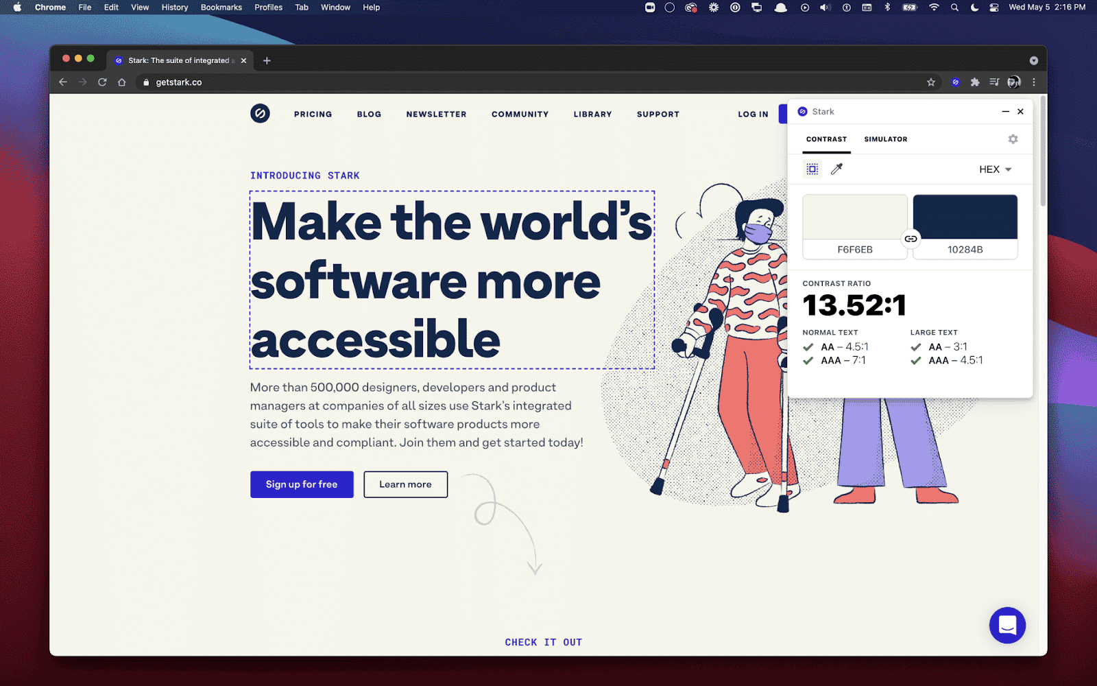
For buttons, and everything that has a background, make sure that the contrast ratio between the text and background is at least 4.5:1. You can measure this using Stark.
Make sure that clickable elements on mobile devices have enough space between them. If not, it will cause lots of frustration when users click on the wrong item.
Now, let’s dig a bit beyond patterns.
Embrace UX web design best practices
From navigation to copywriting, we’ve got advice for you.
Navigation
Navigation plays a vital role in how users interact with a website. It is how your user can get from point A to point B as smooth as it gets. At the end of the day you need to align your navigation with your user goals. Call it reverse engineering if you like.
In the case of online stores, for example, you should use:
- Breadcrumbs;
- Filters;
- Sorting options;
- Product categories;
- Search bars
…to make it easy for the user to find the desired product.
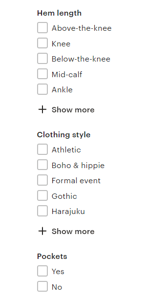
For example, Etsy uses lots of filters for its clothing items. And it’s great how they’re helping users narrow down their options. They’re the only site where I noticed a filter for skirts with or without pockets. I’m loving this filter!
Now, when users navigate the main menu, or select a filter, make sure to highlight the current scope.
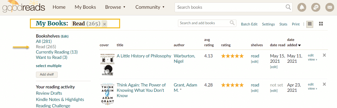
For example, I want to filter the books that I have read on Goodreads. I select the “Read” filter, because this is my scope. Now, the rest of the items in the filter are blue, while the selected one is grey. Also, there’s a status above the filter, “My Books: Read”, that helps reinforce the current scope.
Now, can this be improved? Sure thing, for example, why not increase the contrast between the blue and the grey, or apply an underline? These would work for me, but what about for the rest of the users? Well, a test needs to be performed.
My jaw dropped when I found out that 66% of sites don’t highlight the user’s current scope within their main navigation.
Easy to complete forms
While designing a form, it’s vital to avoid all the unnecessary questions and to require only the most relevant information. Yes, folks, “Less is more” is not a cliché.
Now, let’s say that you do need more fields in your form. There’s a solution for this. You can chunk the form into several steps to minimize the user’s cognitive load. You can even add a progress bar to let them know how close they are to the finish line.
One hint here: don’t assume you’ve found the right form. Test before adding or removing any input fields.
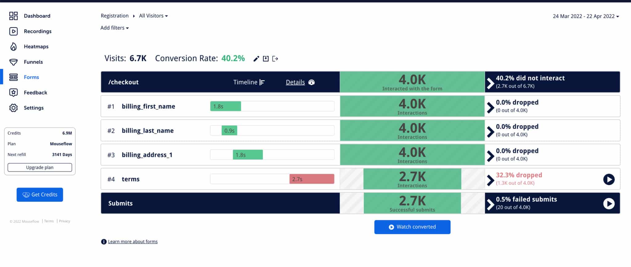
Now, if you want to better understand how users interact with the form, you can use tools such as Mouseflow’s Form Analytics to visualize the interaction. You can get insights about the steps that block the flow, and so that you can make informed decisions about optimization.
Next, make sure that you distinguish optional and required fields.
Smooth checkout process
According to Baymard, the average cart abandonment rate currently sits at 68.8%. What does this mean? After navigating a website, adding stuff to the cart, or removing it, in the end 2 out of 3 users choose to abandon their purchase. Mind blowing, right?
Now, some of these dropouts are a natural thing: people end up finding a better product, a cheaper one, etc.
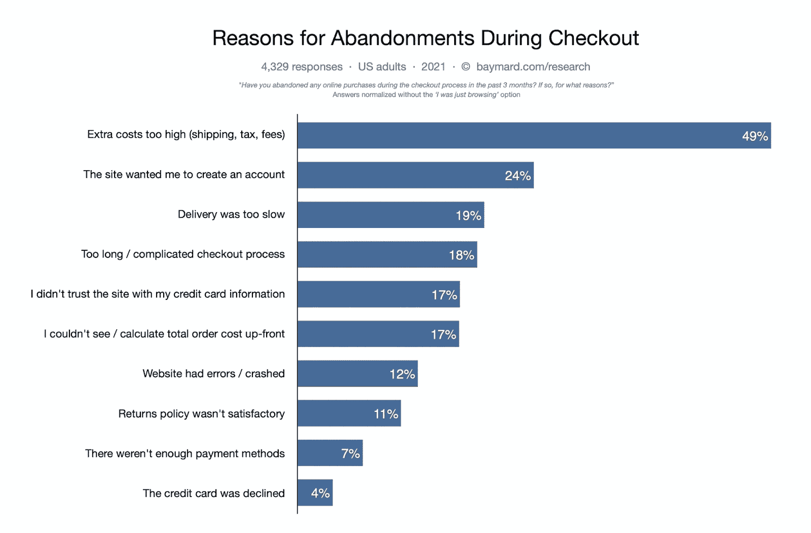
The real a-ha moment is when you find out that 18% of US online shoppers have abandoned an order because of a “too long / complicated checkout process”.
Now, what can you do when your checkout process is too long? Well, the same advice that I gave for forms, can be replicated here as well. In the end, the checkout process is a form, right?
So, you can:
- Chunk the form into several steps to minimize the user’s cognitive load;
- Add a progress bar to let them know how close they are to the finish line;
- Remove unnecessary steps. Do you really need the user’s date of birth?
- Detect the location from the ZIP code;
- When users type in their email you can suggest them the most popular email domains (gmail, etc);
- Have an option for showing the password. This is something that pisses me off a lot: when my passwords don’t match and I don’t have an option to see them.
Leverage familiarity in design
When interfaces are designed (for web or apps) it’s important to create interactions that mimic the ones from the real world.
For example, let’s say you want to use a slider on your site. You can use left and right arrows to point out to the user that there’s some extra info to the left or right. It’s the same when you go inside an IKEA store, and there are arrows guiding you to the exit.
We have all built some mental models around real-life experiences. For example, early cars tended to look like carriages, but with no horse. Moving to the digital world, when you look at photos on Facebook, you feel like turning the pages in a photo album. The same goes for Netflix or Audible, where movies and audiobooks seem to be arranged on shelves in a video store or library.

And don’t we all send many mails to the Trash folder in our mails, or send files to the Recycle Bin for Windows?
At the end of the day, familiarity helps us with minimizing cognitive load. When we do not have to think too much, experiences become more enjoyable.
Copywriting
Use words and concepts familiar to your ideal customers and users, rather than internal jargon. Don’t sound too academic, but communicate as you would do in a normal face to face encounter. People like the feeling of familiarity.
Write in present tense, and avoid passive voice.
Always remember that font-size is correlated to the importance of the text.
Small fonts should have more spacing (distance between the words), this way they become easier.
Limit line length to 70–80 characters, they are easier to follow and understand.
Error prevention
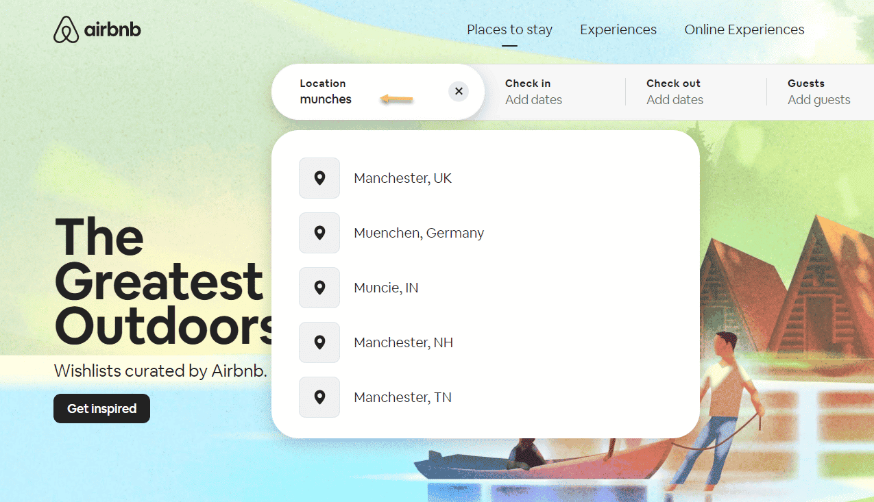
As Jakob Nielsen puts it: “Even better than good error messages is a careful design which prevents a problem from occurring in the first place”. For example, the folks at AirBnb know that people type incorrectly many times. Let’s say I’m looking for “Manchester”, but I’m misspelling it. The search bar can provide close variations to my actual search.
Next, make sure to announce if an error has been made in a friendly manner, and do not accuse the user for the mistake. You do not need to add some extra frustrations by making accusations. You are here to build a relationship. Keep your eye on the problem and its solution.
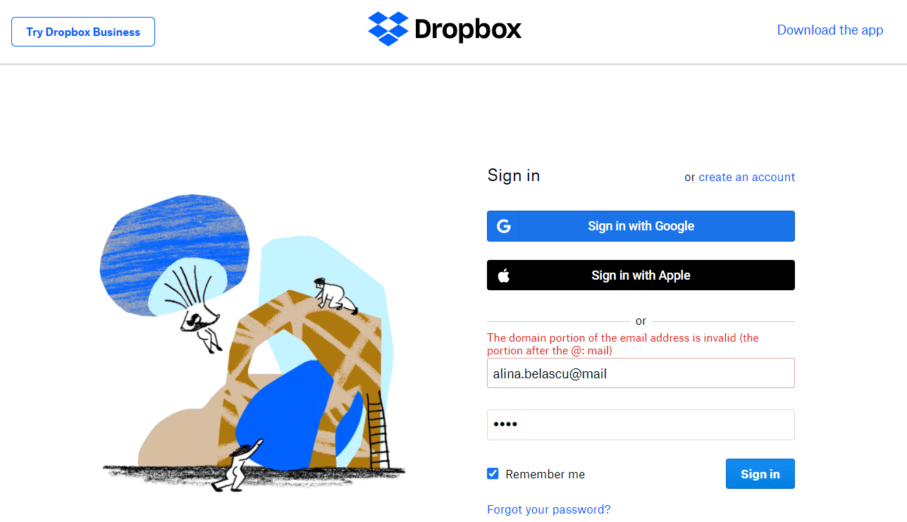
For example, if you do not type the right email address when signing in to Dropbox, you are prompted with a message that clearly explains what the error is about, and how to fix it.
Promote recognition
Us humans have limited short-term memories. This is why we need to make it easy for website users to come back to certain pages, or products.
For example, you can allow for certain pages to open in new tabs, or, for ecommerce stores, to have a section for previously seen items.
After reading all these tips, what do you think? Were they obvious or not? Did you resonate with them or not?
Next, the question is: how can you identify any pain points? And no, making an assumption is not the right answer. It’s time to get a bit scientific.
How UX web designers identify pain points
There’s a very old story that I enjoy.
6 blind men are touching an elephant. One of them touches a leg and believes he’s encountered a huge caterpillar. One grabs the tail and believes the creature is made of rope. Another one grabs the trunk and claims that it’s a huge tree. The fourth clutches the ear and decides the creature is like a hand fan. The fifth, touches the belly and compares the creature to a wall. The last one grabs onto a tusk and decides the elephant must be made of solid pipe.
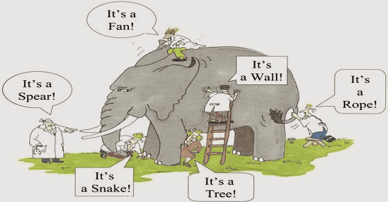
This story is a great metaphor for what we can’t see when we’re not looking for it.
Now, how can UX designers understand user behavior, and users’ needs?
Well, it’s time to talk to the users and use tracking tools.
Talk to the users
User research is the science that can help you study your target users with their needs and pain points. Here’s a great resource on the types of methods you can employ here.
Use tracking tools
With web analytics tools such as Google Analytics or Mouseflow you can understand how users interact with website pages, clickable elements, forms, and more.
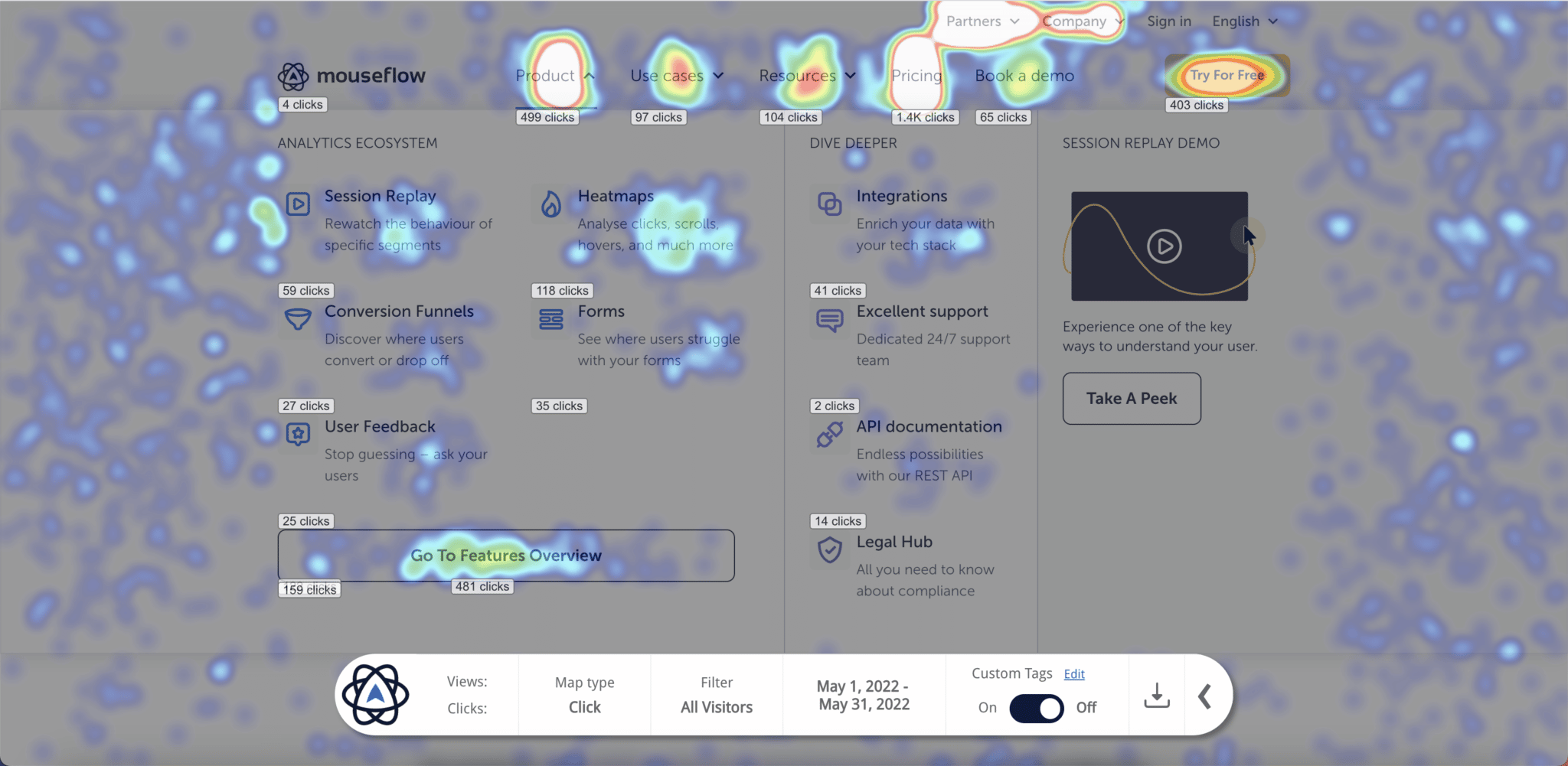
Furthermore, Mouseflow provides heatmaps and click recordings that allow you to identify website sections that interfere with the users’ goals. This way you can lay the groundwork for future experiments that will allow you to fine-tune your website design. You can also explore Mouseflow integrations to make install and analysis even easier.
Do this now to upgrade your UX web design
Usable sites should minimize users’ costs and make sure that they can reach their goals effortlessly. Another way to look at it is like having the user on auto-pilot.
Users rely a lot on habits, and changes annoy them. This is why they follow patterns. Also, don’t forget, prevention is also key, in UX web design as well as in real life. I love this example Jakob Nielsen gives when talking about error prevention in usability: “guard rails on curvy mountain roads prevent drivers from falling off cliffs”.
Now, go evaluate your website and:
- Look for the elements that are causing interactions costs for your users
- Look for the elements and pages that are increasing the cognitive load of your users
- Identify buttons and links that aren’t obviously clickable or do not have enough contrast
- Identify navigation issues that cause delays in reaching a user’s objective on your site
- Use tools that help you understand how users interact with your forms, in order to optimize them and increase conversion rates
- Identify the copy that is not readable or properly chunked. Are you talking the same language as your user?
- Check the design and copy of your error messages
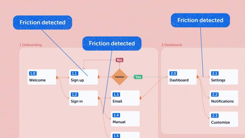
To avoid wasting time and looking through all the pages, you can use Mouseflow to filter out pages with higher friction thanks to our proprietary Friction Score that is attributed to every page and every session.