Black Friday is over. The campaigns are wrapped, the orders are (hopefully) shipping, and your team is catching its breath.
But here’s the real opportunity: if you were using behavioral analytics during Black Friday, now is when the real work begins.
You’ve just put your website through one of the biggest stress tests of the year. The data you collected in those high-pressure moments is pure gold. It shows you exactly where things broke, where users struggled, and what needs to change before the next wave of traffic hits.
And that next wave? It’s not far off. Christmas is around the corner. After that, New Year’s, Valentine’s Day, Easter, spring campaigns, summer sales. Traffic spikes are now a year-round reality, not a once-a-year event.
Why Black Friday behavior matters long after BFCM
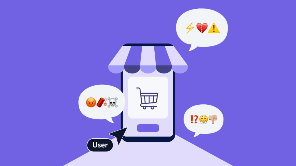
Think of Black Friday as a pressure cooker. Under that pressure, every small UX issue gets louder. Users click faster, skim more, and tolerate less. If something’s broken, confusing, or slow, they won’t wait around. They’ll leave.
What you saw during those days is a fast-forward version of what users deal with all the time. The only difference is that now you have the data to prove it. If you had Mouseflow running, you captured every click, scroll, hesitation, and rage moment. That’s not just analytics. That’s a fix list.
What behavioral data tells you
Standard analytics tell you what happened. Behavioral analytics shows you why it happened.
A rage click on a product image that wasn’t linked? That’s frustration. A user who clicks your delivery policy, then leaves? That’s uncertainty. Someone repeating the same checkout step three times? That’s cognitive overload.
Mouseflow lets you spot these moments using friction detection, session replays, heatmaps, user journey analytics, funnel analysis, and form tracking.
You can go page by page, pattern by pattern, and see exactly where friction built up and conversions broke down.
And because it’s visual and behavior-based, it’s much easier to take action. You don’t need to guess. You can just watch the problem unfold.
Real examples from eCommerce companies
Here’s what some ecommerce brands uncovered with Mouseflow during high-traffic moments and how they used those insights to make fast, high-impact changes:
Scotts Miracle-Gro: Clearer paths in moments of confusion
When Scotts Miracle-Gro kicked off their yearly campaign, their team saw users rage-clicking on product images and brand logos that looked clickable but weren’t. Big seasonal traffic spikes, like during Black Friday, make it even easier to spot this kind of confusion, where users interact with elements that don’t actually lead anywhere.
Using heatmaps and session replays, they spotted the distractions and turned those highly clicked-but-dead elements into real, clickable paths. The result? A clearer path to the call-to-action, and less confusion along the way.
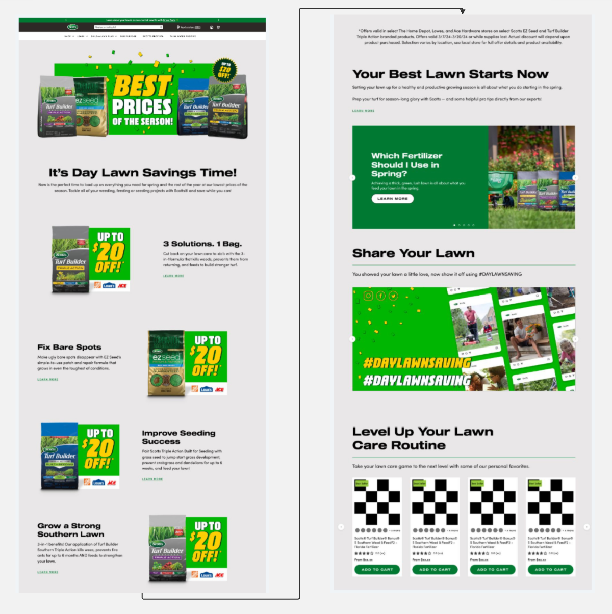
DayLawn Saving landing page after showing optimized design & stronger conversion.

“We took what we learned from Mouseflow the previous year and made changes that drove more meaningful engagement with the CTAs
in this year’s campaign, helping people find exactly what they needed.”
Goldner Fashion: Promo code uncertainty made visible
Promo-code hunting tends to spike during Black Friday. With discounts everywhere, shoppers expect a deal.
Goldner Fashion noticed a pattern of abandonment at checkout. Users were leaving the site to search for promo codes. Instead of hoping they’d come back, the team placed the code directly in the checkout experience. That small change led to a 15% drop in abandonment.
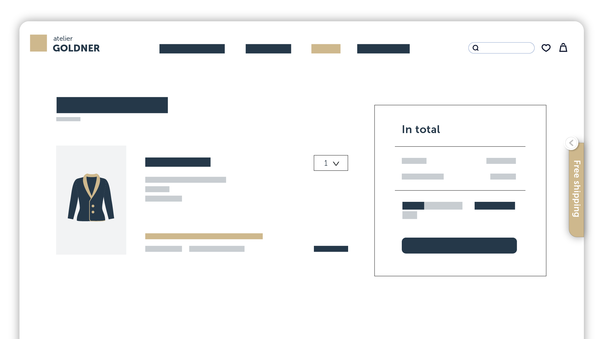
Before: No promo code pop-up
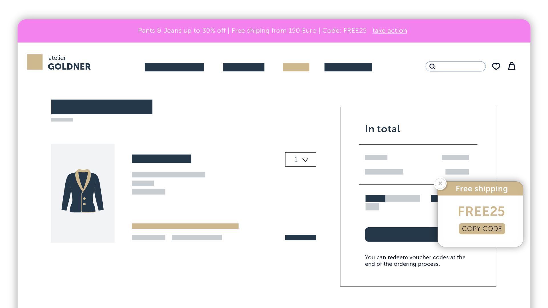
After: Promo code in a collapsible tab for easier access, reducing friction in the checkout process.
They also discovered filter fatigue. Shoppers were overwhelmed by too many product filtering options, leading to hesitation and decision fatigue. Simplifying the layout led to a 70% increase in filter use and 30% more add-to-cart clicks.
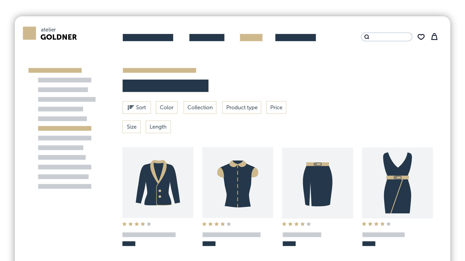
Before: A product listing page on Goldner Fashion’s website with complex filter options, making it harder for users to refine their search efficiently.

After: A simplified product listing page with an improved filtering system, using fewer and more intuitive filter categories for a smoother shopping experience.
Megabad: Friction that traditional tools missed
Megabad faced technical friction. Their “Buy” button sometimes loaded with a delay, and an address validation field was blocking form completion. Mouseflow flagged both issues in session replays. Fixing them led to a 73% drop in checkout abandonment.
But the bigger insight came from something far less obvious. Megabad’s ecommerce platform was set up to offer different payment methods based on country and cart value. Great idea, right?
Well, while that flexibility made sense on paper, it created a hidden blocker. A payment method popular in one country stopped showing up once a shopper’s cart hit a certain value even though it was still expected by users.
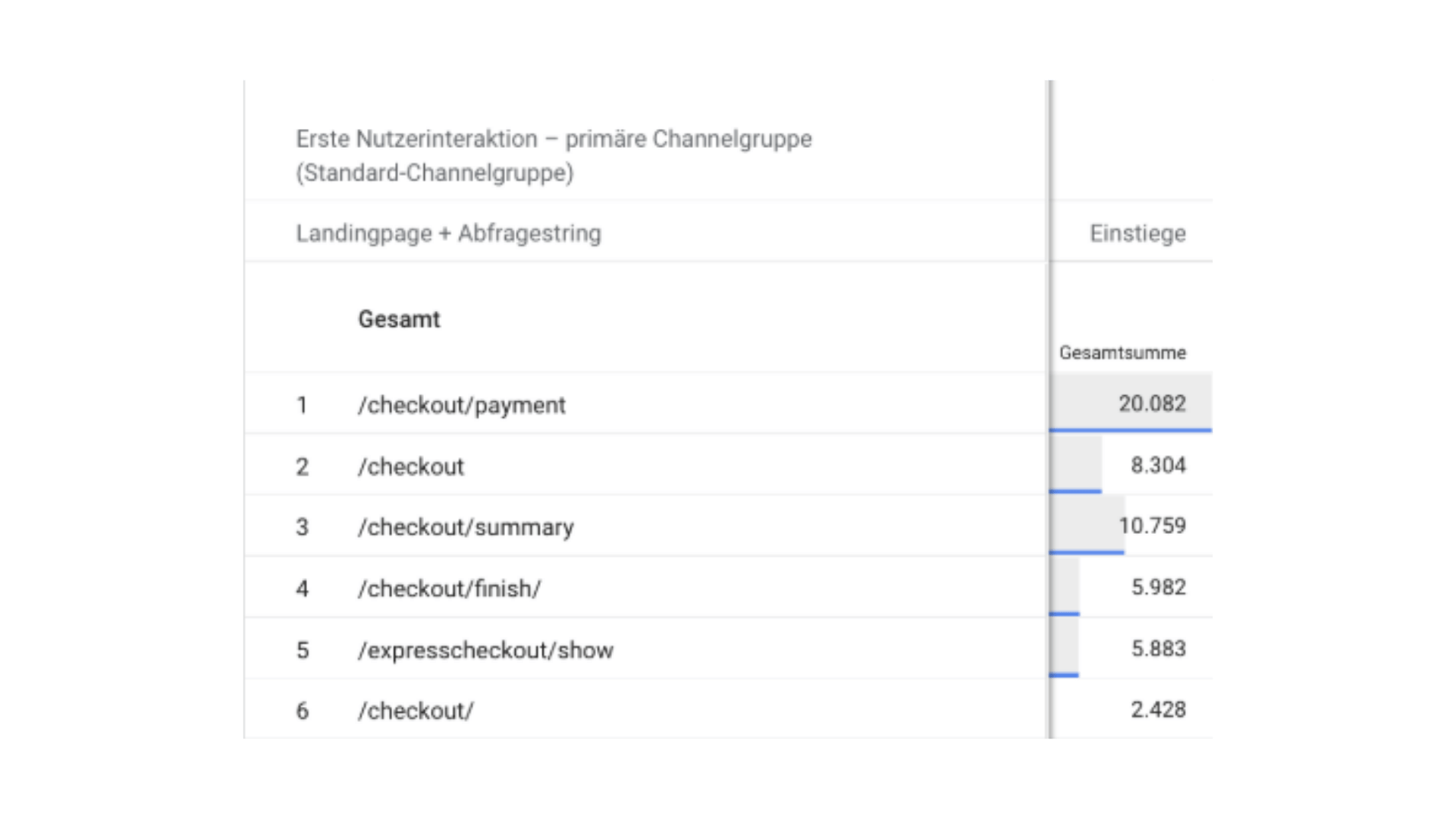
Megabad’s GA4 Checkout Data
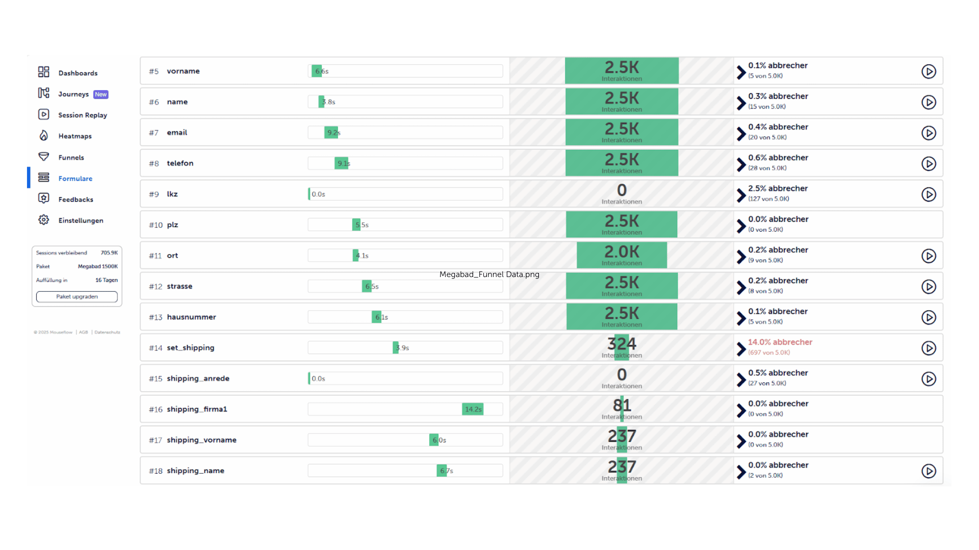
Megabad’s Conversion Funnel Data
This kind of friction is nearly impossible to detect with traditional analytics. There’s no error message. No form drop-off. No complaints. Only by watching session replays could the team see users abandon checkout after failing to find their usual payment option.
That fix wasn’t just technical, it was strategic. And it only surfaced because they had behavioral data in place.
Mos Mosh: Supporting faster, more confident decisions
During peak campaigns like Black Friday, shoppers are hit with a wave of ads, offers, and urgency. When they finally land on a product page, the experience needs to do the heavy lifting. It should help them make a confident decision without second-guessing.
Mos Mosh realized users hesitated on product pages. People weren’t confident they had enough visual information to commit. The fix? More images, better layout, and front-and-back views of key items. That reduced return rates and helped users feel more confident in their decisions.
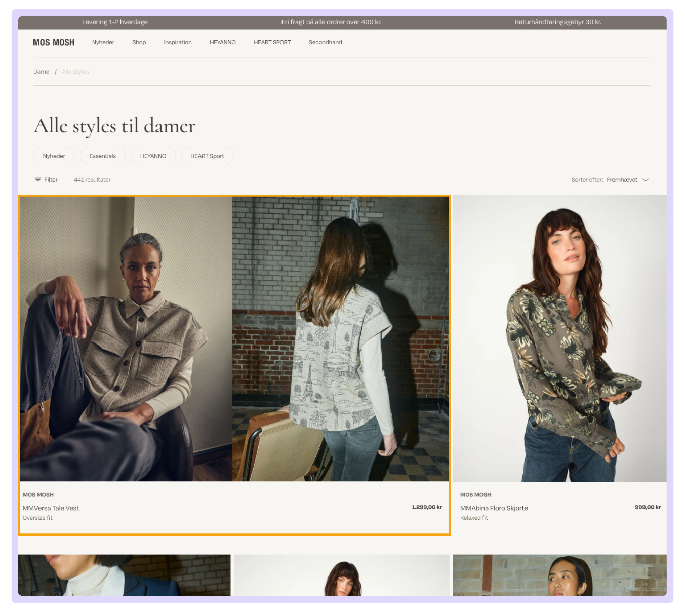
Double-Sized Product on Women’s Collection Page. This highlights both front and back details, occupying two columns. The larger display increased visibility & click rates.
Don’t let this moment pass. If you wait until the next campaign to start analyzing what went wrong, it’s already too late. The good news is, you don’t need another sale to see where the problems are. You just need to review the behavior you already captured or about to. You’ll find signals that repeat in every campaign.
Hidden friction in your checkout. Confusing navigation on mobile. Missing trust cues. Broken visual hierarchy. These aren’t seasonal problems. They’re year-round blockers that just happen to scream louder during a rush.