Get the BSH story sent directly to your inbox
BSH is one of the largest manufacturers of household appliances in Europe with a portfolio of well-known brands like Bosch, Siemens, Gaggenau, and Neff. The company has been in operation since 1967, producing a wide range of products, including dishwashers, refrigerators, and washing machines, as well as a lot of other things one can expect to find in a kitchen or a laundry room. BSH has always been focused on innovation and customer satisfaction, with its products renowned for their quality and reliability.
Finding a way to step into the shoes of thousands of website users – at once
One of the ways that BSH ensures customer satisfaction is by providing the best possible user experience for customers, with the goal of encouraging conversion and positively influencing brand awareness. This is the domain of their Global UX Team.
The UX team frequently faces complex challenges such as optimizing the user experience while also considering the needs and expectations of all stakeholders. BSH is a large company with various departments, including customer-facing ones like e-commerce, marketing, and customer support. However, due to the limited capacity of the navigation menu, there is a debate about which department(s) should have a primary place on the company’s customer-facing websites. While e-commerce brings in revenue, customer support is essential for maintaining customer satisfaction, and marketing ensures the right perception of the brand. Thus, it’s crucial to strike a balance and prioritize departments accordingly.
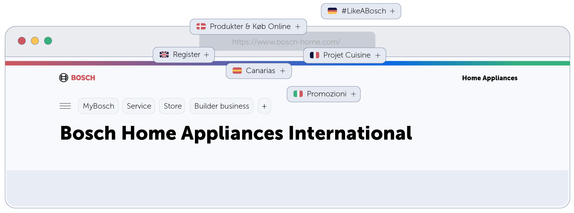
What adds to the scope of the problem is the fact that BSH has various website localizations, and because they are indeed localizations rather than just translations, their structure differs from region to region. How does one ensure the optimal structure of multiple websites, while still maintaining some resemblance between them?
 Different localizations of BSH’s websites have different menu items
Using A/B testing only gives the idea if something works or not, but you should first come up with hypotheses. Also, A/B testing tools and classic web analytics solutions don’t give you the “why” behind the “what”.
Qualitative user tests, on the contrary, give you the “why”. But they need to be run at an immense scale to actually tell if that “why” represents reality for the majority of the users. Running them at such a scale is usually impossible – due to time and budget constraints: they are both slow and costly.
So, BSH used Mouseflow as a source of both qualitative and quantitative data.
Using Mouseflow to get user insights
BSH has been a customer of Mouseflow since 2017. More than 300 users across Analytics, Digital Marketing, and eCommerce teams are using it to track over 126 websites. Michaela Urbas is part of the Global UX Team, which recently led a project on transforming website navigation that involved Mouseflow as a tool to answer the aforementioned questions.
By leveraging Mouseflow, the BSH UX Team was able to rapidly gain insights into users’ click paths and frustrations, and gather a larger sample of data on how most users interact with their devices in a natural environment. This information proved invaluable in making data-driven decisions and improving the user experience.
Optimizing the menu…
The main Mouseflow features used were heatmaps and session replay.
- Session replay helped identify and explore navigation patterns, which pages are most accessed from the menu as well as which elements on that page users interact with the most.
- Heatmaps gave insight into how users interact with the navigation menu across devices and countries. Click maps helped the team instantly identify areas of low engagement, and scroll heatmaps gave insight into the visibility of important information on pages.
As a result, the menu was optimized, with less important items folded under the main drop-down menu, and live heatmaps helped verify that information is getting easily discovered with the implementation of the new navigation.

“Mouseflow bridges the gap by offering quantitative and qualitative data, providing higher user numbers and valuable insights into user behavior.”
… While keeping stakeholders happy
Managing competing stakeholder interests is a universal challenge faced by UX teams. Each department is responsible for different issues, and everyone tends to see their topic as the most important, wanting it to be displayed prominently. Fortunately, Mouseflow data has proven to be a valuable tool in this regard, allowing for easier sharing with stakeholders and helping to convince them of the best course of action.
 Mouseflow helped BSH’s UX team manage stakeholder expectations by sharing valuable user data with them to make better informed decisions
By providing a clear and objective view of user behavior, Mouseflow data helps align stakeholder interests and improve the user experience. Compared to individual user testing, Mouseflow has the advantage of providing the information at scale, showing numbers that can help convince stakeholders. Also, with Mouseflow you do not need to scope and prepare an extensive test – you get all the information right away.

“With the help of Mouseflow, the UX team was able to easily share valuable user data with stakeholders, facilitating productive conversations and informed decision-making.”
For years, Mouseflow has been a critical tool for BSH Group, providing invaluable insights to digital marketing, e-commerce, UX, and analytics teams. From identifying areas of friction to monitoring checkout flow and driving higher conversion rates and revenues, Mouseflow has proven to be an essential component of BSH Group’s digital toolkit. By leveraging the insights gained from Mouseflow, teams across the organization can make data-driven decisions and continuously improve the user experience, ultimately delivering better results for the business.
Company: BSH
Tools used: Mouseflow
Techniques used in Mouseflow: Heatmaps, Session Replay.
