
Static heatmaps are useful, until your site starts behaving like, well, a modern website. Dropdowns, filters, product lists, carts, modals… all the interactive stuff that traditional heatmaps tend to ignore.
That’s where interactive heatmaps come in.
Also known as live and dynamic heatmaps, interactive heatmaps let you explore aggregated behavior data overlaid directly on your functioning site, so you see interactions in the same context your visitors experience it. It’s behavioral insight in context, tailored to how your site actually functions.
Interactive heatmaps are part of a broader set of website heatmaps used to understand user behavior across different types of pages and experiences. If you want a complete overview of how these tools fit together, explore our guide to website heatmaps.
In this post, you’ll learn what makes interactive heatmaps different, when to use them, and how they help teams uncover insights that static tools miss entirely.
What Is an Interactive Heatmap?
An interactive heatmap is a dynamic overlay that lets you view behavioral data – like clicks, scrolls, and movement -directly on top of your live website, with full support for dynamic elements and personalized content.
That last part is the key difference.
Traditional heatmaps are essentially screenshots. They’re useful for identifying general trends, but they fall short when your page changes based on user behavior – think product filters, dropdown menus, cart updates, modals, SPAs, or lazy-loaded content.
Interactive heatmaps solve this by letting you browse your site just like a visitor would. As you interact with the page (apply filters, open a dropdown, or add an item to your cart) the heatmap adjusts to show the behavior data specific to that exact state.
This means you’re not just seeing where people click. You’re seeing where they click when certain elements are visible, when content changes, or when users trigger dynamic actions. It’s contextual, accurate, and tailored to the way your site actually works.
Whether you’re troubleshooting a specific funnel step or reviewing engagement on dynamic components, interactive heatmaps give you the clarity static tools miss.
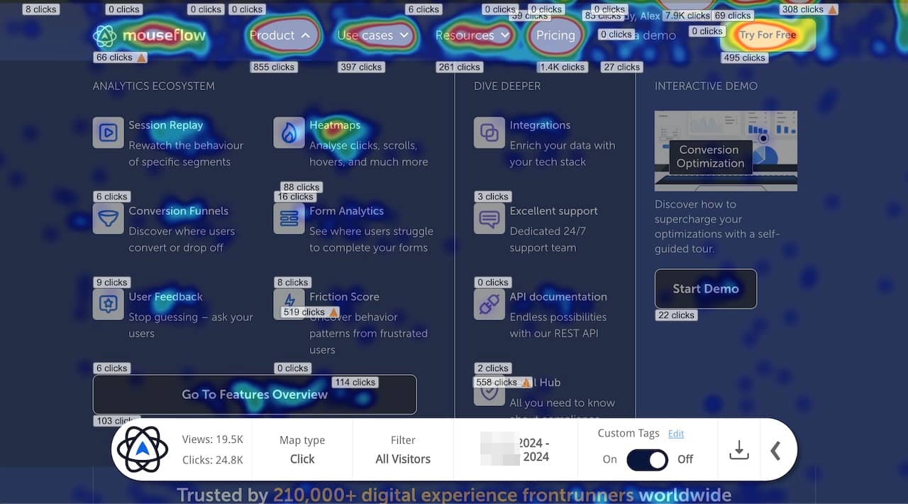
Example of an interactive heatmap
Why Interactive Heatmaps Are a Game-Changer for Dynamic UX
Interactive heatmaps bridge the gap between how your site is built and how people actually experience it. Unlike traditional heatmaps that flatten everything into a single static view, interactive heatmaps give you layered, contextual insight into behavior as it unfolds across dynamic, personalized, or reactive elements.
Their strength lies in showing you what users did – on the version of the page they actually saw. Whether you’re validating UX changes, reviewing drop-offs, or analyzing engagement with modals, filters, or product configurations, dynamic heatmaps help you make sense of behavior in complex, real-world contexts.
And when you need to dig deeper, they become a launchpad. You can move directly from a filtered heatmap view into a session replay to watch the behavior unfold. If you’re investigating why users drop off after interacting with a form or funnel step, the interactive heatmap helps you identify the exact page state where it happens, so you can understand not just that something went wrong, but where and why.
It’s your most intuitive starting point for exploring complex journeys, and your fastest route to uncovering insights that lead to action.
Putting Interactive Heatmaps to Work
Interactive heatmaps are built for modern websites. If your pages shift with filters, load content dynamically, or change based on user behavior, this is where they shine:
Product filtering and category pages: Apply filters like size, color, or price and see how engagement changes. You can review clicks and scroll depth in the exact context your users experienced.
Shopping cart and checkout flows: Cart contents often affect layout and CTA placement. Dynamic heatmaps let you replicate these states to see what’s visible, what’s missed, and where drop-offs happen.
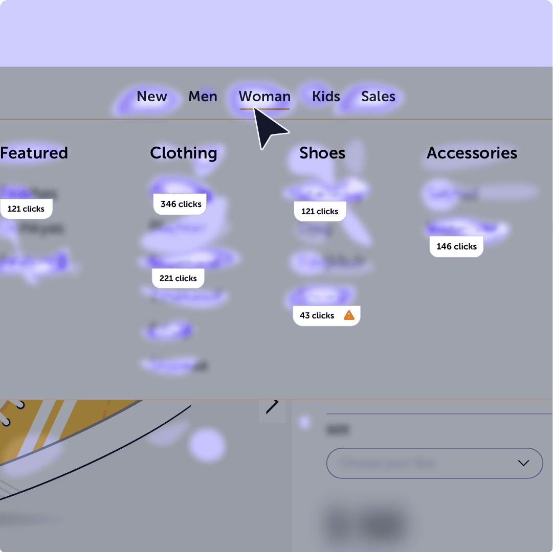
Example of Mouseflow’s interactive heatmap for an Ecommerce Store
Form interactions and modals: Dropdown-triggered fields, auto-expanding sections, popups – interact with these elements live and instantly analyze how users engage (or don’t).
A/B testing with dynamic elements: If you’re testing layout changes or dynamic content, static screenshots won’t cut it. Load each version and view its actual behavior data right on the page.
Presenting insights to stakeholders: Nothing beats showing stakeholders the real page with behavior data overlaid. It’s the clearest way to align, explain, and drive decisions, without exporting or speculating.

Key Insights You Can Unlock
Interactive heatmaps give you a dynamic, real-world view of how users engage with your site’s most complex elements. Here’s a quick summary of where they make the biggest impact:
- Reveal behavior on dynamic elements: See where users click or scroll on modals, dropdowns, filters, or AJAX-loaded content—areas traditional heatmaps often miss.
- Find friction in interactive journeys: Discover where CTAs shift out of view, inputs go untouched, or users drop off after interacting with filters or carts.
- Support UX and design validation: Load any page state and show behavior patterns in context—ideal for reviewing design changes, tests, and stakeholder walkthroughs.
- Enhance CRO efforts in real time: Optimize live experiences like product pages or checkout flows by seeing exactly what’s happening at every interaction layer.
- Maximize Insights from Personalized Content: Analyze behavior on pages that change based on user preferences, product data, or custom configurations.
Interactive Heatmaps vs. Other Mouseflow Types
Every heatmap type in Mouseflow offers a unique lens into user behavior. Interactive heatmaps stand out for their ability to reflect dynamic content and evolving page states, but they’re most powerful when used alongside the others.
Here’s how they compare:
- Scroll Heatmaps reveal how far users scroll before dropping off. Best for identifying content depth issues. View Scroll Heatmaps →
- Click Heatmaps show where users click the most, but only on the static version of your page. View Click Heatmaps →
- Movement Heatmaps track where users move their mouse, helping uncover visual attention zones. View Movement Heatmaps →
- Attention Heatmaps combine movement and hover time to show where users focus and where they don’t. View Attention Heatmaps →
- Geo Heatmaps map user engagement by country or region, highlighting how behavior changes by location. View Geo Heatmaps →
- Friction heatmaps pinpoint areas of frustration, like rage clicks or erratic movement. View Friction Heatmaps →
While the other heatmaps work best for identifying aggregate patterns, interactive heatmaps are your go-to for exploring specific, dynamic user experiences, especially on ecommerce sites, SPAs, or any page that changes based on user behavior.
Final Thoughts: See What Static Can’t
Today’s websites don’t stand still – your heatmaps shouldn’t either!
Interactive heatmaps give you the freedom to explore behavior as it was experienced across dynamic, ever-changing page states. Whether you’re optimizing forms, debugging complex flows, or presenting insights to your team, they help you cut through the noise and get straight to what matters.
And when used alongside Mouseflow’s other heatmap types, you don’t just spot what’s broken, you understand why.
Start using dynamic heatmaps to turn complexity into clarity, on the pages your users actually experience.

