Marketers rely heavily on DIY email template builders to send out emails these days. However, there are times when you need to create a customized email from scratch. As your subscribers are receiving an overwhelming number of emails in their inbox each day, it is of the utmost importance that your email stands out and captures the subscriber’s attention.
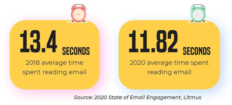
Subscribers are hardly reading your emails nowadays. They’re just skimming and scanning through it. Interestingly, the average time spent on an email has gone down by 12% from 2018.
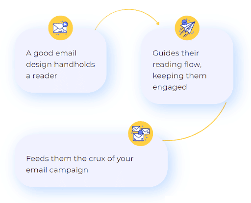
As an implication, you must design the emails in such a way that they promptly convey purpose and intrigue the reader to stay engaged.
A well-designed email crafted with best practices in mind can serve multiple purposes.
Email best practices are broadly divided into two parts: Email inbox and template layout.
To start with, let’s understand email inbox best practices.
How should your email look in the inbox?
Check this out:
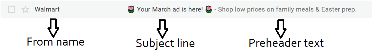
It clearly conveys who the email is from and what it’s about. The from name, subject line, and the preheader text are drafted in a way that would make the subscriber open the email.
Here’s a handy 6-point checklist that can help you do the same:
- Your from name must be identifiable and familiar.
- Use an email address from your own domain rather than a free webmail address or ‘noreply’ email ID. In the meantime, make sure to use a domain scanner to find out and resolve any issues.
- The subject line must be short, personalized, and intriguing enough to drive a higher open rate.
- Length of the subject line must be up to 65 characters.
- Preheader text must elaborate the subject line and set the right expectations of what the email is all about, while providing a compelling hook.
- Keep the preheader text between 30 to 55 characters.
With these broad strokes in mind, your emails are sure to get more than a cursory glance. If you can gain your subscriber’s trust with your from, subject, and preheader, you’ve cleared the toughest hurdle — avoiding the “delete” or “spam” buttons.
Then, it’s up to your email template — design, copy, CTA — to do the all-important job of converting the subscriber.
Email Design Best Practices
If you want your emails to bring in a better engagement rate, greater ROI, and lower unsubscribe rate, it’s crucial to follow these email design best practices:
1. Abide by the rules of visual hierarchy
Focus on the user experience while organizing your email layout. Place the images and text such that the reader can easily navigate through the email. Include plenty of white space and keep it free of any clutter or distractions.
The ideal template dimensions would look something like this:
- Template width: 600 to 800 px
- Template height: Up to 3500 px
- Headline height: Up to 300 px
It’s a good idea to cover all the essential information within the top 350 px.
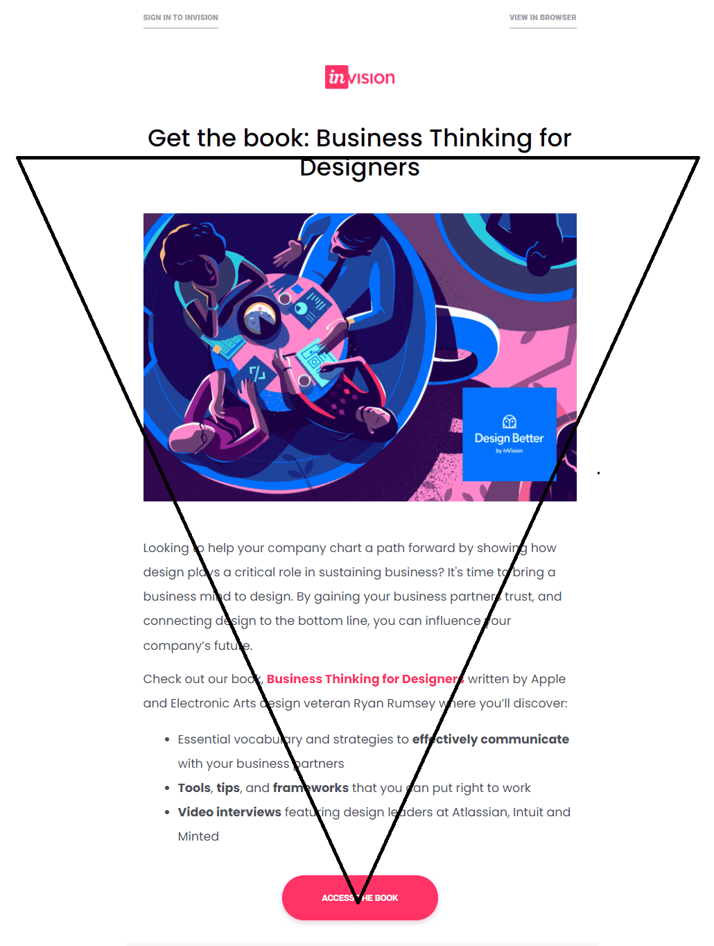
An inverted pyramid design structure works best when it comes to emails. Try to create a simple email with grid-based layers.
For instance, Invision app sets the perfect example of using visual hierarchy in their emails.
If you want to send out an email with lengthy copy, use bullet points or numbered lists to break the content into readable chunks. Also, rather than using fancy fonts, stick to web-safe fonts like Arial, Times New Roman, and Verdana.
2. Design accessible emails
Did you know: 2.2 billion people in the world suffer from some form of vision impairment?
Therefore, it’s imperative to adhere to email accessibility best practices and impart an inclusive experience to all readers. Here are some tips that would come handy to design accessible emails:
- Assemble the content from left to right and top to bottom to maintain a logical reading order.
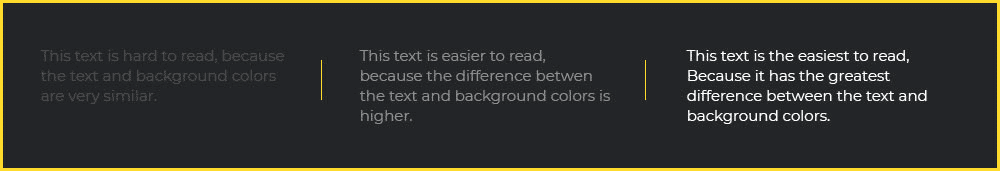
- Use proper color contrast, keeping in mind the color blind people who might be checking your email. See what I mean?
- Avoid center-aligned copy so that people with dyslexia can easily read your emails.
- Lang attribute is a must, as it will let the screen readers know about the language used in the emails (so translation and dictation software can dictate the correct language).
- Alt-text is a must for all the visual elements as subscribers using screen readers will hear the alt-text, so put thought into it to really describe the image at hand.
- Utilize semantic tags so that screen readers can clearly understand the reading flow of the email.
- Avoid using flashy images or animations. The flashing rate of GIFs should not be between 2 to 55 Hz, otherwise it can affect those with photosensitive epilepsy.
- Keep the CTA button size at least 44×44 px with the size of the CTA copy at 16 px or more. It must be easily clickable or tappable with the thumb.
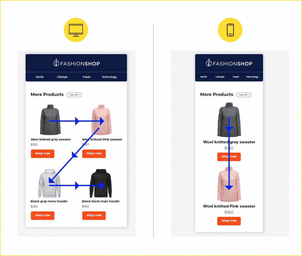
3. Create mobile-responsive emails
Do you wake up and check the emails on your mobile phone? We all do it and so do many of your subscribers. To cater to all these users, you must design mobile responsive emails.
Take a look at these responsive email best practices:
- Single column layout is the safest bet.
- The title font size must be 22 px or more.
- Keep the copy line width up to 6 words of 12-14 px font size.
- Line spacing must be 1.5 times the font size.
It’s advisable to keep the email as short as possible so that mobile users do not have to keep scrolling to read till the end.
See how a well-designed responsive email will render across desktop and mobile devices.
4. Use visuals carefully
Of course, you cannot avoid the usage of imagery as visual marketing is getting more and more popular — and it’s undeniably effective. Rich media elements like GIFs and videos or interactive features such as menu or accordion come in handy when you have a lot of information to showcase in the limited space.
However, you must follow certain guidelines while using visual elements in emails.
- The size of the visuals should not add to the email loading speed.
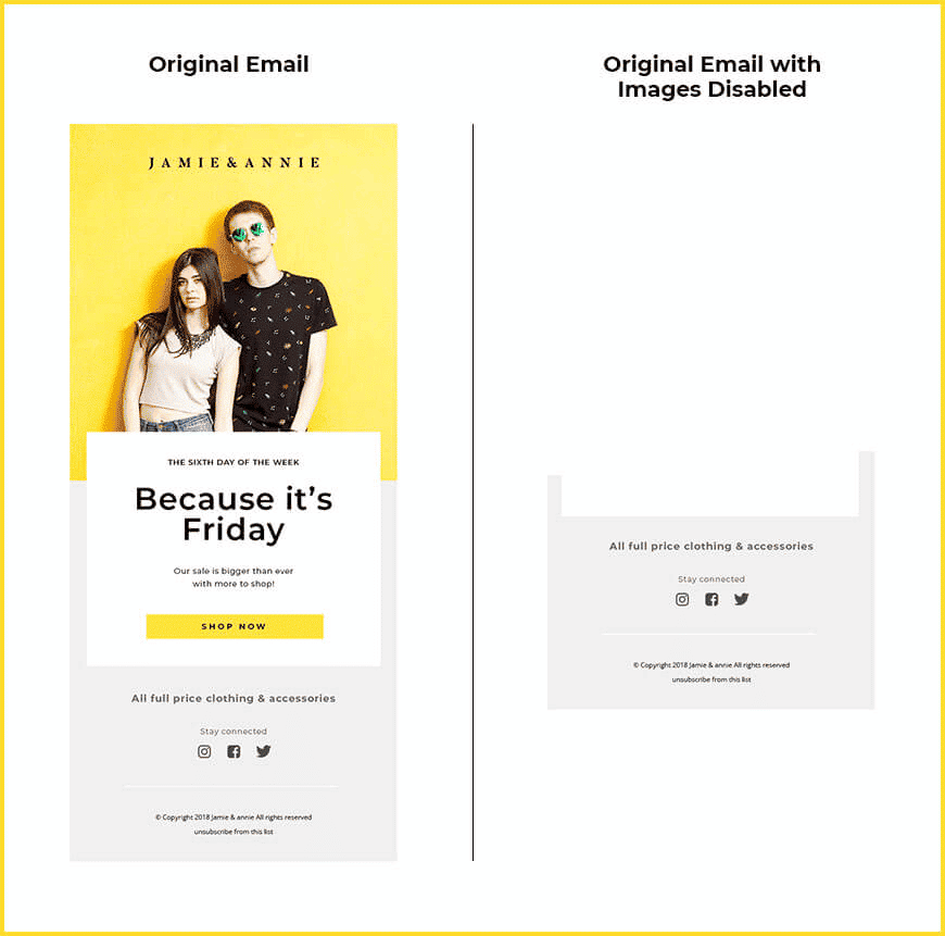
- If you do not use alt-text with the images, it would make no sense for subscribers who have their images turned off by default (as shown in the screenshot below).
- Text to image ratio should be 80:20 so that it does not trigger any spam filters.
- Avoid adding too many images that would make the email look cluttered.
- While using interactive elements, give a proper fallback experience (static imagery or a link) for email clients that do not support them.
5. Strive to deliver an omnichannel marketing experience
Collecting relevant data is of utmost importance when it comes to effective email marketing and design. You can use tools like Mouseflow to uncover the user’s behavior and draft your communications accordingly.
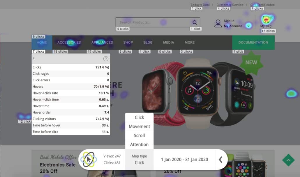
For example: Heatmaps from Mouseflow will allow you to understand how your audience is interacting with your content and what resonates the most with them. Accordingly, you can optimize your email communications as well as landing pages. You can even use this data to send more interesting and personalized offers to the users. Consequently, it will help you render a consistent experience across all the marketing channels and measure the effectiveness of a user’s journey from email to website and through your site’s pages, all the way to the ultimate point of conversion. Learn how to track your email campaigns with Mouseflow.
By following these simple email design best practices, you will surely be able to make your emails more impactful and delight your subscribers. Besides, it will also help you achieve that ROI target your boss has set for you.