Imagine pouring hours into crafting the perfect webpage, only to discover visitors barely notice your most important content. That’s where an attention heatmap comes in.
Unlike other analytics tools an attention heatmap reveals which areas of your page truly capture your audience’s focus. It measures how long different sections stay visible in users’ viewports, helping you optimize readability, content placement, and ultimately, conversions.
Attention heatmaps are part of a broader set of website heatmaps used to analyze user behavior and on-page engagement. If you want a complete overview of how these tools work together, explore our guide to website heatmaps.
What Is an Attention Heatmap?
Attention heatmaps are just one of 7 types of website heatmaps also counting, click, scroll, movement, interactive, friction and geo heatmpas. Each type provides a unique perspective of analyzing user behavior, but attention heatmaps stand out by showing how long users actually focus on specific content.
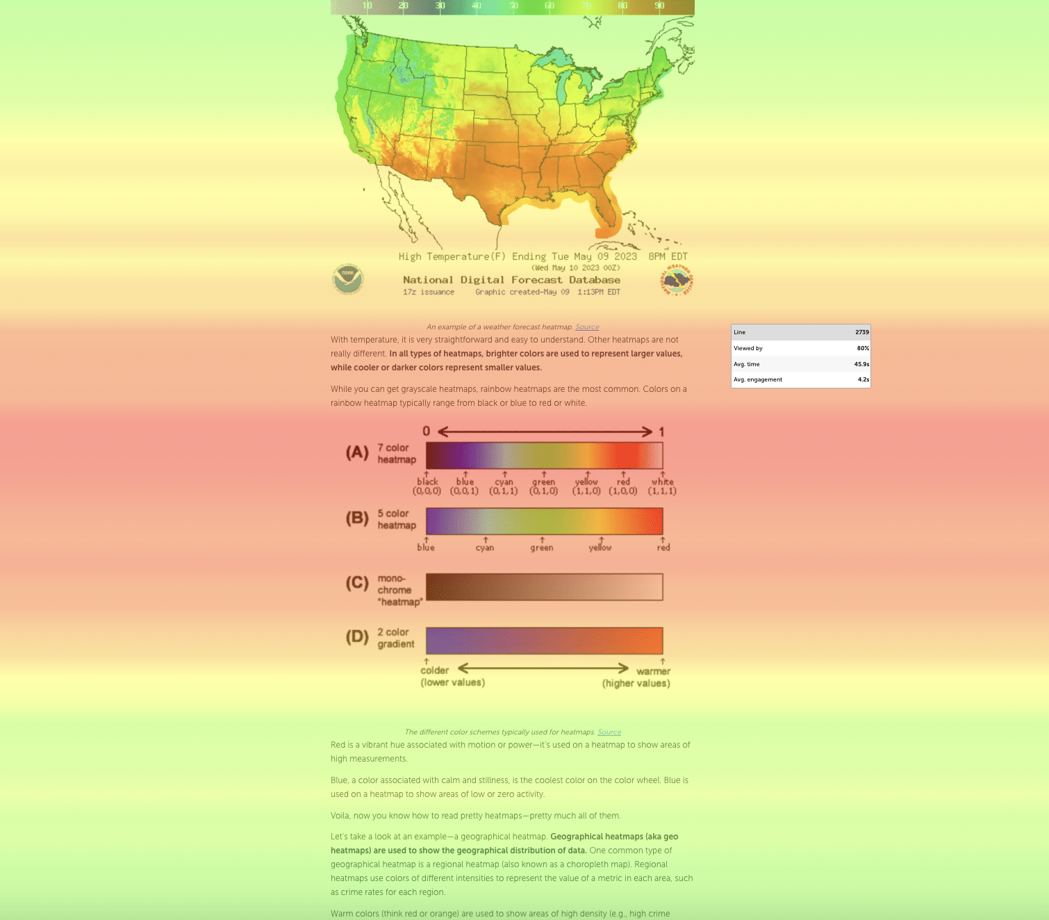
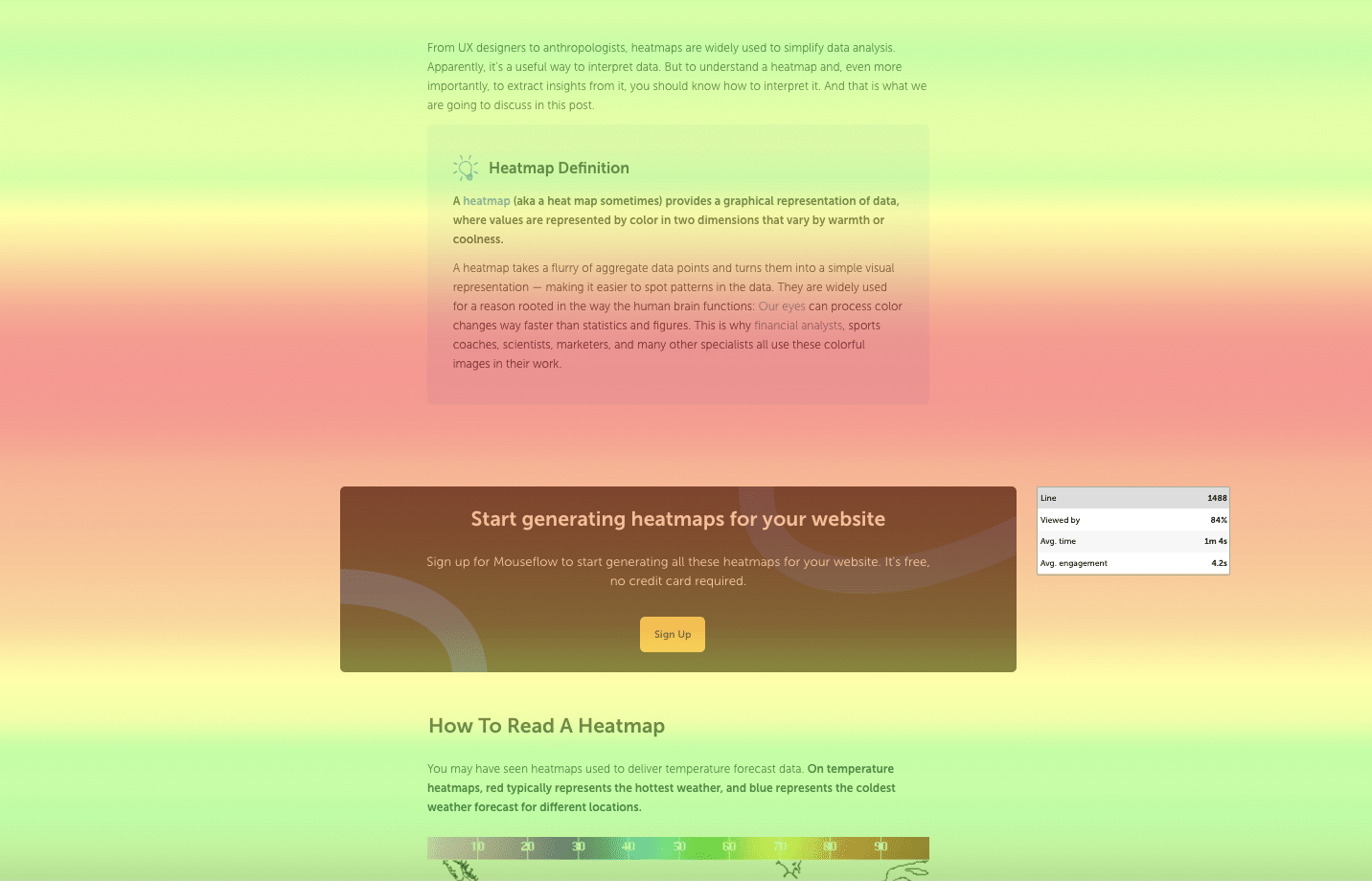
An attention heatmap shows which areas of a web page capture the most user focus. It visualizes how long different page sections remain visible in users’ browsers. The longer an area stays in view, the more attention it receives, represented by warmer colors like red and orange.
By hovering over different parts of the overlay, Mouseflow’s attention heatmaps reveal valuable insights, such as:
Line
Pinpoints the exact location on the interface down to a single pixel—helpful for precise layout decisions.
Viewed by
Shows the percentage of all visitors who viewed that specific part of the page—a crucial metric for ensuring important sections don’t go unnoticed.
Average time
Reveals how long users spend viewing each section, helping you spot areas that either engage or lose attention.
Average engagement
Measures the time users spend actively interacting with a page area, including clicks, scrolling, or mouse movement.
Unlike scroll heatmaps, which only measure how far down the page users scroll, attention heatmaps reveal time spent on each part of your content, helping you spot areas users might be ignoring.
An example of attention heatmap from our own blog post about interpreting heatmaps. It clearly shows that images are something that make people pay attention.
How Does an Attention Heatmap Work?
There’s no magic behind attention heatmaps – they’re simply a visual representation of how long visitors focus on different parts of a web page.
Here’s how a Mouseflow attention heatmap works:
Viewport Tracking
Mouseflow tracks which parts of your page appear in each visitor’s browser viewport as they scroll.
Time Measurement
It measures how long those visible sections stay on-screen. The longer an area remains visible, the more attention it’s considered to have.
Aggregated Data
Mouseflow aggregates these time-on-screen measurements across all visitors to build a heatmap showing hot (high attention) and cold (low attention) zones.
Color Overlay
The resulting heatmap uses color gradients to show focus:
Red/orange → high attention
Yellow/green → moderate attention
Blue → low or no attention
All this data comes from Mouseflow’s lightweight session recording script. No eye-tracking hardware required!
Why Use Attention Heatmaps?
Long-form content should engage your audience and drive action, but the truth is most users simply skim. Studies show only 10-20% of readers actually reach the bottom of blog posts.
Why does this happen? Many content pieces suffer from:
- Long sentences
- Poor formatting
- More content than the reader wants
Addressing these issues requires genuine insights into user behavior. However, traditional analytics tools like Google Analytics only show metrics like scroll depth or time on page. They don’t reveal why users stop reading or which sections capture attention.
They help you:
See which sections attract attention
Know exactly which parts of your content users focus on so you can emphasize key messages.
Spot areas users ignore
Identify “dead zones” where users lose interest, allowing you to adjust content or layout.
Optimize CTA placement
Place call-to-action buttons in high-attention zones to boost conversions.
Tailor content for different devices
Hot zones differ across mobile, tablet, and desktop, helping you adapt layouts for every screen.
Refine word count
If readers consistently drop off after 700 words, why write 2,500? Attention heatmaps let you adjust content length to match real behavior.
Instead of relying on guesswork or time-consuming qualitative research, attention heatmaps provide a fast, visual snapshot of how users interact with your pages—helping you create content that’s both engaging and effective.
5 Tips to Improve Readability of Your Long-form Content with Mouseflow Attention Heatmaps
1. Prioritize Positioning of Attention-Grabbing Content
Have you ever made assumptions about where readers look first? With attention heatmaps, you no longer have to guess.
These tools help you discover the sweet spots where key messages will be viewed by most visitors. Writers can place critical paragraphs or sentences in these hot zones to ensure they’re seen. Too often, important information is buried in conclusions. Attention heatmaps highlight where to position prime content—usually near the top—to maximize impact.
Ever used Minto’s Pyramid Principle to optimize your content? Attention heatmaps take this tried-and-tested tool to the next level. No more guessing where the “main takeaway” goes.
2. Optimize CTA Placement
Writers and editors are under pressure to deliver ROI. But the focus is often solely on “quality,” not whether readers actually see calls-to-action (CTAs).
Attention heatmaps help you strategically place CTAs where users focus most.
For example, after examining an attention heatmap for one of our blog posts, we moved a CTA banner to a high-engagement area, achieving a better click-through rate.
Having looked at an attention heatmap for one of our posts on Mouseflow blog, we moved the CTA banner to an area with high visitor engagement to achieve a better click-through rate (CTR)
Better still? Gaining these high-impact insights takes minutes and can be leveraged immediately.
These insights aren’t just for writers. Product managers and designers also use attention heatmaps to place UI buttons and calls-to-action across digital products.
3. Optimize Title and Heading Placement
Most readers skim rather than read. Titles and headings are critical signposts for skimmers to find valuable content quickly.
Attention heatmaps show you exactly where readers look first, helping you place titles and headings in hot zones for maximum impact.
Don’t limit yourself to heatmaps alone. Once you identify high- or low-attention areas, watch individual session recordings to see precisely how readers consume your content. Mouseflow offers both heatmaps and session replays for a complete picture.
4. Tailor Content According to Device
Yes, mobile users absolutely read long-form content, but layout and design must be adapted. There’s plenty of great long-form content online that’s not optimized for mobile or desktop because content creators simply lack the data.
So how can content be tailored for different breakpoints to improve readability? Enter Attention heatmaps which provide insights into user behavior on different devices.
Hot zones differ massively across mobile, tablet, and desktop. Insights from attention heatmaps help decide where to place images, videos, or CTAs. They also emphasize the importance of white space, clean design, and image resizing for mobile readability.
5. Optimize Word Count
Long-form content can drive organic traffic, but not everyone wants to read 2,500 words. Attention heatmaps show exactly where readers start losing interest.
Indeed, in this “attention economy”, it’s great to offer readers the opportunity for deep learning, and really hone in on a subject. But what if readers simply don’t want to read that much? How much do they actually read, in reality?
Attention heatmaps allow us to quickly and closely examine user’s attention, and optimize the length of our blog posts accordingly. If readers drop off after 700 words, why keep writing? Use attention heatmaps to trim excessive content or create a TL;DR section for busy readers.
These insights inform future content briefs, ensuring engagement and readability while maximizing commercial impact.
Final thoughts
In just a matter of minutes, attention heatmaps offer a laser-focused snapshot of text, images and video.
By examining the color overlay of interfaces on different devices, you gain a quick, granular snapshot of each reader’s preferences. These fascinating metrics offer key insights that can unlock the potential of previously posted long-form content, as well as new material, allowing you to optimize CTA and title placements, adjust word count, and optimize your content for different types of devices.
Optimizing your content based on this easy-to-interpret quantitative data, helps you make 100% data-driven decisions which are almost guaranteed to increase conversions.