The reason why 75.6% of online shopping carts are abandoned is because of a poor checkout experience.
Sixty percent leave due to unforeseen costs like high shipping fees. And over a third don’t convert because there isn’t a guest checkout option.
This guide examines how to increase checkout conversions and create a better checkout process for eCommerce stores.
We break down how the checkout process works. Then we look at conversion rates and why shoppers abandon their carts. We then offer 6 tips to help improve the checkout experience.
Read on to see the main issues that cause cart abandonment and how to improve conversions.
The Checkout Process
The checkout process turns a shopper that is browsing into a buyer. It follows a visitor as they add an item to the cart to the point of completing an order.
It’s part of the conversion rate or sales funnels.
These terms describe the customer’s journey from finding your website to completing a designated action. For an online store, this would include adding items to a cart then making a payment to complete the order.
Most e-Commerce sites traditionally divide the conversion rate funnel into five phases:
- Add to cart
- View Cart
- Account Registration
- Shipping and Billing details
- Confirmation Page
Adding items to the cart normally takes place on a product page (which we don’t consider as a part of the funnel here, but which you also can optimize to improve conversions) or perhaps from a category or search results page.
The view cart page displays the list of products added, including basic information like name, price, and a thumbnail image. Each item shows the quantity to be ordered and a subtotal is given at the bottom. Customers should be able to easily edit their cart before proceeding to checkout.
The ‘Checkout’ button should be clearly shown to invite shoppers to move towards the next step
Traditionally, the checkout process is started by asking existing customers to log in to their account to save time, or inviting new customers to register for an account. They then enter their shipping information and the total price updates after calculating total delivery cost and applicable taxes.
Billing details are then entered and the customer reviews everything before committing. With some of the modern digital wallets, the payment selection is the first step and shipping details are automatically populated.
Customers then receive a ‘thank you’ message which confirms that the order was processed successfully.
What Are Conversion Rates?
Not every visitor’s shopping cart converts into a completed order.
The conversion rate is the percentage of customers that complete the checkout against the total number of visitors.
For example, if a store attracts 10,000 users and 200 complete the checkout, that’s a rate of 2%. How does that compare against the industry’s average?
Average Conversion Rates
Conversion rates vary depending on industry type but in 2024 the overall average is 3.4%.
Gifts and clothing have a higher conversion rate of 4.9%. In comparison, DIY and tools convert to only 1.7%.
Conversion rates and cart abandonment are also impacted by device types like mobile vs desktop. Factors like traffic sources have an input too. Referrals convert best just behind paid and organic search results.
Typical Issues Causing Cart Abandonment
What are the possible reasons for a lower than average checkout conversion rate?
Some typical issues include:
- Customers just browsing
- Unexpected shipping fees
- Confusing checkout process
- Discount codes not working
- Poor choice of payment options
Some visitors use the “add to cart” action more like a wish list. They want a running total but don’t want to commit to a sale. They may also want to make sure the items are available and the actual price once the item is in the cart.
Promotional or discount codes are an excellent way to increase sales. However, in some cases, they can actually be a deterrent. If customers see a promo box but their Google searches don’t provide a code that works they may leave in frustration.
Confusion Equals Abandonment
General confusion like what button to press next or where to add a delivery address can influence the process. If shoppers can’t understand the checkout process, they give up on your eCommerce store and go elsewhere.
There are many other reasons why shoppers leave that are unique to each site. That’s where conversion rate analysis software like Mouseflow can help.
The software identifies exactly what happens when a visitor is on your website so it’s easy to spot when and where the process fails. Catching these issues and dealing with them is the most efficient way to lower your cart abandonment rate.
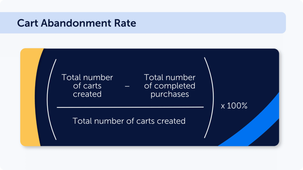
Cart abandonment rate calculation formula
6 Tips to Improve Checkout Conversions
We’ve outlined some of the issues behind customers abandoning their carts, but how can they be retained?
Here are 6 actionable tips to help increase checkout conversions.
1. Offering Guest Checkout
At least 28% of customers don’t finish checking-out because they need to create an account.
Few people want the hassle of creating a username and password. That’s why offering a guest checkout option can help.
As a guest, they don’t have the annoyance of adding extra information or having to login. They’re first time shoppers on the site and don’t fully trust it yet either. If the checkout goes smoothly, they then can choose to become a fully registered member.
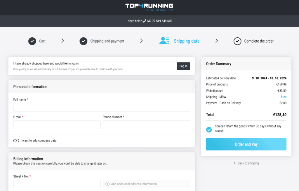
Example: Running gear shop Top4Running offers guest checkout by default with a clearly visible option to log in at the top
Guest checkout conversion rates are higher than registered checkouts. The option is also easy to implement.
Modern shopping cart software like 3dCart.com features a guest option as standard.
2. Alternative Payment Options
Credit and debit cards have the majority share in the US, UK, and Australia. Boleta is a big payment provider in Brazil. While in China, Alipay is the leading third-party online payment option.
PayPal is still a major payment provider used all around the world. Yet some customers prefer to pay via a digital currency like Bitcoin. While others still like to post a traditional check. Newer solutions offer the ability to “Buy Now, Pay Later” which has been proven to increase conversions.
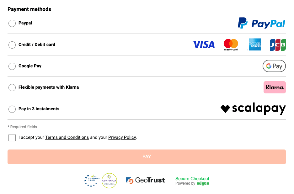
Example: Padel and tennis store SmashInn offers alternative payment options that are relevant to the countries that it ships to, including PayPal and BNPL options
Online stores don’t have to offer all these alternative payments but should research their market. Ignoring how their customers wish to pay will only increase cart abandonment.
3. Single Page Checkout
A drawn-out form with too many mandatory fields can easily lead to abandoning a cart. A better solution is to simplify the process by including only the essential items on one page.
Sites should hide address fields in the billing and shipping sections that aren’t required.
They should integrate panels to separate content into manageable chunks that slide open as needed. And use checkboxes to mark duplicate content so the site can fill in those details automatically.
Online eCommerce stores should also integrate our form analysis tool to monitor shopper engagement.
It measures errors, drop-offs, and refills which can help uncover unexpected issues. Fixing these problems can have a massive impact on conversions.
4. Display Security Seals
Trust or security seals reinforce the message that online shopping is secure and boost conversions.
Providers like McAfee and VeriSign offer this service and actively test a site against known threats. In return, the site is allowed to display their seal of authentication.
Many stores put these seals on the payment page but why stop there?
Place them in prominent spots like the header or beneath the ‘Add To Cart’ buttons. Customers will subconsciously align security with the website the more they see a verifying seal.
5. Optimize for Mobile Shoppers
While mobile devices have surpassed desktop as the device of choice for internet browsing, shopping on a mobile device can still be a frustrating experience if the website has not been set up with mobile visitors in mind.
Many sites have implemented responsive design, where the content adapts to fit the visitor’s screen and interactive elements become easier to use.
However, many online stores often ignore the most vital pages – cart and payment.
A variety of screen sizes, device types, and operating systems should be used to test these. Also different browsers like Chrome, Safari, Opera, and Firefox.
Sites should not require pinch and zoom to view the content. And buttons need to be easy to click with a thumb or finger.
6. Display Clear Order Amounts
Hiding order totals or not making clear what the amount to be charged is, will decrease conversion rates.
Customers want to always be informed. That’s especially true for shipping charges and taxes.
Site owners should reexamine the layout of their cart and compare it to successful competitors. They should use recorded live data to fully investigate what works and what doesn’t.
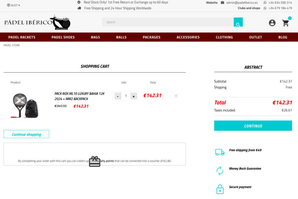
Example: Padel Iberico online store displays clear costs at the checkout, with taxes and shipping
A video that details the causes behind dropping out of a sale can quickly lead to a fix and better results.
Implementing changes based on these 6 tips should help improve your conversion rate. However, checkout improvement is just a part of the overall eCommerce optimization process, so you should not forget about product page optimization, SEO, and other parts.
Rely on Mouseflow to Help Increase Checkout Conversions
In this article, we’ve looked at how to increase checkout conversions through a better checkout flow.
Offering a guest checkout option and a single page experience can help convert sales. But how can you be sure what’s preventing your customers from making that final payment?
Mouseflow helps to reveal why your visitors aren’t converting into paying customers.
Using Mouseflow, you can replay their shopping sessions. It’s just like watching a video recording. See exactly how your customers interact with your site and the reasons why they abandon their cart.
Use heatmaps to spot trends and our sales funnel to discover leakages. Be one-hundred percent sure what the problems are before spending money to fix them.
Mouseflow improves your checkout process conversions through visual proof. That’s something you can rely on.
