
Heatmaps are 2D data visualizations that use color to represent values in a matrix. A website heatmap shows you how visitors interact with your website and – just as importantly – how they don’t interact.
Heatmaps are one of the most widely used website behavior analytics tool. In this blog post, we discuss what are the advantages and disadvantages of using heatmaps in comparison with traditional quantitative web analytics.
1. Heatmaps give an instant overview of key web performance parameters
While other kinds of analytics have their strengths, heatmaps draw instant attention to major issues on your website. You don’t need to look at a heatmap for a long time to see issues and get insights.
We’ve written about the different types of website heatmaps before.
- Click heatmaps reveal the clicking patterns of your users.
- Scroll heatmaps expose the average visibility of your pages.
- Attention heatmaps show which parts of your site are most engaging to users.
- Movement heatmaps track mouse movements.
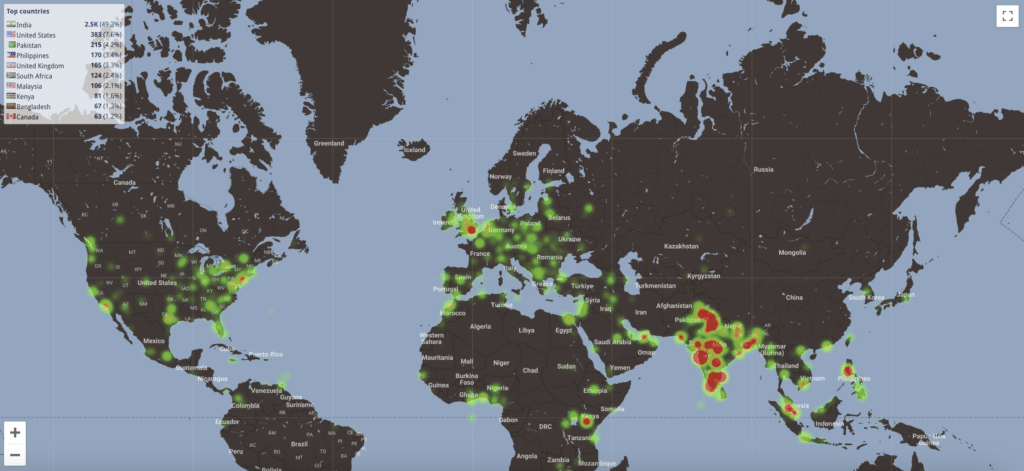
- Geo heatmaps reveal user locations in an anonymized fashion.
- Interactive heatmaps reveal how users interact with dynamic page states that traditional static heatmaps can’t capture.
- Friction heatmaps highlight where users experience frustration, such as repeated clicks, rapid scrolling, or erratic mouse movements.
Let’s go through a few examples of quickly finding issues using heatmaps. For example, cold spots (areas that don’t get much attention) and folds in the scroll heatmaps quickly identify problem areas. Your main message or key call-to-action (CTA) is below the fold or in the colder area? That means not many people see it and you need to move it to hotter areas, above the fold.
Geo heatmaps instantly reveal the territories or countries where conversions are good and where they are not. Filter your geo heatmap by page visited, using the final destination page url (“checkout successful” or “demo booked”) – and you can quickly see which countries are driving the most conversions for you.
In short, heatmaps tell you at a glance what’s working and what needs to be addressed.
2. Heatmaps provide a visual approach to understanding numeric values
If a picture is worth a thousand words, a single heatmap can be worth a thousand numbers.
Although heatmaps are just as accurate as spreadsheets, inasmuch as they are based on hard data, heatmap graphics offer undeniable advantages to Excel’s rows and columns of numbers. Personally I prefer a picture over a spreadsheet any day!
A spreadsheet may tell you that certain links have a surprisingly low click rate, or that a given page has a drastically higher bounce rate (and lower time spent on page) than the rest of your website. But the spreadsheet numbers won’t explain why. Viewing the same data in a properly configured heatmap, however, might quickly reveal that the problematic click rate is due to a link being buried in other distracting elements, or that a high bounce rate could be explained by a low-visibility page.
Just as importantly, their visual appeal turns heatmaps into invaluable communication tools. They conceptualize patterns and interpret data, making it easier for designers and analytics geeks to talk with commercially-focused clients by showing them clear, understandable results. They also help the designers themselves by letting them experience, through their users’ eyes, what navigating their website feels like.
3. Heatmaps make it easier to learn from users to create smarter web design
In my humble opinion smart, effective design doesn’t happen in a vacuum. Anyone who is good at their craft will tell you they spent long time working at it, but also learning along the way. Learning’s not necessarily easy: it involves questioning your own choices and recognizing areas that need improvement.
In web design, learning from your users is particularly important. Heatmaps help you understand what your audience does (and just as importantly, what they don’t do) as they respond to your design. Surveys and forms have their uses, but we are all prone to some form of bias: What we say we do may not always reflect what we actually do.
The navigational patterns of your users as revealed by heatmaps, on the other hand, can be seen as direct, unfiltered feedback. Combine heatmaps and A/B testing, and your learning becomes predictive without being intrusive: You test future design choices before deploying them to a wider audience – and don’t risk alienating your users.
4. Heatmaps complement other tools in your analytical toolkit
There’s no doubt that heatmaps are unique and provide answers that no other tool can. However, that doesn’t mean they offer all the answers. They should be seen as one more tool in your toolkit—one that works best when combined with others.
That’s why we offer an all-in-one analytics solution: because nothing beats what happens when the wisdom of the crowd meets the wisdom of longitudinal data. Compliment your heatmap suite with session replay, and you’ll be able to see your users’ activity play out like a movie—one you can rewind at will and learn from. Filters allow you to zero-in on specific users: for example, returning visitors who browse on their tablet. User feedback will tell you in no uncertain terms how your users feel about your website, and the issues they encountered along the way. Form, trend, and link analytics will allow you to crunch the numbers you need.
5. Even when heatmaps are “confusing” or dispersed, they point to interesting issues and shouldn’t be dismissed
Heatmaps can sometimes feel like they’re not offering the answers you seek or add layers of complication to what you believed was a simple problem. You may be staring at multi-colored splotches, dispersed clicks, or cold spots above links that lead to pages with a high view count.
I can find this confusing from time to time but this is a good thing. UX design can be complex and, let’s face it, so are people. When heatmaps surprise you, they become an opportunity to dig into a site’s content or tricky design issues. This is also why we’ve stressed the importance of using them with other tools.
6. Heatmaps help you understand your visitors better and ultimately give them a better experience
Design, at its root, is a visual communicative act, and the various elements of a website relay a series of messages. Whether the goal is to sell a product, a service, or an idea, your users matter because they are part of the conversation. That means you have a vested interest in knowing how they react to your message and understanding whether you need to find a different way to formulate it.
This sometimes implies understanding what irritates or distracts users, which is why friction scores on heatmaps can be so helpful. Such tools automatically track data points and heuristics to give you an idea of where and when users experience frustration, what interests them, and what doesn’t.
Of course, sometimes the message may be just fine—but not for a specific group. Heatmap filters reveal how different audiences react to the same message. Listening to specific audiences lets you offer them a better experience.
7. Heatmaps help companies make informed choices that improve the bottom line
By helping managers make better web design choices that boost engagement and the conversions that lead to sales, heatmaps enable decisions that drive business results.
Ultimately, heatmaps are all about improving the bottom line. The widespread use of heatmap web diagnostic tools demonstrates that customers appreciate their ROI.
Conclusion
Heatmaps are one of the fastest ways to understand what’s happening on your website. Instead of relying on assumptions or digging through reports, you can instantly see where users engage, where they hesitate, and where they’re running into problems.
Of course, heatmaps are only part of the picture. Pair them with session replay, funnels, and user feedback, and you’ll not only see what users are doing, but also understand why they’re doing it. That’s how you turn insights into meaningful improvements and ultimately, better user experiences and higher conversions.