Get the Derek Rose story sent directly to your inbox
Derek Rose is a luxury nightwear and loungewear brand that started back in 1926 as a family business – and still continues to be family-owned. With a global eCommerce store and four brick-and-mortar stores in London, Derek Rose offers its customers the highest quality sleepwear, leisurewear, and resortwear, designed to make you feel as good as you look.
Derek Rose values quality above everything and strives to make their customers’ experience truly delightful. With this in mind, it comes as no surprise that they’ve been a Mouseflow customer for a while now, relying on Mouseflow’s behavior analytics tools to provide insights into users’ behavior on their website and help optimize their experience.
The Challenge: Getting Back to The Best Year’s Numbers
During the Covid-19 pandemic, when almost everybody was stuck at home, Derek Rose saw a great increase in sales in their Shopify online store. People wanted to feel comfortable and fashionable at home, and Derek Rose’s apparel was perfectly fulfilling their desires.
However, after the lockdown, when social restrictions were lifted across the world, sales started slowing down. Derek Rose saw a decline in month-over-month sales compared to the previous year, despite the fact that the website traffic was up thanks to their digital marketing efforts.
So, for Ellen Bentley, who joined Derek Rose as the Senior Trading Manager, the first point of focus was to review conversions. She had to figure out where exactly the decline was coming from and what actions could be proposed to improve the customer experience across the brand’s website.
The Solution: Finding The Leaks In The Funnel
Using Mouseflow’s data, they realized that most drop-offs occurred somewhere in the middle of the funnel, while the top (traffic acquisition) and the bottom (checkout) were performing as expected. Also, in some countries visitors were for some reason reloading the same page multiple times – a weird behavior that required further investigation.
Mouseflow session recording tool allowed them to watch sessions of the customers that were experiencing friction events. As a result, they discovered patterns and recurring issues that could have impacted the conversion rate.
Among the session recordings marked as “unhappy” or ”very unhappy” in Mouseflow, 23% included click rages. This number was lower on desktop and much higher (51%) on mobile – which prompted the team to investigate in more detail what was happening there.

Mouseflow helped us understand where the frustrations were and by using session recordings also helped explain it to the development team so that they could improve the website user experience and propose actions that would have a positive impact.
Overall, here’s what they’ve found:
- Some pages were slow to load (Mouseflow displays render time for each session and for each heatmap, i.e. for each page).
- There were some UX issues such as a location selection popup reappearing after the users closed it, with the users trying to interact with the contents of the page behind it – to no avail.
- The same popup didn’t disappear quickly enough, and in some locales it just refused to close.
- The popup attracted a lot of rage clicks from the users seemingly trying to close it and failing.
- Reloading the page multiple times seemed to happen mostly on mobile, and the reсordings showed that it’s connected with users having troubles with the navigation mega menu.
After the initial analysis of potential problems, Ellen and the team designed some solutions for them:
-
- Some technical improvements were made to speed up loading the pages.
- The popup was redesigned to have a larger cross to close it, which also got a word “Close” right next to it. The users were given the option to close the popup just by clicking outside it as well, and pressing the “escape” button resulted in the same behavior. If the popup was present on the screen, the rest of the content was blocked to prevent users from attempting to interact with it. The team also modified the CTA wordings on the popup, because recordings indicated that some users seemed not to understand its purpose.

New pop-up example
|

Old pop-up example
|
- The popup disappearance time was reduced, and the issues with it sticking around were fixed.
- The navigation menu underwent a slight redesign to be more consistent with the elements on the rest of the website.
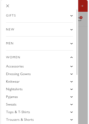 New navigation layout on mobile
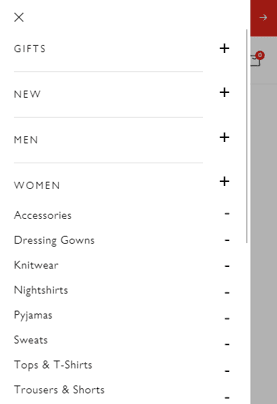 Old navigation layout on mobile
The Result: Small Changes Are Enough for a Huge Conversion Rate Increase
The audit was conducted in May, and all the changes were in place by October. After comparing data for these months, the team saw drastic changes.
Sessions with click rage decreased from 23% to 7%, and on mobile they went from 51% to just 15%, which meant that the user experience on mobile had improved dramatically.
Click error count on desktop went down by 8 percentage points.
Bounce rate decreased from 58% to 51%.
And most importantly, the conversion rate increased from 0.97% in May to 1.33% in October – a staggering 37% improvement! And it kept increasing since then.
These were the results of just one conversion rate optimization sprint, and Derek Rose aims to run them continuously, relying on Mouseflow data to help pinpoint where UX improvements could have a huge impact on conversions.

The data that we got from Mouseflow shaped our actions to give us positive results – and we’re very pleased with the outcomes.
Company: Derek Rose
Tools utilized: Mouseflow, Google Analytics, Shopify
Features used in Mouseflow: Using Session Recordings Report to review data by country, device, pages visited, session replay, friction score, and friction events.
