So your website has a low conversion rate – lower than you’d like, anyway. Maybe you’ve benchmarked it and found it doesn’t stack up, or maybe you’ve watched it decline over time. Maybe you have a new marketing or sales director who swears they had a much better CVR at their last gig — and trust them or not, the bug’s been placed in the right ears and now you’re on a conversion crusade.
Conversion Rate Optimization (CRO) to the rescue! Right? Just run some quick A/B tests, get some wins, and drive up that conversion rate. Right?
… right?!
If you’re Salesforce or Sephora, absolutely.
But if you have low website traffic, not so fast. A/B testing on a low traffic site can do more harm than good.
Fortunately, there’s more to CRO than A/B testing. There’s a wide variety of tactics you can employ – you just have to match the tactic to your site’s capacity (and your team’s strengths).
Put them together correctly and you’ll have a CRO strategy that brings more conversions from your existing website traffic, and scales as your business grows.
How low is “low” website traffic?
Time for an important distinction. Your ability to do A/B testing actually hinges on how many conversions you get, not visitors.
Mind blown?

OK, maybe not “mind blown” but it is a tricky, yet crucial distinction to make and it often gets overlooked in conversation.
As a rule of thumb, any site with fewer than 500 conversions per month should proceed with great caution when thinking about experimentation. So when you’re asking about low website traffic CRO, what you’re (probably) really looking for is low-conversion CRO, but then that sounds sort of redundant, doesn’t it?
In this context, “conversion” refers to an action that makes you money, or is closely tied to making you money. Think purchases for ecommerce, leads for a sales driven organization, signups or upgrades for self-serve SaaS.
You can optimize your site for banner clicks, or pageviews – maybe you do get more than 500 of those a month. But it’s possible, even likely, that this optimization won’t lead to an increase in revenue. Don’t bother.
What’s so special about 500 conversions a month?
It’s not a magic number. The basic dynamic at play here is the more conversions you get, the more sensitive your experiments are, and the faster they run.
As an example, if you get 100 conversions per month, and you run a test for 4 weeks with just one variation (a traditional A/B test), there are three possible outcomes:
- Your variation’s conversion rate is more than 50% higher than the current experience
- Your variation’s conversion rate is less than 50% lower than the current experience
- Your test is inconclusive
This means if your variation really is better, and raises the conversion rate by 10%, 20%, even 40%, you won’t have enough data to detect this fact with certainty.
The requirement to design an experience with a conversion rate that’s 150% of your current rate puts a lot of pressure on you. Unless your current site is just terrible, it’s unlikely you’ll get a win this big with your first try.
The numbers change when you have more monthly conversions, though. If you get 500 conversions per month, your variation only has to be about 23% better. Extend the test from 4 to 6 weeks and the target is 18%. That’s much more achievable.
But if you’re trying to get conclusive results with the 100-conversion test, you’d need to run the experiment for 10 weeks or longer. And that’s just not going to work.
What’s so bad about an inconclusive test?
An inconclusive result doesn’t break your site or ruin your business. But it represents an awful lot of wasted effort.
You designed, implemented, launched, and monitored the experiment. That called on UX, development, and analytics resources. You waited 4 weeks or more for results. And at the end, you’re left making a decision based on your instinct – something you could have done in the first place.
A/B testing is all about reducing uncertainty, and an A/B test that fails to provide an obvious conclusion is a failure – it’s much worse than a test with a losing experience.
It leaves the possibility that you’ll choose to put the new experience into production anyway, because “it seemed to do well.” When in reality, its true conversion rate is lower than the original, you just didn’t have the quantity or time available to realize that scenario.
On the other side, it’s possible that you’ll scrap the new experience, when in fact it does convert better – again, you just didn’t have enough data to find out.
Why not just go with CRO best practices?
If you can’t test, should you just use UX benchmarks to optimize pages with low website traffic? Yes and no.
Some guidelines are worth following, no matter what. You wouldn’t test these changes, even if you had the option. For example:
- Every page should have a single purpose and clear call to action (CTA)
- CTAs should contrast with the rest of the page
- Your site should be mobile friendly
Once you get beyond the basics, though, things get murky. There are two issues with making “best practices” your entire optimization strategy.
Minor UX tweaks are unlikely to lead to significant improvements in your conversion rate
By all means, vertically center the text in your buttons. Give menu dropdown items a distinct hover state on desktop, and make them big enough to tap with confidence on mobile.
All these fixes help, but none of them are going to transform your business.
What works for some sites might not work for others
The closest we can come to an iron-clad law of website conversion might well be “Fewer form fields means more form completions.” But even this isn’t always true.
A generic conversion strategy isn’t going to work for your site – unless your customers are generic. And of course they’re not!
CRO when you have low website traffic: What can you do then?
The good news (finally!) is that you have a ton of options outside of A/B testing and implementing best practices. Here’s a rundown of your best bets.
1. Use polls

At its core, CRO is all about uncovering reasons visitors hesitate, get confused, or abandon your site. If you already knew all those reasons, you’d already be addressing them. Obviously you need a way to uncover the “unknown unknowns” that stop visitors from converting.
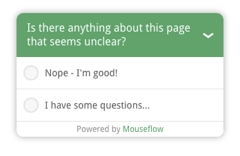
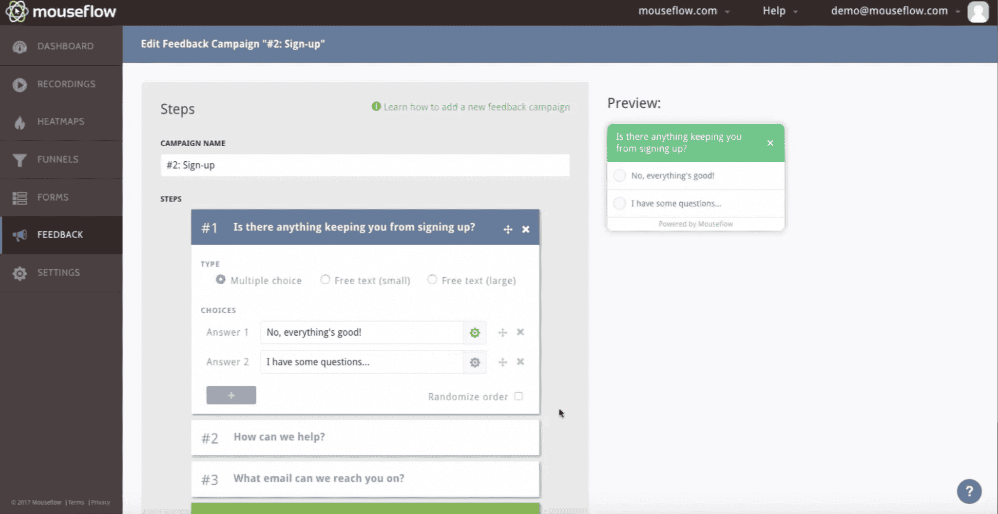
Polls are perfect for this. A single, well-timed, open-ended question will let your visitors teach you what you never could have figured out on your own.
Here are two I recommend:
- The post-conversion poll: ask visitors who just converted a simple question: “If anything caused you to hesitate before purchasing (or signing up, or reaching out), what was it?”
- The high-exit-rate-page poll: after 20 seconds or so on the page, ask visitors “What’s missing from this page?”
Collect answers for a month or so, then review them with your team. Are you addressing the causes of hesitation as clearly as you could be? Can you add the “missing” information to the high exit page?
The best thing about polls is that they’re so quick to set up. You can launch a new Mouseflow Feedback Campaign in minutes, and start collecting insights right away.

And this tactic isn’t just a low website traffic CRO secret. It’s actually in use by even the highest-trafficked websites! Take for instance a global automotive brand. When they launch a product recall, they use Mouseflow’s feedback feature to collect questions from visitors to its recall landing pages. These responses are then answered preemptively the next time the brand has to run a recall campaign.
But how is that optimizing for conversion? It’s reducing the brand’s call center volume (a cost center) and instead getting users to book their service appointment more promptly, without hesitation. That’s a win for consumer safety and brand reputation.
2. Conduct user testing
This is another way to learn what visitors are thinking, and uncover insights you couldn’t have generated internally, especially when you don’t have thousands of site visitors per month. And it’s really not too heavy of a lift to get a user testing program off the ground.
Screen your testers to ensure that they have enough context to understand the problem you solve. (They don’t have to be your ideal customer, but they need to be able to work a browser!)
Give them a script (task list) that requires them to use your site to solve a common problem – for example, check for a specific feature, find pricing, and reach out.
Then watch the playback to see how actual humans – who, unlike you, don’t think about your company all day – navigate your site and find information.
If they get lost, have unresolved questions, or take wrong turns, can you update the site to make things easier?
3. Use session recordings and heatmaps
Watching session recordings is similar to playing back user testing sessions, with two crucial differences:
- The goal of the session and the visitor’s internal thought process are obscure
- There’s a ton of them – likely thousands of hours per month
To overcome these challenges, be laser focused.

A good place to start is to watch only sessions where visitors converted. In these cases, it’s safe to assume that their goal was to convert. And we already know you don’t have hundreds of these sessions to view.
Treat these recordings just like the user testing sessions – watch for visitors getting lost, backtracking, lingering over sections for longer than you’d expect, skipping over sections you think of as important.
Segmenting session recordings by converters is one route. Auditing recordings for high-friction sessions is another. Mouseflow’s session recording feature automatically assigns a happiness value to the user, so you can easily surface those who had a troublesome experience.
Then, you can do the same for website heatmaps. Segment by converters and by high-friction users. Use the color-coded data visualization to identify elements on the page that need attention. And that’s only the beginning… Check out our in-depth guide on heatmapping.
Better yet, if you have session recordings and heat maps active on your web analytics, you have a constant, passive stream of user tests always in motion.
4. Interview your customers (or potential customers)
Talking to humans is one of the most powerful research methods available. It doesn’t scale, and that’s fine – 5 conversations will likely lead you to months’ worth of website improvements, whether that’s a high or low website traffic situation.
The key here is to get them talking about the problem they solve with your product or service. Pay close attention to the language they use and the emotions they express. (You can find scripts for these conversations in The Mom Test or Lean Customer Development.)
Now go back to your website – does it use the same language? Does it acknowledge the relevant emotions, and promise relief?
5. Talk to sales
If you’re a sales-driven organization, a friend on the sales team is one of the most valuable assets you can have. Buy them lunch and pick their brain.
What questions does every lead seem to ask? (Could you answer those better on the website?)
How does the sales team think about customer segments? (Do you address these distinct visitor types on the site?)
What content does sales most frequently share during the sales process? (Is there something you should add to the site, or make more prominent?)
When and why does a prospect evolve from self-serve to needing some hand-holding via the sales team?
Think back to the automotive recall example — is there anything the sales teams communicate often on calls or demos that can be instead addressed on the website?
6. Optimize your forms
Earlier we saw that reducing form fields usually increases conversions. But not always. So how do you know if it’s safe to remove a field?
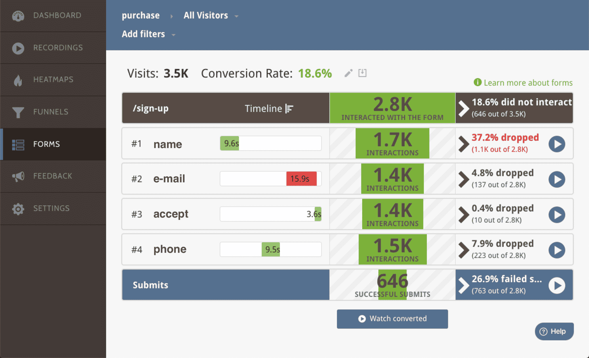
A good way to decide is to look at whether the field is an actual source of friction for visitors. Does it lead to errors in submissions? Is it commonly left blank? Do visitors abandon the form when they reach it? Have they told you specifically, “I’m not comfortable sharing that information?”

Using Mouseflow’s Form Analytics feature, you can identify which forms on your site have the lowest conversion rate, and which fields are causing problems for visitors – whether because they take too long, or because visitors frequently have to change their input.
If visitors to your site even make it to your form, that’s huge. The challenge with low-traffic CRO, then, is getting the absolute most juice from the squeeze — when you only have a couple oranges to begin with.
7. Pay for traffic (in order to run tests)
If you don’t have the conversions you need for testing, but you have the budget, you might be able to buy enough traffic to run experiments.
(Or put another way, if you’re already paying for traffic, you absolutely should be experimenting on it.)
This might look like paid search ads, paid social media ads, or more niche acquisition channels like newsletter placement or even radio spots.
If you go this route, be sure your experiment begins at the ad level. Don’t just buy a bunch of clicks and dump them onto a test page – test one combination of ad copy and landing page against another.
This ensures that your experiences are different enough to yield a conclusive result. It also requires more creative resources and coordination between your acquisition and website teams, so make sure to get the most out of it – beyond measuring conversions, you’ll want to tag these visitors so you can segment heat map and session recording data by experiment variation.
So many CRO options for low website traffic, where to start?
Even if testing is off the table for now, you’ve got choices. If anything, the range of choices is a bit overwhelming. What can you do today to enact a low-traffic CRO plan?
The highest return for the least effort will be setting up polls on your site.
This ensures that in a month, you’ll have some qualitative data that expands your conception of how visitors use the site, what they’re looking for, and where they get stuck. It’s a great first step toward building a scalable CRO strategy. And it’s so easy to do!
If you’ve only got half an hour, go add a quick “What caused you to hesitate?” poll to your Thank You page.
If you can spare another hour, dig into your analytics to find an internal page with a high exit rate – typically a product, solutions, or category page – and add a “What’s missing?” poll.
Set a calendar or SMS reminder for one month out to review responses with your team.
If you do this with Mouseflow, you’ll automatically be gathering form error and abandonment data, too – giving you even more optimization opportunities.
The most important thing is: start now! Gathering data today means optimizing tomorrow, and before you know it you might just cross over into “500 conversions per month” territory sooner than you think. But that’s for another post.


