An essential component of a full-suite web analytics tool, website heatmap turn thousands of data points into a single visualization of on-page user behavior. These information-rich heatmaps tell you where users click, what interests them, why they get frustrated, and more — all with the aim of helping you provide a better user experience.
What is a heatmap?
A website heatmap is a visual representation of aggregate data points. Website heatmap tools utilize a color coding system to indicate increased and decreased levels of activity. In the past decade, website heatmaps have exploded in popularity. Analytics positions, UX analysts, product managers, digital marketers, and many others professions are beginning to utilize website heatmaps on a day to day basis.
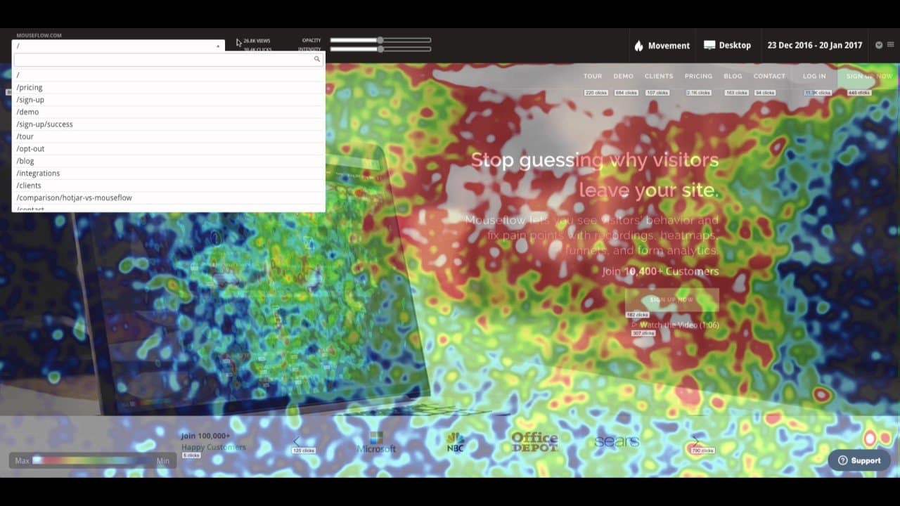
Unlike other raw analytics services (Google Analytics, Adobe Analytics, etc), heatmaps provide a graphical display of aggregate data. Most analytics tools provide basic statistics on what users are doing on your website — which is helpful! But it doesn’t explain why users are doing what they do on your website. That’s where heatmaps come in. And it’s the missing link in marketing analytics. Heatmaps provide a visual glimpse into user behavior — and make it easy to take action on.
What are different types of heatmaps?
As of today, there are five main types of heatmaps. They are the following:
- Click
- Scroll
- Attention
- Movement
- Geographical (or Geo)
Each heatmap records and displays different types of user behavior on your website. Each one is useful to interpret and take action with. We’ll walk you through all five types and explain the benefits of each.
Click Heatmaps
Let’s start with click. A click heatmap is fairly self-explanatory: it reveals where your website visitors click on your website. It’s incredibly valuable in measuring the effectiveness of links throughout your site. Whether it’s a navigation bar, a call to action element (sign-up, purchase, add-to-cart, contact us, etc), a click heatmap will tell you exactly where (and how many) users are clicking on your website.
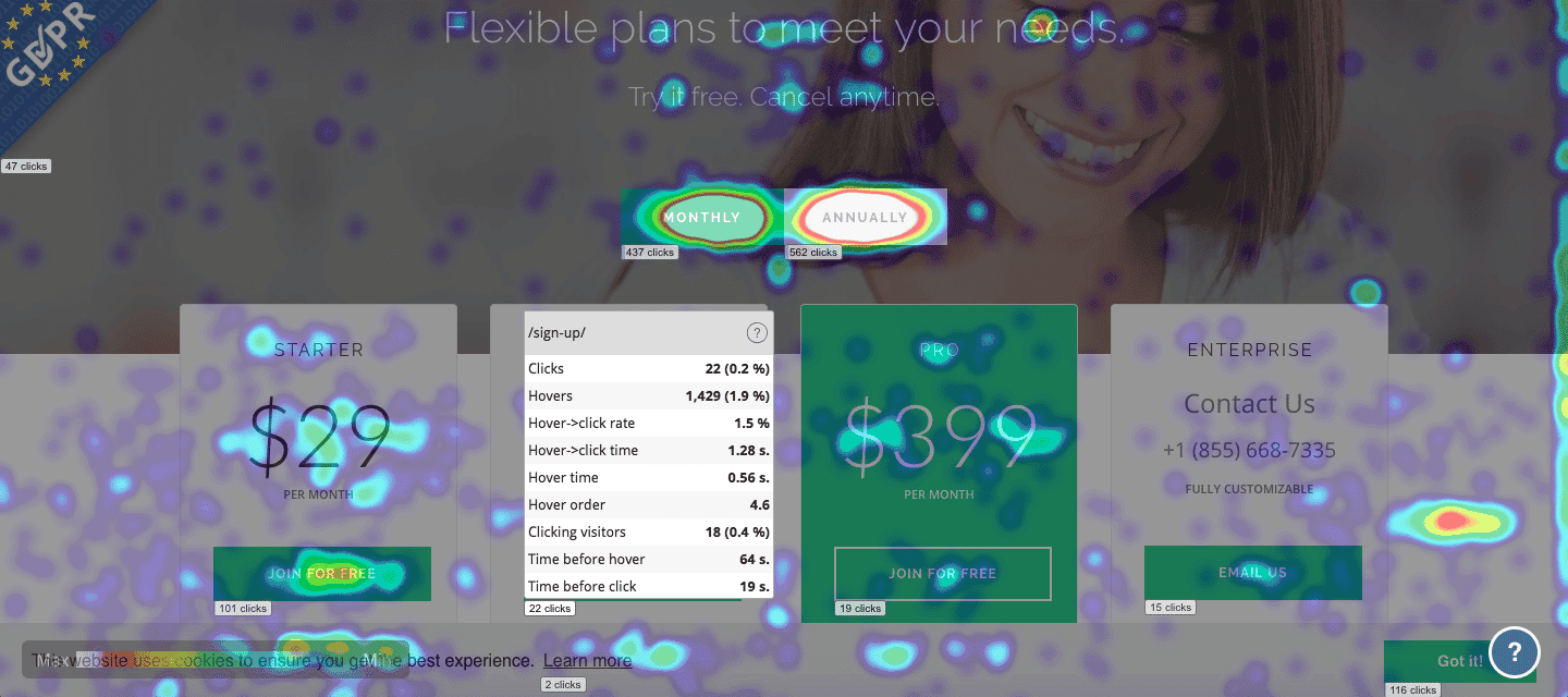
You can expect your home page to receive a lot of clicks, as the most visitors will likely view that page.
However, there are also pages (and areas) where it doesn’t make sense to have clicks. This happens because visitors are confused or have an expectation that something is clickable (for more information) when, in reality, it isn’t. When viewing a click heatmap, I like to ask myself several questions:
- Do important page elements have click activity?
- Are there certain elements, relative to others, that receive more activity? Is there a good reason for this?
- Do form fields receive equal amounts of click activity? Or, are there certain fields where there is a considerable drop off?
Scroll Heatmaps
Scroll heatmaps indicate how much of the page is visible to your visitors. Each fold in a scroll heatmap will reveal the average visibility and time spent on that part of the page. Let’s face it: you don’t know how visitors will browse on your website. But, a scroll heatmap shows you, in aggregate, whether people are able to see/interact with content as you expect. For example, a call to action button is almost always best suited in the top fold of your page. But websites are not always designed this way.
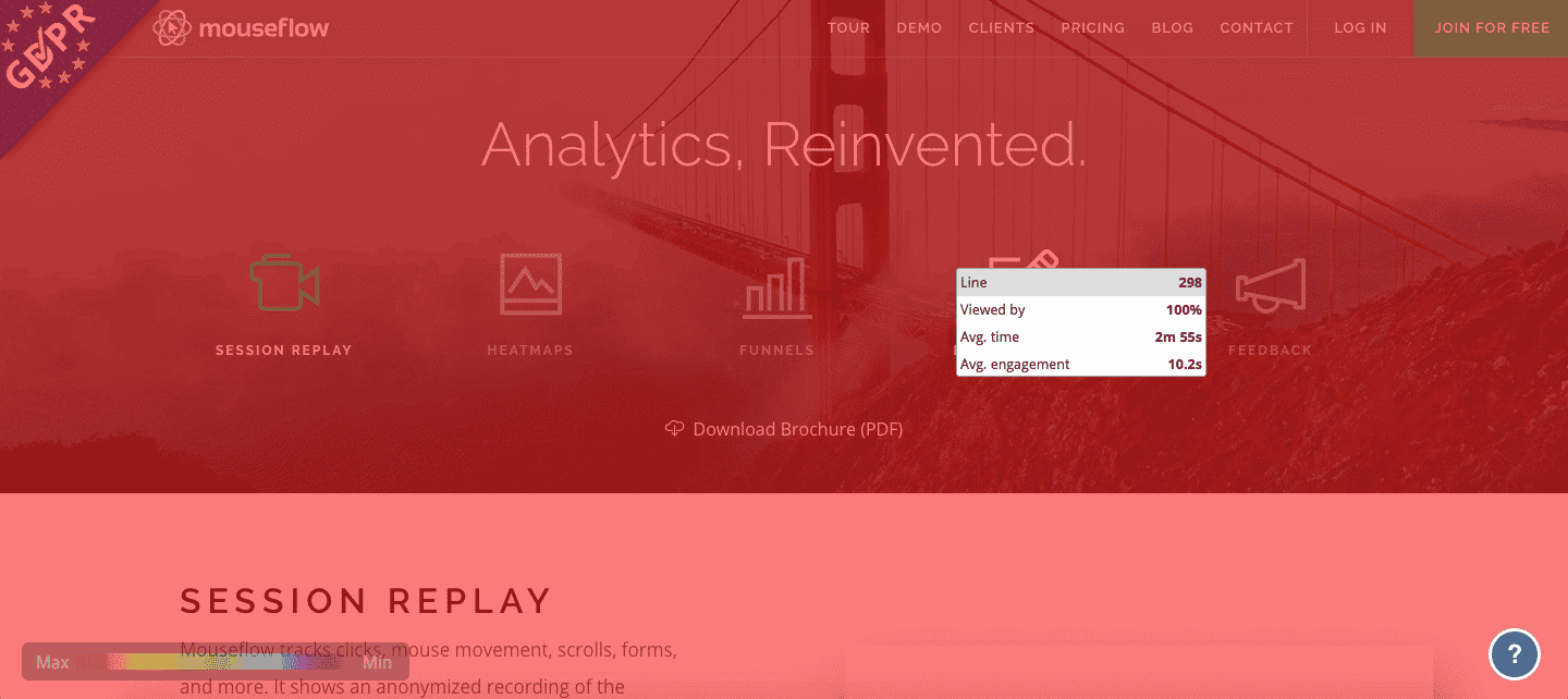
Here’s two questions I like to ask when viewing a scroll heatmap:
- Is key content (that supports the goal of each page) visible above the fold line?
- Is there sufficient time spent either viewing or interacting with parts of each page that are important?
Attention Heatmaps
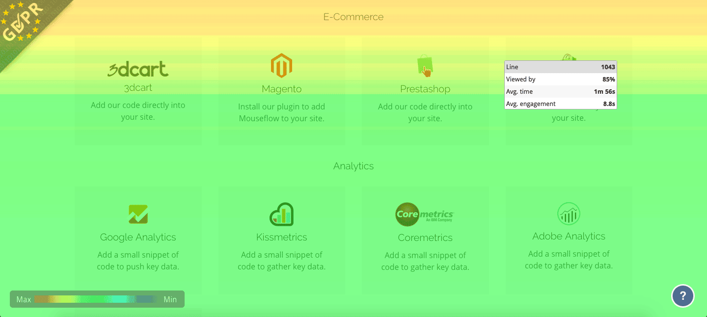
Attention heatmaps show you how much time users are spending on your pages. It shows what parts of the page are most and least actively engaged by utilizing a colored overlay. By watching the color change, you can interpret how the activity changes on the page. The hotter the activity, the hotter the color. The cooler the color gets, the less activity.
Peep Laja, the founder of ConversionXL (a renowned digital marketing academy), had this to say about attention heatmaps:
“What makes this useful is that it takes account different screen sizes and resolutions, and shows which part of the page has been viewed the most within the user’s browser. Understanding attention can help you assess the effectiveness of the page design, especially above the fold area.”
When you hover over a part on the attention heatmap, you’ll see several different statistics. You’ll see a view percentage, average time spent (on this specific part of the page), and average engagement level (clicking, scrolling, movement, and similar activity) on that part of the page.
This is extremely valuable because you can interpret what parts of your page are the most attractive to your users. When you analyze your website, notice if important elements are in areas that are cooler: indicating they’re not getting as much attention. Several questions I like to ask myself when viewing an attention heatmap:
- Do my most critical content areas receive the most attention?
- Which areas of the page are receiving the most or least attention? Is this by design?
- Should I consider moving any elements to areas where visitors focus their attention the most?
Want to try heatmaps on your website? Mouseflow, an official website heatmap provider, has sponsored this article to give readers free credits to test heatmaps on their website (there is no credit card required). Simply click this link to sign up for a free trial account and extra credits will be automatically applied.
Movement Heatmaps
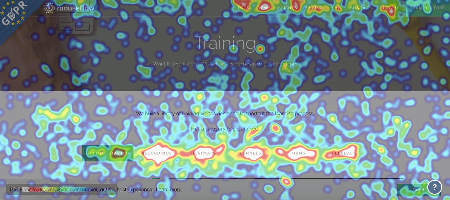
Movement heatmaps focus exclusively on where visitors move their mouse on the page. This heatmap is helpful because it tells you which parts of your page receive mouse attention.
In practice, the optimal page layout is dependent on your visitors, the type of website, and how they interact with it. I like to tell clients that you should have one conversion goal (or action goal) for each page of your site Then, in each movement heatmap, make sure that content which supports that goal is located in the “hot” areas. This will improve usability and boost conversions.
Here’s two questions I like to ask myself when viewing a movement heatmap include:
- Do the warmest areas support my overall page goal?
- Are there hotter areas over content that isn’t well explained in the content? If so, visitors might be interested in learning more and you might want to consider some modifications.
Geographical Heatmaps
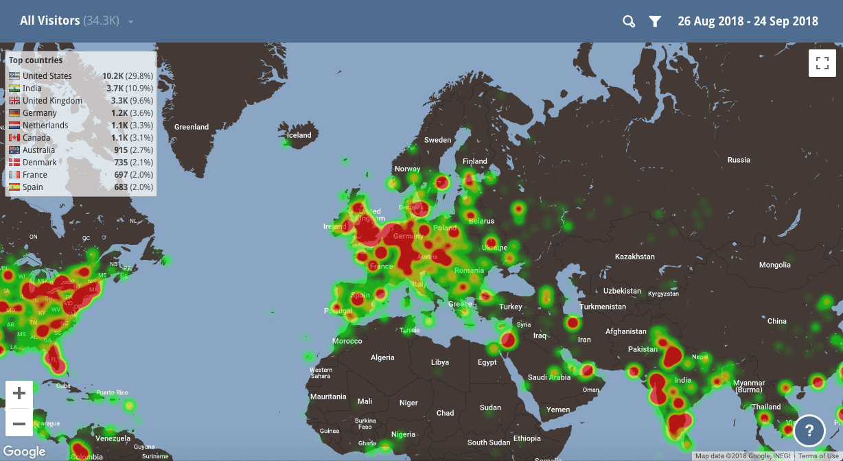
The final heatmap is called a geographical heatmap, or “geo”, for short. A geo heatmap reveals the general location (anonymized to a level that can’t be individually traced to a specific user) of a visitor to your website. This heatmap is helpful in optimizing your marketing campaigns — it allows you to identify which regions, cities, and areas contain your most prospects. Geographical heatmaps can be used to visualize all sorts of data, even beyond the web, and are a favorite of global analysts.
You can then filter the geo heatmap to identify further details about your customers — and launching targeted campaigns to those prospects.
Let’s take an example: say you’re an ecommerce site. You can filter the heatmap for all users who exited your /checkout-stage-3 page. This filter reveals the general locations (anonymized not to pinpoint specific locations) of all visitors who are interested in your product, but dropped out late in your checkout stage. You could then launch targeted Facebook and Twitter (or other) campaigns to reignite product interest in those prospects’ regions.
Parting Thoughts: How can heatmaps benefit me?
Heatmaps are a valuable tool in analyzing user behavior in aggregate across specific pages of your website. They help you determine where your visitors are clicking, which areas of the page are most (or least) interesting and engaging, whether users are confused or struggling, if visitors are simply not seeing the most critical parts of your page, and much more.
Whether you’re going through a website redesign, trying to boost your conversions (sign-ups, purchases, subscriptions, etc), or making small adjustments to elements throughout your website — heatmaps are an absolutely necessary tool to understand visitor behavior on your website. If you’re looking for additional guidance on how to use heatmaps for conversion optimization, watch this interesting video:
Heatmaps are mostly commonly used in combination with session replay, which provides individuals recordings of visitors on your website. Heatmaps provide the aggregate display of data, while recordings/session replay are helpful in pinpointing specific examples of user frustration across your website.
