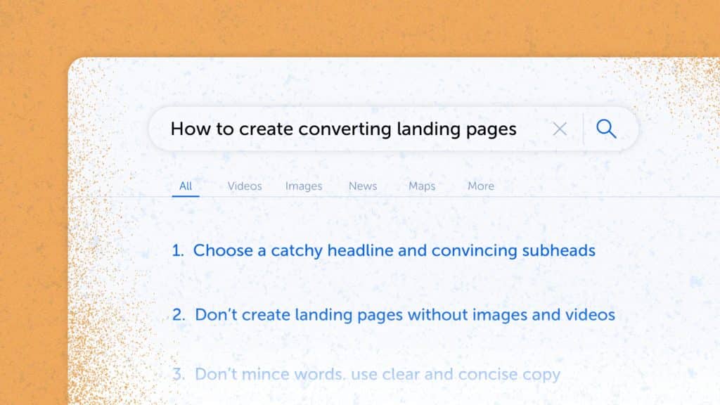
- 1. Choose a catchy headline and convincing subheads
- 2. Don’t create landing pages without images and videos
- 3. Don’t mince words, use clear and concise copy
- 4. Present a single call to action (CTA)
- 5. Ensure landing page load time is less than 3 seconds
- 6. Use social proof
- 7. Optimize forms
- Bonus Track. Track user interaction with landing pages using technology
- Recap
A well-designed landing page is a finely-tuned recipe to generate qualified leads. But, it only comes out right when you include appropriate visuals, dish out compelling content, and serve it to the right target audience.
An average conversion rate (CR) for a landing page is 5.89%, according to Hubspot. A good landing page has a CR of about 10%. Feel the difference? Almost twice as much leads without spending a single penny on additional traffic!
No wonder expert marketers understand a landing page’s relevance and pay attention to conversion rate optimization.
Do you want to turn your landing pages into conversion engines? Well, then the tips listed below are for you.
How to create high converting landing pages
1. Choose a catchy headline and convincing subheads
“First impression is the last impression,” might be a cliché, but is worth remembering and applying when crafting a headline for your landing page. Since it’s the starting theme, it must be short, clear, and catchy. Keep two important things in mind while creating the headline:
- The attention span of your audiences is on a consistent decline.
- If your snippet headline is longer than 580px, Google will chop it off on the search result pages.
It’s also worth mentioning that if the catchy and attractive headline of your landing page blends well with an image that illustrates the product or service, the copy of the landing page need not be lengthy and tedious, which makes the entire landing page quite effective.
The sub-headline is the next component you’ll need to make an effective landing page. If the headline draws the reader’s attention, the sub-headline should entice them to stay. These two pieces of your landing page work in confluence like a team of two players.
Persuasiveness is what must define and guide a sub-headline of the landing page. Placed directly underneath the headline, it can go further deep into explaining the anticipation created by the headline. Take a look at the following example from MailChimp:
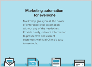
A no-nonsense headline by MailChimp: Source: The Daily Egg
Takeaway: Neatly distribute your landing page content using impactful headings and subheadings.
Checklist:
- The title and the subheadline sum up your unique value proposition.
- The title is concise.
- The title and the subheadline resonate with the landing page’s target audience.
- The title either sells a benefit or solves a problem for the target audience.
2. Don’t create landing pages without images and videos
Visuals on a landing page strike the emotional chords amongst the audience if done in the right way. They have the ability to make your visitors feel joyful, informed, motivated, or reassured—all of this playing a significant role to boost your conversions.
Visuals can be incorporated in the landing pages in the form of images, videos, and even GIFs. To produce quality images, consider using BeFunky or any other photo editor.
Images have the dual benefits of capturing attention and amplifying your message especially if you know how to use the different colors effectively. Also, images are easy to use and fast to load. For better user experience, low page load time is indispensable. Also, images are easily available, easy to edit, and cost-effective.
The advantages of videos for marketers and conversion rate optimizers are self-evident. They assist you in better demonstrating your merchandise. They also assist you in employing more effective storytelling approaches, such as animation, in order to tell your story. Moreover, visitors spend less time trying to understand your content if you use videos. As a result, your offer will be better understood.
There are, however, two major catches in using videos in landing pages. First, users with slow network speeds, particularly mobile users, will be excluded. And second, users unable to use headphones or speakers will also be excluded.
It’s, therefore, best to provide a video alternative or show the video only if the user wants it by pressing a button. You will not lose any visitors as a result of this. And did you know, landing pages with visuals tend to improve conversion rates by 80%? So, use them wisely.
Take a look at the following example from Slack. It educates its users with the help of visuals in an engaging manner.

Through images, Slack educates its potential users: Source: Not Boring
Takeaway: Visuals have the twin purpose of not only drawing attention to your message but also in amplifying it.
Checklist:
- Images match your brand colors.
- Images are easy to digest.
- Images are of the right size and optimized for the web.
- Videos do not start playing automatically with sound on.
- Videos do not display third-party ads.
3. Don’t mince words, use clear and concise copy
Businesses can offer their unique value proposition quite effectively if their content on the landing page is clear, concise, and to-the-point. Clarity in words represents clarity of thought that sets the expectations on the minds of your audience regarding what they can hope to achieve in absolutely clear terms.
Some people believe in writing creative copies for the landing pages as well, just like they do it in blog posts. Creativity is, no doubt, a virtue. It should, however, be limited to blog posts and other similar forms of content.
Because your prospects have clicked through from a PPC ad, a SERP result, or an email, it’s safe to assume that most visitors who reach your landing page are already interested in what you have to say. If you don’t get to the point right away, chances are that most of them wouldn’t stay engaged.
Every sentence and word on your landing page, therefore, should have a specific function, which should be to promote your call to action. Words and sentences that do not serve this purpose must be cut off.
Takeaway: Your landing page should make your offering clear. It should highlight your value proposition right from the get-go.
Checklist:
- The page clearly describes the benefits of your product or solution.
- The page copy is clearly aligned with the visitor’s intent and the buyer’s journey stage.
- The copy is clean and concise.
- The message of the copy matches the headline and the ad that drove traffic to the page.
4. Present a single call to action (CTA)
Another cliché worth remembering is “All’s well that ends well.” And you must practically apply it while creating your call-to-action (CTA) of the landing page, since it’s one of the most crucial aspects of any landing page. A call-to-action is a short phrase that directs visitors to execute a particular action on a landing page. Your CTA is the site of conversion, with a single, focused, action-oriented button, while the body copy displays your unique value proposition.
Everything on your website, from the headline and body copy to the graphics and overall style, should complement your call to action. Your CTA should be clear about how to convert and what users can expect by converting, even if it’s only a few words or a phrase.
Avoid using generic CTAs like “Submit” that don’t instruct the consumers what to do next. Instead, use something like “Start Your Free Trial”, “Book an Appointment”, or the one that Netflix uses to sharpen the viewers’ focus.

A singular impactful CTA by Netflix sharpens the viewer’s focus. Source: Attention Insight
Takeaway: CTAs tell your prospect the action you want them to take once they are on your landing page.
Checklist:
- There is only one CTA on a landing page.
- This CTA is used multiple times across the landing page.
- The CTA button is clearly visible both on desktop and on mobile devices.
- The CTA button is clickable.
- The CTA text doesn’t contain unnecessary words and gives a clear idea of the outcome.
- The tracking on the CTA works correctly.
You can find a good CTA example below 😉
5. Ensure landing page load time is less than 3 seconds
If a user navigates to a page on your website and has to wait more than a few seconds for it to load, they are likely to abandon the page, potentially costing you a conversion.
The longer it takes for a website to load, the higher the bounce rate. A high bounce rate indicates to search engines that users do not find the material on the page useful, and the page’s ranking will suffer as a result. Think about the e-commerce businesses who will lose clients if their checkout pages are even a fraction of a second slower than their competitors’.
You can improve the page load time by using appropriate tools to determine website/webpage speed. It’s also important to know what your users expect based on which you’ll make the tweaks in your website. Finally, try optimizing everything right from the images, to the code and database.
Takeaway: Your landing page loses credibility if it takes too long to load.
Checklist:
- The landing page loads in under 3 seconds on both desktop and mobile devices.
- You checked the page with PageSpeed Insights.
7. Optimize forms
More often than not, landing pages are there to generate leads, and that usually means using a form. And website visitors often drop off while filling out forms – for a whole lot of different reasons.
A form can be too long. Users don’t want to spend much time filling them out.
A form can ask for sensitive information. For example, people are very reluctant to share their phone numbers. If they see that they are required to do so, they may as well abandon the form. So, in leadgen forms, it’s better to avoid asking for this information.
A form can be confusing. Which fields are mandatory? Does the email field accept only work emails or all emails? What does this “Error!” message that popped up on a submission attempt mean?
Clearly marking mandatory fields and adding comments under fields that may provoke confusion helps improve the form completion rate a lot. And that’s, after all, your landing page’s end goal, right?
Using a form analysis tool can speed up the process of optimizing forms significantly, as it will show which fields cause visitors to drop off or spend too much time on.
Checklist:
- The form includes only absolutely necessary fields.
- Each field has a clear label and comments where necessary.
- The form has a clear title and describes the outcome of filling it.
- Required fields are marked as required.
- A clear error message appears under the specific field that caused the error.
Bonus Track. Track user interaction with landing pages using technology
A landing page’s main objective is to convert visitors. And conversion tracking requires tracking the user interaction first that allows you to assess how well your landing pages are performing.
Marketers, analysts, UX specialists, product specialists, conversion optimization specialists, and anyone interested in monitoring and enhancing online user experiences can use website heatmaps. It displays user data as heat signatures, such as clicks, scrolling, and motions. High activity is represented by “hot” spots, whereas low or no activity is represented by “cool” spots.
This information is provided by website heatmap technologies, which allow teams to clearly identify areas of potential or struggle in their customers’ or users’ journeys. By displaying how actual visitors interact with your website, website heatmap software can lead to optimizations that increase the key landing page performance metrics, conversion rate, lead quality, order value, and more. Making adjustments to content, message, design, and other aspects of a website leads to improved user experiences and business ROI.
Mouseflow’s Heatmap tool tracks user clicks, scrolls, and more. Source: Mouseflow
Takeaway: Tracking and monitoring your landing page’s usage is key to improving it. One way of doing that is by studying the most attractive elements within your landing pages through heatmaps.
Recap
A well-designed landing page is a formula for generating quality leads and significant conversions. To make it practically work, consider choosing a compelling headline and a convincing sub-heading, include quality visuals in your landing page, and don’t mince your words. Use clear and concise copy, a single call to action (CTA), and a landing page load time of less than 1 second. Use plenty of social proof, and optimize the forms, if you have any. You can use Mouseflow for that, as well as for tracking user interactions with landing pages to generate valuable insights.

6. Use social proof
People trust people. So, seeing familiar logos, badges, and quotes from happy customers is an absolute must when building a landing page.
When it comes to logos, you can use either logos of your customers or “as featured in” logos from media resources that mention your business. Both give you credibility. Don’t have either? It’s OK to use integration logos if you’re offering a SaaS tool and have those integrations.
Customer quotes also help, especially if a quote describes how your solution solved a problem for your customer, and the website visitors have the same problem. Getting quotes is not too hard: talk to your customers and ask for them. Review sites such as G2 and Capterra, for example, are also a great source of customer quotes.
The very same sites offer badges that you can use as another type of social proof.
But be very cautious if you decide to write fake customer quotes yourself. It’s often very easy to see through it, and instead of building trust, fake quotes often ruin it completely.
Most importantly, don’t stop after using just one quote or a couple of badges. The more social proof you have on the page, the better. There is, of course, such a thing as too much social proof, but not enough is much more widespread.
Checklist: