🎙 On the go? Listen to the article through our podcast, Cave Bits!
Listen to more episodes of Cave Bits
You hover your mouse over a button – and it changes color, which tells you that it’s clickable. You start downloading a file – and see a round progress bar indicating how much of the file has been downloaded so far. There may even be a sound after the download is finished. These are examples of what’s called micro-interactions, and they are so common that we barely pay attention to them.
Yet, they are the cornerstone of UX design – without them, you likely won’t understand that the button is clickable and that the download has even started. If they are designed the wrong way, it may also result in a lot of confusion.
To give a formal definition, a micro-interaction is a trigger-feedback pair, where the trigger is an event initiated either by the user or by the system itself, while the feedback is always given by the system to the user and is usually visual or audible.
Why are micro-interactions so important for UX
One can say that the users’ experience of a website, for example, consists of three main parts: what the website is about or what it actually does, how it’s structured (think user journey), and the micro-interactions. All these parts are equally important. Yes, equally, because broken micro-interactions would likely result in user frustration and make the website difficult to use. Also, a broken or not thought out micro-interaction can result in a lot of confusion and doubt for the user.
Imagine, you’re editing a document. You click the “Save” button – and… nothing happens, at least visually. In fact, your document has been saved, but the system doesn’t give you any indication (in UX design people call that system feedback) of it. No pop-ups, no “saved 2 seconds ago” in some status bar – nothing. That’ll make you worry, won’t it? It also makes the system untrustworthy – you would likely use trust in the website or the tool that you are using, and look for an alternative.
Or, say, you open a document and try to move the scroll bar down to go to the end, but the page doesn’t move. Pretty annoying! And that’s also another broken micro-interaction that does not match what you expect it to do or behave like you thought it would. Not all micro-interactions are there just for the sake of a better UI, some, such as scrolling, are a part of core functionality of the product.
But let’s stop telling grim stories of broken things, and take a look at an example of a better user experience related to micro-interactions. Say, you’ve filled in a form to download some report, and instead of “we’ve sent the report to your email” you get “we’ve emailed you the report, but you can also click this button to access it immediately”. That’s a micro-interaction optimization that tries to remove an unnecessary step of the user having to go to their email to fetch it there. Instead, they get direct access to the report, which in turn makes their experience more delightful. And the vendor who is distributing the report has likely improved their conversion rate with this micro-interaction adjustment, because now users don’t get lost trying to open their email first, and then being distracted by something in their inbox other than the report. That’s a win-win!
And that’s just a few examples of how making sure that the right micro-interactions are in place and optimizing them ensures a good user experience, and through that – higher conversion rates, happier users, and a flourishing business.
Designing and analyzing micro-interactions
To have the right micro-interactions, you need to first design them with the users’ expectations and UX best practices in mind. And then, continuously optimize them based on an understanding of how users are interacting with your website. That means that a lot of analysis should go into how each and every micro-interaction works.
To effectively analyze micro-interactions, it’s important to use a combination of both quantitative and qualitative methods. Quantitative data can provide a broad understanding of user behavior – and give you an idea of what the users are doing. Qualitative data, on the other hand, can provide a more detailed understanding of individual user experiences and give an idea about why the users are behaving the way they are.
The two approaches that can help are user testing and behavior analytics:
User testing
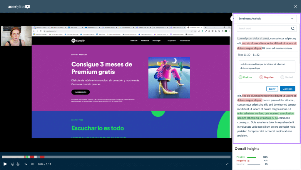
User testing is a qualitative approach that allows you to test micro-interactions with real users to get feedback and users’ thoughts, mood, expectations, etc while interacting with them. User testing tools such as Userlytics are invaluable in the early stages of feature development, as they can get you very detailed feedback on each and every micro-interaction.
If you are not familiar, Userlytics is a full-scale usability and UX research and testing platform that allows researchers to conduct a wide-range of industry leading UX testing methodologies, including moderated, unmoderated, and quantitative testing.

Additionally, Userlytics allows researchers to hone in on their exact audience with its global panel of over 2 million panelists. Using testing platforms, such as Userytics, also gives researchers access to advanced, in-depth testing tools including Ai UX Analysis, Sentiment Analysis, eye tracking, card sorting, tree testing, and several other state of the art tests.
Find more about Userlytics by visiting their website here.

Behavior analytics
Behavior analytics is good for both qualitative and quantitative research. Tools like Mouseflow allow you to record user sessions to watch how they interact with a website, create heatmaps to learn more about usage of specific elements on a page, and detect friction to identify where users struggle the most.
Let’s get into some more details about how these tools can help you create the most effective and intuitive micro-interactions to ensure the best user experience.
Utilizing testing to optimize micro-interactions
Let’s start with user testing. By testing micro-interactions with real users, you can get deep and detailed insights into how users interact with a website. One of the main advantages of user testing is the ability to ask in-depth questions and receive detailed answers, and clarify something if necessary. Through user testing, you can gain insights into users’ thought processes, which can help you understand why certain micro-interactions are working or not. By understanding what the user intends to do while performing a certain action, you can create micro-interactions that precisely meet their expectations.
Micro-interactions are also used to provide users with context – where they are in their journey and what they should be expecting. By reducing cognitive load and giving users this understanding, you ensure that they can make informed decisions about how to proceed.
User testing allows you to ask all the right questions about users’ understanding of where they are and what they think they are supposed to do at this stage, and observe what they are doing. This knowledge is impossible to obtain through any other means, and it allows you to fine-tune the micro-interactions to guide them in the right direction.
Using behavior analytics to improve micro-interactions on your website
Another way to analyze micro-interactions is through relying on behavior analytics. Tools like Mouseflow provide you with user session recordings and heatmaps, so that you can look at how the user interacts with your website. Some, like Mouseflow, also have additional functions such as user feedback surveys, as well as form and funnel analytics.
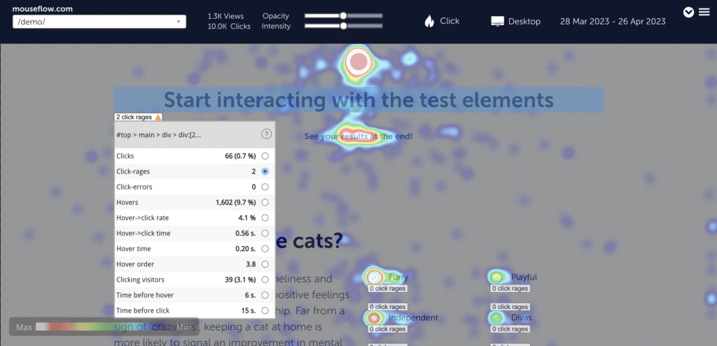
The most obvious way to utilize behavior analytics would be to use heatmaps to identify elements where users have experienced click-rage – clicking multiple times on the same element. Click-rage usually indicates that something is wrong with the element – either users expect it to be clickable, while it’s not, or maybe the feedback triggered by clicking on it doesn’t match their expectations. After identifying elements where click-rage happened, you can watch the session recordings with click-rage on these elements and discover what exactly the users did, and what went wrong for them.

A heatmap of Mouseflow’s demo page highlighting elements with click-rage.
Click-rage is an example of website friction – but there are others, such as click-error (when a JavaScript error is fired upon clicking a button, even though visually everything works fine), or speed-browsing, when the user scrolls the page rapidly, apparently hoping to find something that they didn’t find on the top of the page. Mouseflow indicates six distinct types of friction events, and calculates a friction score for your page or the whole website to give you a benchmark from your industry. Improving micro-interactions helps reduce the website friction and lower the score.
Another way to use behavior analytics is by analyzing funnels and forms to identify where conversions drop. This can help you determine which fields in the form are being filled in less and optimize the form accordingly. A typical example is that users are often reluctant to give out their phone number, and as a result, decide not to complete the form. By removing this field from a form, you can likely significantly increase the amount of successfully filled forms.

An example of form analysis using Mouseflow. It shows which fields took the most time to interact with and which caused the users to abandon filling in the form.
Another good example of using behavior analytics to improve micro-interactions in forms is tweaking form validation errors. If a user’s trying to fill out a form, and something goes wrong, they need to clearly identify where corrections are needed. Otherwise, they’ll abandon the form. Looking at form analytics data and user session recordings can help identify if your error messages – which are also micro-interactions – are clear and actionable enough.
Finally, behavior analytics helps with verifying your hypothesis by looking at changes in behavior and creating a continuous user feedback loop. You spot some place where the users struggle, you change something, and then you track how the behavior has improved in order to determine whether the updated micro-interaction is effective and works as intended. Feedback tools can be used here for design research – you can fire feedback surveys when users interact with certain elements of a new design.
Conclusion
Seamless micro-interactions are extremely important for a great user experience, and the amount of research and thought that should go into designing and optimizing them shouldn’t be underestimated.
By using behavior analytics in conjunction with user testing, you can get invaluable insights about micro-interactions across your website. They allow you to make informed decisions and design a delightful, informative, and intuitive experience that guides your users along the right path and enables them to accomplish the task they intended to do with ease.


