How do you create a user experience that actually stands out in SaaS today?
It’s no longer about flashy interfaces or trendy UI patterns. Most products already meet a high baseline of usability, so what really sets great experiences apart is how they feel to use.
The best SaaS UX is both functional and intuitive, but also creates a sense of clarity, confidence, and even delight as users move through the product.
That’s why UX design isn’t just a product concern – it plays a key role in your overall SaaS marketing strategy, influencing how users convert, engage, and stay over time.
In this guide, we’ll walk through seven SaaS UX best practices to help you strike that balance and design experiences that truly stand out.
1. Build Your UX Upon Research and Testing
You might think a certain workflow will make sense to users because it’s common across competitor apps or feels intuitive to your team. But these assumptions always need to be tested before making any large-scale rollouts.
Depending on where you are in your UX development journey, there are two ways to go about this:
- If you’re starting from scratch with a brand-new UI/UX design, the next step after creating your SaaS design mockups is to conduct focus group testing. This UX research technique involves showing your app or website to a small group of people and observing how they interact with it. You can gather participants from your own audience or use usability testing platforms like Userlytics, which provides testers and an easy testing environment.
- If you already have a SaaS platform or website with a large user base, beta testing is the way to go. You can launch new features or design changes to a smaller group of users and tag those with beta flags. This lets you collect feedback and see how the changes perform in a real-world environment before rolling them out to everyone. At Mouseflow, we do this, too—our team uses beta testing to catch UX issues early, so they don’t affect the broader user base.
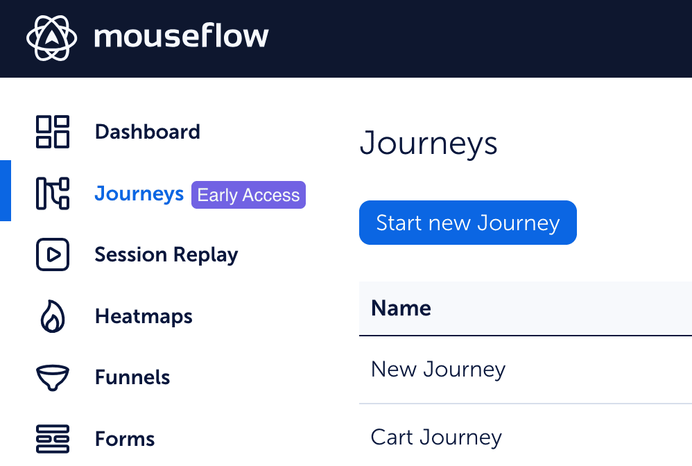
The Journeys feature is about to roll out publicly, but we’ve first released it in early access mode to a few select customers
What exactly should you focus on when validating your UX ideas?
To really understand how users respond to your UX and decide whether it needs further tweaking (most often, it does), you need to collect both quantitative and qualitative data. Using a digital experience analytics platform like Mouseflow makes this easy:
- Collecting quantitative data:
- Track metrics like friction events in your new workflow. Are more users running into issues after the update?
- Monitor how many users start the new workflow, and how many actually complete it. This helps you see if your new UX is intuitive enough.
💡Pro tip:
Build a conversion funnel for your workflow, starting from the very first page and all the way to the last one. This way you’ll see which exact steps need improvement.
![]()
If you are testing something and your old and new workflows live on different URLs, you’ll need two funnels. If the URL is the same, it’s just one funnel, but make sure to implement some UTM parameters or add a custom tag to differentiate between workflows and to see if the new one is doing better than the old one using filters.
- Collecting qualitative data:
- Watch session replays of users who encountered problems, like high-friction areas or abandoned workflows. Look for moments of frustration.
- You can also trigger feedback surveys during key frustration points—like rage clicks or website errors—to capture user reactions in real time.
![]()
With user research tools in hand, you can confidently experiment with your UX and apply trending best practices—knowing you’ll quickly spot whether they’re improving the experience or just creating new issues.
2. Stick to the Principle of Familiarity
Think twice before getting too creative with your UX. Before you try out any unconventional UX ideas, remember that effective information architecture is usually built upon the principle of familiarity.
Here’s what we mean by it.
Your app’s information architecture is like the blueprint for how users navigate your product. And the principle of familiarity is simple: users are most comfortable with what they already know.
When designing your app or website experience, it’s important to create an architecture that keeps core elements—like navigation menus, buttons, and common workflows—in line with what users have seen and used thousands of times before.
Think about the last time you used a device with a different operating system (OS) than you’re used to. Even though the device’s owner swears it’s the best thing ever, you probably felt lost. You couldn’t wait to get back to the familiar OS.
Need more proof people hate change and unfamiliar experiences?
Instagram has a history of facing public backlash due to controversial UX design updates, often leading to rollbacks to keep users satisfied. In 2018, the platform briefly introduced a horizontal feed, which sparked immediate outrage. Users disliked the idea of scrolling their feeds in a completely new way. The change was quickly scrapped, and the test never made it to a full rollout.

Source: TheVerge
The same thing happens when you’re building a product in an established market. If your goal is to make users switch from a familiar solution to yours, it’s tempting to create a fresh UX and make it more “efficient.” In your mind, they should love the intuitive workflows you’ve built. But in reality, the new experience only feels foreign and frustrating to them.
That’s not to say there’s no room for creativity. But before you introduce anything new or unconventional, ask yourself (and your focus group):
Is it truly improving the user experience, or just adding complexity?
3. Implement Progressive Disclosure
Another user experience design principle—that will be just as relevant in 2025 as it is in 2050—is to allow users to gradually learn your product’s full functionality, one task at a time. Jacob Nielsen, a famous UX designer and one of the founders of Nielsen Normann group, came up with this design practice and called it progressive disclosure.
Here’s how you can implement it in your UX:
- Layer features: Present core, frequently-used tools prominently, while tucking more advanced or less commonly used functions away in sub-menus or collapsible sections.
- Offer detailed onboarding flows: Guide users through their first actions within your app with clear, step-by-step onboarding flows.
- Provide continuous in-app guidance with on-demand tooltips: Let users discover your product at their own pace using tooltips that appear only when needed. These tooltips can be triggered by user behavior, such as hovering over a feature or starting a new workflow.
Take Freed.ai, a medical scribing software, as an example. Freed’s onboarding process begins before users even see the app interface. The onboarding flow is unskippable, which is great—but only when you aren’t planning to jump at your users with a 10-minute survey before they start the flow.
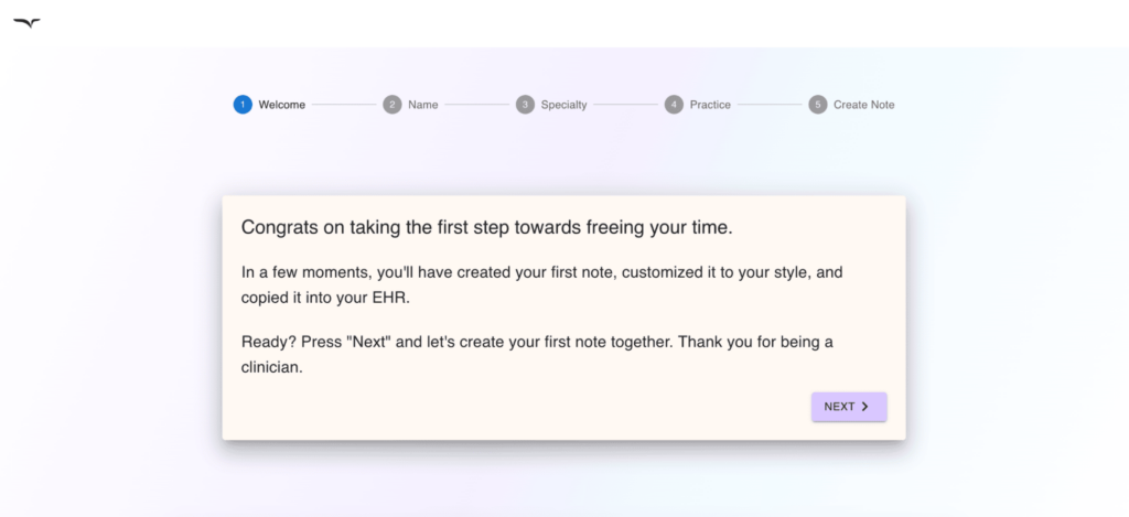
Source: Freed
Well, in Freed’s case, the discovery process is quick and straightforward. In under a minute, users input their name, specify their industry, and indicate the size of their team. Once inside the app, the first task is creating a mock conversation, which is then transformed into a mock note. This way, users can experience the tool without waiting for an actual conversation.
Freed also maps out all the steps to generate a medical note, setting clear expectations and making the workflow easier to follow.
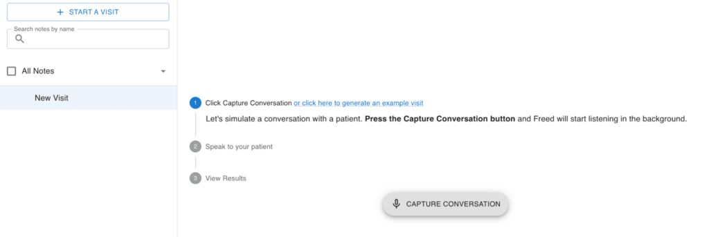
Source: Freed
4. Enable Personalized User Experiences With In-App Data Collection
Almost every app you use today offers some level of personalization (no surprises here, personalization is the new black in SaaS marketing).
When you log into LinkedIn, you see updates from the people you engage with the most. When you open Netflix, you get movie recommendations based on what you watched previously. Personalization has become so routine that you only notice when it’s missing.
With AI and machine learning driving more and more tools, personalization has become a key part of great UX. But you don’t need complex algorithms to get started. You can begin by simply asking your users about their needs and preferences.
The best time to collect this data is during onboarding. Use quick surveys to ask about their goals, industry, or team size. Make it clear that this information will be used to personalize their experience, so users feel more comfortable sharing.
For example, Kit, an email marketing platform, asks new users what tool they’re switching from. This allows Kit to tailor its onboarding flow based on their prior experience. If users are used to different terminology or workflows, personalized tips help bridge the gap.
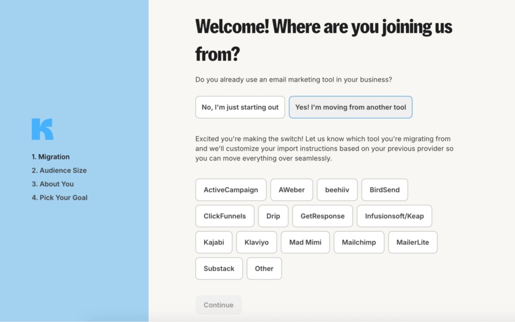
Source: Kit
5. Drive Adoption With Micro-Interactions
Onboarding might be done, but your chance to shape a great user experience doesn’t stop there.
Micro-interactions are a subtle but powerful way to guide users through your product without being intrusive. These tiny design elements can take various forms, from a change of a button color after a user clicks it to a push notification triggered by a long time of inactivity.
Micro-interactions are a staple of any good UX—they make your SaaS solution’s UI more interactive and more familiar for the user at the same time.
Here are some of the most common types of micro-interactions:
- Status indicators: Visual cues like loading spinners or progress bars that let users know something is happening.

Click the image to see the animation. Source: Stackoverflow
- Hints and guidance: Tooltips, hover effects, or button animations that help users navigate the app or take the next step without needing extensive instructions.
- Call-to-action reinforcement: Small animations that highlight key actions, such as a button pulsing to encourage users to click and complete a task like signing up or submitting a form.
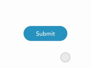
Click the image to see the animation. Source: Pinterest
- Alerts and notifications: Quick prompts that inform users of updates, errors, or new messages.
Toggl, the time-tracking app, uses micro-interactions to guide users through features they haven’t explored yet. It’s a nice example of blending progressive disclosure with subtle prompts that keep users engaged and help them discover new tools without feeling overwhelmed.
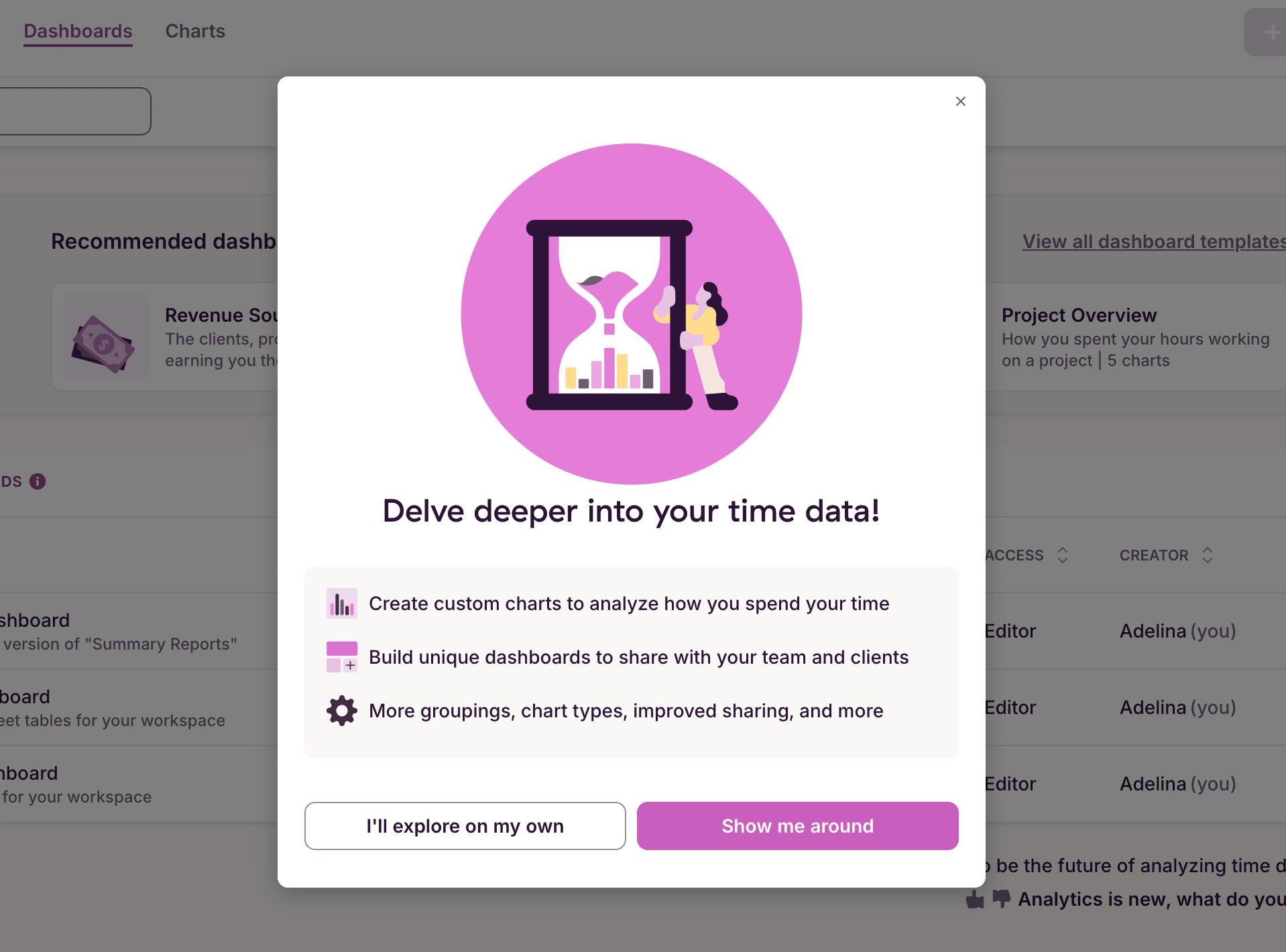
Source: Toggl
6. Implement AI-Powered Workflows
If you check out ten SaaS websites, you’ll likely see AI-powered features being advertised on at least eight of them.
AI is here to stay, and its impact is only getting bigger as more users discover its advantages.
No matter your niche, there’s a way to weave AI into your product—be it a simple chatbot assistant or advanced AI analytics.
Take Memrise, a language-learning SaaS application, for instance. Memrise has recently incorporated an AI-powered chatbot that helps users practice their skills in real-time conversations. With a handy chat interface, users can work on grammar, quickly translate chats, or get answers to their questions—just like they’re chatting with a real tutor.
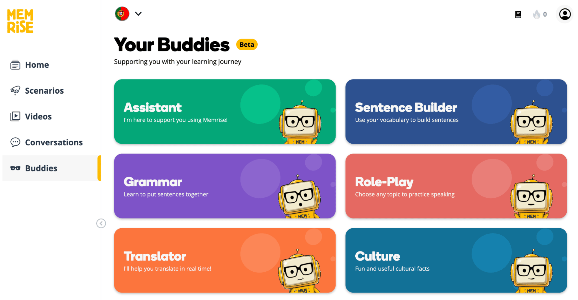
Source: Memrise
And the good news is that integrating generative AI into your SaaS app UX is extremely easy. You can connect your app to the OpenAI API and add AI features within hours.
7. Add Gamification Elements
The best practices we’ve discussed so far focus on usability and making your SaaS product user-friendly. Now, let’s add the finishing touch: engagement.
Gamification is a great way to drive adoption and make your app experience more enjoyable. By integrating game-like features into non-game environments, you can encourage users to dive deeper into your product and stick around longer.
Take Temu, an online marketplace known for its gamified shopping experiences. Features with a clearly videogame origins like
- rewards,
- challenges,
- spin wheels,
- and limited-time events
keep buyers engaged, encouraging them to spend more time on the platform and often buy more than they originally intended.

Source: Temu
While Temu’s approach might feel annoying to some, it’s undeniably effective—and it’s not just for eCommerce.
B2B SaaS companies can also use gamification to connect with users, build community, and improve retention.
For example, Grammarly allows writers to see how they stack up against the writing community. This simple yet effective feature boosts user loyalty and drives app adoption.
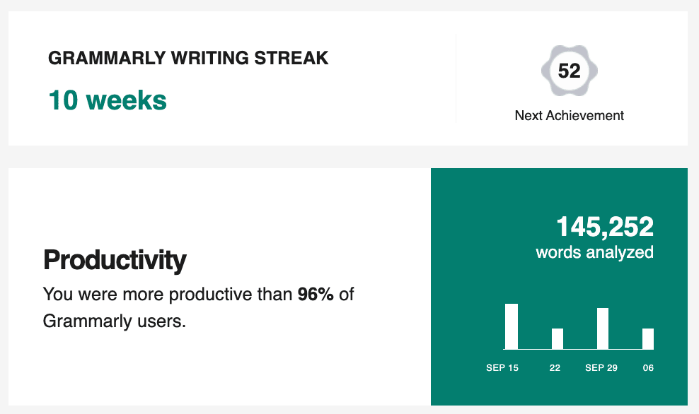
Source: Grammarly
Make UX Design Decisions Informed by Data
Keeping up with trends is a great way to spark new ideas for your SaaS product. But just copying what others do won’t guarantee a smooth user experience. As you develop your SaaS UX, take the time to see if those trends really fit your users’ needs and preferences.
Always support your UX design choices with data. Once you’ve rolled out your ideas, use Mouseflow’s experience analytics to see how users are responding. Track behavior in real time and add quick micro-surveys to get a clear picture of what your users really think about your UX. Start monitoring your digital experience today, it’s free.


