This post has been updated in April 2023 to reflect modern best practices.
Website layouts are the key to unlocking your site’s potential. With strategic design, you can give your visitors an exceptional user experience (UX). And that user experience drives your business growth through higher conversions.
That growth continues through ongoing usability testing and conversion rate optimization (CRO) using tools like A/B testing, heat maps, and session recordings.
Whether you are considering a major redesign or just starting out with your site, use this guide for inspiration. We’ll go over some of the commonly used patterns and some examples that will charge up your growth and conversions in no time.
What’s a good website layout?
There are a lot of ways to answer this. You can get ideas, view datasets, and learn everything there is to know about web design’s best practices.
But really, the truth is this:
A good website layout is one that works for your users. One that helps them understand your product/service/content without putting in too much effort to navigate it
No matter what design you choose, be prepared to continually tweak it based on what you learn from your user’s actual behavior.
Tips for creating your website layout
Before you brief your designer or start looking at web design templates, there are three things to plan ahead. These three elements should underpin every piece of design and UX work you ever do, so ensure they’re at the heart of all your discussions.
1. Plan the user journey
How do you want users to navigate through your website?
Let’s dial this question back a little. How would users expect to navigate through your website? What questions do they come with?
A good starting point here would be to take a look at the home page, and:
- Create a plan for your information architecture (IA). Use card sorting to write down all the pages you want to have on your website and logically organize these. Think about how all these pages will feature in the next point to consider.
- Plan your navigation. You can have the best-looking website ever created. It doesn’t matter if your customers have no idea where they’re supposed to go or how to find what they’re looking for.
If you find yourself struggling here, break the process down using the following question:
How can I get my visitors to the information they need or a conversion point in the fewest possible clicks?
Of course, you might (you definitely should!) have a call to action right there on your homepage.
But you shouldn’t load all your pages with the same content.
2. Plan your visual hierarchy using scanning patterns
Each page should have a clear visual hierarchy or pattern. The point is to bring attention to the most critical content on your page.
This is your opportunity to draw users in and guide them to crucial information or the calls to action you want them to follow.
Plan your visual hierarchy based on the type of website you are building.
F-pattern design
F-pattern designs are for websites where the main focus is text or information. Like a blog, publisher, or news platform.
People in the western world read left to right. So, when confronted with text, we start scanning downwards on the left, reading more fully if something catches our attention.
If your site is text-driven, go for a single-column design that caters to an F-scanning audience. Of course, one of the internet’s most popular examples of this is the blog platform Medium.
Z-pattern design
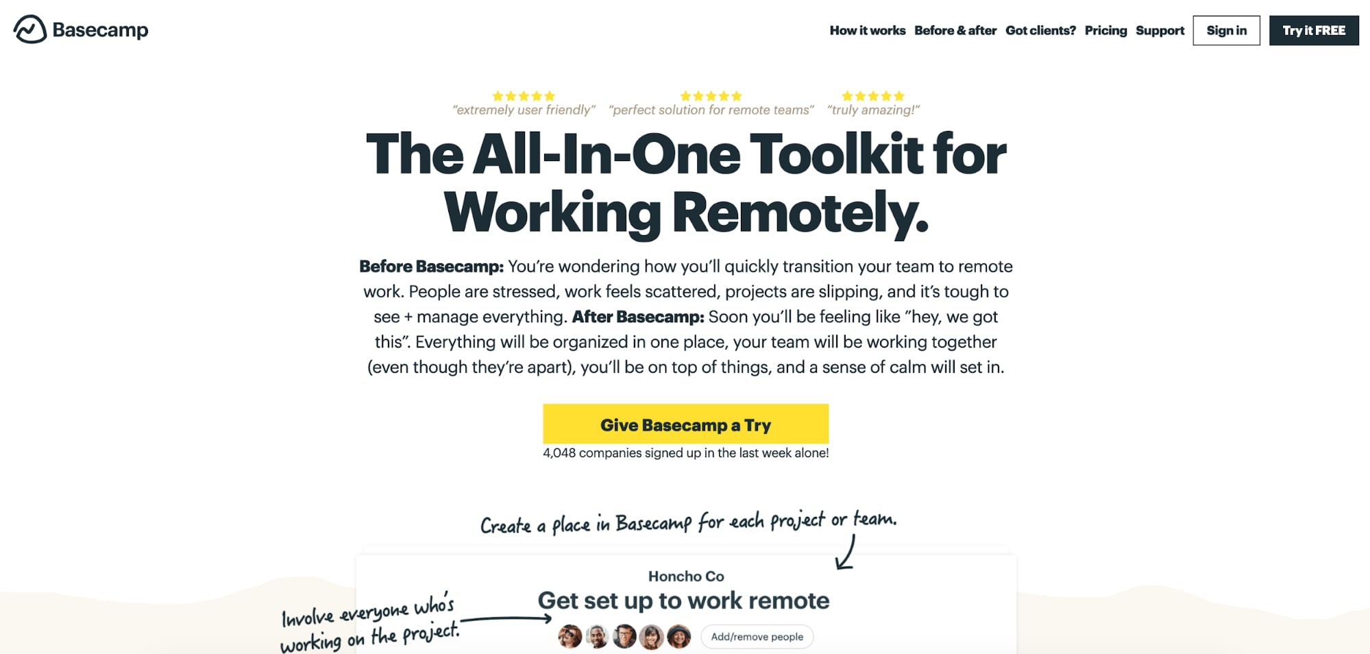
If you’re selling a product or service, go for a Z-pattern design. This organizes your page with header navigation at the top, a sales message and call to action in the middle, and then some key statistics and social proof at the bottom. Basecamp does this brilliantly.
Card-based website layouts and split screens
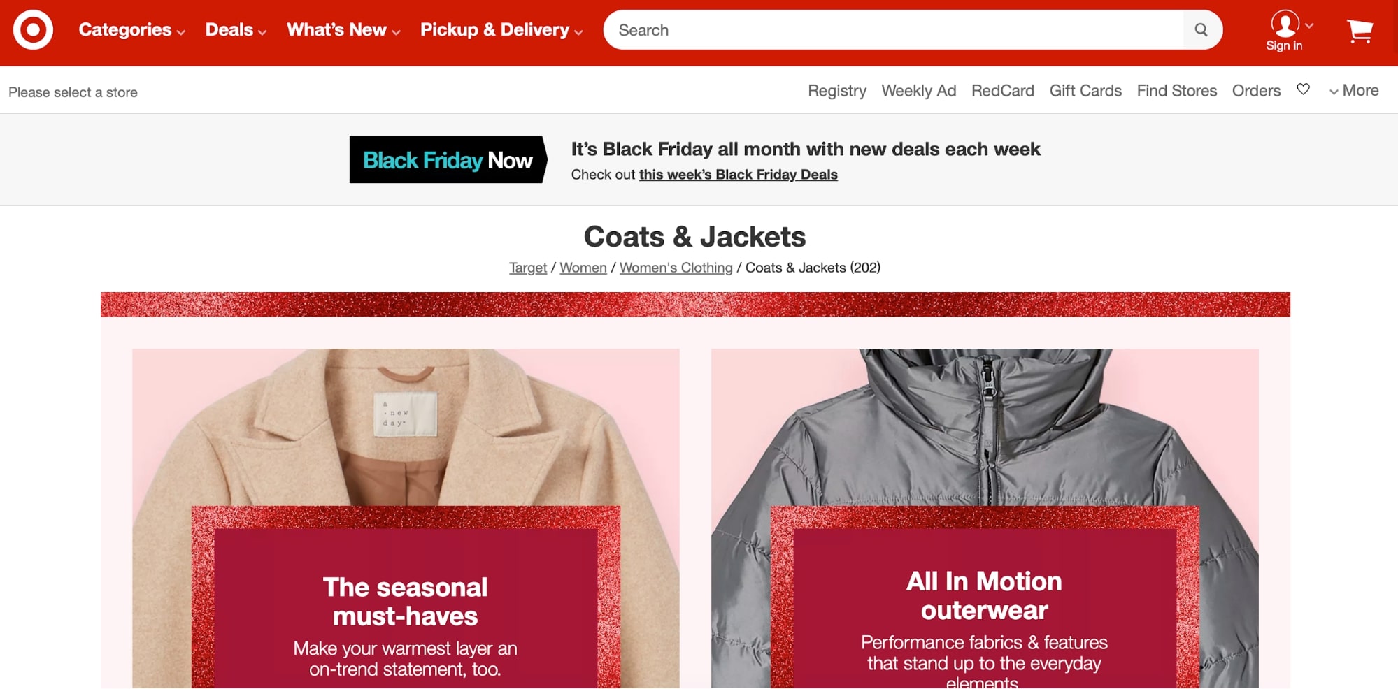
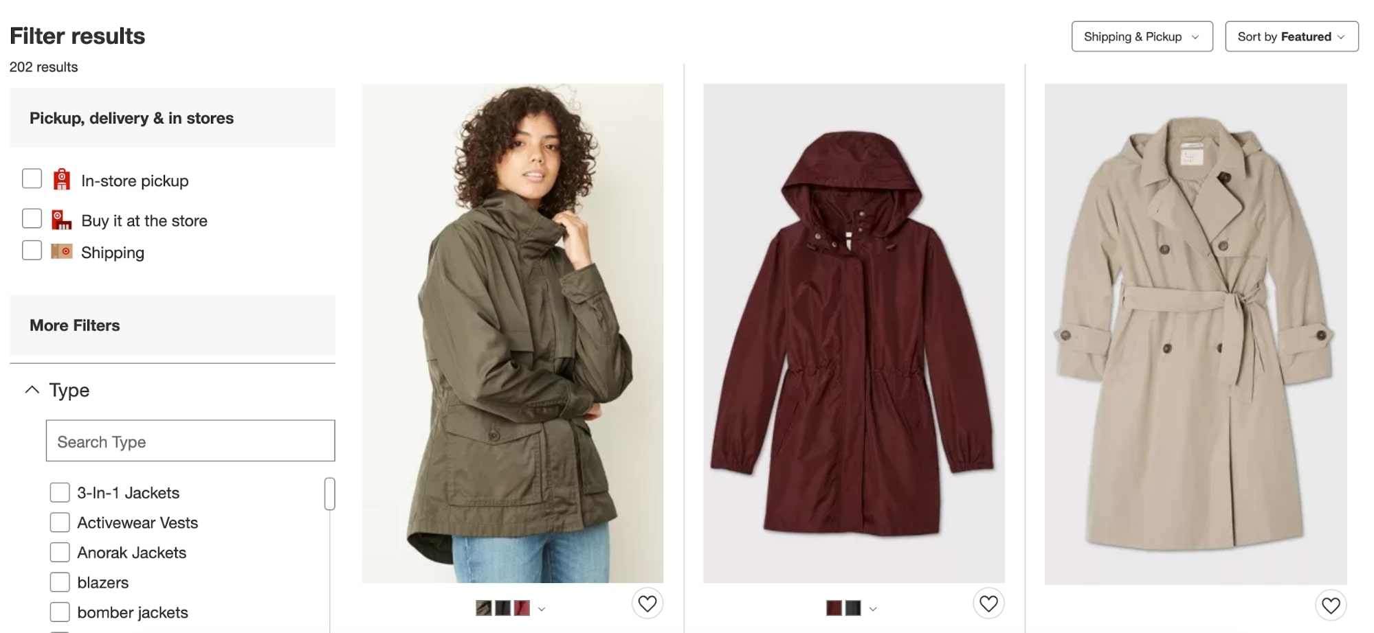
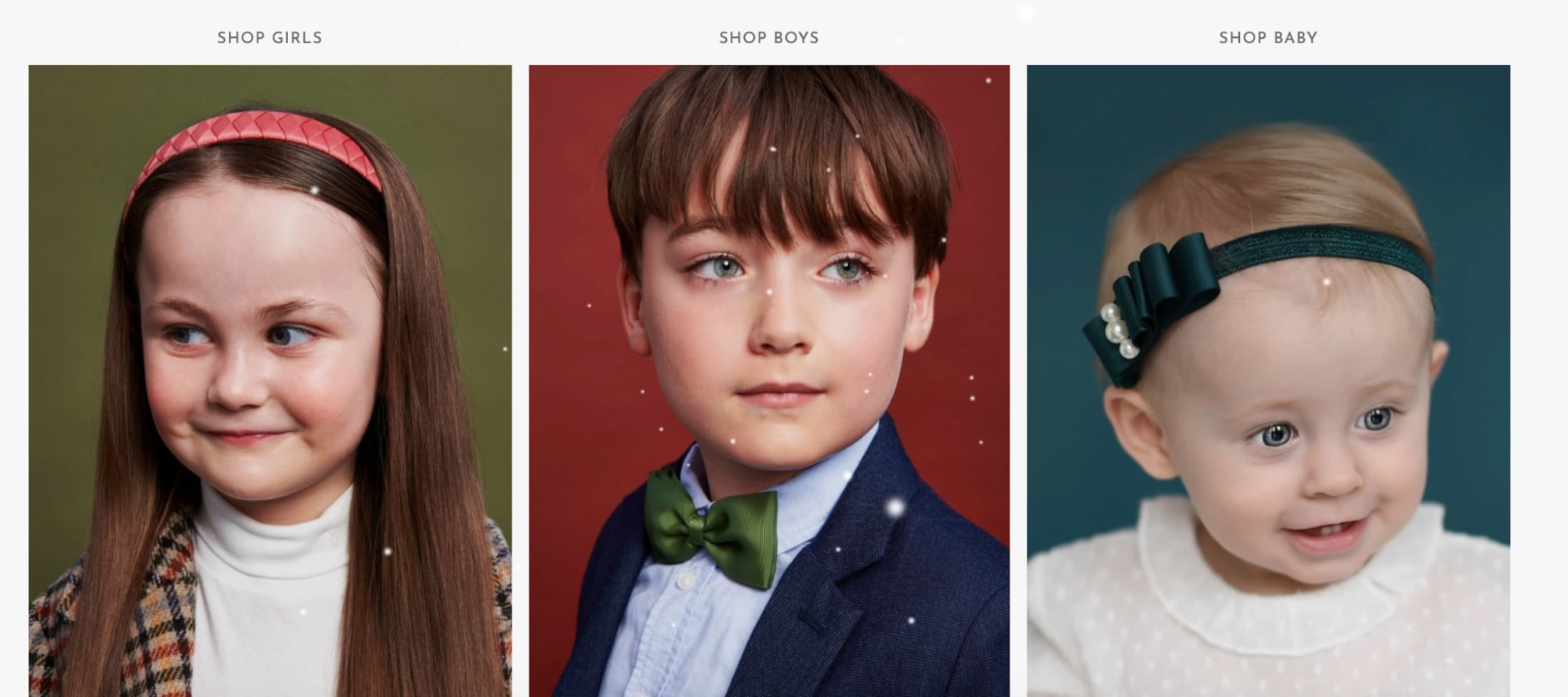
Do you sell lots of products? If so, you want to show your users more than one product at a time. Card-based layouts and split screens are excellent for allowing users to compare different products – and for you to highlight specific items you’re looking to push. Target’s women’s clothing page combines these design elements to great effect.
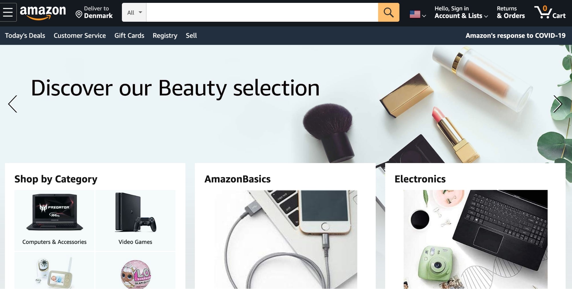
Working with the “rule of thirds”
An old principle in web design is the rule of thirds. With this approach, you break your design down into three rows and three columns, giving you a 3 x 3 grid.
There are two key ideas behind the rule of thirds. First, the point is to make each row and column have a similar theme. That makes scanning easy on the eye.
The second is that you get these hot-zones for attention where the lines intersect. Place calls to action and key messages in these areas and use the rest of your page to direct users to these areas.
With the Amazon homepage, you can often see the rule of thirds in action.
3. Plan your call to action buttons
Calls to action (CTAs) are your best option to tell users what you want them to do on your website. They’re one of the critical things you’ll test and tweak on an ongoing basis but are a must for your website from day one.
Follow these three principles to nail your calls to action:
- Make sure they look clickable. Remember, users need it to be obvious what you want them to do. If your CTA doesn’t look like a button, you’re going to miss out on clicks.
- Make sure they’re labeled with an action. If your CTA doesn’t tell users to do something like “Sign Up” or “Try for Free,” is it even a CTA?
- Highlight your most important calls to action. Every CTA is essential, but you need to emphasize the key messages. For example, if you have both a “Free Trial” and “Subscribe to Newsletter” CTA, which one do you want users to see first and be most attracted to?
- As a rule, CTAs need to be above the fold. You want them to stare right back at your visitors as they first enter a page. That doesn’t mean you shouldn’t have them later on your page as well.
Best website layout ideas: 11 examples of sites that convert
So, we covered a couple of key principles for creating web designs that drive business growth. Let’s put it into action and look at some real-world examples. Here are 11 great website designs from successful businesses.
1. Mailchimp
Mailchimp is the world’s most widely used email marketing tool. Still, even though most people know what Mailchimp is before visiting their website, they don’t slack up on delivering a fantastic UX.
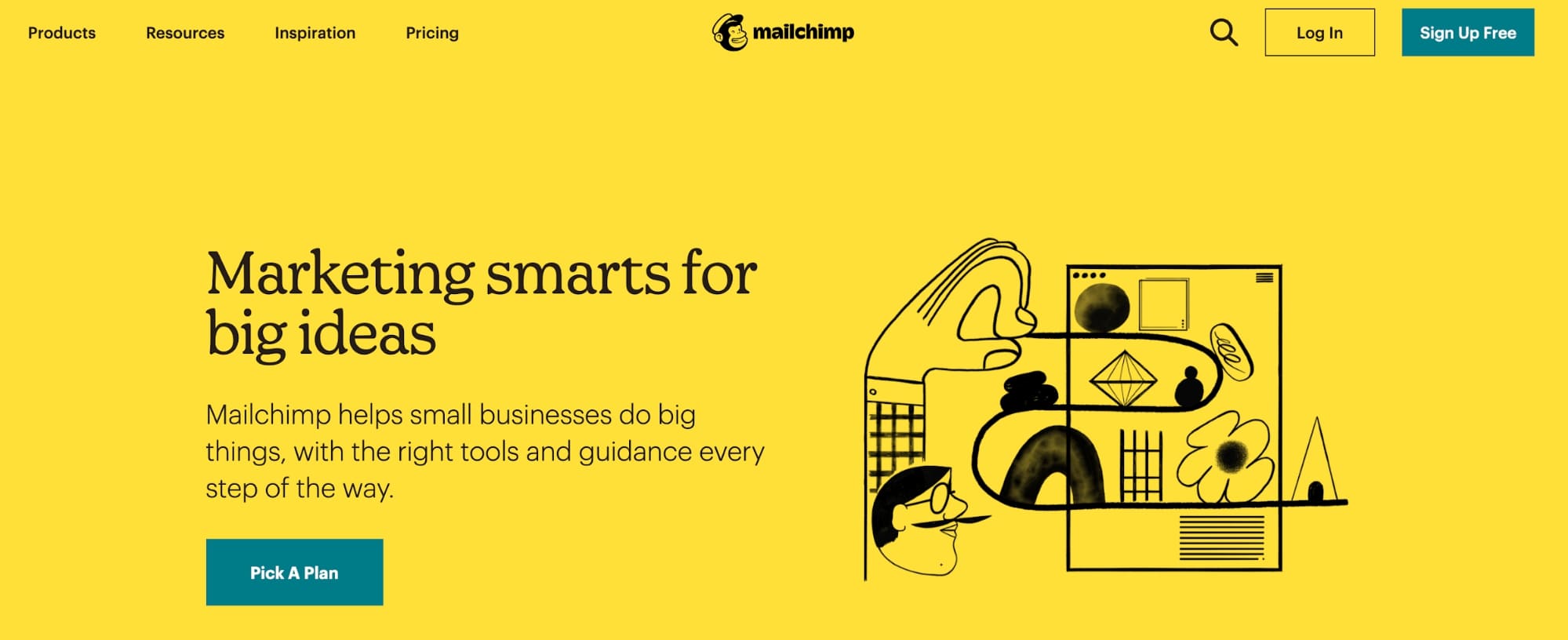
The top of the homepage is designed for Z-pattern scanning. The vibrant yellow colour grabs your eyes and doesn’t let them go. Different font sizes emphasize both key messages and the actions they want you to take.
It’s crisp, clear, and obvious what Mailchimp wants you to do.
2. Omnified
Sometimes, simple and minimalist is the way to go. OMNI does that well.
Look at these screenshots.
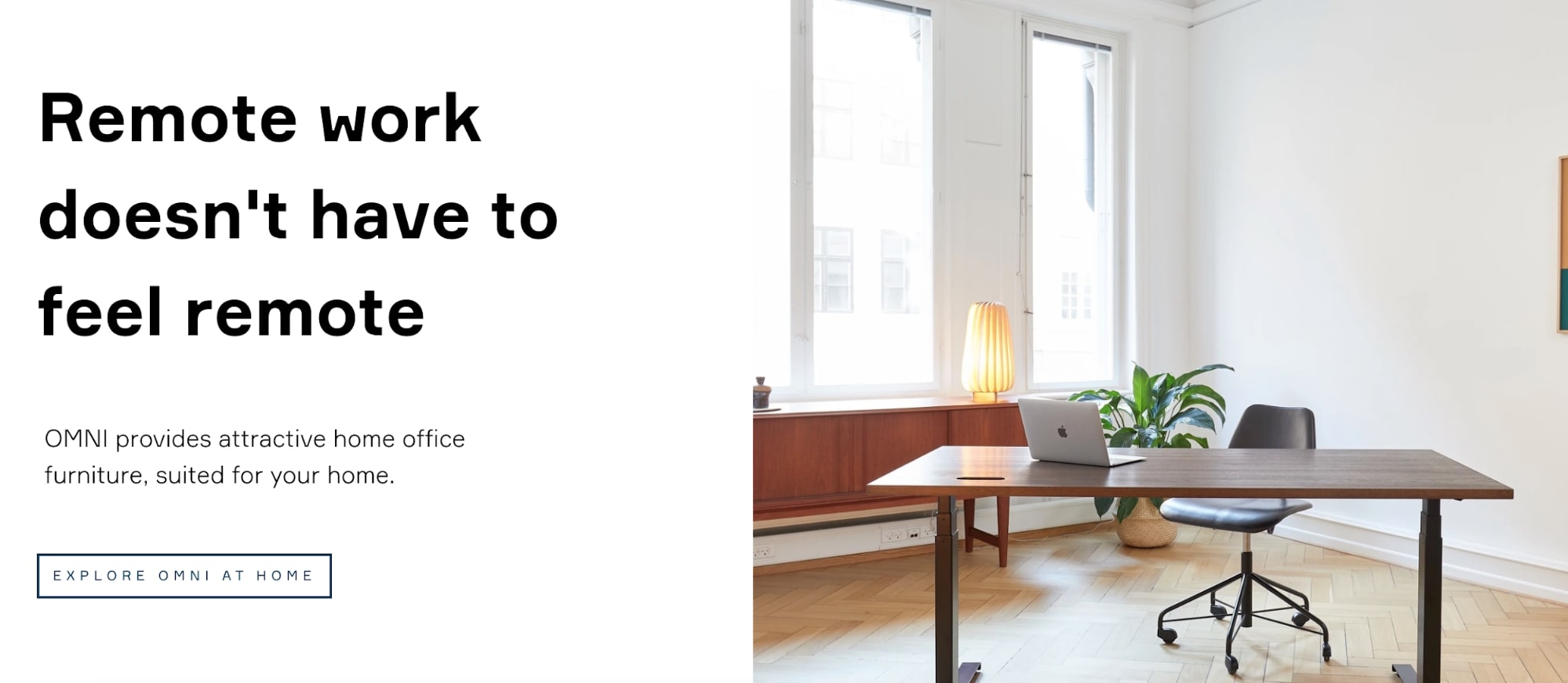
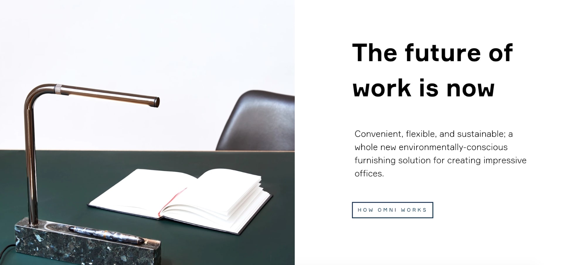
The two-column layout features little text and beautiful clean images. This creates a Z-shape pattern throughout the website that invites you to keep looking. For each bit of text there’s a clear CTA to take you to the next step.
And the sleek, minimalist design of the page follows the clean lines of the furniture, too.
Ecommerce customers love information about products, but it’s the visual that really sells!
3. Apple
If there’s one thing Apple knows, it’s how to sell tech products.
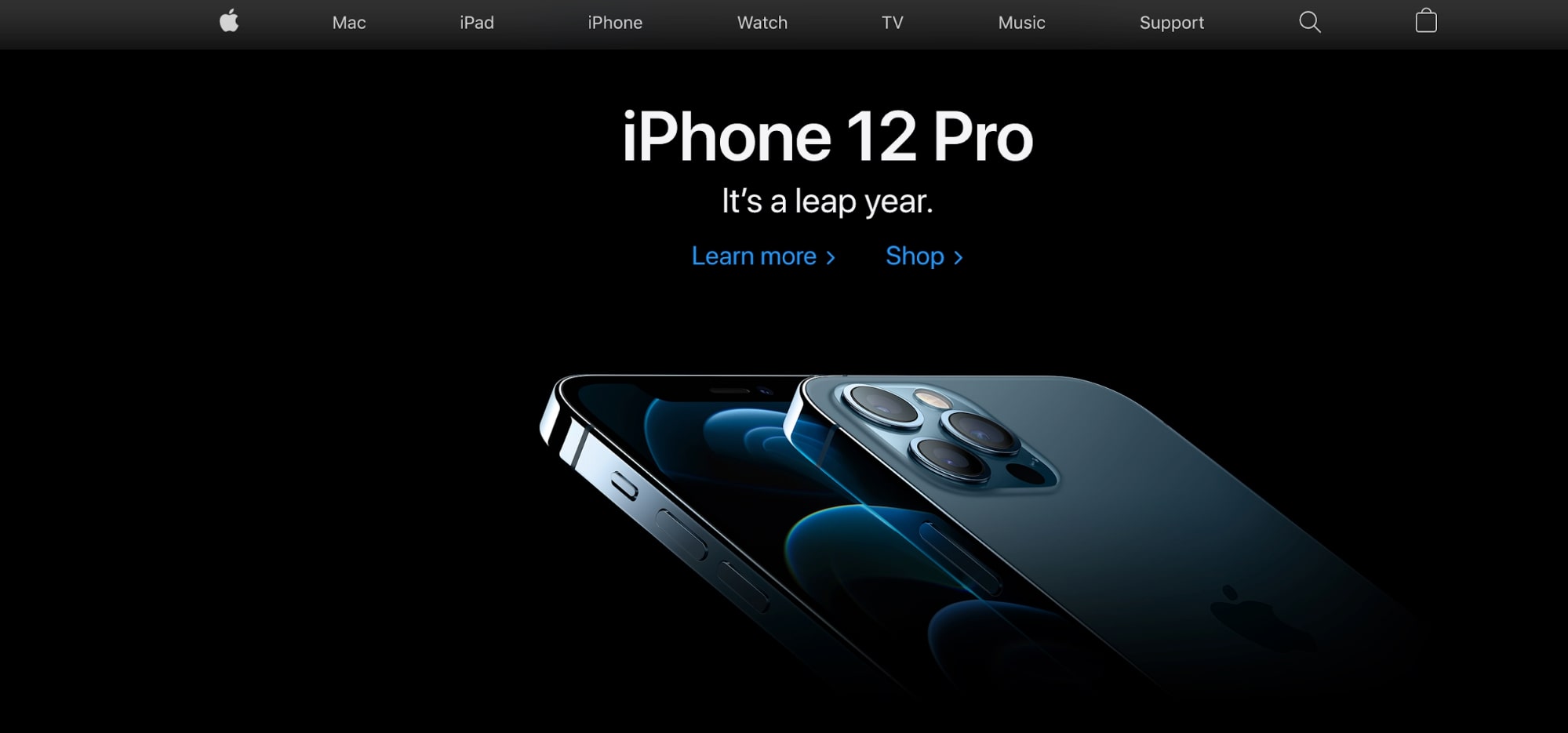
Featuring a product in the center of the page highlights the use of Z-patterns and the rule of thirds. The picture below shows the iPhone 12 Pro in the center of the screen, covering all the points where the rule of thirds lines would intersect.
The splash of blue color for the CTAs leaves visitors with no doubt about the next step. Instead of bombing their visitors with information, Apple knows that a lot of its potential customers want the phone anyway. So they just need to make it easy to actually convert.
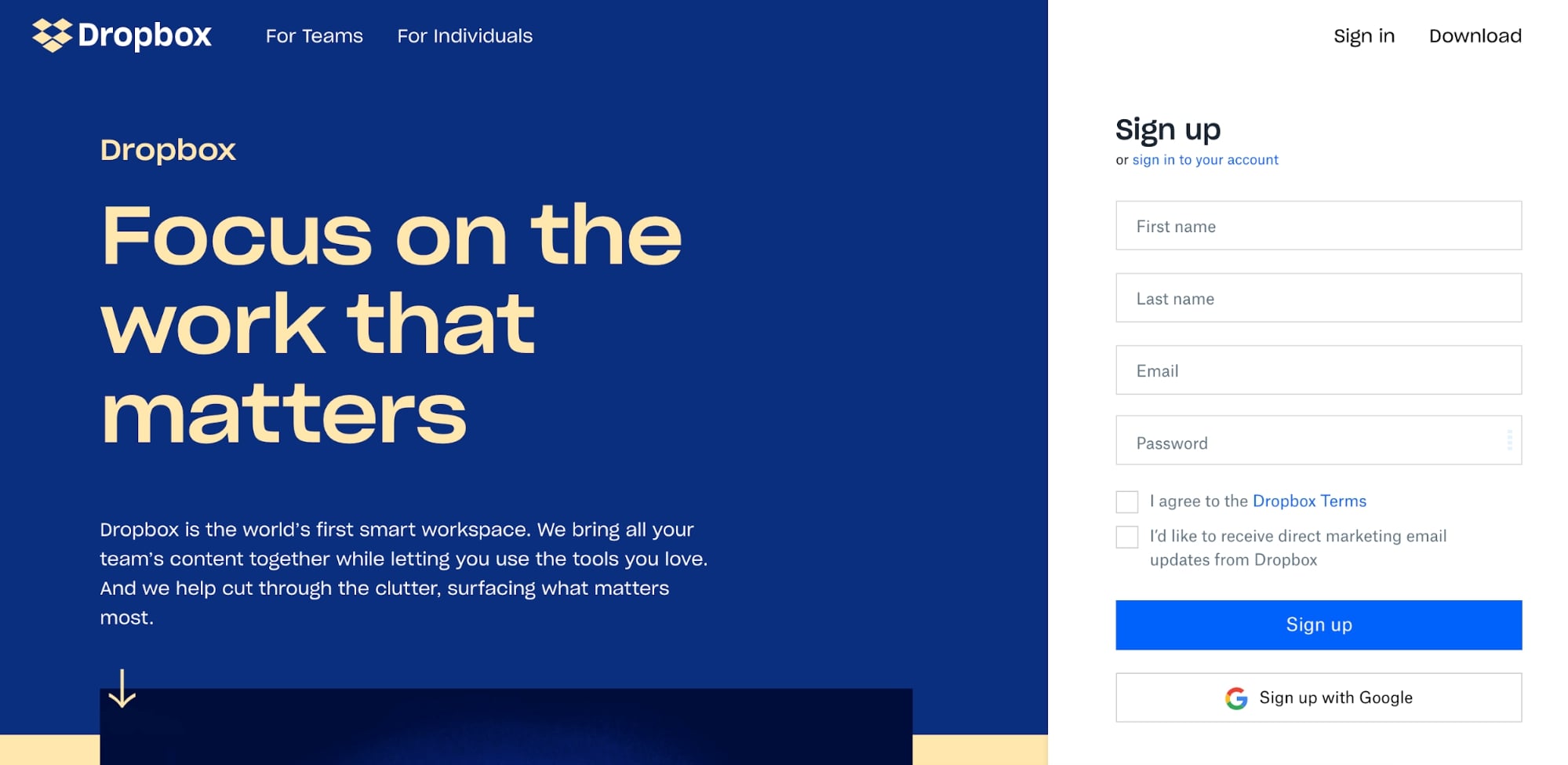
4. Dropbox
Dropbox uses a simple design that combines a split-screen introduction with a dual column display as you scroll.
It has a couple of things going for it.
First, the sign-up form takes up close to a third of the screen. Secondly, by using the yellow arrow at the bottom they make it clear that there are two options for users – but one is better than the other.
They can either sign up or learn more – but should really just sign up. It’s simple to figure out what to do next as a visitor.
5. YouTube
It’s not just e-commerce that can profit from card-based layouts. Perhaps the most famous example of this in action is YouTube.
What YouTube does well is change how it presents videos to users depending on where they are on the site. For example, when you land on the YouTube homepage, you’re shown a video grid as well as a selection of your favorite categories, which utilizes both Z-patterns and the rule of thirds.
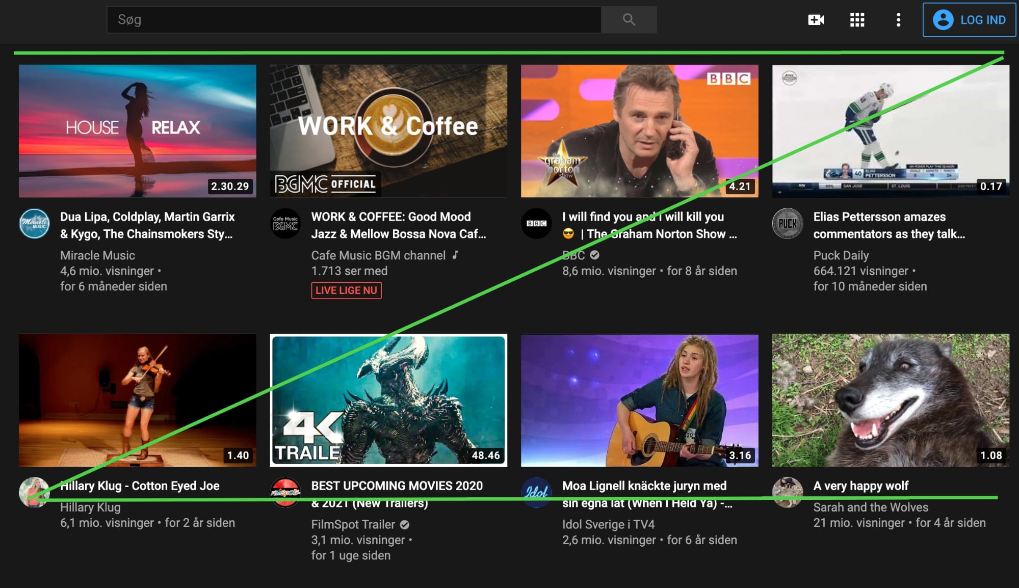
In contrast, when you search for a specific video, you’re shown a list that’s more reliant on F-pattern scanning. This design principle is in place because the streaming giant knows users click based on the YouTube thumbnail and video title, which is a fantastic example of a design based on user behavior.
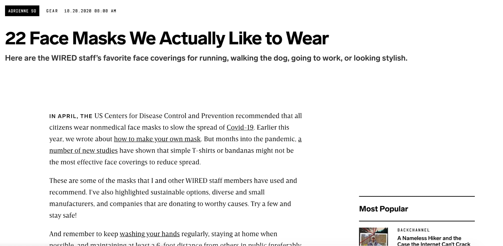
6. Wired
While Wired uses a card-based design for its homepage and categories, we want to look at its article pages.
These are great examples of F-patterns in use on a text-driven website, making their content accessible, whether you want to scan through or read in-depth.
And that with an incredibly simple design. There aren’t really any fancy bells or whistles here – just simple, clean design that invites you to keep reading.
7. Yell.com
Yell.com is an online business directory springing from the old-school analog yellow pages books. And their website reflects that it lives off recommending other services. Featuring a large background image and an attention-grabbing search bar, they know what their visitors want.
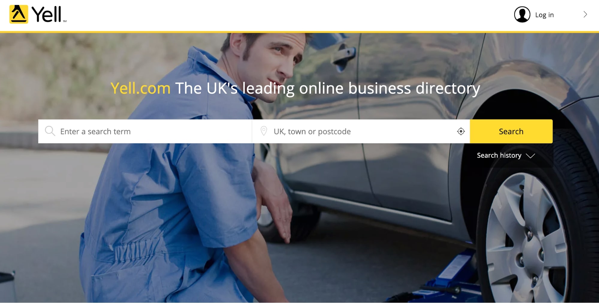
And they deliver it. You don’t need to hire a team of expensive designers to reinvent the wheel. In the end, the best website layout is the one that works for your users.
8. Trefecta
Trefecta’s homepage doesn’t stick to any of the web design principles we highlighted earlier, but what we want to focus on here is the fixed left-hand sidebar.
Remember when you were planning your information architecture earlier? Well, if you only have a handful of pages on your site, that particular task will be easy. It may also mean that having a fixed navigation panel such as Trefecta’s is an option for your site.
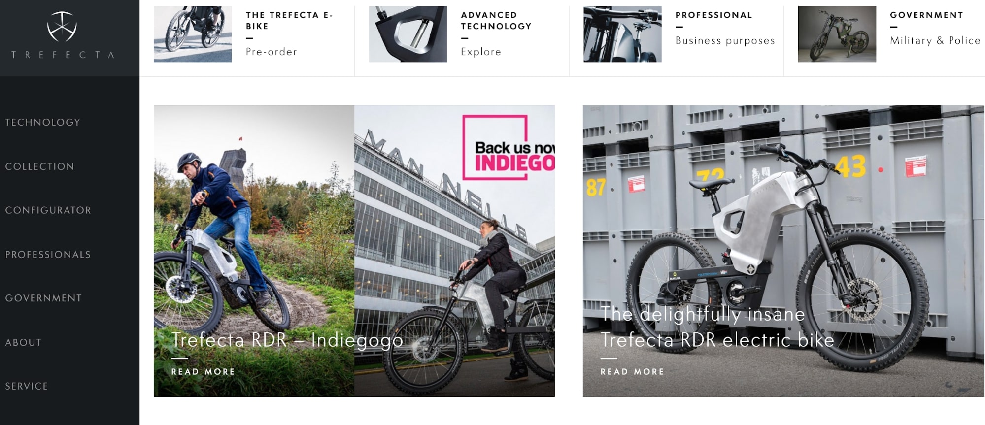
It keeps your design slick and gives a focal point on the left-hand side for users, whether they’re signing up for a product or gathering information.
Not only that, it shows you that sometimes breaking the rules is okay.
9. Milledeux
For a bit of seasonal inspiration, check out Danish e-commerce site Milledeux. The Christmas mood oozes from the page from the beginning. A simple animation in the form of snowfall invites you to think of the cozy times to come. And then your eyes are drawn to the product.
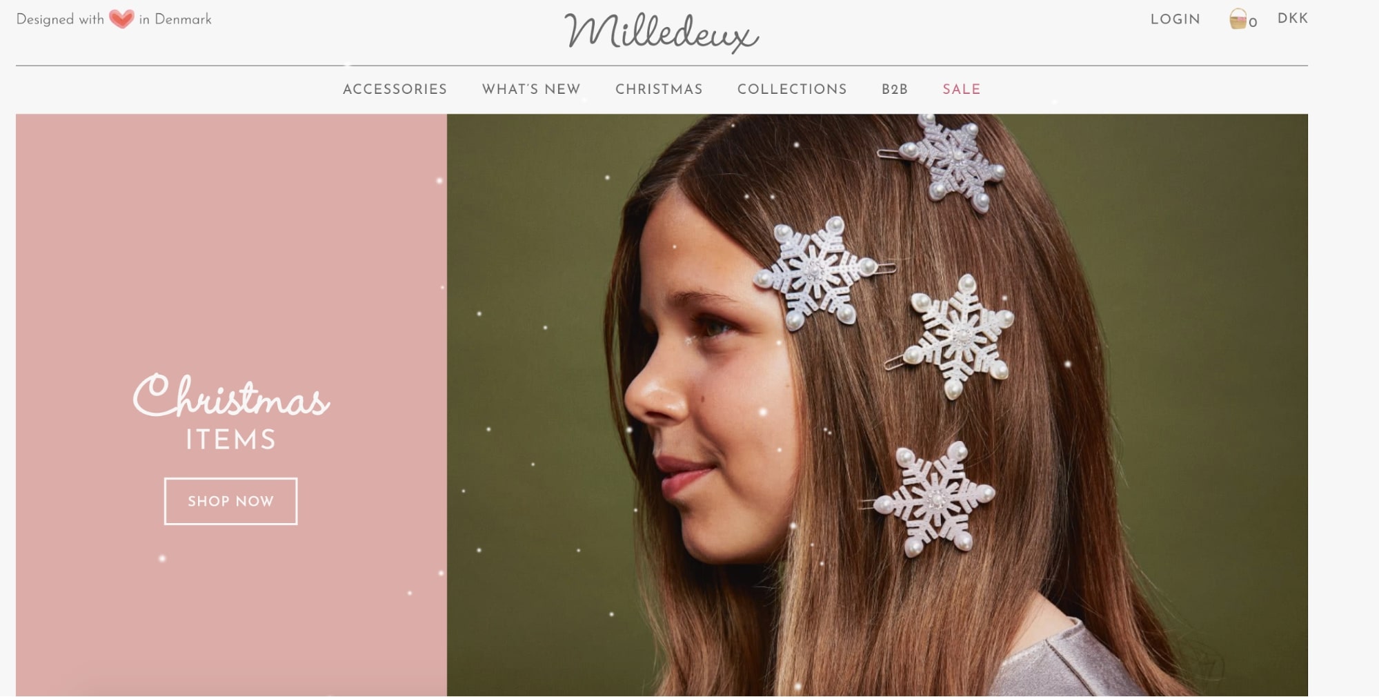
The rule of thirds is used with ⅔ for the product and ⅓ for the CTA. This is a way to make it simple to convert while still telling the users what the page is all about.
For those still hesitating, you get a card-based layout with big images. We’ve said it before, but for e-commerce you need to make the images central to your design.
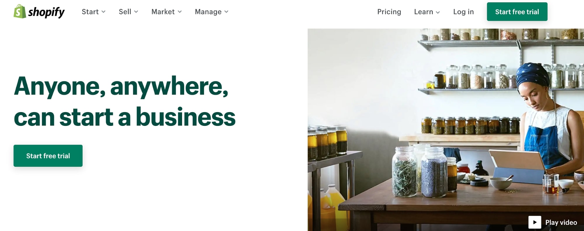
10. Shopify
Shopify is another fantastic example of a website that uses simple design and minimal messaging while making it 100% clear what it does and why you should use it.
When you land on the site, your eyes are drawn to the green buttons. You are invited to start up.
It’s also a prime example of good CTA’s. A good CTA always has positive, action-packed language. And not just the buttons here. The navigation bar has inviting categories like “Start”, “Sell”, “Manage” and “Learn.”
11. Stripe
A lot of the designs we’ve shown are pretty minimal. Lots of white space and not too many colors all at once.
Enter Stripe. It might look chaotic at first glance, but there’s a method to the madness. The futuristic waves, animations, and vivid use of color underpin their brand. And the way the screen is split diagonally makes the Z-pattern very obvious.
Although you might not start from this point, Stripe is an excellent example of how you can use different usability testing techniques to get your design to a place where it works for your users. Their homepage used to look much different, as you can see below!
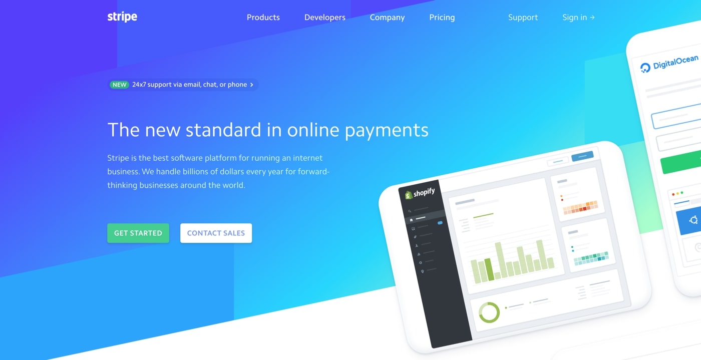
With dynamic color elements and clear messaging, Stripe still retains everything you want from a great page, though, including straightforward navigation and use of CTAs.
Actually, in all of the cases, success comes not from the design, but also because of the content of the landing page. Read our blog post on tips for creating landing pages that convert to learn about what else matters when building a landing page.
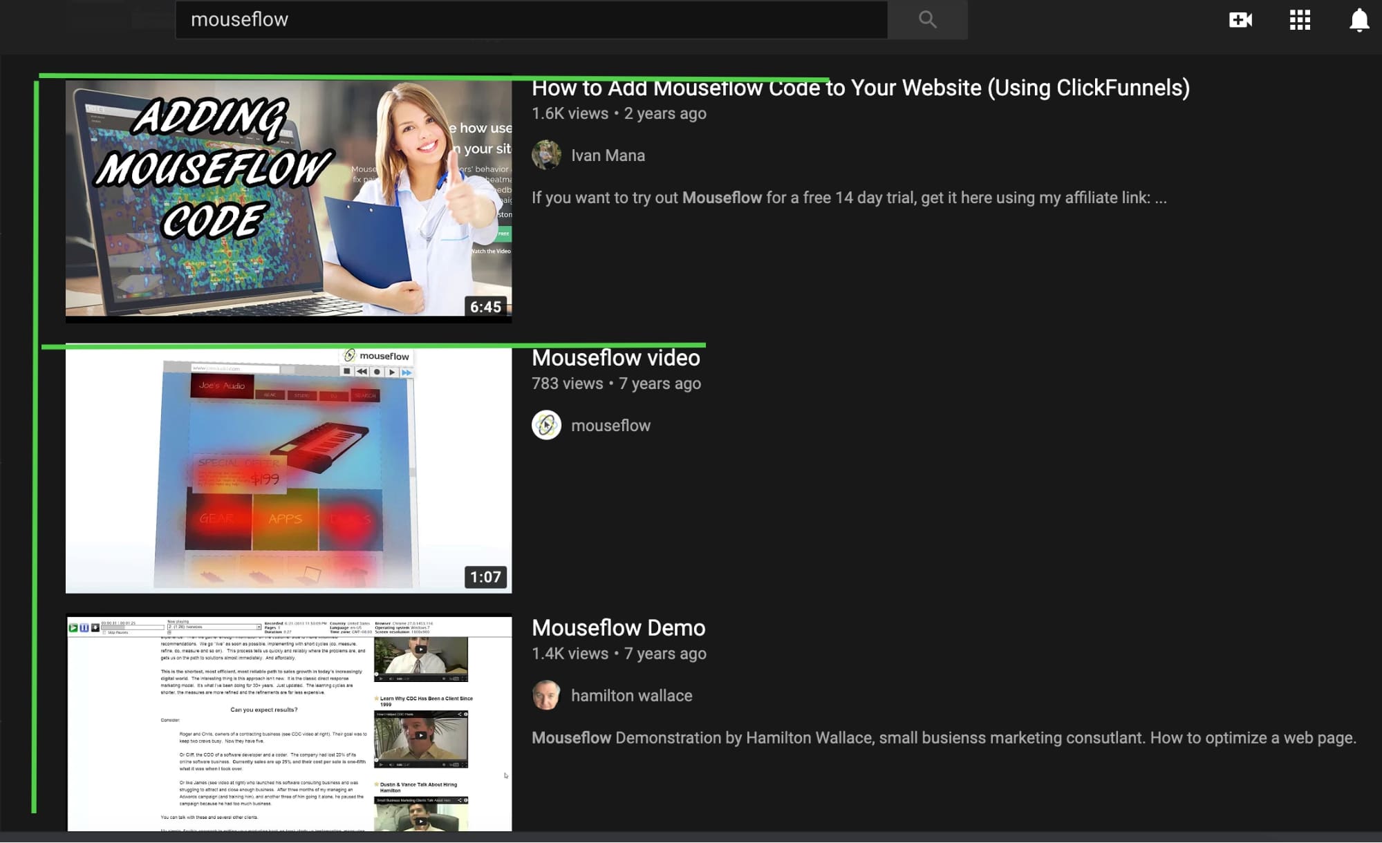
Using Mouseflow to optimize your website layout
Most website analytics platforms give you information about bounce rate and where people click. But you need to add further context to this data to make real improvements to usability, UX, and design.
You can use Mouseflow like a traditional analytics tool, but you get so much more to help you analyze how users are interacting with our website.
Our heatmaps and session recordings features can help you discover:
- What elements your users are paying attention to
- Points of hesitation before clicking a CTA
- Parts of your page that might be distracting users from your core message
- Where you can make improvements in your design
Watch training videos about how Mouseflow can help you optimize your design and grow your business, or get started here with a 14-day free trial.
FAQ
A good website layout is one that works for your customers! When getting started with web design, think about navigation and information architecture, visual hierarchies, and the effectiveness of your calls to action to create a framework for your design.
It depends on what the objectives of your website are. For example, an F-pattern design might be useful if you’re presenting information on a blog-style website. In contrast, a Z-pattern design can be better if you’re selling a product or a service.
The rule of thirds breaks your design down into three rows and three columns, creating a 3 x 3 grid. The idea is that each row and column has a specific theme or focus. At the same time, the four points where your grid lines intersect would be the main focal points of your page where you could place images, essential information, or calls to action.