
You launch a new landing page. Traffic is flowing, but conversions aren’t improving the way you expected.
Analytics show that users reach the page and interact with your CTA, but something is clearly going wrong. Are users confused? Is the button broken, or is the page simply slow to respond?
Traditional analytics tools can show where users drop off, but they rarely explain what caused the frustration in the first place. This is where friction heatmaps come in.
A friction heatmap helps you visualize the moments where users struggle on your website by highlighting signals like rage clicks, dead clicks, and click errors. Instead of guessing where the experience breaks down, you can quickly identify the interactions that create friction.
Friction heatmap is just 1 type of Mouseflow’s heatmap tool. If you want the full overview of how you can use heatmaps to analyze user behaviors and improve conversions, check out our guide to website heatmaps.
In this article, we’ll explore what friction heatmaps are, why they matter, and how they help you uncover UX issues that impact conversions.
What is a friction heatmap?
A friction heatmap is a visualization that highlights areas of a webpage where users experience frustration during interactions.
Instead of showing where users click most frequently, friction heatmaps focus on signals that often indicate problems in the user experience. These signals include:
- Click-rages. A rage click occurs when a user repeatedly clicks the same element in quick succession. Often indicating that the user expects something to happen but the interface doesn’t respond.
- Dead clicks. A dead click occurs when a user clicks an element that produces no response. This often happens when design cues suggest something is interactive or clickable even though it isn’t.
- Click-errors. Click errors occur when an interaction triggers a error, such as a form validation issue or a failed request such as 404s or other server errors. These signals can appear around buttons, forms, navigation elements, images such as logos, text elements, or other interactive components.
When these interactions are aggregated across many sessions, friction heatmaps reveal clusters of frustration on specific elements of a page. This makes it much easier for teams to identify potential usability issues without manually reviewing dozens of session recordings.
Unlike click maps or scroll heatmaps, which show where users interact with a page, friction heatmaps highlight where interactions fail or cause confusion.
Why friction heatmaps matter
Even small moments of friction can significantly impact user experience. A button that doesn’t respond quickly enough, a form field that produces confusing validation errors, or an element that appears clickable but isn’t can interrupt the user journey.
While traditional analytics may reveal that users abandon a page, they rarely show what caused the frustration.
Friction heatmaps fill this gap by visualizing the interactions that signal frustration. Instead of just guessing, teams can identify the specific elements that cause confusion or frustration.
For UX designers, product teams, and CRO specialists, this makes friction heatmaps an effective tool for identifying and prioritizing improvements that directly impact conversions.
What a friction heatmap looks like in practice
Below is an example of a friction map highlighting signals across a page. In this view, clusters of friction signals appear where users repeatedly encounter issues during their journey. These signals can appear around buttons, forms, navigation elements, text, images like logos, headers or other interactive components.

Mouseflow friction map highlighting friction signals across a page
By aggregating these interactions across many sessions, friction heatmaps reveal patterns that may indicate broken functionality, confusing design, or slow responses. In Mouseflow’s Friction Map, you can also click directly on a friction hotspot and jump to session recordings where users experienced that issue on a specific element, piece of text, or other UI component, making it easy to investigate what happened and understand the context behind the frustration.
Example 1: Detecting friction on a CTA button
Friction heatmaps are especially useful when analyzing critical conversion elements such as call-to-action buttons. In the example below, the friction map reveals that users encounter several frustration signals when interacting with the “Add to Cart” button. The friction breakdown shows:
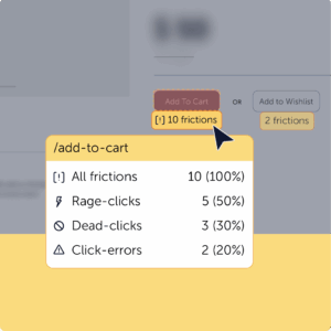
This pattern suggests that users expect the button to respond but encounter issues during the interaction. The cause might be a slow response, a broken event trigger, or an interface issue that prevents the action from completing.
By identifying these signals early, teams can quickly investigate the problem and fix the underlying UX issue before it affects conversions.
Example 2: Discovering hidden friction on a landing page
Friction heatmaps can also reveal when users interact with elements that were never intended to be clickable.
When the team at Scotts Miracle-Gro analyzed their landing page, they noticed strong engagement across the page. Visitors were scrolling through the content and interacting with several sections of the design. However, Mouseflow revealed an unexpected pattern.
Users were repeatedly clicking on retailer logos and product images, even though those elements weren’t clickable. Instead of interacting with the intended CTA buttons that directed users to retailers, visitors were attempting to click the visual elements surrounding them.
This type of interaction is often captured as dead clicks in a friction heatmap. The pattern revealed a usability issue: the visual hierarchy suggested that the logos and product images were interactive, while the actual CTA buttons were less prominent.
After identifying this friction, the team redesigned the landing page to make the CTAs more visible and reduce the emphasis on non-clickable elements. The updated page kept the same level of engagement but guided users more effectively toward the intended actions.
This example highlights how friction insights can uncover subtle UX issues that traditional analytics tools like GA4 might overlook.

“We took what we learned from Mouseflow the previous year and made changes that drove more meaningful engagement with the CTAs in this year’s campaign, helping people find exactly what they needed.”
Putting friction heatmaps to work
Friction heatmaps are particularly valuable on pages where user interactions directly influence conversions. By highlighting frustration signals, they help teams quickly identify elements that interrupt the user journey.
In practice, friction signals can appear anywhere users interact with a page. However, certain areas tend to surface friction more frequently because they involve critical actions or interactive elements.
-
Landing page CTAs
Call-to-action buttons are one of the most important elements on a landing page. If users repeatedly click a CTA but nothing happens, friction heatmaps often show clusters of rage clicks around that button.
This can indicate a slow response, a broken interaction, or unclear feedback after the click. In other cases, friction signals may appear around nearby elements, such as images or headings, suggesting that users expect those elements to be clickable instead of the CTA.
-
Signup forms
Forms are another common source of friction. Users may repeatedly click the submit button only to encounter validation errors or unclear requirements.
Friction heatmaps can highlight clusters of error clicks around specific form fields, helping teams identify confusing form inputs, overly strict validation rules, or missing feedback messages that prevent users from completing the signup process.
-
Checkout flows
In ecommerce experiences, even small UX issues during checkout can significantly impact conversion rates.
Friction heatmaps can reveal repeated clicks on payment buttons, shipping options, or confirmation actions that fail to respond as expected. These signals often point to slow loading interactions, payment errors, or unclear confirmation feedback during the checkout process.
-
Navigation and menus
Navigation should help users move through a site easily, but friction heatmaps often reveal when menus or navigation elements behave unexpectedly.
For example, users may repeatedly click a navigation item that does not expand or leads to an unexpected page. These frustration signals can highlight broken links, confusing navigation labels, or inconsistent menu behavior across devices.
-
Visual elements that look clickable
Sometimes friction doesn’t come from broken functionality but from misleading visual cues.
Users may repeatedly click images, icons, product cards, or logos that visually appear interactive but are not actually clickable. These dead clicks often reveal a mismatch between user expectations and the design of the interface.
-
Dynamic UI components
Modern websites frequently include interactive elements such as dropdown filters, tabs, carousels, or product configurators.
Friction heatmaps can reveal when users attempt to interact with these components but encounter issues, for example filters that fail to update results, tabs that don’t switch content, or sliders that don’t respond properly to clicks.
-
Mobile usability issues
Friction heatmaps are also especially useful for identifying issues on mobile devices, where small design details can have a large impact on usability.
Users may repeatedly tap small buttons, icons, or menu items that are difficult to interact with on smaller screens. In some cases, page elements may overlap on mobile layouts, preventing users from tapping the intended target.
By analyzing friction patterns across devices, teams can identify mobile-specific UX issues and improve the experience for users navigating the site on smaller screens.

Key insights you can unlock with a Friction Heatmap
Friction heatmaps turn frustration signals into actionable insights. They help teams move beyond simple engagement metrics and understand where the experience breaks down.
Some of the most valuable insights friction heatmaps provide include:
- Identifying frustration hotspots where users repeatedly encounter issues
- Detecting broken or unresponsive elements such as buttons or links
- Revealing misleading design patterns that cause dead clicks
- Uncovering form and checkout friction that blocks conversions
- Prioritizing UX and CRO improvements based on real user behavior
Friction heatmaps vs. other Mouseflow heatmaps
Each type of heatmap reveals a different aspect of user behavior. For example, click heatmaps show where users click most frequently on a page, helping teams understand which elements attract attention.
Scroll heatmaps reveal how far users scroll down a page and where engagement drops off.
Movement heatmaps track cursor movement patterns that often correlate with user attention.
Attention heatmaps help teams analyze how long users spend engaging with specific sections of content.
When analyzing dynamic interfaces such as dropdowns, filters, or modals, interactive heatmaps reveal interactions that traditional heatmaps often miss.
Finally, geo heatmaps visualize where visitors come from geographically, helping teams understand regional behavior patterns.
Together, these heatmaps provide a comprehensive view of user behavior. Friction heatmaps add an important layer by highlighting where the user experience breaks down.
See the bigger picture of user frustration
User frustration rarely appears as one obvious issue. More often, it shows up through small interactions that don’t behave as users expect. A button that fails to respond, a form that produces confusing errors, or an element that looks clickable but isn’t can all interrupt the user journey.
Friction heatmaps make these problems visible by highlighting the interactions that signal frustration. When combined with session recordings and other behavior analytics tools, they help teams move beyond guesswork and focus on improving the parts of the experience that matter most.