
What is eCommerce Navigation
eCommerce website navigation refers to how users move around and explore your online store. Visiting the homepage, browsing the deals section, clicking a menu item that takes them into the electronics category, and typing “iPhone” on the search bar –these are all examples of navigation.
By implementing effective navigation practices into a great website layout, you can guide visitors through their product offerings, categories, and checkout process with ease. The end goal: making the purchase experience seamless, so customers find exactly what they need and have a pleasant time purchasing. Metrics-wise, we are talking about increased engagement, higher conversion rates, and customer satisfaction.
To introduce a clear and simple navigation to an eCommerce store, you need to understand the concept of information architecture first – and clearly outline the information architecture for your eCommerce website.
eCommerce Website Information Architecture
If your store is well organized, customers will feel they have all the information they need about the products on sale and navigation will happen more easily.
This is related to eCommerce website information architecture, which serves as the backbone of the website, providing a clear structure that is reflected in the navigation. The name “architecture” is not accidental. Just as a physical store has lanes, shelves, and intercoms, online shops have categories, product pages, and tags.
If the architecture is clear and concise, it’s easier to organize the navigation that quickly leads the user to the desired items. The wider the variety of goods that an online store sells, the more thought should be put into its information architecture.
And all this is especially relevant for online shops that serve multiple groups of items. Think handcrafted jewelry shop as opposed to a department store – the first has an easier time guiding the customer since it presents fewer options. However, it only means that the department store should put more thought into how it’s organized.
eCommerce Information Architecture Elements
Let’s delve into the various elements of information architecture commonly found in eCommerce website navigation:
1. Parent Categories
Parent categories serve as the main high-level divisions of products or services offered on the eCommerce site. “Parent” here means that it has “child” categories, more commonly referred to as“Subcategories” (more on them later on).
These top-level categories represent broad groups that help users quickly identify the main areas of interest. For example, in a clothing site, parent categories may include “Men’s Clothing,” “Women’s Clothing,” “Kids’ Clothing,” and “Accessories.”
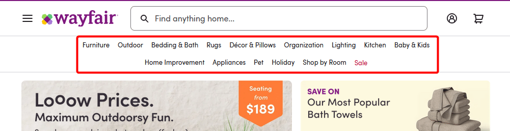
Example: Wayfair showcases product parent categories on an horizontal menu up top. There are many items (15), but the generous spacing helps with readability. And only one is highlighted, in red. Source
2. Subcategories
Subcategories provide more specific divisions within each parent category.
Using the same clothing store example, subcategories under “Men’s Clothing” could include “T-shirts,” “Shirts,” “Pants,” “Jackets,” and so on. Subcategories help users further narrow down their search and explore relevant products. They are typically displayed in dropdown menus or expandable submenus within the main navigation.
And subcategories can, in turn, have their own subcategories, and so on, in a tier system. The depth of this rabbit hole depends on the range of your products and how precisely you want to organize them. A rule of thumb is: if you only have more than a handful of items of the same type, maybe it’s worth bundling them into a category or subcategory.
Example of multi-tiered categories: “Men’s Fashion” > “Clothing” > “Shirts” >“T-shirts”.
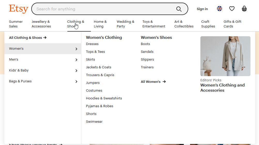
Example: Etsy offers an impressive assortment of subcategories for each parent category on a mega menu. To avoid overwhelming the user, the layout is clean and organized into lists. Source
3. Tags and Labels
Tags and labels provide additional ways to organize and navigate products within an eCommerce site. They are keywords or descriptors assigned to products to classify them based on specific characteristics.
For instance, a clothing store might use tags like “casual,” “formal,” “summer collection,” “eco-friendly,” etc., to help users discover products based on their preferences or specific themes. But also, it makes sense to use tags for colors, sizes, and certain features. So, “green”, “size: 42”, and “pockets” can also be tags.
Tags are often displayed alongside products, allowing users to click on them and explore other items with similar attributes.
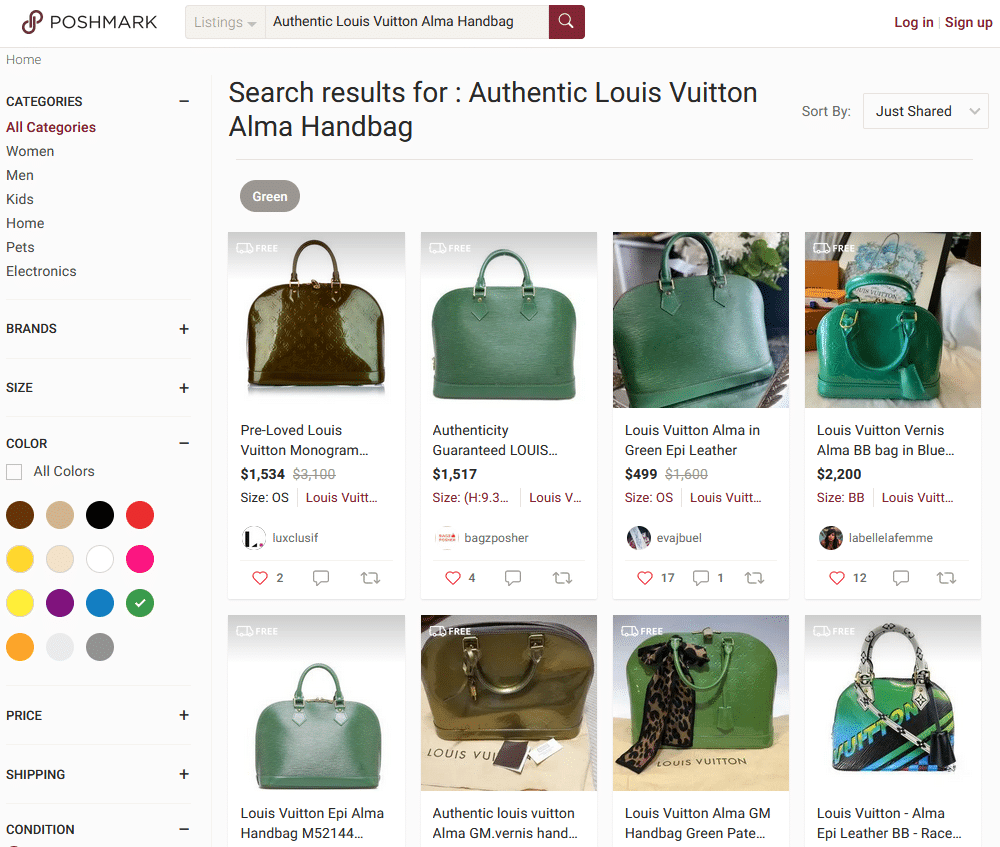
Example: This Poshmark search includes only bags with the label “Green”. It shows how labels can help refine searches in very specific conditions. Source
4. Product Pages
Product pages showcase individual items within an eCommerce site’s inventory. Each product page contains detailed information about a specific product, including images, descriptions, specifications, pricing, and customer reviews.
Product pages are crucial for providing a comprehensive view of the offerings and facilitating the purchasing decision. Users often get to product pages by selecting the appropriate parent category and subcategory or by searching for something and going through the search result page.
Just as you would examine a product closely in a physical store, customers can view multiple images and read detailed descriptions on the product page to make informed purchasing decisions. And since in online stores you can’t try out physical goods, this information is extra important. Also, the product page is usually the place where the user adds a product to the cart.
Read our blog post on eCommerce Product Page Optimization to learn more about what visual assets to add to such pages, what to include in descriptions, and what other optimizations you can do to increase conversions.
5. Filtering and Sorting Options
To enhance user experience and facilitate finding and comparing specific products, eCommerce sites often include filtering and sorting options.
Filtering allows users to refine their search based on various attributes such as price range, size, color, brand, and more. Visually, filters are usually signaled by a funnel icon. Tags and labels are introduced mostly for filtering purposes.
Sorting options enable users to arrange the displayed products based on factors like relevance, price, popularity, customer ratings, and more.
Both features are typically available as interactive elements within the navigation or sidebar of the search results page or category pages.
One thing to note is that they might or may not work in tandem: shoppers can both filter and sort the list at the same time. Be it as it may, it’s important to communicate very clearly if either feature is active.
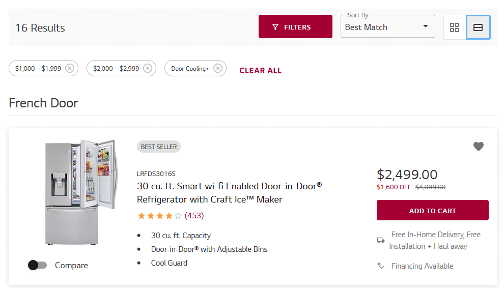
Example: LG’s online store showcases a very clean example of a filter with multiple parameters (here, with a price range and a feature) as well as sorting (here, by “Best Match”). Source
6. Breadcrumbs
Breadcrumbs are a navigational aid that shows the user’s current location within the website’s hierarchy. They display the path the user took to arrive at the current page, typically shown as a series of clickable links.
An easy way to picture them: when browsing files on your computer, for all intents and purposes the explorer shows breadcrumbs. Example in Windows: C:\Users\John\Downloads\
Breadcrumbs are especially useful in eCommerce websites with deep hierarchies as they provide a clear way for users to retrace their steps and easily navigate back to higher-level categories or search results.
When utilized correctly, breadcrumbs provide a sense of orientation, helping customers explore different product lines, lowering frustration, and increasing retention rates.
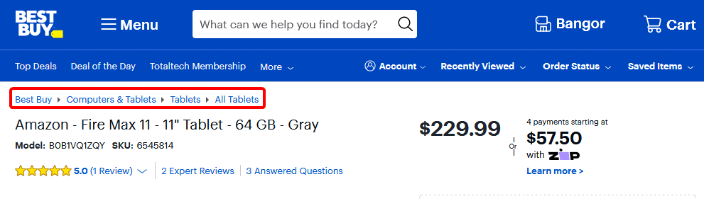
Example: With so many categories, subcategories, and items to sell, Best Buy’s website would be very confusing without breadcrumbs. In this photo, we circled the breadcrumbs in red. Source
7. Search Bar
A prominent search bar is an essential element in eCommerce navigation. It allows users to directly search for products or specific keywords, providing an alternative method for finding items quickly.
Search results should be relevant and displayed in a user-friendly format to help visitors easily locate desired products.
Just as you would inquire about a specific product or category to a human being at a bookstore, customers can type keywords or phrases into the search bar to find what they are looking for quickly.
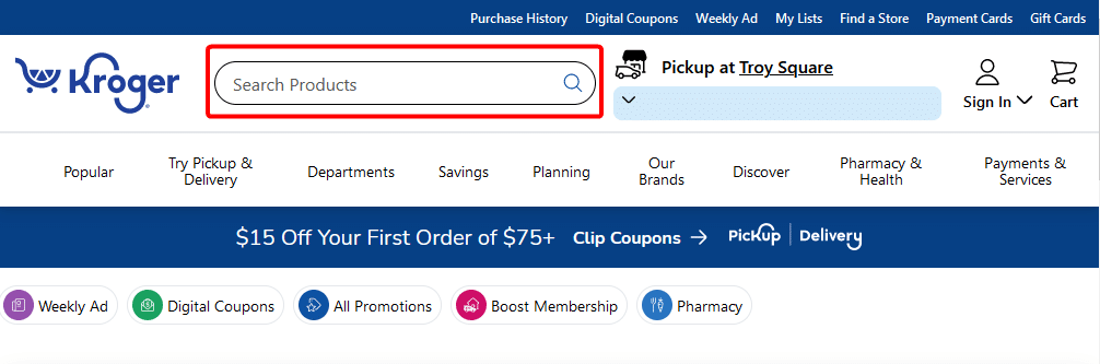
Example: Kroger places the display bar in a premium position, next to the logo. They use a common technique: the placeholder text (here, “Search Products”) that instructs the user on how to use this particular element. Source
8. Featured and Promotional Sections
Featured and promotional sections on an eCommerce site are equivalent to eye-catching displays or special sections in a physical store.
Just as physical stores may have featured products or seasonal promotions in prominent locations, eCommerce sites highlight these items on their homepage or dedicated sections to attract customers’ attention and drive sales.
The importance of these sections can’t be understated: it’s prime real estate. It should be dedicated to your most important products and seasonal campaigns.
Types of eCommerce Website Navigation
In the list above, we discussed eCommerce information architecture elements. You may have noticed already, but one exciting aspect is that they can be displayed in many different ways. That’s why two online stores that sell the same items organized under the same labels can look radically different.
Let’s cover how to create distinct user experiences for similar elements: by choosing different types of eCommerce website navigation.
Navigation Menus
1. Horizontal Menu
The horizontal menu is the most common navigation element found at the top of a website, typically in the header section.
A horizontal menu displays a series of items (usually categories) in a horizontal layout, often with drop-down menus to access subcategories or specific pages. They provide easy access to different sections or product categories, allowing users to navigate through the website quickly.
A horizontal menu can be sticky, which means that it sticks to the top of the page once the user scrolls the page down, so that the menu is always accessible. Alternatively, it can be visible only when the scroll bar is at the uppermost position. In eCommerce, it’s considered a best practice to make the menu sticky, simplifying navigation for the users.
Pros:
- Intuitive and easy to use.
- Effective for displaying a small number of options.
Cons:
- Limited capacity.
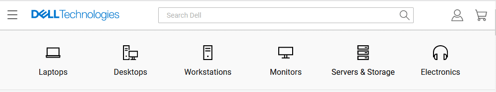
Example: Dell’s website showcases parent categories with elegant icons inside an horizontal menu. Note, that a horizontal menu in this case also incorporates a huge search field and icons to access the cart and the user’s account. Source
2. Vertical Menu
A vertical menu, also known as a sidebar or vertical navigation, is positioned on the left or right side of a webpage.
It presents a list of menu items in a top-to-bottom layout, usually with expandable submenus.
Vertical menus are particularly useful when there are numerous categories or subcategories to display, as they provide a compact and organized way to navigate through the website.
Pros:
- More room for navigation items.
- Very visible.
Cons:
- Takes valuable screen space (especially on smaller screens).
- Can be harder to read than horizontal menus.
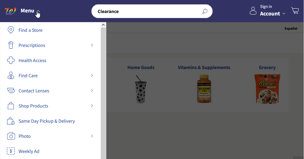
Example: Walgreens uses a long vertical menu. Certain categories (marked with an > icon) can be expanded to reveal subcategories within. Source
3. Mega Menu
A mega menu is an expanded version of a dropdown menu that displays a multi-column layout with additional information and visuals.
It allows for a more extensive display of categories, subcategories, and featured products. Mega menus are useful when an eCommerce website has a large number of product categories or wants to showcase specific items or promotions directly within the navigation menu.
Pros:
- Very flexible.
- Provides context – it can incorporate images and descriptions to give the user a better perception.
Cons:
- Can be overwhelming.
- Can slow down the website speed.
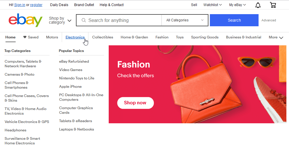
Example: of mega menu: By hovering over a category on Ebay.com, the user is presented with a massive mega menu including several items, columns, and images. While it can be overwhelming, it certainly reflects the wide variety of items available for purchase. Source
4. Hamburger Menu
The hamburger menu is a compact and minimalist icon consisting of three horizontal lines stacked on top of each other.
It is typically positioned in the top corner of a website and expands into a fully-fledged menu when clicked.
The hamburger menu is useful for mobile-responsive designs or when space is limited, providing a clean and uncluttered navigation experience.
In comparison to all other menus, a hamburger menu requires an additional click to take the user to the desired location. However, it’s small, and doesn’t take up a lot of screen real estate, which is important on smaller screens.
💡One of the best practices of responsive design is to change a horizontal or a vertical menu into a hamburger menu upon shrinking to a certain screen width.
Pros:
- Saves space.
- Works well on mobile.
Cons:
- Requires additional clicks.
- Users may not pay attention to it.
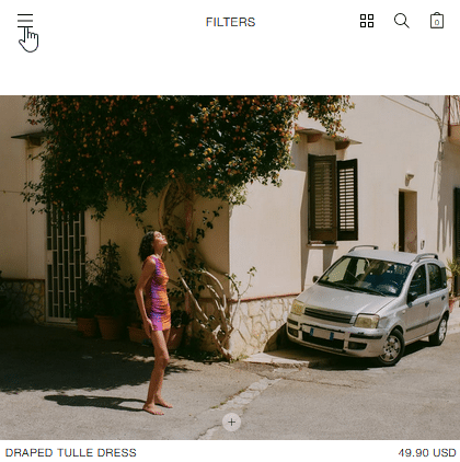
Example: The hamburger menu on Zara’s website is subtle and does not block any elements by default, helping in providing users with seamless mobile navigation. Source
5. Quick Links or Navigation Shortcuts
Quick links or navigation shortcuts are often located in prominent areas of the website, such as the header or footer.
They provide direct access to important pages, such as the shopping cart, user account, customer support, or frequently visited sections. Quick links improve usability by allowing users to quickly access essential features or perform common actions without navigating through multiple pages.
Pros:
- Simplifies user journeys to key pages.
- Highly customizable.
Cons:
- Takes valuable screen space in the header or footer.
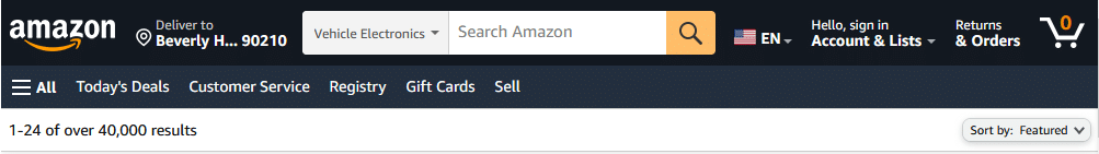
Example: Amazon’s header has so many quick links (delivery address, language, cart) that there’s little space in between. While not elegant, it certainly offers quick navigation to core pages. Source
6. Dynamic or Contextual Navigation
Dynamic or contextual navigation adapts to the user’s behavior or context to provide relevant navigation options. This dynamic nature makes them a key element in the personalization of the user experience.
For example, it can display recently viewed products, related items, or targeted recommendations based on the user’s browsing history or purchase behavior.
Dynamic navigation enhances the user experience by reducing the effort required to find relevant products. The chance of adding a related product to a cart is higher than for a random product, therefore, providing contextual navigation also increases cart value.
Pros:
- Personalized user experience.
- Can increase sales.
Cons:
- Hard to set up.
- Can be inaccurate.
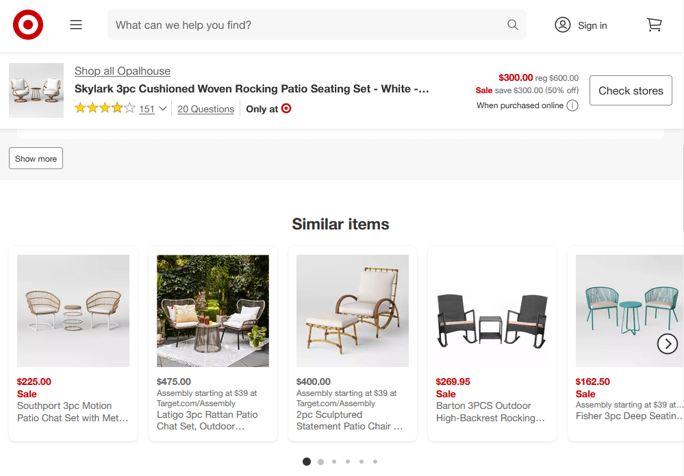
Example: Product pages on Target’s website have a “Similar items” section that helps users find what they are looking for. Source
Combining Different eCommerce Navigation Types
You absolutely don’t need to choose one option from the list. Or two. You can combine as many of them as you need to create a simple, straightforward navigation that helps your users reach their goals in their journey across your website, ultimately increasing sales and revenue.
We’ve already mentioned a couple of examples, such as a horizontal menu transforming into a hamburger menu on smaller screens. Some retailers such as Newegg are using as much as three navigation menus at once: a horizontal menu with quick links and a search bar combined with a vertical menu with categories and a hamburger menu that duplicates them both.
As long as it helps your customers get to where they want to, every navigation option is great. Note, however, that overloading your website with too many navigation options can be overwhelming for the user.
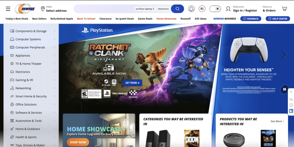
Example: Newegg uses both horizontal menu, vertical menu, and hamburger menu.
💡Understanding How Visitors Navigate Your Site with Mouseflow
After you have decided which information architecture and navigation options to use, it’s important to understand if they actually work as you want them to.
The best way to do this is use a behavior analytics tool like Mouseflow, and review sessions recordings and heatmaps.
The insights you can get from watching session replays of your website visitors include how real users’ journeys actually look, what prevents your customers from converting, and more.
Heatmaps are a great tool to understand how navigation elements are used: which buttons get clicked the most on certain pages, do users even notice the hamburger menu, and more.
Conclusion
eCommerce customers are increasingly overloaded with options, even in niche markets. In this fast-paced world, optimizing website navigation is the pathway to alluring them to stay, purchase, and come back.
It’s essential to understand how users move around your online store and explore all the tools you have at your disposal to engage them. That means organizing items efficiently into categories, labels, and more, and then using all the right elements to display the products.
By incorporating the best practices and examples of eCommerce website navigation discussed in this blog post, businesses can improve engagement, boost conversion rates, and achieve higher customer satisfaction.
For more eCommerce website optimization tips, check out our Definitive eCommerce Optimization Guide.