This post has been updated in June 2023 to reflect new techniques in addressing click-rage and click-errors
Imperfect user experiences (UX) can cost you a lot of potential revenue, users, and more. Nowadays, users expect websites and apps to work flawlessly, and when they don’t, it quickly leads to frustration. Users don’t wait long before switching to different tasks, abandoning tabs, canceling subscriptions, leaving websites, and finding alternatives that perform better for them.
If even a single element of the user experience that a website provides is not working as the user expects it to work, it can begin to cause friction. There are multiple types of website friction.
For example, Mouseflow, our behavior analytics platform, detects five types of friction events by default:
- Click-errors
- Click-rage
- Bounce
- Mouse-out (when the cursor leaves the tab)
- Speed-browsing
There’s also custom friction, where you can specify your own definition of friction events, such as landing on a 404 page, for example. You can learn more about friction from our Friction Score page. In this post, we want to focus on the two most notorious types of friction:
Out of all tracked friction events, these two likely indicate that something is broken on the website, or at least not working as intended.
Click-errors and click-rage hit users the hardest, sometimes rendering websites completely unusable for them. Thus, you can consider chasing and getting rid of click-errors and click-rages as the lowest hanging fruit of using behavior analytics.
The Two Most Costly Types of Website Friction
What Is A Click-Error?
A click-error (also known as dead click) is a friction event triggered by a Javascript error on a website. It occurs when users encounter errors while attempting to interact with elements on a website, such as buttons or links.
Here are some examples of UX problems that can result in click-errors:
- A link that is not clickable;
- A button that is not working;
- A menu that is supposed to drop down, but it doesn’t;
- An input field where you cannot input anything.
Naturally, this type of broken micro-interactions is among the worst, and it heavily impacts conversions. Basically, if the “add to cart” button doesn’t work and throws an error, it comes as no surprise that sales are not showing exciting figures.
What is Click-Rage?
Click-rage is a situation when a user clicks or taps a website element multiple times in a short period of time, likely because of frustration or impatience.
Examples of website UX problems that can result in click-rage:
- Unresponsive clickable elements
- Slow-loading page
- Non-intuitive navigation
- False buttons – when something looks like a button, but isn’t
In Mouseflow, we add a click-rage tag to a user session recording when a user is clicking 5 times on the same element in less than 1 second.
The difference between click-rage and click-error is that with click-rage, no Javascript errors are fired in the console. In fact, it can be that the website is working completely as intended – it’s just that it was poorly designed to start with.
If the user is rage-clicking, it likely means that they expect some feedback from a certain micro-interaction, and are not getting it. It could be that they think some element should be a button and try to click it, but it turns out to be not interactive. Or something just takes too long to load, and the user gets bored.
Whatever the reason is, getting rid of click-errors and click-rage can result in very significant improvements in both user experience and conversion rates. But to eliminate them, you need to find them first.
Spotting Click-Errors and Click-Rage with Mouseflow
As an integrated behavior analytics platform, Mouseflow offers a variety of tools that can help you identify click-errors and click-rage. They allow you to see exactly where these friction events happened, what led to them, and even try to save the users’ experience if something like that happens to them.
Here’s how you can use different behavior analytics tools to deal with click-errors and click-rage.
Use Heatmaps to Determine Which Pages are Affected the Most
You can use heatmaps and filter out click-rage or click-error to see where exactly these events happen. If, for example, you decide to filter out heatmaps with click-rage, you’ll get an overview of pages sorted by the amount of click-rage events. This way, it’s easy for you to know where to pay attention.
 Filtering out heatmaps in Mouseflow can show on which pages click-rage happens more often
Next, once you look at a click heatmap of a specific page, you can select, for example, click-rage – and see on which elements most click-rages happen.
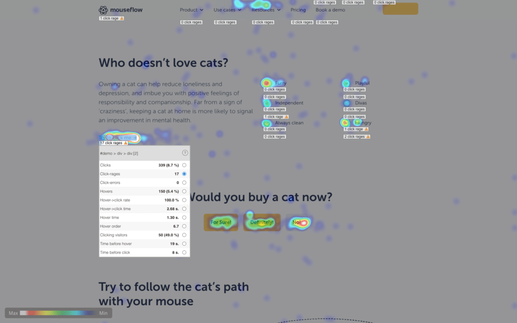 On Mouseflow’s demo page, we’ve set up the “Try to click me” button to be not clickable. As a result, you can see that there’s a lot of click-rage events happening on it.
That gives you knowledge of which elements on the website to inspect. Look for some Javascript errors related to them. Fixing these errors would help restore the micro-interaction as it was designed to be, and improve the user experience.
We would recommend setting up notifications, so that you get a message on Slack or email whenever a click-error occurs. The faster you fix it, the more conversions you are going to save.
Use Session Recordings to Understand What Happened
Sometimes, identifying the page where certain friction events happen more often is not enough. You need to understand what exactly led to them – the sequence of events that led the user to a click-error or a click-rage event. Understanding their journey could also help understand their expectations – and knowing them can help you fix the problem.
For that, you can use Mouseflow’s session replay tool. Just as with heatmaps, you can filter out session recording with this or that friction event.
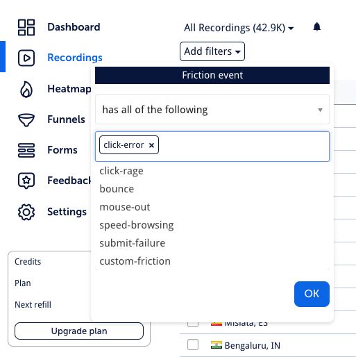
See all sessions where friction events happened:
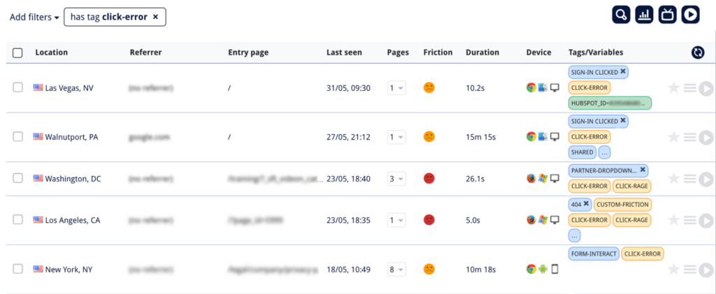
And see where exactly in that session the event happened:
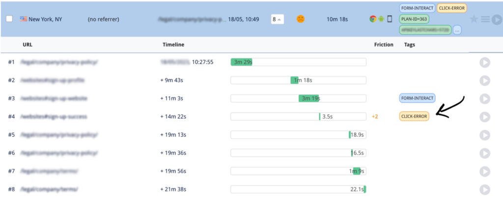
Watching a session replay gives you the opportunity to step into the user’s shoes and see how they got to the point which resulted in a click-error or provoked click-rage. The more context you have, the easier it is to understand how to fix the problem.
Bonus! 🎉 How To Save The User’s Experience After Encountering a Click-Error Or Click-Rage
You can not only analyze the sessions that happened in the past to find and eliminate click-errors and click-rage on your website, but also try to proactively save the users’ experience even if they encounter one of these friction events.
For that, you can use our user feedback tool. For example, if a user encounters a click-error, you can use trigger a quick survey saying something like:
“Sorry! It seems you encountered an error on our site. If you require assistance, our friendly support team will be happy to help (help@support.com).”
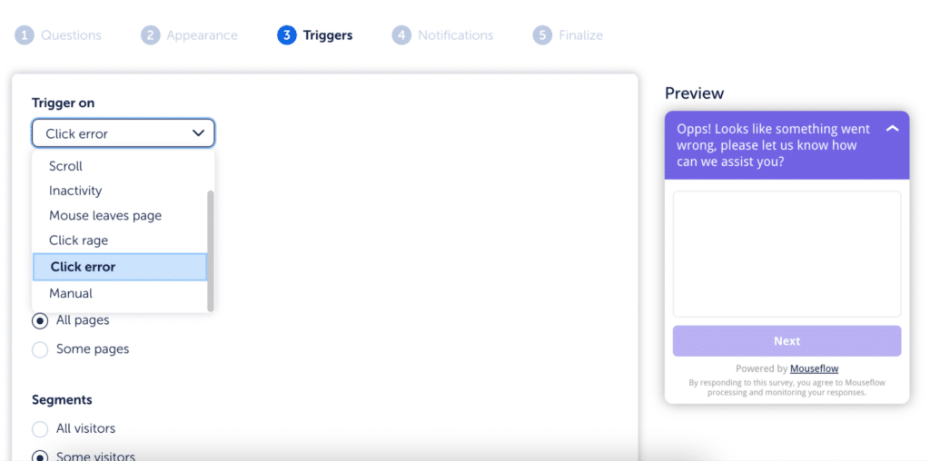 You can trigger surveys on various events, including click-rage and click-errors
On rage-clicks, you can use a different type of survey. We recommend setting up a question with multiple choice answers asking what the visitor is trying to do on your site, and if possible, offer them several alternative ways to achieve this result.
Maybe they can talk to the support team, or maybe there’s a shortcut in the user journey that you know about and that would help them achieve their goal. Solving the visitor’s problem will once again turn a negative experience into a positive one.
 Example of a survey launched upon encountering a website friction event
Conclusion
Enhancing user experience is an ongoing endeavor for marketers and UX researchers. By understanding and addressing friction events such as click-rage and click-errors, you can create a frictionless user journey that drives engagement and boosts conversions. By the way, here are 5 other ways you can boost them.
Click-errors and click-rage are the two most notorious friction events, and to ensure the best user experience, we suggest that you pay attention to their occurrence and try to eliminate their causes on a regular basis.

