Many of us have been to a restaurant and we generally expect to see a menu there. The purpose of this menu is to inform the patron of all that’s available to them. How this menu is designed will determine not just if the customer will eat there but also what specifically they’ll eat.
Many of the strategies applied in developing a physical restaurant menu can be applied to the design of your navigation bar. Here’re the website navigation best practices that every website designer ought to pay attention to when creating a website menu:
- Use descriptive labels
- Try an extended menu design
- Serial position effect
- Optimize according to device and data
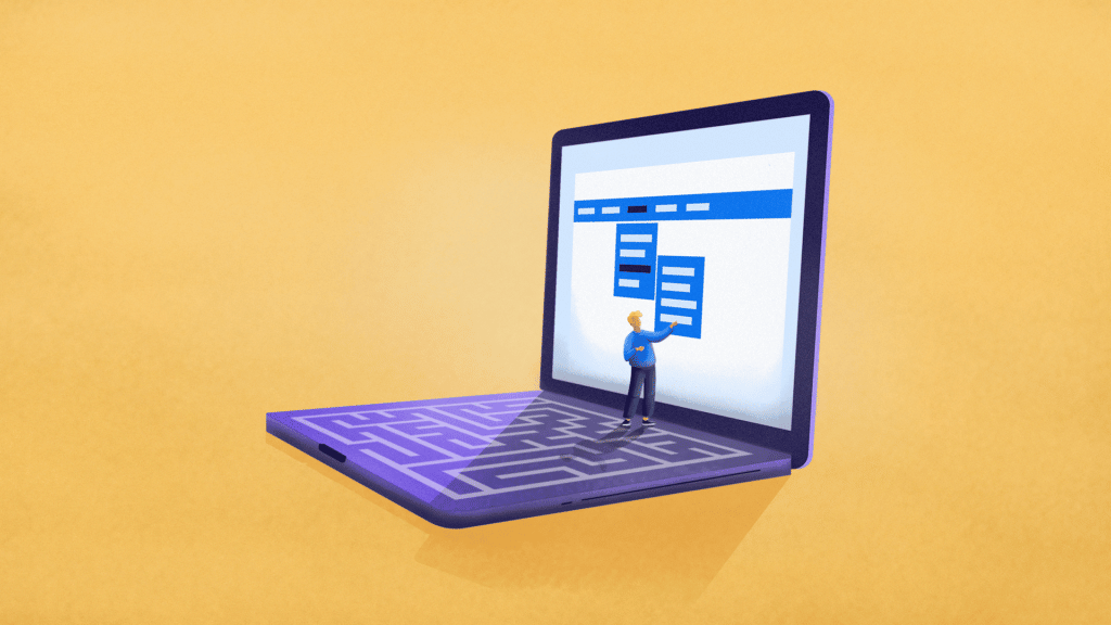
Serial Position Effect
The order in which objects appear plays a significant role in how well we will remember them. The serial position effect says that items at the beginning and the end of any given list are more likely to be remembered than those in the middle. The primacy effect and the recency effect together form the serial position effect.
- Primacy Effect: the ability to remember the beginning of something
- Recency Effect: the ability to remember the end of something
Because of this, the first and last menu labels of your navigation structure will naturally stand out the most. That’s not to say no one will engage with the other buttons. The main point here is that your strategy ought to consider what you want people to engage with first. Chances are very high that the first button on any given menu has the highest click rate compared to all other buttons on that page.
It is important to prioritize the items in your website’s navigation menu, with the most important items at the beginning and the least important items in the middle. This helps ensure that users can easily find the most important content on your website first and can easily access the contact page when needed
Now think about the “Home” label on your menu. Since we’re limiting the navigation bar to up to seven labels, every label must be well thought out. We’re entering a digital age where the “Home” label is no more. Many businesses are opting to omit the “Home” label and use their company logo as a button to navigate to the home page.
Digital real estate is highly valuable. Avoid using the limited space you have for concepts that are already universally known. If your audience is likely to understand that clicking the company logo will send them to the home page, there’s no need for a “Home” label in your menu bar. Use that space to link to a high ticket item or some other web page that’ll move your site visitors along the buyer journey.
Want to understand where your users are clicking in a menu or on a particular page to adjust navigation? You can use click heatmaps for that.
Optimize According to Device and Data
The best way to know how something is working is to look at your data. If your website analytics tool tells you that most of your website visitors are coming to your site via a mobile device, there are some things you’ll have to pay closer attention to.
If you see three horizontal lines stacked upon each other, that’s the hamburger menu icon. Some audiences using a mobile device, such as a phone or tablet, might get confused and not understand that this is indeed the website menu. Know your site visitors and decide if a button that says “Menu” or some other design makes the most sense.
Even though the first button is likely to get the most engagement, you still need to pay attention to which web pages are getting the most traffic. Pulling from the mega menu design example, you might find that the “Pescatarian” and “Vegetarian” pages under the “Dietary” label have minimal traffic. At the same time, the “Vegan” label has a lot of clicks. This is a signal that your website traffic may benefit from rearranging the navigation structure to highlight “Vegan” instead of “Dietary.”
To quickly get a grasp of which menu item is getting the most clicks, you can use interactive heatmaps that reflect link clicks even for dynamic menus.
Wrapping Up
There is so much more to talk about when it comes to designing the best navigation structure. The only way to know for sure if a strategy works for you is to experiment with different ideas. To sum it up, here are the main website navigation best practices:
- Use descriptive labels: Avoid generic terms and incorporate keywords into your labels. This will tell your audience exactly what they’ll find on the page and it’ll boost your SEO ranking.
- Try an extended menu design: When your main navigation bar is approaching seven labels, it’s time to consider menu extensions. Avoid overusing dropdown menus and explore the mega menu option if you have many, many links.
- Serial position effect: Use the natural functions of the brain to your advantage. Leave the most important items at the beginning and end of your lists to encourage navigation to specific web pages.
- Optimize according to device and data: Your data will tell you what is working and what isn’t. As you experiment, change your design and website menu options to complement the natural flow of traffic to and around your website.
FAQ
The term website navigation refers to the set of elements on the website that help users move around and explore the different sections or pages of that website. These elements include menus, links, buttons, or other interactive elements that enable users to move across the website.
The purpose of website navigation is to provide users with a clear and intuitive pathway to find the content they are looking for.
Creating a good navigation for your website involves a lot of research and several key considerations:
- Website navigation should be simple and intuitive. The user should be able to easily understand it and use it without confusion. Use clear, descriptive labels and organize the navigation in a logical hierarchy, placing important or frequently accessed pages where it’s easy to find them.
- Consider using standard navigation patterns and conventions to make it familiar and predictable for users.
- Make sure the navigation is responsive and works well on different devices and screen sizes.
- Use behavior analytics to test and optimize your navigation based on users’ behavior patterns to improve it and make sure it remains user-friendly.
Here are the four navigation types that are most widely used on the modern websites:
- Horizontal navigation: This type of navigation is placed at the top of the page and consists of a horizontal menu bar.
- Vertical navigation: Vertical navigation is usually displayed on the left side of the webpage and consists of a vertical menu with a list of links items that users can click to navigate through the website.
- Dropdown menus: Dropdown menus are often used in conjunction with horizontal or vertical navigation. When a user hovers or clicks on a menu item, a list of additional options or subcategories appears in a dropdown format, allowing the users to navigate deeper without moving to another page first.
- Hamburger menus: Hamburger menus are often used for responsive design. They look like a button with three horizontal lines and are typically placed in the top corner of the webpage. When clicked, the menu expands like a dropdown menu to reveal the navigation options.
