- What is website redesign?
- Redesign or update: What’s the difference?
- How to know if you need a website redesign
- 7 questions to ask before redesigning your website
- Putting it together – making a website redesign proposal and strategy
- Your website redesign checklist
- Evolutionary website redesign: Using Mouseflow to convert like crazy
- FAQ: Website redesign
Why should you want a website redesign?
- You recently completed an overhaul of your brand identity and need to redesign your website to reflect this.
- It’s been a few years since your last website update, and you feel like your site looks outdated compared to competitors’ sites.
- You’re looking to react to user experience (UX) issues or declining commercial metrics.
In reality, the reasons why you should redesign your website will often overlap.
The good news is that a website redesign has the potential to transform your online metrics and help your business grow. In contrast, if your website redesign is poorly done, it has the potential to sink you for good.
Read on to learn how to do it right!
The most effective path to a successful website redesign is to put your customers at the heart of what you’re doing.
This guide will look at how you can address your customers’ needs both with the initial design and on an ongoing, long-term basis.
What is website redesign?
A website redesign is a significant update to things like :
- Code
- Color scheme and branding
- Information architecture (IA) and navigational structure
- Core content messaging
The specific objectives of your redesign project will depend on the reasons you’re considering a redesign in the first place.
You might be looking to:
- Improve your bounce rate or other behavior metrics
- Focus your customers’ attention on key messages and remove distractions
- Grow your revenue
Redesign or update: What’s the difference?
Before doing anything, you must recognize and plan for the scale of your project.
It’s common to see the terms website update and redesign used interchangeably. However, it’s crucial you know the difference, especially if you’re inexperienced at dealing with web design projects.
In general:
- A website redesign is as described above. It’s typically a large-scale project during which you will overhaul the appearance and look of your website. A website redesign might include backend tasks like server migrations or new content management system (CMS) development. For instance, we’ve redesigned our website completely in 2022, as we’ve introduced a new brand.
- A website refresh is typically a smaller set of actions. You might tweak specific page templates, update typography and font sizes, and tweak the wording of your calls to action (CTAs).
Use a redesign to establish your website’s visual identity and a foundation for your brand. Then, longer-term, you use refreshes to make slight tweaks based on usability testing and heatmap data.
How to know if you need a website redesign
Ask yourself these questions:
- Does your website design look outdated? Compare with your competitors. Whose website looks the most modern? How is it built up? Do they use any plugins worth using on your site?
- Are your conversions, sales, or behavior metrics decreasing? This will be easy to identify from both your backend and your web analytics platform.
- Have you received negative feedback or full-on complaints about UX problems or design issues? You may have received these privately, via social media, or even on review platforms like TrustPilot.
If you answer “Yes” to any of the three questions, you should consider a redesign.
Of course, you may need to consider other factors, such as having a usability issue on a specific browser. Take note of these if that’s the case, and ensure it’s included in your plan for your new design!
7 questions to ask before redesigning your website
The most significant shortfall with many website redesign projects is that they’re aimless. That’s how they end up sinking businesses online rather than rejuvenating them.
Below, we look at seven questions you should ask before redesigning your website and what you should think about when planning your project.
You might not know the answers to some of them, and that’s okay. But at least thinking about them will ensure your redesign project hits the right track from day one.
Extra tip: Before asking strategic questions, you also need to ask technical questions. Developer or not, you need to have this in mind. These are questions like:
- What technology do you use? Does the redesign also require a shift in CMS/back-end system or do you like what you have?
- Is your page responsive? At least half of your visitors are likely on mobile. And with Google using mobile-first indexing, you definitely want a responsive site. This can take even more development time if your CMS is not geared for it.
1. Which pages on your current website deliver the most value?
You’re probably looking at a website redesign to help you fix things that aren’t working. Yet, there might be lots of good things happening on your website already. Therefore, the first step is to identify which pages on your site deliver the most value. We’re going to find this out using data.
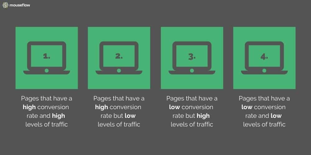
Using your web analytics tool, divide your main website pages into four types. If you’re using Google Analytics, Mouseflow, or another tool that shows you your conversion funnels, use these to measure the success of your pages.
Alternatively, use the Behavior – Site Content – All Pages, and Content Drilldown reports in Google Analytics if you want to learn the value of each page. Google Analytics’ multi-channel funnel analysis and Goals may also be useful stats.
We’ll call our four page types the Mouseflow Page Value Matrix:
- Pages that have a high conversion rate and high traffic. You don’t need to be a genius to work out these are the most valuable pages on your website – however, don’t go by gut feel. Look at the data – reality might surprise you. Your redesign should look to maintain these pages as much as possible, short of any uniform changes like rebranding. Try to redesign your site while keeping these pages’ structure the same. Remember that conversions don’t start and end with a purchase or a completed form. Pages that are a crucial part of goal flows or your conversion funnels and seemingly do “nothing” might be inspiring people to get closer to buying something. This is where your Google Analytics multi-channel funnels and Goals will provide you with significant value.
- Pages that have a high conversion rate but low traffic. These pages are just as crucial, as you’re getting conversions from a lower traffic baseline. Make sure you look after the structure of these pages during your redesign. When planning your new navigational structure, consider how you can get more traffic into these pages. Note: The data might be biased because of the low sample size if there isn’t a lot of traffic. Maybe only the most action-ready of your visitors specifically visit this site. So if possible, test if the conversion rate holds true at higher traffic levels.
- Pages that have a low conversion rate but high levels of traffic. These types of pages have the most potential for improvement. Still, in redesigning for better conversions, you need to ensure you maintain your traffic levels. Or if traffic reduces, it’s because you’re getting better targeted and more relevant traffic. You can afford to play around and try different things when redesigning these pages.
- Pages that have a low conversion rate and low traffic. These pages are an even more significant opportunity if you want to try experimental design and templates. Also consider whether it’s worth your time redesigning them. If they’re such low value, can you just delete them and simplify your website structure?
You should also think about where traffic is coming from. Updating the design of a page that delivers a lot of organic search traffic is riskier than changing a page that you use as a landing page for pay per click campaigns.
2. Who are your website visitors?
Don’t assume this is the most straightforward question of the seven and immediately answer with whatever demographics make up your target audience. We’ll get to that shortly, but the first thing you need to know is the type of people visiting your website now.
This is something else you can learn from your web analytics and may be a crucial indicator of the direction you need to take with your redesign. For example, if you’re trying to sell products to women over 50, but most of your website visitors are men between 18 and 24, you know you have an issue with your marketing and targeting. You can address this in your redesign by updating things like content to do a better job of targeting the visitors you want to get.
Using Mouseflow’s heatmaps for segmenting your visitors
If you’re using heatmaps, using filters such as location can also give you some inspiration. For example, let’s say only have an English language website but get a lot of Spanish speaking traffic. The content they see is what Google Chrome’s translation gives them. You can expect to see your heatmaps all over the place and conversions low.
The answer? A specific design and content for your Spanish-speaking audience!
This is where your target audience comes significantly into play.
By creating buyer personas, you can imagine your target audience as users of your website. Everything about your redesign project then feeds into what they would expect from the UX when using your site.
3. Why do they visit your website?
Within your buyer personas, you should consider the reasons why people visit your website.
From a design and long-term conversions perspective, you still need to cater to customers who aren’t yet ready to buy.
If you don’t cater to visitors at different stages of your conversion funnel, you won’t have a funnel at all. It’ll be more like a sieve.
Ensure your design and content caters to the following customer behaviors:
- A desire to learn about the benefits of your brand or using your products or services
- A desire to contact you
- A desire to learn how to use your products or services
- A desire to buy your products or services
Think about:
- The specific purpose of each page on your website.
- The type of page each of your pages is. Is it there to help users navigate, learn, or transact?
- How do you move people from an informational page through your conversion funnel to a page where they make a purchase?
4. How do customers currently interact with your website?
Having data is excellent. However, while website performance metrics tell you how many people visit a page, click a link, or convert, they don’t tell you why they took or didn’t take a specific action.
By using heatmaps and session recordings, you can take a closer look at your website pages to identify friction points and areas that are effective. Seeing that a specific paragraph of copy makes users hesitate or inspires them to click through to a page is hugely powerful. It gives further context and meaning to the data you already have.
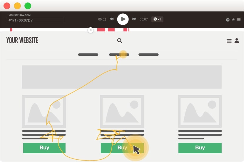
Crucially, it’ll enable you to approach your website redesign in a more well-rounded way and isolate features that work and don’t work. This will ensure you don’t replicate existing issues or inadvertently get rid of things that work well.
5. Who will be involved in your redesign project?
You redesign your website for your customers, but the project itself should be an internal project with lots of stakeholders.
Companies will often unveil a new website, and “go live” is the first time anyone other than the developer has seen it.
Why is this approach a mistake?
It makes it more challenging to get your team to buy into the concepts behind the new design, and often they’ll start to spot problems from day one.
Consider involving all people in your business who might need to use your website.
For example:
- UX, design, and development teams should interact from the start of the project, ensuring your objectives are achievable and that your project is planned efficiently.
- Content teams need to know how much space they have and how much content is required and what updates you want to make to your messaging.
- Marketing teams need to adjust campaigns and will likely want to have some input on design and UX elements that might tie into SEO.
- Sales teams might collate information about leads from your website’s backend. They need to know how to use it to ensure they can work effectively, especially if your website will use an API or integrate with a CRM system.
- Customer support teams will need to know what customers are referring to when dealing with online queries or those looking for information, especially if your website’s layout and structure will drastically change.
There’s a lot to consider there! The best approach is to gather each group’s thoughts before planning and then keep them involved at every stage of the process.
6. What will a successful redesign look like?
How you measure your redesign’s success will depend on the reasons you went ahead with a redesign in the first place.
However, being able to say, “our website now looks up to date,” probably isn’t going to fly with your finance director!
To measure whether your redesign has been successful, you will need to look at metrics. Set up a custom dashboard in Mouseflow and track your progress!
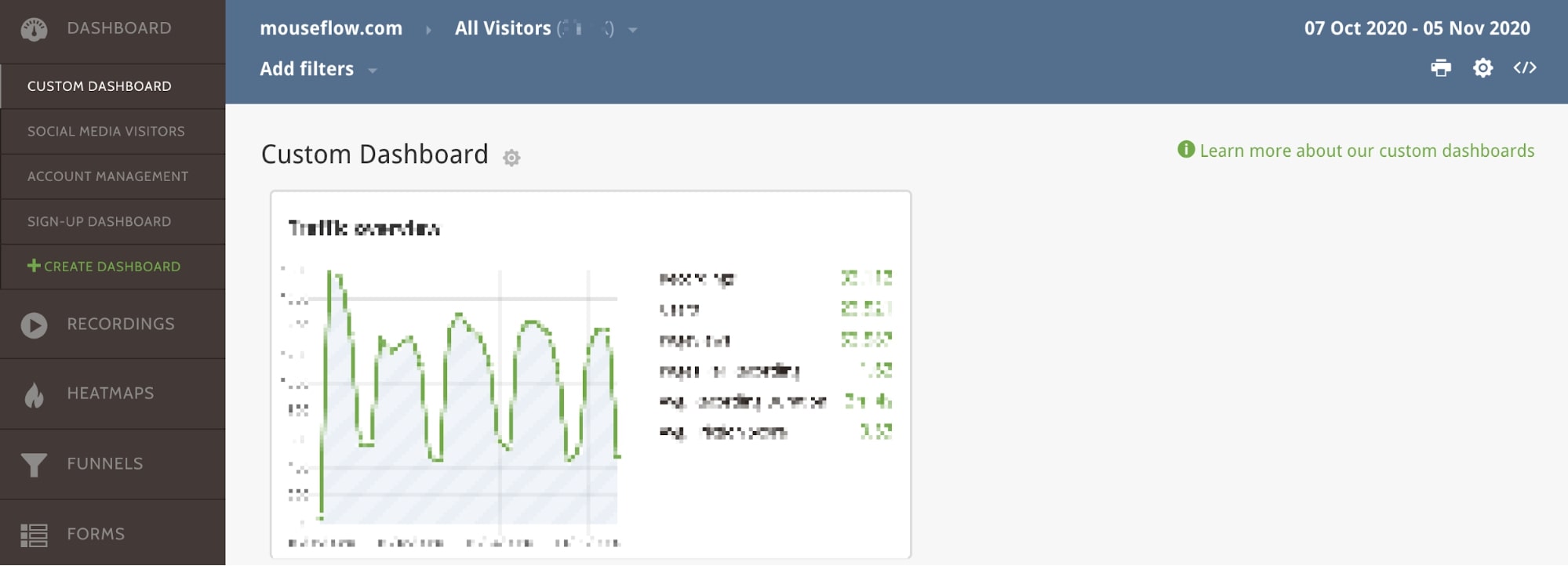
Don’t just think about traditional metrics you can get from your analytics platform, such as:
- Conversion rate
- Revenue
- Email newsletter sign-ups
- Goal completions
- Internal click-through-rate
- Average order value
Of course, those are all crucial, but you can also consider things like:
- Customer feedback. If you quantify your feedback into negative, neutral, and positive, check whether the balance changes after your design has gone live.
- If support requests relating to website issues decrease after you deploy your new design.
- Using Mouseflow’s interactive heatmaps and session recording to understand if your redesign influences users to act how you’d like them to.
We’ll look at the importance of benchmarking against your previous design shortly.
7. How will you test future ideas?
You don’t want to put yourself and your business through a full redesign every time you notice a trend from viewing your heatmaps or session recordings.
With that in mind, you should ensure that:
- Your redesign is put together in such a way that it’s easy to make tweaks in the future as you need to.
- You have a clear plan in mind for how you will deploy usability testing, A/B testing, and multivariate testing methods in the future. These will help you test ideas and make changes effectively when the data shows you an opportunity for improvement.
When testing new ideas in the future, go back to thinking about the pages that deliver the most value. Trial changes on lower traffic or lower converting pages first, before rolling them out across the site.
Putting it together – making a website redesign proposal and strategy
Once you know you’re going to proceed with a redesign, you may need to produce an in-house website design proposal or provide a strategy to the finance department for them to sign-off the project budget.
Whatever you create, this should become a working document that you use throughout the website redesign and relaunch process. Therefore, create it in Google Sheets or using another document collaboration platform. That way, everyone who needs to be involved or know where you’re at with your project can access the data.
Four things to include in your plan:
1. Benchmarking current performance
The first thing you should do is isolate the performance of your current website. The easiest way to do this is to annotate Google Analytics with the data your new site went live. Long-term, ensure you track any changes or updates in this way.
At the same time, export this data from your web analytics platform as a spreadsheet.
Once your new website goes live, you can easily use data comparisons to see how your new design is performing, but having this data can also help you to:
- Catalog your website, and in particular, identify any low-value pages you might not want to keep.
- Cross-reference and set up technical elements such as 301-redirects if your redesign also incorporates URL structure changes.
2. Planning time and budgetary allowances
When planning a website redesign, it’s easy to:
- Go way over budget
- Underestimate how long it will take to get everything done
Plan out every element of your redesign, starting now with putting this strategy together!
Use the table below as a starting point for your plan!
| Action | Time Needed | Budget | Who? | Target Date |
| Create budget planner | 2 days | In-house | Project Manager | November 16th |
| Write strategic outline | 2 days | In-house | Project Manager | November 18th |
| Write action plan | 2 days | In-house | Project Manager | November 20th |
| Plan consumer research | 1 week | In-house | Design/UX team | November 27th |
| Create initial designs | 2 weeks | $2,500 for outsourced designer + in-house costs | Design/UX team | December 4th |
| Conduct first phase usability testing | 3 days | In-house | Design/UX team | December 11th |
| Content writing | 1 week | $1,000 for outsourced content & proofreading + in-house costs | Content team | TBC |
| SEO check | 2 weeks | $3,000 for external launch audit + in-house costs | SEO Manager | TBC |
3. Create a strategic outline
Your strategic outline should give you a top-line overview of your website redesign project. This doesn’t need to go into tremendous detail. However, it does need to be easy to interpret and follow.
Your strategic outline will look very similar to your budget plan above. Instead of time and money, adapt the table to focus on specific goals and what is needed to deliver specific tasks.
4. Create an action plan
Finally, you should create a detailed action plan of each specific action that needs to be completed, and by whom, alongside deadlines. This will help you keep your project on track from day one and ensure that each department delivers what they need to. Assign specific responsibilities to department managers and team leaders to enable yourself to have an overview of the entire project.
If you want to get even more detailed, you might have action plans for every page to ensure that each part of your website gets a specific review before launch.
Use the table below as inspiration for your action plan.
| Specific Task | Aims | Person Responsible | Target Completion | Date Finished |
| Keyword research | Identify new keyword opportunities to include in updated content | SEO Manager | January 11th | |
| A/B test new homepage | Identify via usability testing which version of our final homepage designs is preferred | UX team | January 11th | |
| Test new CTA buttons | Identify which CTAs are most effective based on the outcome of the homepage test | UX team | January 25th | |
| Write six new blog posts to support the redesign launch | Drive traffic to the site when the new design goes live with some low competition, keyword driven content | Content team | TBC | |
| Complete an SEO audit | Ensure new design maintains previous website structure; use staging environment | SEO Manager (outsourced SEO expert to complete audit) | TBC |
Bonus tip: Add all this to a collaboration platform
Once everything is finalized in Google Sheets or whatever platform you used, export all the tasks into Jira or a similar platform. Not only will this give you an overview of your entire redesign project, but people will also only see their own assigned tasks and not have to waste time finding the rows on a sheet that are relevant to them.
Remember, if your plan is robust, you could have hundreds of rows of actions on one sheet!
Your website redesign checklist
Print out the below table, which incorporates everything we’ve looked at in this guide, to use as a checklist to help you nail your website redesign.
| Task | Complete? |
| Do I need a website redesign? Is my site outdated, or have performance metrics dropped? | |
| Identify which pages drive the most value | |
| Identify who the audience is, and what they do on the website | |
| Use heatmaps and session recording to complement user data to identify the main areas for improvement | |
| Identify the key people in the business who need to be involved in the redesign process | |
| Clarify how we will measure if the redesign was a success | |
| Future plan for embracing evolutionary site redesign (ESR) and user testing | |
| Exporting data to benchmark and catalog existing content | |
| Creation of budget document and project timeline | |
| Creation of strategic project outline | |
| Creation of specific action plan per department | |
| Plan added to Jira or other workspace | |
| Project underway – ongoing management | |
| Project complete – sign-off and move to ESR | |
| Ongoing, long-term usability testing and updates |
Evolutionary website redesign: Using Mouseflow to convert like crazy
Once you nail your website redesign and move onto making periodic updates, that’s what’s known as evolutionary site redesign (ESR). Following ESR means that, rather than overhauling your website every few months, you evolve your website’s look and feel based on how users interact with it.
Which is where Mouseflow comes in!
When you use Mouseflow, you can use features like heatmaps and session recording to assess your design’s performance, make changes based on friction points and the places users give their attention, and convert like crazy!
Learn more about how Mouseflow can help you stay on top of your design and conversions using our training materials or get started with our 14-day free trial.
FAQ: Website redesign
Q: What is a website redesign?
A: A website redesign is a significant update to things like your website’s code, information architecture, navigation, and branding.
Q: What is the difference between a redesign and a website refresh?
A: While a redesign is a comprehensive revamp of your website, a refresh may look at more subtle details such as the typeface or size of font, or the positioning of call to action buttons.
Q: What is evolutionary site redesign?
A: Evolutionary site redesign is the practice of consistently reviewing your website’s performance using tools like heatmaps and session recordings to identify friction points and improve the user experience for your website visitors, leading to a better conversion rate.
