- What is eCommerce Optimization?
- How to Increase Sales Through Website Optimization
- Ecommerce Metrics and KPIs That Matter
- Understanding User Behavior and Friction
- Website Structure and Navigation
- Optimizing Product Pages for Conversions
- Improving the Checkout Experience
- Optimizing the Ecommerce Conversion Funnel
- Ecommerce SEO for Website Performance
- Conversion Rate Optimization (CRO)
- Building a Continuous Optimization Process
- Ecommerce Optimization Checklist
- Final Thoughts
- FAQ
Ecommerce growth doesn’t come from traffic alone.
You can double your visitors and still see no meaningful increase in revenue if your website isn’t doing its job. What actually drives results is how well your site helps users move from curiosity to purchase, without confusion, hesitation, or friction.
That’s what ecommerce website optimization is really about.
It’s not a collection of isolated tactics. It’s a system. One where navigation, product pages, checkout, and user behavior all work together to guide users through the journey, and remove anything that gets in their way.
In this guide, we’ll break down how to build that system and where to focus if you want to increase conversions and revenue.
What is eCommerce Optimization?
Ecommerce website optimization is the process of improving how your site performs once users land on it. Not in terms of traffic, but in terms of what users actually do.
- Do they find what they’re looking for?
- Do they understand your products?
- Do they move smoothly through the journey?
- Or do they hesitate, get lost, and leave?
That’s the difference between a site that converts and one that doesn’t.
Optimization sits at the intersection of user experience (UX), conversion rate optimization (CRO), on-site SEO, and behavioral analysis.
And the key idea is simple: instead of guessing what users need, you observe what they actually do, and improve from there.
How to Increase Sales by Optimizing Your Ecommerce Website
If you’re trying to increase sales on your ecommerce website, the instinct is often to look outward – more ads, more traffic, more campaigns.
But most growth opportunities are already on your site.
Users are visiting. They’re browsing. They’re even adding products to cart. And then they drop off.
Not because they don’t want the product, but because something in the experience breaks.
It might be unclear navigation, missing product information, lack of trust, or unexpected costs at checkout.
These are not marketing problems. They’re experience problems.
And once you start looking at your site this way – as a journey to optimize rather than a channel to feed – you begin to see where revenue is actually lost.
Key Ecommerce Metrics and KPIs to Track
Before you improve anything, you need to understand where things are going wrong.
Conversion rate is the obvious starting point, but on its own, it doesn’t tell you much. A low conversion rate could mean poor traffic quality, but it could just as easily point to issues on product pages, navigation, or checkout.
That’s why you need to look at metrics as a system.
Cart abandonment rate, for example, tells you where users hesitate. Bounce rate shows whether your landing experience matches expectations. Average order value gives you insight into how well your product pages and recommendations are working.
If you want to go deeper, you can explore how to structure and prioritize your ecommerce KPIs for measuring growth.
And if you’re still building your analytics setup, this guide on ecommerce analytics tools to drive sales gives a practical overview of how to actually collect and use this data.
The goal isn’t to track everything. It’s to track enough to understand where the experience breaks.
Understanding User Behavior and Ecommerce Friction
Most ecommerce teams think they understand their users. But what users say and what they do are rarely the same.
This is where friction comes in.
Friction isn’t always obvious. It’s not just broken pages or bugs. More often, it’s subtle: users scroll past important information, hesitate before clicking, or abandon a flow that should work.
You won’t see this in dashboards alone. You need to observe behavior. Looking at recordings, heatmaps, click patterns, and user journeys often reveals problems that traditional analytics never surface. Understanding how to analyze ecommerce user behavior systematically helps uncover where users struggle, what captures their attention, and why they leave before converting.
Once you start observing behavior, patterns begin to emerge. Users hesitate, abandon journeys, overlook important information, or repeatedly encounter the same obstacles. These moments are often signs of ecommerce friction, where small usability issues create enough resistance to prevent users from moving forward.
And if you zoom out, understanding how customer behavior is shaping ecommerce today helps explain why expectations around speed, clarity, and usability are higher than ever.
This shift is becoming even more pronounced as users grow accustomed to AI-driven experiences.
Whether it’s search, chat, or product discovery, people are getting used to fast, direct answers with minimal effort. When they land on an ecommerce site, they bring those expectations with them. If something feels unclear or requires extra effort to figure out, they don’t adapt, they leave.
Optimization starts when you stop assuming and start watching.
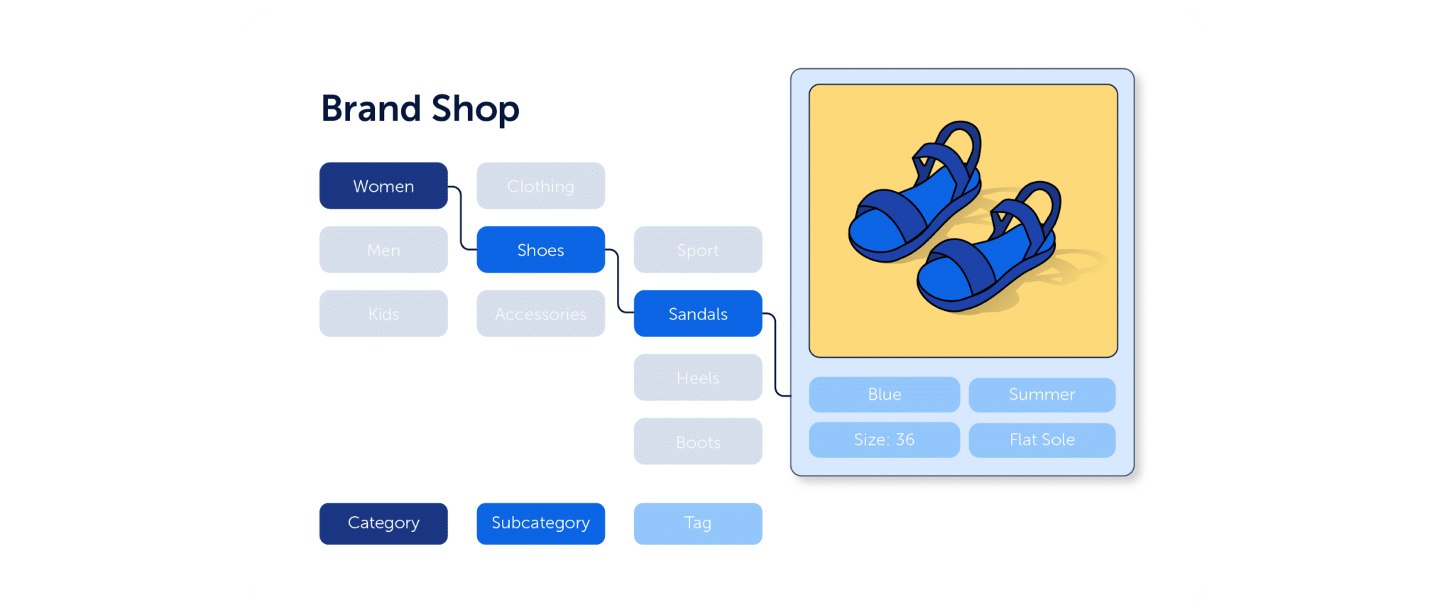
Ecommerce Website Navigation and Structure
If users can’t find products, nothing else matters.
Navigation is one of the most underestimated drivers of conversion. When it works, it’s invisible. When it doesn’t, users leave without hesitation.
The goal isn’t to build a clever structure. It’s to make the path to products feel obvious.
That means categories that match how users think, filters that actually help narrow choices, and search that returns relevant results.
This is where information architecture becomes critical. If your structure doesn’t reflect how users browse, you create unnecessary friction before they even reach a product page.
A more detailed breakdown of this can be found in this guide to ecommerce website navigation and information architecture, which walks through how to structure your site for real user behavior.
How to Optimize Ecommerce Product Pages for Conversions
Product pages are where decisions happen.
By the time a user lands here, they’re already interested. The question is whether your page gives them enough clarity and confidence to act.
Most underperforming product pages fail for simple reasons: the product isn’t clearly explained, key details are missing, or there’s not enough trust.
Strong product pages remove doubt. They answer questions before users have to ask them and make it easy to evaluate the product.
If you want to see exactly how to structure and improve each element, this guide to ecommerce product page optimization goes much deeper into what high-performing pages actually look like.
How to Optimize the Ecommerce Checkout Process
Checkout is where intent meets friction.
At this stage, users have already decided to buy. If they abandon, it’s rarely because they changed their mind about the product, it’s because something in the process made them hesitate.
Unexpected costs, forced account creation, or too many steps create just enough resistance to stop a purchase.
The goal is not to make checkout more advanced. It’s to make it feel effortless. Reducing steps, clarifying pricing, and removing unnecessary fields can have a measurable impact.
This is explored in more detail in this guide on how to improve your ecommerce checkout process and reduce drop-offs, where common friction points are broken down.
Ecommerce Conversion Funnel Optimization
Your website is not a collection of pages. It’s a funnel.
Users move through it step by step; from landing page to product discovery to checkout. And at each step, some of them leave.
Understanding this journey is what allows you to improve it.
Instead of asking how to improve a single page, the better question is where users are dropping off and why.
This is exactly what’s covered in this guide to understanding ecommerce conversion funnels, which shows how to map and analyze the full journey.
Once you see the funnel clearly, optimization becomes much more focused.
Ecommerce SEO for Better Website Performance
SEO is often treated as a traffic channel. But for ecommerce, it’s also a structure and experience problem.
If your category pages don’t match search intent, users leave. If your product pages aren’t clear, they don’t convert. If your internal linking is weak, users struggle to move forward.
Good eCommerce SEO aligns what users search for with what your pages deliver.
That alignment is becoming even more important as search itself evolves. Users are no longer only clicking through traditional search results, they’re increasingly interacting with systems that interpret, summarize, and recommend content.
That makes structure, clarity, and context even more important. Pages that are easy to understand, for both users and machines, are more likely to surface, whether through search engines or AI-driven interfaces.
This shift is changing how products are discovered online. As AI increasingly helps users evaluate options before they even visit a website, ecommerce teams have less time to build trust and answer questions once visitors arrive. Understanding how AI is changing ecommerce search and product discovery helps explain why clarity, relevance, and user experience are becoming even more important.
If you want to measure whether your SEO is actually contributing to revenue, this guide on ecommerce SEO KPIs and performance tracking goes deeper into how to evaluate impact beyond rankings.
Ecommerce Conversion Rate Optimization (CRO)
Conversion rate optimization is where everything comes together. It’s the process of improving your site based on evidence, not assumptions.
Instead of redesigning based on opinions, you test changes and measure their impact.
But before you start testing, it helps to understand what might be causing poor performance in the first place. A low conversion rate is rarely the result of a single issue. More often, it’s the combined effect of friction, weak product pages, unclear navigation, or breakdowns elsewhere in the customer journey. Understanding why your ecommerce conversion rate is low helps you focus your optimization efforts where they will have the biggest impact.
Once you have a clearer picture of the problem, these ecommerce CRO tests with immediate ROI provide practical ideas you can implement and validate through experimentation.
And for more platform-specific tactics, this guide on improving conversion rates for Shopify ecommerce stores shows how these principles translate into real setups.
The key is consistency. Optimization is not one test, it’s a process.
Continuous Optimization: Building a System That Improves Over Time
The biggest difference between average ecommerce teams and high-performing ones is not tactics. It’s how they approach improvement.
Instead of making one-off changes, they treat the website as something that evolves continuously.
Every change becomes a test. Every test produces insight. Every insight feeds the next improvement.
Over time, this creates a system where performance improves naturally.
Here’s a framework that you can use to implement this testing approach:
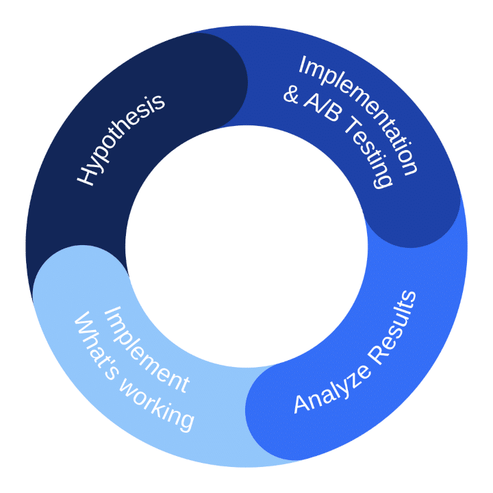
- Come up with a hypothesis. Start by developing a clear, testable hypothesis, for example: adding customer reviews to product pages will increase conversion rates.
- Implement and A/B test. Once you have a hypothesis, you can implement the proposed change. But rather than making the change across your entire website, use A/B testing to validate the impact and determine whether the change produces a measurable improvement.
- Analyze results. After running the A/B test for a statistically significant period, analyze the results by tracking changes in key metrics and use analytics tools such as heatmaps and session recordings to understand how the changes affect customer experience.
- Implement what’s working, adjust what’s not. If the test results confirm your hypothesis and show improved performance, implement the change site-wide.
- Start again. After concluding one test, start the process over again with a new hypothesis.
Ecommerce Optimization Checklist
By this point, the pattern should be clear. Optimization is not about doing more. It’s about removing what gets in the way.
If you want a structured way to apply everything in this guide, this ecommerce optimization checklist brings it together into a practical framework you can follow.
Final Thoughts
Most ecommerce websites don’t fail because of bad products or weak marketing. They fail because the experience doesn’t match user expectations.
Users don’t think in terms of funnels, UX, or CRO. They just want to find a product, understand it, and buy it without effort.
The closer your site gets to that, the better it performs.
And the only reliable way to get there is to stop guessing, and start understanding how users actually behave.
FAQ
To increase ecommerce sales, focus on improving how users move through your site rather than just driving more traffic. That means making it easier to find products, reducing friction in the buying journey, and ensuring product pages and checkout are clear and trustworthy. Even small improvements in usability and clarity can have a significant impact on conversions and revenue.
Improving your ecommerce conversion funnel starts with identifying where users drop off. Analyze each step, from landing pages to product pages to checkout, and look for points of hesitation or confusion. Once you understand where users leave, you can simplify the experience, remove friction, and guide them more smoothly toward purchase.
To improve conversion rate, focus on the parts of your website that influence decision-making. This includes product page clarity, trust signals, pricing transparency, and checkout simplicity. Instead of making broad changes, test specific improvements and measure their impact over time. Consistent, data-driven optimization is what leads to meaningful gains.
Friction can be identified by observing how users interact with your site. Look for signs like hesitation, repeated actions, or drop-offs in key flows – these are often indicators that something isn’t working as expected.
Tools like session recordings and heatmaps help reveal these patterns, but more advanced solutions can go a step further by automatically surfacing friction points across your site. For example, friction detection tools can highlight where users struggle, such as rage clicks, repeated form interactions, or areas with unusually high drop-offs.
Once you understand where friction occurs, it becomes much easier to fix, whether that means simplifying navigation, clarifying product information, or removing unnecessary steps in the user journey.