
Heatmaps make complex behavior easier to understand. They highlight where users interact, lose interest, or get stuck. Whether you are reviewing a scientific chart, a geographic pattern, or activity on your website, the basic principle stays the same. Colors reveal concentration. This guide focuses on how to read and interpret heatmaps, with a practical angle for teams working with UX, CRO, product, and digital marketing.

Before You Start: How Heatmaps Use Color
All heatmaps use color to translate data into something visual. Warm, bright colors show high activity. Cool, darker colors show low activity. Once you understand that scale, reading any heatmap becomes more intuitive. It is the foundation for interpreting website behavior across pages, devices, and different goals.
If you want a broader overview of how heatmaps work across different use cases, there is a complete heatmap guide available.
Heatmap Colors Explained
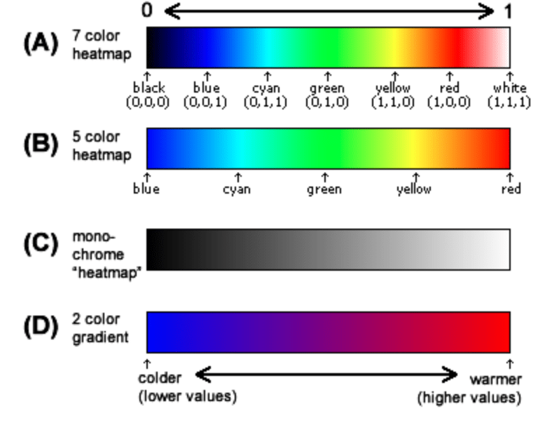
Color is the core of any heatmap. A typical palette moves from blue or green (low activity) to yellow, orange, and red (high activity). Some heatmaps include white for the most extreme values.
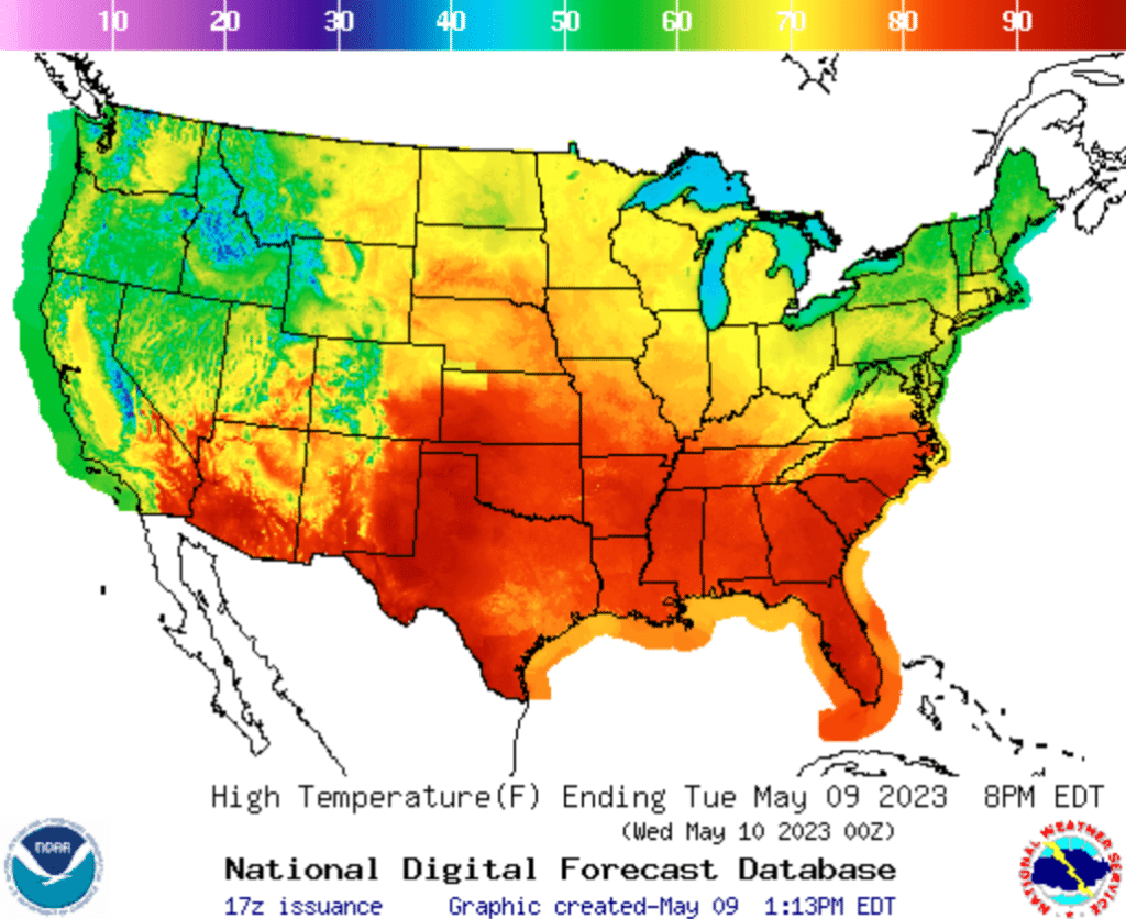
A quick example from outside the digital world helps set the scene. Weather heatmaps often show temperature. Red areas mark high temperatures. Blue areas mark the coldest parts of the map. The same logic applies to any heatmap. The color tells you what is happening and where
On website heatmaps, the meaning behind each color depends on the type you are working with. For example:
- On a click heatmap, red highlights areas with many clicks.
- On a scroll heatmap, red marks sections that most visitors reached.
- On a movement or attention heatmap, red shows where users paused or hovered.
Cooler colors show low engagement or areas users simply ignore.
It is easy to misread colors. Red is not always positive. It can reveal distractions, misclicks, or areas that pull attention away from a key action. Understanding the color scale helps you separate healthy engagement from signals that something needs adjustment.
How to Read a Heatmap: Step-by-Step
Heatmaps become more valuable when you read them with purpose. This step-by-step process helps you interpret patterns accurately and turn insights into decisions.
- Check the color scale
Tools use different palettes. Confirm which colors represent high and low activity before you start interpreting anything else - Locate hotspots
Bright areas show where users concentrate their actions, attention, or scrolling. Look for patterns that align with your expectations. A hotspot around a CTA or navigation item is often positive. A hotspot on a decorative element usually is not. - Identify cold zones
Cool colors highlight content users skip or never reach. Cold zones can indicate low visibility, unclear hierarchy, or sections that do not match user expectations. - Compare behavior to your goals
Review what users do against what the page is designed to support. If important elements sit in cooler zones or large hotspots appear on unexpected areas, there may be a mismatch between user intent and design. - Look for friction or confusion
Unexpected hotspots, misclicks, or sudden drop-offs signal issues that block progress. For example, click clusters on non-clickable elements or abrupt color fades on scroll maps show where users struggle. - Validate insights with session replay
Heatmaps show where something happens, not why. Session recordings help you confirm the reasoning behind patterns such as hesitation, missed CTAs, or navigation loops. - Prioritize improvements
Focus on the areas with the strongest impact. Examples include misplaced CTAs, unclear paths, content that sits too low, or visuals that draw attention away from key actions.
If you want to try these steps on your own site, Mouseflow includes click, scroll, movement, attention, and geo heatmaps as part of its heatmap suite.
Examples and Interpretation of Key Heatmap Types
Different heatmap types highlight different parts of the user journey. Together, they help you understand how people interact with your site. Here are the main types, how they work, and what their patterns often mean. Each description includes a practical example to show how interpretation works in real situations.
Scroll Heatmaps
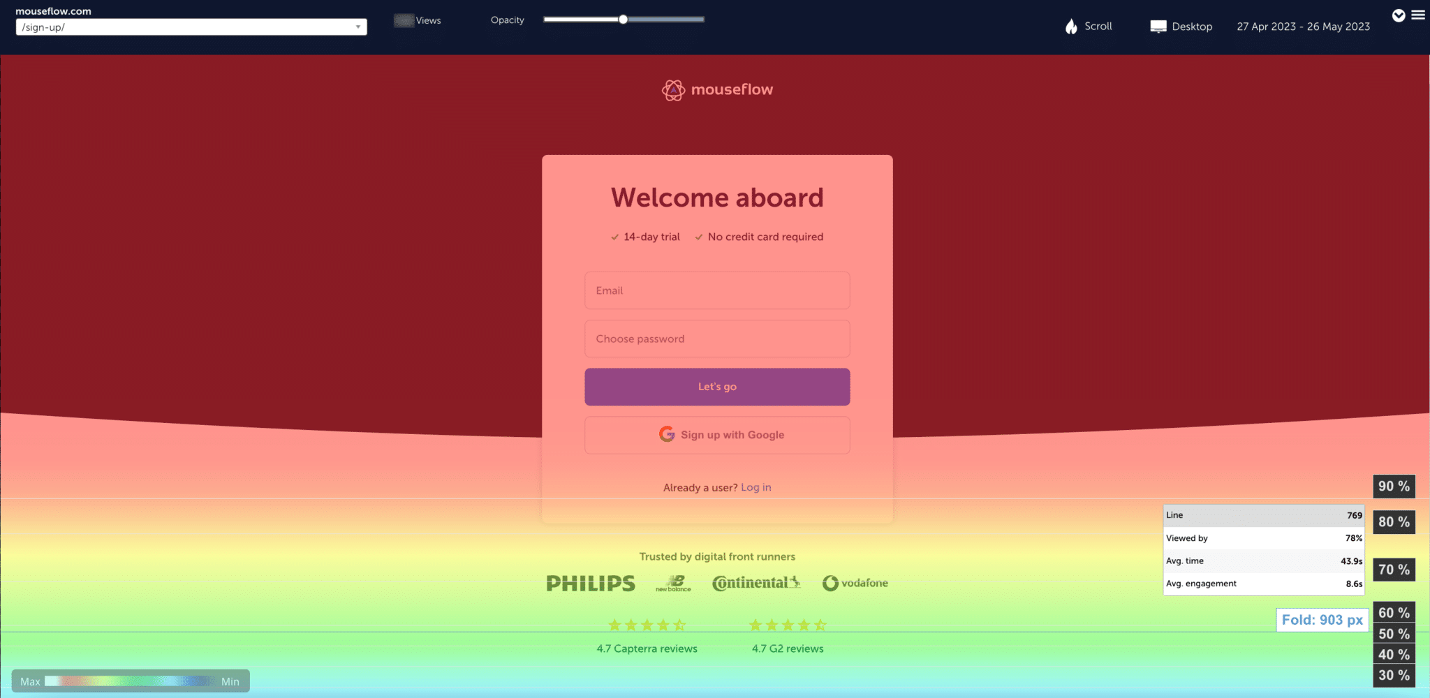
An example of a scroll heatmap of Mouseflow’s sign-up page.
Scroll heatmaps show how far visitors scroll down a page. Warm colors reveal sections most users see. Cooler sections highlight where interest drops.
Imagine a long blog post where the introduction is bright red, but the color fades sharply halfway down. That usually means readers lose interest at that point. It can also signal that important content sits too low on the page.
If you want to go deeper into scroll behavior, there is a full guide available.
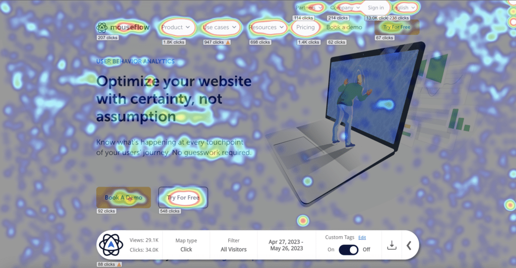
Click Heatmaps
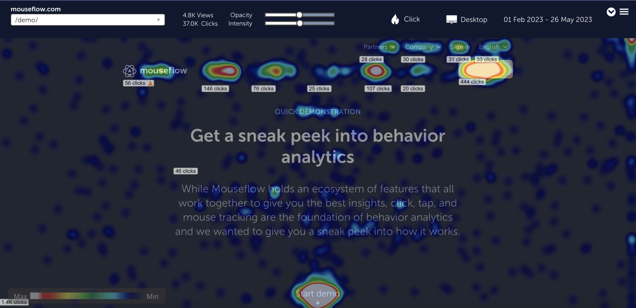
A click heatmap of Mouseflow’s demo page shows that users click a lot on the “Start Demo” and “Try for Free” buttons.
Click heatmaps show where users click or tap. They help you understand which CTAs attract attention, where navigation works, and where visitors expect interactivity.
If a headline appears in bright red because users click on it repeatedly, it usually means they expect it to lead somewhere. When a non-clickable element becomes a hotspot, it points to a mismatch between user expectations and design.
You can explore more examples and interpretation tips in the click heatmap guide.
Movement Heatmaps
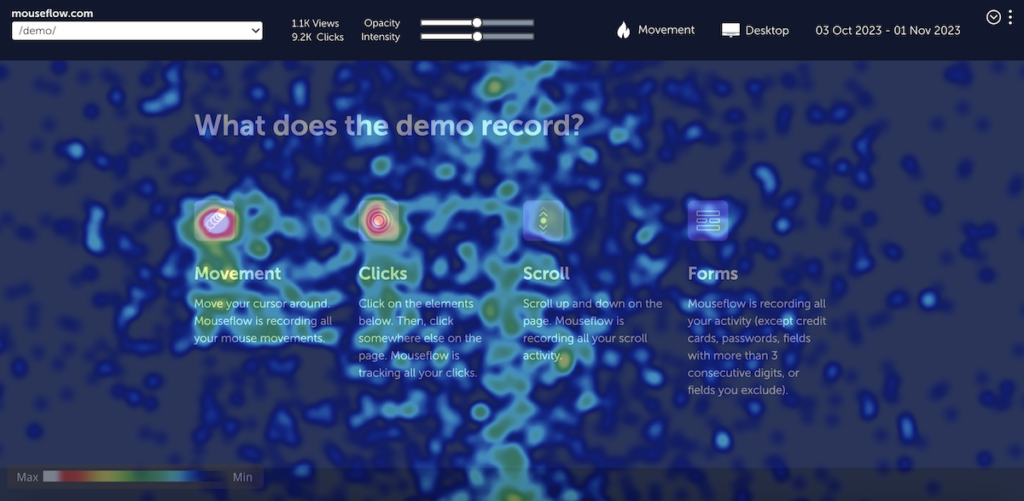
A movement heatmap of Mouseflow’s demo page shows areas where users hover their mouse cursors.
Movement heatmaps track mouse movement and hovering. They show where visitors focus before they engage. Warm areas reflect scanning patterns and visual attention.
A movement heatmap may reveal that users spend a lot of time hovering over a large image but ignore the text next to it. This suggests the page layout guides attention away from key information.
You can learn more in the movement heatmap guide.
Attention Heatmaps
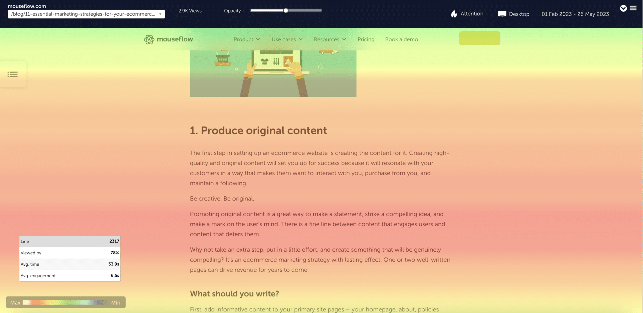
An attention heatmap differs from a scroll heatmap as it shows where visitors pause to read or view something on the page.
Attention heatmaps combine scroll depth, visibility, and time spent. They show where visitors actually pause long enough to consume content. These heatmaps are especially useful for content-heavy pages such as articles, documentation, or landing pages.
If an important section shows very little attention, it often means the content is hard to scan or placed too far down the page. Adjusting layout or formatting can help bring attention back to where you want it.
You can read more in the attention heatmap guide.
Geo Heatmaps
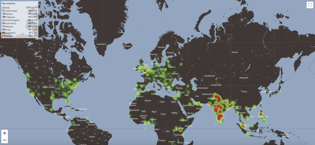
A geographical heatmap for one of Mouseflow’s blog posts clearly shows that this particular blog post is very popular in India.
Geo heatmaps visualize where your visitors come from. They help you understand which regions show interest in specific pages or products.
A geo heatmap might show that a product page receives significantly more traffic from one region than expected. This can guide decisions about localization, targeting, and conversion paths.
You can find more details in the geo heatmap guide.
Interactive Heatmaps
An example of a interactive heatmap with Mouseflow
Interactive heatmaps show behavior on pages with elements that expand, collapse, or update when users interact. They adjust to the state of the page, so you see clicks and activity inside dropdowns, menus, tabs, or other dynamic components.
For example, a static heatmap might place a cluster of clicks on top of a closed menu, while an interactive heatmap reveals which menu items users actually select once it opens. This gives a clearer picture of how people move through layered navigation and where friction may occur.
If you want to explore more examples of dynamic behavior, the interactive heatmap guide covers common patterns and use cases.
Common Mistakes When Reading Heatmaps
A few patterns often lead to misleading conclusions. Staying aware of them keeps your analysis accurate.
- Assuming red is always positive.
- Reading heatmaps without checking session recordings.
- Ignoring how mobile users behave differently from desktop.
- Making decisions based on single hotspots instead of reviewing the whole structure.
- Skipping context such as traffic sources, page goals, or device type.
- Heatmaps work best when paired with behavior data such as recordings, feedback, or funnels.
Heatmaps work best when paired with behavior data such as session replay, feedback, or funnels.
Closing Remarks
Heatmaps give you a clear view of what users notice, ignore, and struggle with. When you know how to read and interpret them, you can make informed decisions that improve the experience on your site. Better placement of key content, clearer paths, and stronger alignment with real user behavior all start with a solid understanding of what the colors show.
If you want to see how heatmaps perform on your own pages, you can set up tracking in Mouseflow and start gathering insights based on real user behavior.