Describe your medication, you have 10 seconds. According to Nielsen Norman Group, that’s how long it takes for a website to capture – or fail to capture – a visitors’ attention.
In those 10 seconds you must convey your main message, make sure your website loads fast, works seamlessly, and is perceived as trustworthy. Otherwise, the potential customer might simply close it and click the next link on the search engine’s results page.
This means that, within those 10 seconds, you must deliver an AWESOME user experience (UX). To retain attention beyond the initial 10 seconds, the site should offer detailed information about the treatment and be highly interactive. In essence, it should continue to provide an outstanding user experience. UX matters!
Pharmaceutical website visitors, whether they are consumers or healthcare professionals (HCPs), are still just people. Naturally, they experience life outside the pharma universe. Consequently, they become accustomed to the pleasant user experiences provided by websites in other industries, like retail, fashion and apparel, travel, finance and entertainment.
They expect the same level of UX from pharmaceutical websites. And it’s the brand’s chance to shine! Your website is that rare place where you can fully control the user experience, unlike in case with social networks, display ads, and other touchpoints, where UX is largely controlled by the platform owner.
Nurturing Trust and Guiding User Actions
Pharmaceutical websites play a crucial role in shaping brand impressions and serving as a trusted resource for patients and healthcare professionals. They are often the first point of discovery for treatment options and provide valuable information on diseases, dosage, and side effects.
However, unlike eCommerce websites that focus on direct sales, pharmaceutical websites don’t directly sell anything. Their primary conversion goal is user education. With a wealth of information to navigate, it’s crucial to organize and structure this information effectively so users can make informed decisions.
A positive user experience on a pharma website fosters trust to the brand, and ultimately results in more prescriptions. According to McKinsey, the likelihood of a prescription heavily depends on the overall customer experience, and pharma websites play a significant role in this experience.
Unlike making a purchase on an eCommerce website, every interaction on a pharmaceutical website has the potential to impact health decisions and shape brand reputation. Prioritizing user experience is not a luxury; it is a strategic necessity.
Meeting Diverse User Expectations
One of the challenges that pharmaceutical websites face is catering to a diverse audience – there are patients, healthcare professionals, and sometimes medical researchers, and each group has unique expectations:
- Consumers/patients: This persona seeks accessible, reliable information on mediations and treatments they or their family will consume. They value clear language, direct answers, and an intuitive user experience that empowers them to make informed decisions about their health.
- Healthcare professionals: They need comprehensive and easily searchable content (drug information, clinical trial data, medical guidelines, etc) on pharma websites to support their medical practice and efficiently access the precise information they need.
And of course, there are others, such as medical researchers, analysts, pharmaceutical job seekers, investors, and more.
Below are some questions your website needs to answer for the two main groups.
| Patient/Consumer | Healthcare Professional (HCP) |
|
|
That’s a lot of questions, and for very different audiences. Is it even possible to answer them all, while maintaining a good user experience for everybody? Yes, but only with a very well thought out content strategy behind your websites.
Combining information for all these personas in a single website and building complex navigation might be overwhelming. So, it can be a good decision to split the websites for different groups and have separate one per user type.
To give you an example, for one of their medications – Fasenra – AstraZeneca has a website with general information for patients and consumers – https://www.fasenra.com/, and another dedicated to information about the same drug for healthcare professionals – https://www.fasenrahcp.com/.
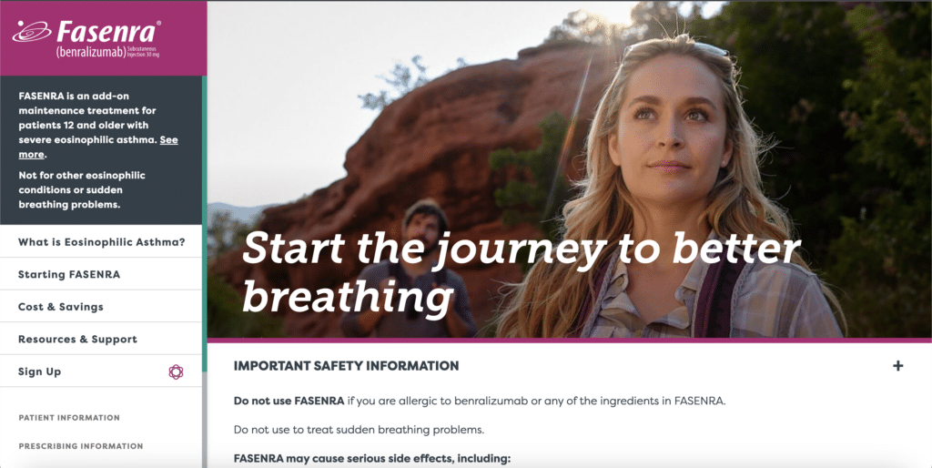
AstraZeneca’s Fasenra website for patients. Notice how AstraZeneca puts two most important pieces of information – what is Fasenra and the important safety information – above the fold, clearly visible for the visitor once they open the website.
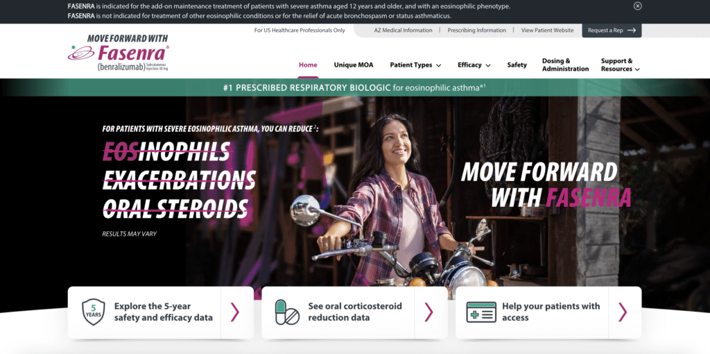
AstraZeneca’s Fasenra website for HCPs. Its contents are completely different from those of the patient website, and it focuses on the three key CTAs relevant for HCPs.
By tailoring the user experience to meet expectations of the respective personas, these websites can effectively build trust, facilitate informed decision-making, and ultimately shape the brand’s reputation in the healthcare ecosystem.
The Key Components of Pharma Website Engagement
A well-optimized website has the power to captivate users, significantly influencing their perception of the brand and driving key business outcomes. This is not achieved with just a good story or splendid looks alone, but only with a combination of various elements aligned together.
1. Website Navigation
Website visitors should be able to effortlessly find the information they seek. This is why pharma websites both for HCPs and customers often use simple navigation menus with few options, aiming for absolute clarity.
Below we list some of things to consider when designing navigation for a pharmaceutical website:
- The amount of elements in the navigation menu.
- The wording used for key CTAs.
- Can the user (be they a patient or an HCP) quickly understand if this website is for them, and if it’s not, can they quickly switch to the other website?
- The number of clicks it takes to get to key information pieces.
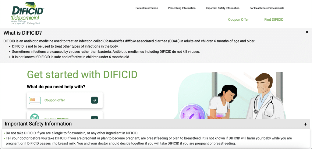
Merck’s site explaining Dificid medication to patients. Notice that the navigation menu contains just a few elements to simplify the user journey. Also, Merck decided not to offer search here for further simplification.
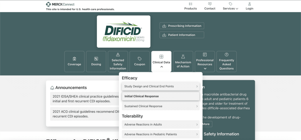
Merck’s site about Dificid medication for HCPs. Notice that here the menu is much more diverse and has more layers: Merck trusts healthcare professionals to know what they are looking for and offers a broad variety of options.
2. Content Relevance and Quality
Providing high-quality, relevant content is vital to engage users and position the website as a trusted resource.
Ideally, there should be some balance between short, easy to grasp messages that are easy to scan, and detailed, comprehensive information on various aspects of disease or drug use that gives the visitor the full picture.
To be engaging and relevant, the content of a good pharmaceutical website should:
- Take into account the users’ level of education and speak to them in their language.
- Be easy to understand, with most important messages being clean and concise.
- Answer all questions regarding the medication or the disease that the visitor might have.
- Be authoritative, providing all the necessary quotes, citations, and data sources.
- Be up to date, containing latest information and most recent research data.
3. Visual Appeal
Attention should be given to the visual design and aesthetics of the website. Appealing website layouts, well-organized content, and visually engaging elements help direct users’ attention and create a positive impression, encouraging them to explore further.
To help increase user engagement, the website should:
- Be easily accessible and readable on all types of devices, including desktop and mobile.
- Communicate the values that are relevant to the visitor (while for patients the message is usually about continuing to enjoy life, for HCPs it may be very different).
- Combine visual, text, and interactive elements to cater to different content consumption patterns.
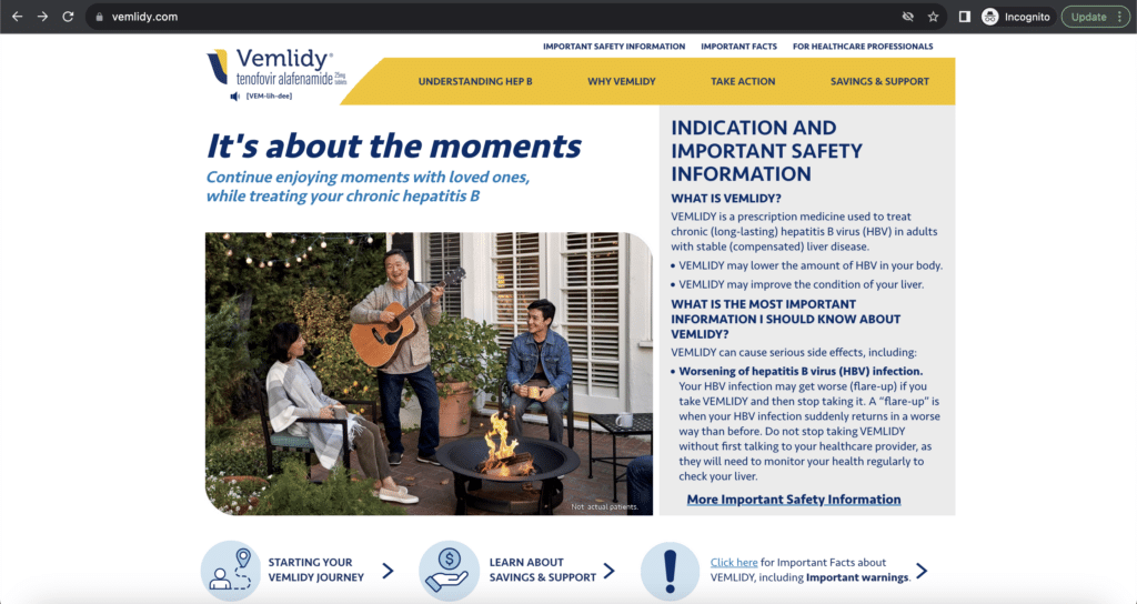
Gilead’s website about Vemlidy medication for patients. The key message of both text and image is pretty clear and touches on what is important to the patients – continuing to live as normal.
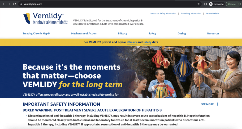
Gilead’s website about Vemlidy medication for HCPs. Notice how the message is almost the same as on the consumer website, but with a different angle – here it talks about longevity, and that’s what HCPs would likely want their customers to enjoy.
By making sure that a website is visually appealing, easy to navigate, and has relevant and quality content, pharmaceutical brands can ensure that visitors have a great user experience. As a result, they would be more likely to engage with the website in a meaningful way, remember the information, and have a positive impression of the brand.
80% of websites believe that they provide a superior experience but only 8% of their users agree.
A Way to Understand User Behavior at Scale
Now here’s an interesting statistic: 80% of websites believe that they provide a superior experience but only 8% of their users agree.
At Mouseflow, we understand the importance of bridging this gap between perception and reality. Our solutions have helped over 200,000 companies, including some household names in the pharma industry optimize their user experience and truly meet the needs and expectations of their users.
Behavior analytics provides pharmaceutical companies insights into their website visitors’ navigation and behavior, enabling optimization of the user experience. By analyzing aggregated data from numerous user sessions, you gain a deeper understanding of how users interact with your website, identify pain points, and tailor the experience to their needs.
Pharmaceutical brands rely on various tools that Mouseflow offers to connect theory with reality:
- Heatmaps to understand which parts of the page and menu items get the most attention from users. Heatmaps are an invaluable tool for refining navigation menus and adjusting CTA placement.
- Session recordings to step into the users’ shoes and observe how they use the website. Session recordings help understand and streamline user journeys, as well as find and eliminate friction points and loops.
- Custom tags to track, and analyze website events, allowing for better data segmentation and getting a comprehensive view of different user segments. This understanding helps you optimize your website to meet their unique expectations.
- Form and funnel analytics for in-depth analysis of conversions to leads, downloads, and other actions.
Mouseflow prioritizes users’ privacy, and is fully compliant with regulations like HIPAA, GDPR, and CCPA. User data is anonymized and aggregated, while protected healthcare data is excluded to protect individual privacy while still delivering valuable insights.
Conclusion
Optimizing user experience (UX) on pharmaceutical websites is crucial in today’s rapidly evolving healthcare landscape. Engagement plays a central role in capturing user attention, shaping brand perception, and fostering trust. Understanding the unique needs of different user segments is essential for tailoring the UX to meet their expectations.
By enhancing site navigation, delivering relevant and high-quality content, incorporating interactive features, and leveraging behavior analytics, pharmaceutical websites can boost user engagement and drive key business outcomes.

