
You’re not Coca-Cola or Apple—companies that can pour millions into brand awareness. You need your marketing to deliver real, measurable results. You’ve got goals to hit and a board that’s expecting a report.
But even the flashiest marketing campaigns with brilliant visuals and clever copy won’t bring you the expected results if your audience simply doesn’t know what to do next.
This is what you need a call to action (CTA) for. Implementing powerful CTAs within your campaign content will help you guide people through their journey with your brand, whether you want them to read your blog article or make a purchase right away.
You’ve heard it a million times: “Use a clear CTA.” But what does “clear” mean in your specific case? How do you craft and place a CTA that works best with the attention your marketing assets get?
These are the questions we’ve tried to answer in this guide.
The Two Types of CTAs: Hard vs. Soft
You’ve used them both, but there’s a chance you haven’t realized these are different types of CTAs:
Hard CTAs–like “Buy Now”, “Start Free Trial”, or “Book a Demo”, are designed for audiences who are ready to take the plunge and make a decision right away.
Soft CTAs–like “Learn More”, “Read the Case Study”, or “Subscribe to Our Newsletter”, are more subtle, guiding the audience to take a smaller step. These are great when you’re capturing and nurturing leads who aren’t quite ready to commit but are interested in learning something that you specialize in or continuing their journey with you.
When Is It Best to Use Each Type of CTA?
Both types of CTAs can be included throughout your marketing content, from social media ads to blog posts to landing pages.
The trick with choosing the right one is knowing where the audience of this specific asset is in their journey. This requires setting up a SaaS marketing funnel that links each of your marketing assets to the respective phase in the buyer’s journey.
Let’s take this paid advertising campaign by HubSpot as an example. Think of it as a fast-tracked version of the B2B SaaS customer journey, where each touchpoint moves the user through different stages of the funnel: top of the funnel (TOFU), middle of the funnel (MOFU), and bottom of the funnel (BOFU). In reality, a potential customer needs much more than three touch points, but the stages remain roughly the same.
- TOFU: A user comes across a HubSpot ad that drives them right into the funnel. It invites them to learn more about how AI can scale their content operations. This is a classic soft CTA, designed for those at the top of the funnel who are just starting to explore.

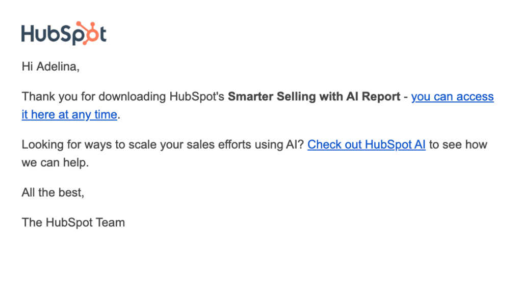
- MOFU: Once the website visitor clicks, they’re taken to a landing page offering a guide on integrating AI into their workflows. To download it, they share their contact information, moving to the middle of the funnel. After downloading, they receive an email with another soft CTA: “Check out HubSpot AI”.
- BOFU: If they click that link, they’re taken to a bottom-of-the-funnel page with a couple of hard CTAs: “Get started free” and “Get a demo.” HubSpot expects that at this stage, the potential customer has moved through the awareness and consideration phases and is now primed for conversion.

All in all, the earlier the potential customer is in the funnel, the “softer” the CTA usually is. However, there’s no real rule for when to use soft or hard CTAs. It’s about knowing your audience and what they need at each stage of their journey with you.
No matter whether you’re going with a hard or soft CTA on a particular page or email, you need to make sure that it’s strong and placed correctly.
What Makes a Good CTA
Soft or hard, a CTA should serve one purpose—driving users to take specific action. Here’s a quick, universal best practice checklist of what makes a CTA effective:
- Action-oriented language: Your CTA should clearly tell the audience what to do next. For instance, instead of a statement like “Your Report Is Here,” opt for a command-based phrase like “Download the Guide.”
- Value: Where applicable, show the benefit of clicking. Instead of just saying “Buy Now,” try something like “Get 50% Off Today” to make the value of the immediate action clear.
- Focus: Aim for one or two main actions per page. Having too many different CTAs may distract website visitors from taking any action at all.
- Relevance: Make sure your CTA matches what users expect. Misleading CTAs might help you get more clicks, but these will only lead to frustration if website visitors land on something different from what was promised. Misleading CTAs prevent users from progressing further on their journey.
- Design: The CTA should be eye-catching and easy to spot. Make it visually stand out with contrasting colors and bold fonts.
- Placement: Position your CTA where users are most likely to see it. We’ll talk more about finding the perfect CTA placement below, as this is a topic worth particular attention.
💡These are general best practices, but every case is different. For example, in the HubSpot email above, the CTA was just a simple text link instead of a bold button. This made the message feel less like a sales pitch and more natural, avoiding the audience’s built-in “spam filters.”
The key to finding what works? Test and tweak until you hit the right balance.
How to Identify the Best Placement for Your CTA
So here comes the time for tests and tweaks.
The placement of your CTAs within your website copy often matters even more than the wording or design itself (though for ads and social media, that’s a different story).
General rules for the effective CTA placement are:
- Above the fold. Users should see your CTA without having to scroll. So, the CTA should be on the screen when they open your website (that’s called “above the fold.”) The most common spots for CTAs are the sticky header and the hero section.
- At a logical decision point. Place CTAs where users naturally expect to take the next step. For example, at the end of a blog post, after detailing a solution in a product description, or alongside testimonials on a B2B SaaS landing page.
- Multiple CTAs. Use more than one CTA on longer pages. One near the top, a few in the middle, and one at the bottom is a standard flow for long landing pages and blog posts. However, don’t use different CTAs, stick to the same one.
That said, your audience isn’t going to behave exactly by the book. While these rules are a good starting point, especially when you don’t have much data to rely on, you can gain much more value out of your CTAs if their placement is data-driven.
Look into your user behavior patterns
Start by analyzing how users are interacting with your site. Here’s where to look:
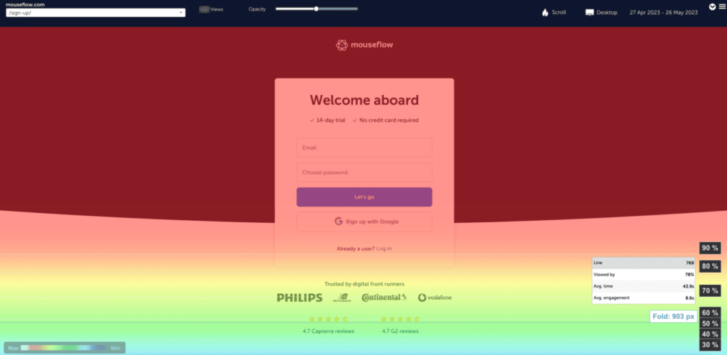
Heatmaps. With a tool like Mouseflow Heatmaps, you can see exactly where users are clicking, moving their mouse, or lingering. For CTA placement purposes, the perfect tool is attention heatmaps which show on which parts of the page users linger longer. The most engaged areas will show up in orange and red. Are users spending plenty of time around a certain section? That’s a prime spot for a CTA.

An attention heatmap by Mouseflow
Scroll depth analysis. Track how far down the page users are scrolling with another type of heatmaps – scroll maps. If most people aren’t reaching the section where your CTA is, it’s a good reason to place it higher on the page.
You can access scroll depth insights in almost any digital experience analytics tool. For instance, Mouseflow lets you do it in two ways: by either seeing the average metric for each page or accessing more detailed data with scroll heatmaps. The latter will show you how many people have made it to a particular point on the page.
A scroll heatmap by Mouseflow
Bounce rates. Analyze bounce and drop-off rates on key pages using Google Analytics, Mouseflow, or similar tools. High bounce rates might indicate that users aren’t finding what they’re looking for fast enough. A well-placed CTA at the top of the page could help reduce that.
Session replay. Tools like Mouseflow Session Replay allow you to watch real user interactions on your site. This is your opportunity to see the actual reasons behind users bouncing too early or not clicking your CTA. If you see users rage-clicking in sections where they expect a link or quickly scrolling through certain sections, these are the areas worth your attention.
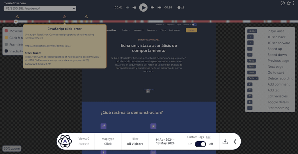
Session replays in Mouseflow
Make a hypothesis
Based on what you’ve learned from the data, think about where your CTAs might work best.
For example, if your attention heatmap shows users frequently stop to look at a section without a CTA, your hypothesis might be: “Placing a CTA here will increase clicks.” Or, if scroll depth data reveals users rarely make it to your current CTA, you might hypothesize: “Moving or adding a CTA higher on the page will improve conversion rates.”
In short, your hypothesis should directly address what your data is telling you. We have a separate blog post that we recommend you read if you want to make data-driven hypotheses like a pro.
A/B test your hypothesis
Once you’ve formed your hypothesis, it’s time to test it. Create two versions of the page: one with the original CTA placement and one with the new, optimized position based on your data. Then, split your audience between the two to see which one performs better.
You’ll need an A/B testing tool like Kameleoon or Optimizely to handle this. These tools let you set up the test, split your traffic evenly, and monitor performance—no tech skills required. After the test, you’ll get a detailed breakdown of how each version performed and the A/B testing tool will determine a winner for you based on the key metrics—in your case, based on CTA clicks.
Both tools can integrate with analytics platforms to give you deeper insights. For example, with the Mouseflow & Kameleoon integration, you can go beyond quantitative metrics and watch how users interact with each version of the page.
💡 One way to do that with Mouseflow is by setting up conversion funnels. Start by creating a two-step funnel to track the percentage of users who convert and those who drop off after clicking your CTA. To better understand why some users abandon the funnel, check out real session recordings of those who bounced.
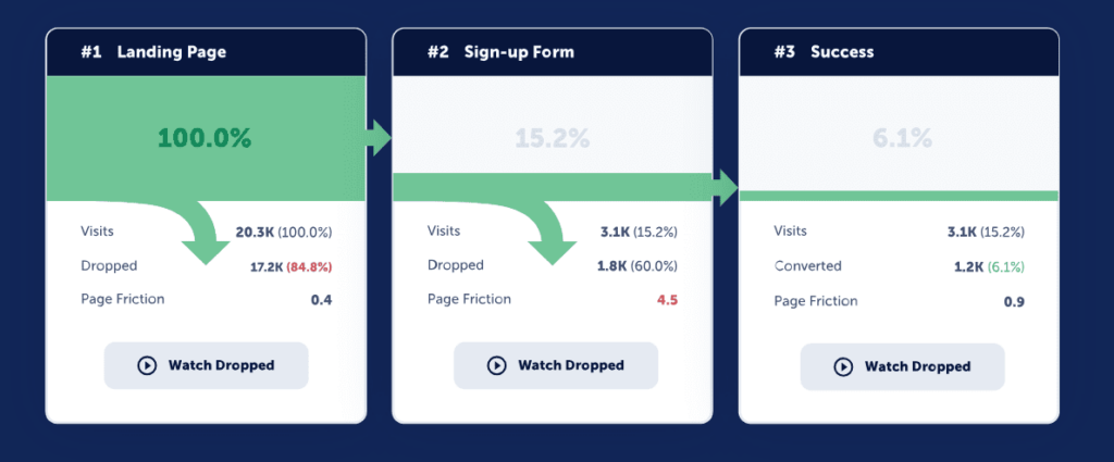
Mouseflow conversion funnels
3 Unobvious Experiment Ideas to Maximize Your CTA Performance
We’ve chatted with SaaS marketers from different companies to find out their most effective and surprising CTA placement experiments. Check these out to inspire your thinking.
1. Add an extra CTA
We’re all for minimalism and keeping things clean to avoid overwhelming your audience. But less isn’t always more.
Sometimes, adding that sixth CTA to your page can make all the difference. Lauren Funaro shared that adding just one more CTA in the hero section of a blog post didn’t just increase signups—it boosted conversions to paid users by 15%.
Example of adding an additional CTA at the top of a blog post page on a B2B SaaS website
That small and seemingly irrational adjustment can create a big impact on the bottom line—that’s why we always urge you to run experiments before jumping to any conclusions.
2. Ungate your gated content
Not happy with the quality of leads you’re generating with your gated content? Consider opening it up.
While there are many benefits to ungating your content—from removing friction from the user experience to pre-qualifying leads before driving them into your funnel—this experiment is really about optimizing your CTA placement for better conversions.
Instead of hiding your CTAs in downloadables that sit behind a form, try integrating them directly into the open, web-based version of your content.
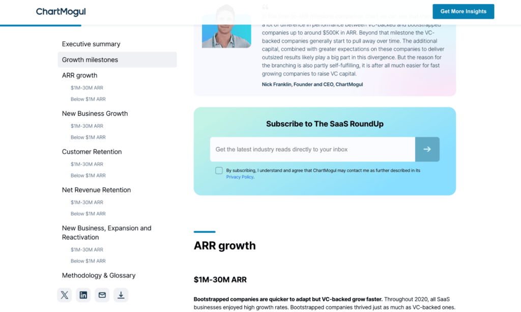
ChartMogul experimenting with ungating content and changing their CTAs to newsletter signup

“When we ditched our gated, downloadable reports, we had to rely on CTAs within the web-based “state of SaaS industry” report. Placing our CTAs across the page and offering relevant deep dives into the topic proved most successful.
We saw increased conversions from ICP-fit leads, not just meaningless downloads from non-leads. There’s nothing better than a relevant CTA in the right place.”
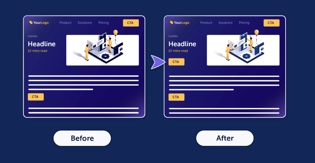
3. Tie your CTA to page content
Think of a typical B2B SaaS blog post: you read through some text, face a CTA out of nowhere, continue reading, see a product mention, and then get hit with a final CTA at the end.
Softr’s Jakub Rudnik suggests putting in the effort to align your CTA closely with the content above it.
“One of my favorite experiments was adding a CTA directly after a section that covers common challenges—that is so common in TOFU/MOFU blogs,” Jakub explains.
“For example, in an article titled ‘What are internal tools and how to build them,’ I’d include a section called ‘5 Challenges of developing internal tools.’
You can use this section to list, obviously, common challenges. This should intersect directly with the value proposition for your business offerings or products. So for Softr, a no-code app builder, we would list ‘Engineering and developer resources’ as one of the challenges. Directly afterwards, we can surface a CTA with ‘Build internal tools today, without engineers. No coding required.’ or something to that effect.”

Adding a contextually relevant CTA

“Adding these sections and matching the challenges to your product and the CTA has driven a lift in signups and leads at different SaaS companies I’ve worked with.”
Boost Your Conversions With Great CTAs
In a winning SaaS marketing strategy, each asset needs quality copy, eye-catching design, and a clear, compelling CTA. Shake, don’t stir. If only it were that easy!
In reality, getting your CTAs to perform involves a lot of experimentation to find the right context and placement. And just when you nail it, it’s time to start on the next asset.
The good news is, at the end of the day, your efforts will pay off with increased conversions.