It is not enough to design websites that are responsive, functioning, and aesthetic. The internet is for everyone at any time of their daily life.
As a designer, I’ve often been told to stay aware of my own bias and to test my assumptions. It is only normal that we design based on who we are, what we know, and the situation we’re in. However, this is how many of us fall into the trap of non-inclusive design. That’s why I think it’s important to follow accessibility guidelines and use tools to assess whether our designs are accessible – also for other users in other situations.
Designing with accessibility in mind has been and still is a continuous learning process for me as a designer at Mouseflow. In this article, I’ll share some of the insights I’ve had so far. Though it’s only scratching the surface, the topics I’ll touch upon here have started my journey of designing for accessibility, and I hope it can inspire you on your journey as well. Now, let’s get down to business!
What is Accessible Design in the Digital World?
Accessible design, in the context of digital and web design, refers to the practice of creating digital interfaces and content that are easy to navigate, understand, and interact with for all users, no matter their abilities and limitations.
It encompasses a wide range of considerations, from visual and auditory elements to user interface (UI) components. The fundamental principle of accessible web design is to ensure that every user can access and use digital products effectively.
For me, it is also important to think about the fact that accessibility deals with a range of limitations – from permanent disabilities to temporary or situational limitations which we might have as we go through our daily lives. Talking about limitations – I often explain myself better in visuals than words, so here’s an infographic from Microsoft’s Inclusiveness 101 Guidebook for ya!
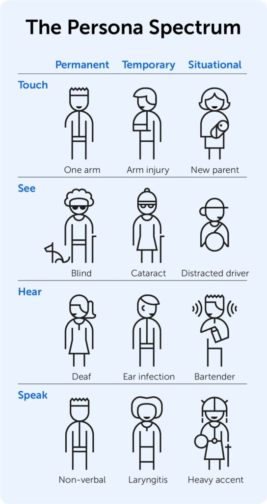
Microsoft’s Persona Spectrum infographic gives a good overview of the limitations that influence how we use the web can be not only permanent, but also temporary, or situational. Last time you were using your phone maps while driving, you had a situational limitation – you had to keep holding the wheel!
The Importance of Accessibility
The picture above gives you a good idea why you should design with accessibility in mind. There are so many different people and so many situations in which they can find themselves while engaging with your website, so to cater for them all you’d rather be prepared for everything. It’s not just about adhering to legal requirements (although compliance is essential), but it’s also about providing equal opportunities and a seamless experience for all users. In addition, here are some of my personal motivations for making design accessible:
- Be inclusive: Accessibility ensures that your website or application is inclusive, welcoming users of all abilities. It’s really about embracing diversity in the digital realm.
- Meet legal obligations: Many countries have stringent accessibility laws and regulations in place. Complying with these standards is not only ethically responsible but also a legal necessity.
- Expand your audience: By making your digital products accessible, you open them up to a broader audience. This can lead to increased user engagement, higher conversion rates, and improved brand reputation.
- Future-proof your work: As technology evolves, so do user expectations. Designing with accessibility in mind ensures that your products remain relevant and adaptable in the ever-changing digital landscape.
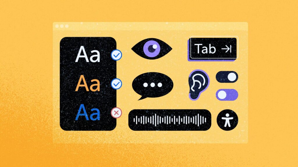
With this in mind, let’s move on to some of the concrete steps I try to take when designing for accessibility. Oh, and another infographic, if you (like me) love to get an overview of what you’re about to spend your time on!
Color Contrast is Key
Color plays a big role in design, but we should always strive to use it with accessibility in mind. Insufficient color contrast can make text and UI elements difficult to read and understand, particularly for users with visual impairments. To keep myself on the right path with colors, I found these steps useful:
- Try to follow Web Content Accessibility Guidelines (WCAG), aiming for at least 5 in contrast ratio.
- Utilize tools that check the contrast of your chosen colors to ensure compliance with accessibility standards.
- Consider implementing a dark mode or light mode feature, catering to users’ preferences and potentially improving readability in various lighting conditions (more about this in the next chapter).
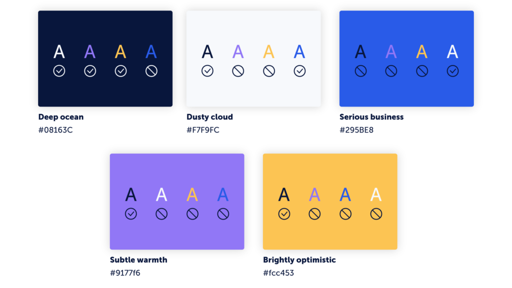
How we showcase which primary colors are accessible on top of other primary colors in our palette.

Workflow Tip
I tend to use Coolors Contrast Checker to check my color contrast ratio or when working in Adobe XD I use the Stark plugin.
The Big Debate - Dark Mode vs Light Mode
For years, there has been an interesting discussion in the design community about the pros and cons of dark mode. My take on the matter is that we should offer both options for the user to make the decision. Here are some of the considerations you might have to take into account when designing for the two modes:
- Switching between the different modes might just be a switch for the user, but you cannot as a designer just directly convert a light color to a dark color, there will be some “manual” work involved.
- When choosing your palette, avoid pure white and black – use nuances of e.g. grey or blue to soften the UI.
- While some see darkmode as a relief to eye strain, others warn that a high number of users worldwide suffer from astigmatism, which causes “halation”. This means that users reading light text on dark backgrounds will see a more blurry text.
- Dark mode is said to be the more “sustainable” mode as it is energy-saving on OLED screens.
- Depending on the user’s physical context, one mode might be more suitable than the other – so when monitoring the user behavior, don’t assume to see a user always staying in one mode, the preference might be situational.

Monitor tip
I always try to track all the user behavior I can. When implementing dark mode on this website, I placed a custom tag through Mouseflow on the mode toggle in our utility bar. This way I can filter and analyze the users who interact with the toggle and track the feature adoption.
A fun little design exploration we did whilst designing dark mode for this website was to research which type of dark mode toggle was the most intuitive. The result is the toggle you can see above the menu today. You can see the LinkedIn discussion on this topic here and in the illustrative overview below.
Readability before Aesthetics
Today there is an ocean of beautiful fonts that are designed with a focus on readability. I believe that choosing the right font for your brand or product is a balancing act between readability and visual identity. Though designers are not solely responsible for the readability, we can definitely influence it with the following:
- Limit line length going across the screen to roughly 50–75 characters. If you want to dive into that rapid hole, here’s a great study on it from the Baymard Institute.
- When designing for text-heavy use cases (such as blogs or online newspapers) increase the font size and line height slightly. Notice that the font size (18px) and line height (30px) are slightly bigger in this article than on our other web pages.
- Use letter casing that fits the purpose. It can be used as an element in creating visual hierarchy, but also to increase readability. For example, use all caps for short, but important text that should stand out from other UI elements. Use title casing for shorter “call-out” text, and use sentence casing for all other text. Notice that our call-to-actions (CTAs) all have sentence casing as this is believed to increase the readability of short texts.
- Don’t forget that your visuals will also be read by screen readers for some users. Spend some time adding alternative text to your images, especially when they are more than just decorative – but keep it short and to the point.
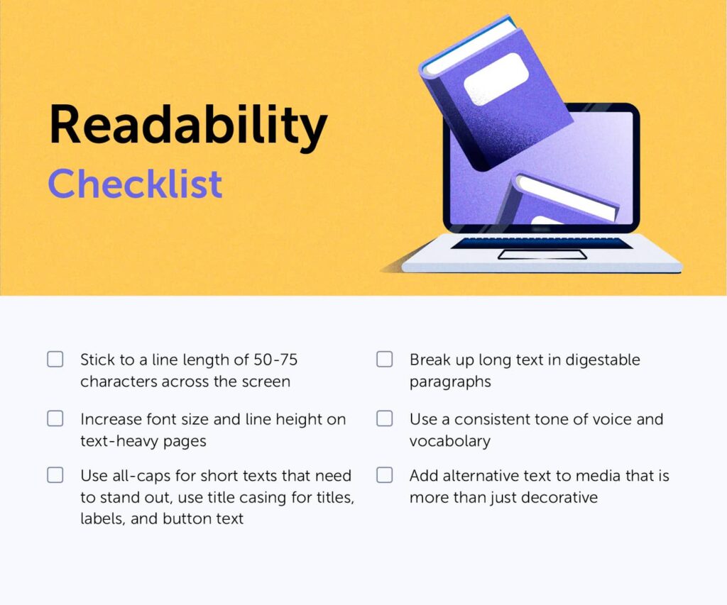
Readability checklist summarizing the above chapter.

Content Tip
It’s not enough to optimize readability through design, the written content plays a big role in the general readability. Research what your audience prefers from your content. Stay consistent with your tone of voice and vocabulary. Refrain from using fancy words and jargon that complicate your message. Separate your content into smaller digestible bites, and don’t do like Mark Twain – make time for “writing the short letter” instead of the long one. Take a look at this article if you want to know more about evaluating and optimizing your content.
Visual Focus Indicator
Keyboard navigation is essential for many users, especially those with mobility impairments. Browsers have a default way of indicating that an element has keyboard focus, but unfortunately a lot of websites manually “remove” this, or the site is not built to support the right order of the events.
Make sure that you together with your developer(s) have a plan for this on your site and test it out yourself. Can you navigate your site and do the action(s) you want from your users only by using your keyboard, specifically by using the tab, shift+tab, and enter buttons?
Workflow Tip
Use Wave to evaluate the order of your elements to support the user journey for keyboard users and screen readers.
Visual Hierarchy & Interactivity
For me, one of the tricky areas of design is to know when you’ve created a successful visual hierarchy. It’s a continuous learning process where we as designers train our eye by creating our own designs and analyzing others. When it comes to accessible web design, I find the following points helpful:
- Brush up on our classic Gestalt principles (proximity, similarity, continuity, connectedness, and closure) and consciously use them in your designs. A place I often see problems is with input forms – we need to make sure that every input field has a clear label that is in proximity to the field it belongs to. Remember that a label is not the same as a placeholder text inside the form field as the labels need to be readable for screen readers. I continuously use Form Analytics to analyze how users interact with our forms.
- Use whitespace decisively around elements that you want the user to focus on.
- Make it clear in your UI whether an element is interactive or not. I’ve fallen into the same pitfall many times trying to make a website component a bit more unique or different. When I then look at session recordings through the Mouseflow app, I discover that users are either clicking on something that is non-clickable, or not understanding that something else is clickable. Use shadows, contrasting colors, and hover effects to indicate interactiveness.
Workflow Tip
I get notifications via email of e.g. click-rage happening on our site through Mouseflow. That way I can easily go and watch why users sometimes click on non-clickable elements. I try to make rational assumptions about why the user might try to click this element and either change the look of the element so the user won’t think it’s clickable – or even better, try to understand what action the user is trying to perform and make the element behave as they expect.
I also tend to look at the attention heatmaps to understand where users spend the most time or when they engage with elements on the page.
The video below shows the workflow when going from setting a notification in Mouseflow to optimizing a page where e.g. click-rage was detected.
Responsiveness, The Cousin of Accessibility
Responsive design is really a cornerstone of accessible web design, and by now I believe users simply expect everyone to nail it. No matter which device they are using, they anticipate a seamless and coherent experience. A few concrete actions I try to take when designing are:
- Use standard breakpoints for responsive design, but also use data-driven insights to determine which screen sizes you should prioritize. For example, through the Mouseflow app, I know that the majority of our website visitors view our site from a desktop, and the top three screen resolutions are 1920×1080, 1440×900, and 1536×864. Based on this knowledge, I can then focus a bigger part of my design efforts on these screen sizes.
- Continuously monitor user interactions to identify potential pain points on specific screens. Mouseflow automatically tags users with different friction events that amount to a friction score indicating how happy or unhappy users are, making it so much easier for me when analyzing the user experience of our site. When I analyze the satisfaction of our users, I often go to session recordings in Mouseflow and filter on device or screen resolution to see whether there are more unhappy users on certain screens compared to others.
- Make custom changes for the different screen sizes. You can’t always rely on standard stacking of elements, or showcasing all elements the same way on mobile and desktop. Your navigation might need to change – do user research to determine whether users have different goals with visiting your site depending on the device they’re on.
Example
On our pricing page, you can see how we’ve changed the order and layout of elements as you go from bigger to smaller screens. Notice how the last price plan becomes the top one when elements start to stack, and how the feature comparison table goes from comparing all plans to being a comparison between two plans of the user’s choosing. This was all done to improve the experience of the page and make sure that the user, no matter the screen size, will get the information they need.
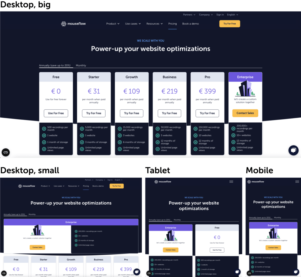
Our pricing page has some custom solutions depending on the screen size a user is visiting it from.
Continuous Improvement (Cliché, but true!)
Accessibility is not a one-time effort but an ongoing commitment. Like with all other user-centric designs, we need to continuously monitor and assess our website’s accessibility. Leverage tools like The Lighthouse Metric and the WAVE Web Accessibility Evaluation Tool to check for issues and evaluate the order of your elements for screen readers and keyboard-only users. Be responsive to user feedback and iterate on your design to create a more accessible and inclusive digital space.
For me, accessible design isn’t just a set of guidelines to follow; it’s a mindset that I step by step try to include in every stage of the design process. By implementing these principles and best practices, you, I, and other designers not only meet legal requirements but also create digital experiences that resonate with a wider audience, fostering inclusivity and accessibility in the digital realm.
Monitor Tip
We have a quarterly performance review in which we evaluate our page through a variety of tools such as the Lighthouse score (found in the Chrome Developer Tools), and Wave. Below you can see how these look. We then dive deeper into the improvements we can make, prioritize them, and execute them in between other website-related tasks during the next quarter. Be aware that there can be fluctuations in these scores due to your internet, device, plugins, etc. When we implement bigger changes to our production site, we also tend to evaluate them straight after implementation to make sure these haven’t affected our performance.
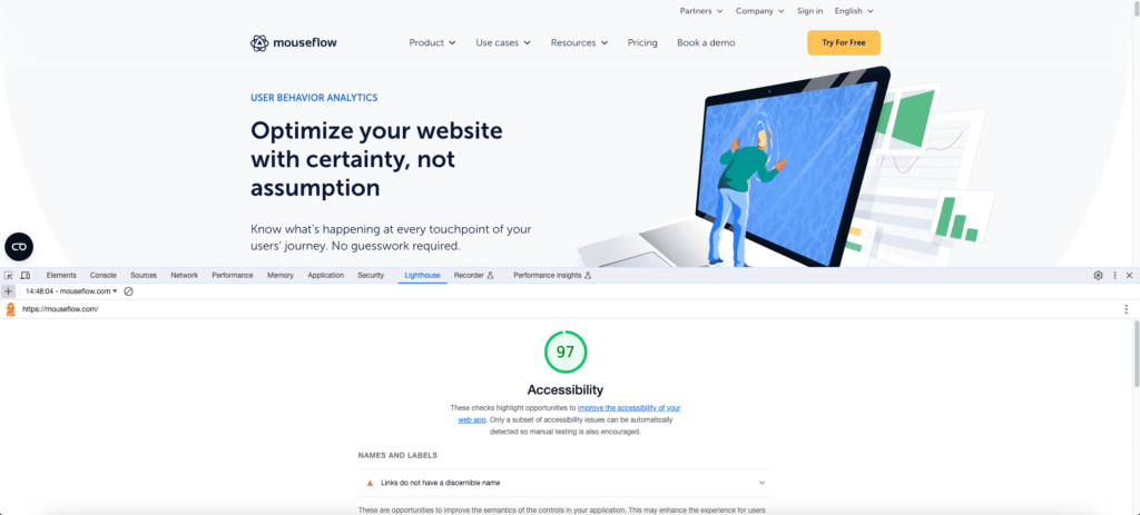
We continue to monitor our site and optimize based on reports such as the above Lighthouse Score.