
Let’s pause for a second and think how much modern businesses rely on forms. Forms on websites help capture leads, convert prospects into customers, and gather data about website visitors and potential users. Forms are an absolutely critical website component.
Okay, most websites have forms. But how sure are you that yours are working like a clock?
Yes, you receive some submissions. But how many users even see your form to begin with? Are there any errors that people encounter when they try to submit a form? How many of your website visitors start filling out a form and then abandon it for some reason? What exactly is the reason for their abandonment?
To get answers to these questions, to understand how your forms perform, and to improve their conversion rate, you need form analytics. And that’s what we’re going to discuss in this blog post.
What Is Form Analytics?
Let’s start with a definition.
Form analytics is a data measurement tool that tracks user behavior when interacting with your online forms.
Form analytics can provide you with data that you can use to improve the overall effectiveness of online forms on your website. It helps you increase your leads, conversions, and user experience.
There are multiple ways to analyze how users interact with forms.
For example, you can rely on heatmaps, which allow you to see where users click on your website pages. This can be useful for understanding which areas of your forms are getting the most attention and which might confuse users. You can also analyze how far users scroll on each page and if they even reach the form by using scroll heatmaps.
Or, you can tag the users that have interacted with forms and watch session recordings for users who have been tagged. That way, you can basically step into the users’ shoes and observe how they fill in forms, where they struggle, and so on. But it takes quite some time to go through all of these recordings.
The most convenient approach would be to use dedicated form analytics software, that gives you all the necessary data for each form right away.
What Can You Track With Form Analytics?
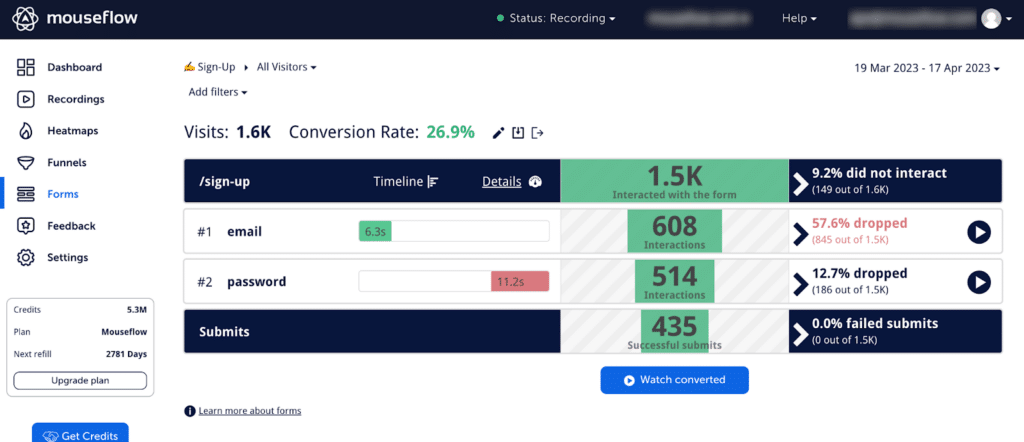
Mouseflow’s form analysis tool shows various metrics for a certain form
Here are some key metrics to monitor with form analytics:
- Visits: Visits indicate the number of people visiting pages with your form. It’s a basic, yet fundamental metric. The more people visit the page, the more are likely to interact with the form.
- Form interactions: Form interactions show how many people have engaged with your form. It differs from visits as not all visitors interact with a form. Employing SEO web design practices can help expose your form to more site visitors. Consider using attention heatmaps to identify attention-grabbing sections and place the form there.
- Drop-Offs: This metric reveals the number of users who abandoned a form before submitting it. Shorter and simpler forms generally have lower drop-off rates, although achieving zero is unlikely.
- Average Duration: Average duration, also known as hesitation time, measures the time it takes for users to fill in each form field. Certain fields may naturally have higher hesitation times. Analyze fields with prolonged durations, as unclear instructions or confusion may be the cause for form abandonment.
- Blank submits: Blank submits tracks the number of visitors who submitted a form without filling in a specific field. Consider streamlining the user process by removing fields with high levels of blank submits or, on the contrary, making them mandatory if the information is essential.
- Submits: This critical metric refers to the number of completed forms – after all, form submissions is what you care about when it comes to leadgen, eCommerce, and pretty much everything.
- Conversion rate: The conversion rate represents the percentage of page visitors who successfully completed the form (and is a good metric to estimate the form performance). Maximizing this metric should be the goal of all your form experiments.
These metrics are essential for proper web form tracking. Now, let’s explore the reasons behind form abandonment.
Reasons Why Users Abandon a Form
By now we’re on the same page about the fact that you need to ensure your forms are as effective as possible. That means maximizing the percentage of visitors who have successfully completed the form. To do this, you need to know the reasons why users abandon forms.
Here are some of the typical abandonment reasons that can help you with online form analysis:
-
- The form is too long: In today’s fast-paced world, people lack the time and patience to fill out lengthy forms. If a form is too long, users are likely to abandon it and seek alternatives. While there is no definitive rule for the number of fields a form should have, it is advisable to keep it short. How short? Depends on how engaged the user is when they encounter the form. For lead generation forms targeting cold leads, aim for just one or two fields in a contact form. For users with an existing rapport, a slightly longer form may be acceptable, but avoid burdening them with extensive surveys.Ask yourself this question every time you’re done creating a form: “Do I really need all this information at this point in my relationship with the user?” If not, eliminate unnecessary fields. You can gather additional information and feedback from users at a later stage in their journey when they are more likely to provide it willingly.
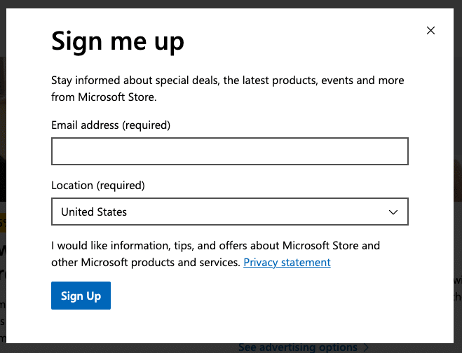
A form on Microsoft’s US website for updates on special deals is as short as possible: just two fields (one of them pre-filled) are enough at this stage of the users’ journey
-
- The form is confusing: If a form is difficult to understand or if the value of the offering behind it is unclear, users are likely to become frustrated and leave. Forms should be designed to be user-friendly and easy to comprehend. Ensure that you name the fields in a manner that is easy to understand, and avoid fields that take too long to fill out. If you notice any fields that stand out in terms of average duration, they are likely to be confusing to users.
- The form is irrelevant: If a form field is irrelevant to the user, they are more likely to abandon it. For instance, if a user is filling out a form to sign up for a product demo and encounters an irrelevant field, such as a requirement to provide the number of years of their professional experience, it increases the chances of abandonment. Avoid including irrelevant fields in the form at all costs. Also, consider placing the form where the user would expect it and where it is relevant to them. If a particular field is causing a significant number of drop-offs, question its relevance.
- There’s ineffective error messaging: If a user attempts to complete a form but encounters an error, it is crucial to provide a clear error message. Failing to provide an error message or not making it clear enough will leave the user unable to understand why the error occurred or how to fix it. Therefore, ensure that the form’s error message is concise, clear, and easy to comprehend. Use plain writing and short sentences to prevent user frustration and discourage them from giving up on submitting the form. Here’s an example of an ineffective error message:
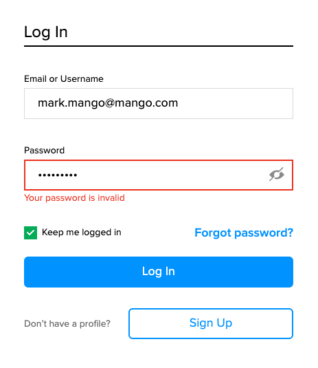
The form doesn’t explain why there’s a problem. Nor does it explain how the user can fix the problem.
-
- The form is not mobile-friendly: Over 90% of all internet users use their mobile devices to browse the web. If a user on a mobile device encounters a form that is not optimized for their device, they are likely to abandon it. Mouseflow’s form analysis tool allows you to segment out mobile users and assess whether their conversion rate is significantly lower than that of desktop users. If it is, it suggests that the form may not be well optimized for mobile devices or that the offering may be irrelevant on this type of device. For instance, if users expect to receive a large PDF report upon form submission, they are less likely to complete the form on a mobile device. To understand what exactly went wrong for them, you can watch their session recordings.
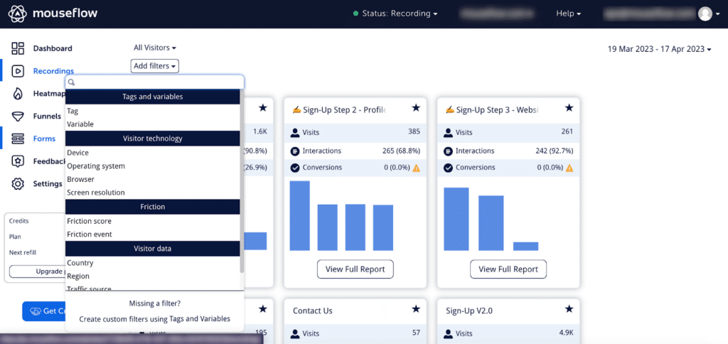
Mouseflow allows you to filter our form data for mobile users and analyze it
- The form requires too much personal information: Between 2019 and 2020, the number of identity thefts increased by 45%. As a result, many people are hesitant to share their personal information online. For example, from 2018 to 2019, the ARF reported a drop from 41% to 31% in home address sharing. Therefore, if a form requires excessive personal information, users are likely to abandon it. Consider removing unnecessary fields, especially at the initial stage. For instance, if you don’t truly need the user’s phone number in a lead generation form, removing this field can likely improve the conversion rate.
Ensuring that your forms are short, simple, and user-friendly can help reduce the number of form abandonments. Additionally, providing the option for users to save their progress can be beneficial.
Using Form Analytics to Boost Your Business
While following best practices can improve your forms, taking it a step further requires using form analytics tools. Form analytics provides valuable insights that can enhance your B2B, B2C, eCommerce, or SaaS marketing strategy. Just like other analytics, it helps you make data-driven decisions.
For example, if many visitors leave your form page without completing it, form analytics lets you analyze the steps and find out which field is causing the drop-off. You can also assess if your form is too long and needs optimization.
You might also need to make changes to your website design. This could involve improving the visuals around your form to make it more noticeable or making your copy clearer to explain why users should fill out the form.
By tracking your form analytics, you can identify and address these issues effectively, optimizing your efforts to drive better results for your business.
In Closing
Form analytics is a powerful way to track user interactions with your forms and identify areas for improvement. You can make informed decisions about improving your forms, making them more likely to be completed, and generating better results for your business.
This guide helped you get a general perspective on what form analytics is, why it matters, and what metrics you can track with it.
Some best practices for designing forms include:
- Placing the form where it’s visible for the user
- Keeping it short and easy to understand
- Making sure it’s mobile-friendly
Use a form analytics tool to monitor and improve your forms, and you’ll reap the best results.