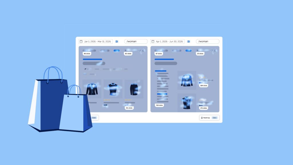
Shopify analytics can show product views, add-to-cart activity, checkout behavior, and conversions. Those numbers tell you where performance changes, but they do not always show what shoppers experienced on the page before they acted or left. Website heatmaps add this behavioral layer by showing how visitors interact with individual pages and elements.
A shopper may reach a product page without noticing the delivery information, repeatedly click an image that does not expand, struggle with a mobile filter, or scroll past the Add to Cart button while looking for more detail. A Shopify heatmap makes these patterns visible across many visits, helping ecommerce teams decide which pages and interactions deserve closer investigation.
This guide explains how to use heatmaps on product pages, collection pages, navigation, and the journey toward checkout. The goal is not simply to generate colorful reports. It is to connect a store problem with behavioral evidence, investigate the likely cause, make a focused change, and measure what happens next.

What Is a Shopify Heatmap?
A Shopify heatmap is a visual representation of how shoppers interact with a storefront page. Depending on the map type, it can show where visitors click or tap, how far they scroll, which sections remain visible longest, where desktop visitors move their cursors, and where signs of frustration occur.
Shopify heatmaps help answer page-level questions such as whether visitors notice the Add to Cart button, reach reviews and shipping details, use collection filters, or interact with elements that do not respond. They aggregate behavior across multiple sessions, making them useful for finding patterns rather than evaluating one shopper at a time.
This article focuses specifically on applying those behavioral signals to Shopify stores.
What Can Heatmaps Tell You About Your Shopify Store?
Shopify heatmaps reveal how page layout and interface design shape shopper behavior. They are particularly useful for identifying five kinds of evidence:
- Visibility and content hierarchy: Scroll and attention patterns show whether shoppers reach reviews, sizing, delivery, returns, product benefits, and other information needed to make a decision. They can also reveal when promotional content receives more exposure than purchase-critical information.
- Purchase interaction: Click data shows whether visitors use Add to Cart, Buy Now, product galleries, swatches, size guides, accordions, and recommendations. Comparing clicks with visibility helps distinguish a CTA that is not seen from one that is seen but not persuasive.
- Product discovery: Interaction with menus, search, categories, filters, sorting, and product cards shows how shoppers narrow the catalog and where the discovery process may become difficult.
- Friction and misleading design: Repeated or unsuccessful clicks can expose controls that do not respond, images that appear clickable, unclear variant requirements, broken elements, or interactions that provide insufficient feedback.
- Differences between audiences: Separate maps for mobile and desktop, new and returning shoppers, campaign sources, or purchasers and non-purchasers can reveal problems hidden by an aggregate view.
Together, these signals help teams locate where the storefront experience supports or interrupts the path to purchase. A heatmap can show, for example, that mobile shoppers rarely reach delivery information or that visitors repeatedly click a product image that does not expand. It cannot establish the cause on its own. Low CTA activity could reflect weak visibility, unclear copy, missing product information, low intent, or a technical issue. The workflows below show how to investigate each pattern before deciding what to change.
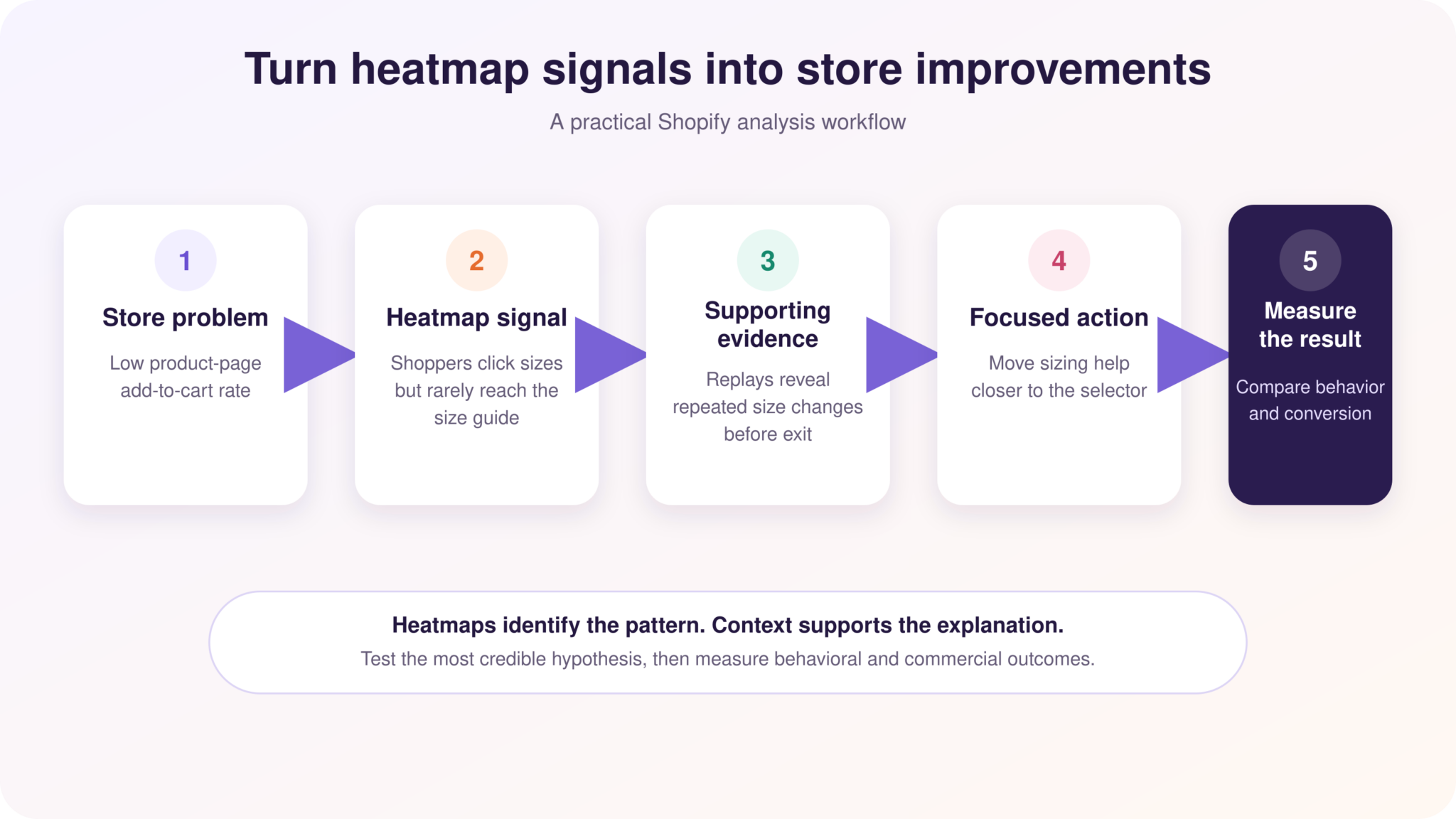
Use heatmaps to locate a pattern, supporting evidence to interpret it, and store outcomes to measure the change.
6 Ways to Use Heatmaps to Optimize a Shopify Store
Effective heatmap analysis starts with a specific store problem rather than a general search for hotspots. The six workflows below connect common Shopify questions with the relevant heatmap evidence, the additional context needed to interpret it, and a practical next step. In each case, validate the pattern before changing the store and measure whether the change improves both shopper behavior and business outcomes.
1. Analyze Your Product Pages
Product pages have to help shoppers evaluate an item without seeing, touching, or trying it in person. A useful analysis therefore looks beyond the Add to Cart button and considers the complete decision area: product images, gallery controls, price, variants, sizing, descriptions, reviews, delivery, returns, stock messages, and trust information.
Start with a click heatmap to see whether shoppers use image galleries, size guides, variant selectors, review links, and expandable sections. Then use scroll and attention maps to determine which information is visible and where attention falls. A product description may technically appear on the page but still receive little exposure if it sits below a long gallery or collapsed accordion.
For example, imagine that a product page receives strong traffic but has a low add-to-cart rate. The click heatmap shows frequent interaction with the size selector, while the scroll map shows that most visitors do not reach the sizing guide below the fold. Session recordings then reveal shoppers changing sizes repeatedly before leaving. A reasonable hypothesis is not simply “make the Add to Cart button bigger.” It is that sizing information needs to appear closer to the selector or open directly from it.
Compare mobile and desktop separately, as the same product content may appear in a different order or require more scrolling on smaller screens. For a broader review of page elements and merchandising decisions, see this guide to ecommerce product page optimization.
2. Check Whether Shoppers See Your Most Important Content
Information can influence a purchase only if shoppers see it. Scroll heatmaps show the percentage of visitors who reach each part of a page, while attention heatmaps indicate how long page sections remain visible. Used together, they help distinguish reach from sustained visibility.
Review the exposure of:
- Delivery dates and shipping costs
- Returns and warranty information
- Product benefits and specifications
- Size or compatibility guidance
- Customer reviews and other trust signals
- Related products and bundles
Suppose only 30% of visitors reach customer reviews. That does not automatically mean the reviews must move to the top. First compare purchasers with non-purchasers and inspect recordings from visitors who leave. If converting shoppers actively seek reviews while non-converters abandon before reaching them, moving a review summary or rating closer to the purchase area may be worth testing.
The same principle applies to long collection and landing pages. A sharp decline in scroll reach can indicate that visitors found what they needed, lost interest, encountered a false bottom, or moved to another page. Treat the map as a signal and use the surrounding journey to interpret it.
3. Identify CTA and Interaction Problems
A click heatmap shows whether shoppers interact with Add to Cart, Buy Now, product recommendations, promotional banners, and other calls to action. It also reveals clicks on elements that shoppers appear to mistake for controls.
Look for three patterns:
- Low interaction with a visible CTA: shoppers see the area but do not click.
- Competing interaction: secondary links or promotions attract attention away from the intended action.
- Unsuccessful interaction: shoppers repeatedly click an element that does not respond or produces an error.
The appropriate action depends on the pattern. Low CTA activity alongside low scroll reach is primarily a visibility problem. Low activity despite strong attention may point to unclear value, missing information, or insufficient intent. Repeated clicks on the CTA may indicate slow feedback, an unavailable variant, validation failure, or another technical issue.
Do not optimize for clicks alone. A promotional element may attract a large hotspot while pulling shoppers away from higher-value actions. Compare the heatmap with add-to-cart and conversion outcomes before deciding that more clicks represent an improvement.
4. Improve Collection Pages and Navigation
Collection pages help shoppers narrow a catalog. Heatmaps can show whether they use filters, sorting, search, category links, product cards, quick-add controls, and pagination or load-more buttons.
Pay particular attention to dynamic elements. Filters may open a drawer, update the product grid, or add active-filter chips without loading a new URL. A static screenshot can combine interactions from several states and make the pattern difficult to interpret. An interactive heatmap allows the analyst to open menus, filters, accordions, and overlays while viewing the relevant behavioral data.
Consider a mobile collection page where the filter button receives few taps. That could mean shoppers do not need filters, but it could also mean the control is hard to notice. Check whether visitors scroll through many products, reformulate searches, return to the menu, or leave the collection. If recordings show repeated browsing without refinement, testing a clearer filter label or more visible control is a stronger response than assuming filters are unnecessary.
Use click patterns to identify categories and menu labels that attract or confuse visitors, then combine that evidence with search terms and product-discovery paths. The guide to ecommerce navigation and information architecture provides a broader framework for structuring categories, filters, menus, and search.
5. Find Friction Before Checkout
Not every lost sale begins in checkout. Shoppers may struggle with variant selection, cart drawers, discount-code expectations, shipping estimates, quantity controls, login prompts, or links to delivery and returns information before they reach the payment flow.
These moments are part of a broader pattern of ecommerce friction: small usability, information, or technical obstacles that make the path to purchase harder than it needs to be.
A friction heatmap can surface clusters of rage clicks, dead clicks, and click errors on the storefront. Investigate those signals in session recordings to see what the shopper attempted, what the interface returned, and whether the visitor recovered or abandoned the journey.
For example, repeated clicks on a disabled Add to Cart button may indicate that the shopper did not understand a required variant selection. The action may be to clarify the instruction, preselect a valid option where appropriate, or provide stronger visual feedback – not simply to change the button color.
Heatmap and replay coverage across checkout can vary according to the store’s Shopify setup, checkout configuration, tracking method, permissions, and third-party tool implementation. Do not assume that a storefront installation captures every checkout or payment interaction. Confirm the pages and events available in your own configuration, and use Shopify checkout and conversion data alongside behavioral evidence. For a journey-level view, see how to analyze an ecommerce conversion funnel.
6. Compare Different Shopper Segments
An aggregate heatmap can hide the differences that matter most. Segmenting the same page can reveal that a layout works well for one audience and creates friction for another.
Useful Shopify comparisons include:
- Mobile versus desktop
- New versus returning visitors
- Purchasers versus non-purchasers
- Paid campaign traffic versus organic or direct traffic
- Visitors from different countries or markets
- Users who added an item to cart versus those who did not
Imagine that paid social traffic generates many product views but few purchases. A segment comparison shows that campaign visitors engage heavily with product images and reviews but rarely reach delivery information. Organic visitors, by contrast, scroll farther and convert more often. This does not prove that shipping information is the only problem, but it provides a focused hypothesis: campaign visitors may need key buying conditions earlier because they arrive with less context.
Mouseflow’s dynamic filters and side-by-side comparison let teams compare pages, periods, devices, heatmap types, or audience segments without relying on two unrelated aggregate screenshots. This is especially useful after a theme update, campaign launch, merchandising change, or experiment.
Which Heatmaps Are Most Useful for Shopify Stores?
The most useful Shopify heatmap depends on the question. Click and scroll maps provide a strong baseline, while attention, friction, and interactive maps add context for content visibility, unsuccessful interactions, and dynamic storefront elements.
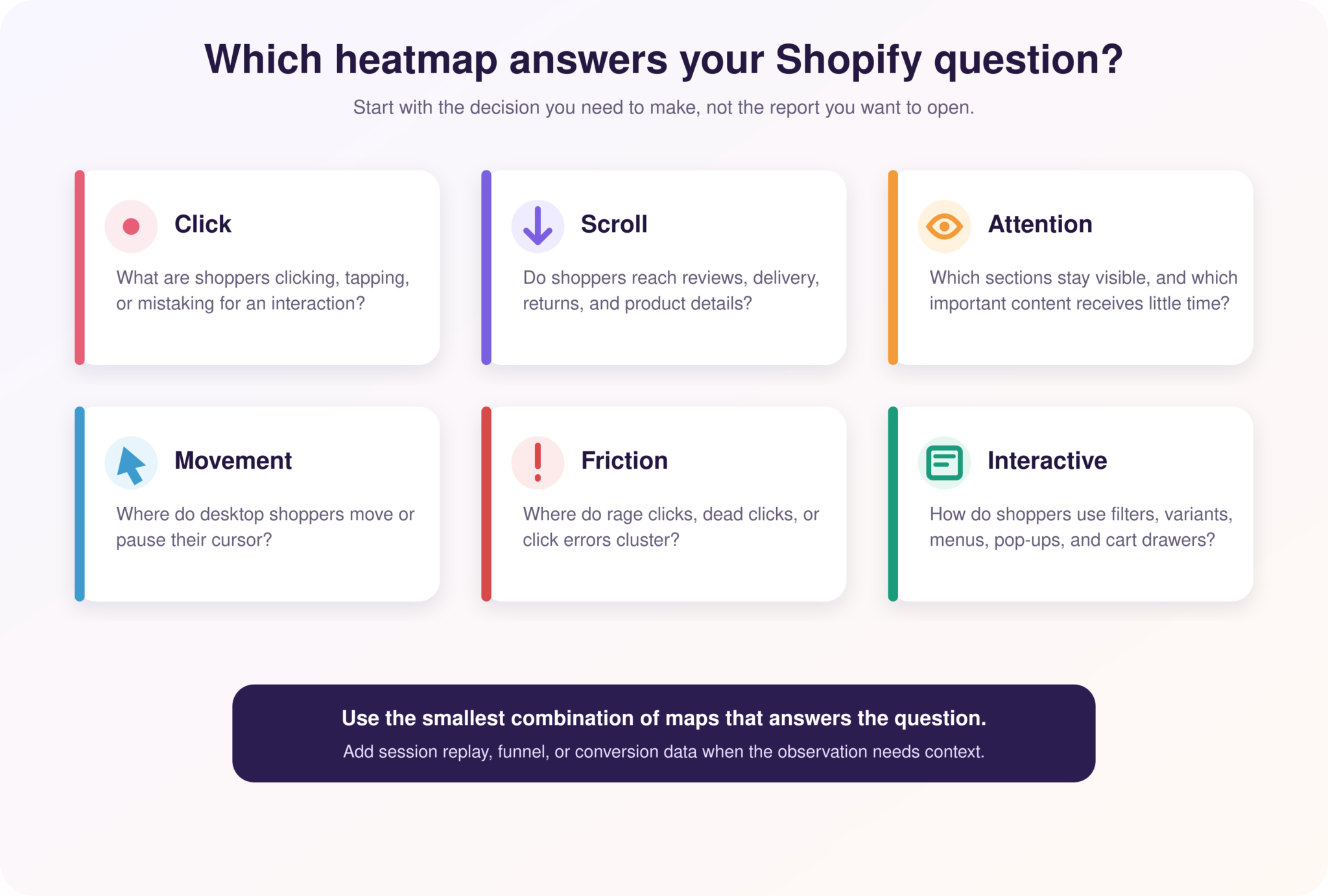
Choose the heatmap type according to the Shopify question you need to answer.
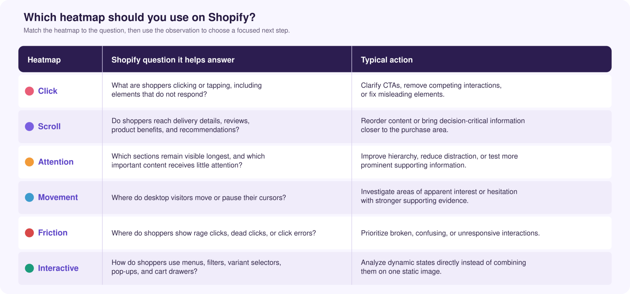
You do not need to review every map for every page. Select the map that matches the question, then add another source only when it helps confirm or challenge the interpretation.
How to Analyze Shopify Heatmaps Without Jumping to the Wrong Conclusions
A heatmap observation is not an explanation. “Few visitors click this CTA” describes a pattern; it does not establish that the CTA should be larger, brighter, or higher on the page.
Use this four-step process:
- Describe the observation without interpreting it. For example: “Only 18% of mobile visitors click Add to Cart, compared with 31% of desktop visitors.”
- Check exposure and context. Determine whether both segments see the same content, reach the CTA, encounter the same variant controls, and arrive from comparable sources.
- Investigate the relevant sessions and journey. Use session replay to see the sequence behind the pattern and funnels to understand whether it affects progression or conversion.
- Form and test a specific hypothesis. Change the element or experience most strongly supported by the evidence, then compare behavior and business outcomes after the update.
Also check sample size and time period. A map built from a small campaign, seasonal sale, or unusual traffic mix may not represent normal store behavior. Separate device types and important traffic sources, exclude internal activity where possible, and compare equivalent periods.
Finally, distinguish attention from success. A hotspot may represent useful engagement, confusion, or a broken interaction. High scroll reach may indicate interest or simply that shoppers are searching for information they expected to find sooner. Pair the visual pattern with recordings, conversion funnels, Shopify outcomes, and direct feedback before prioritizing a change.
How to Use Heatmaps With Mouseflow on Shopify
Mouseflow connects heatmaps with session replay, friction detection, filters, comparison, funnels, form analytics, journeys, and feedback. The practical workflow for a Shopify store is:
- Connect Mouseflow to Shopify. Add the Mouseflow tracking code to the store using the current Shopify integration instructions. Confirm which storefront and checkout pages are included in your configuration.
- Configure privacy controls before collecting data. Apply appropriate consent settings, mask or exclude personal and payment information, and review the store’s legal requirements. A behavioral analytics tool can support compliance, but it does not make the implementation compliant automatically.
- Allow representative behavior to accumulate. Avoid drawing conclusions from only a handful of visits. Include enough traffic to compare the audiences relevant to the question.
- Select the page and segment. Start with a high-impact product page, collection, campaign landing page, or pre-checkout interaction. Filter by device, traffic source, visitor type, location, campaign, or tracked behavior where relevant.
- Choose the heatmap that matches the question. Use click maps for interaction, scroll maps for reach, attention maps for sustained visibility, friction maps for unsuccessful behavior, and interactive maps for dynamic elements.
- Validate the pattern. Move from the heatmap to recordings from the same visitors. Check funnels or journeys to determine whether the behavior is connected with abandonment, add-to-cart activity, or conversion.
- Create a focused hypothesis. Define the observed behavior, the suspected cause, the proposed change, the affected audience, and the outcome expected to improve.
- Measure the result. After the change, compare equivalent periods or segments and monitor both behavior and commercial outcomes. A hotter CTA is not a success if add-to-cart or purchase performance does not improve.
This workflow places heatmaps inside a broader ecommerce optimization process: find a meaningful behavioral pattern, investigate its cause, prioritize an evidence-based change, and evaluate the result.
Explore the Mouseflow Shopify integration or learn more about the Website Heatmap Tool.