Get the Dignity story sent directly to your inbox
Dignity is one of the oldest providers of funeral services in the UK. They started back in 1812, and now have more than 3,000 employees serving over 800 local communities nationwide.
Dignity has been present online for more than 15 years, having launched their first eCommerce website in 2007, aiming to expand their reach and make their services more accessible. Recently, Dignity has launched a new Dignity Funeral Plans Website, which offers Funeral Plans.
A Funeral Plan is a product that contains several steps, each allowing users to choose from various options in order to guide them towards their ideal, personalized funeral as they want it to be. Upon completing the process, users receive a PDF with a breakdown of their selections, costs, and tailored payment options. The aim of offering Funeral Plans is to share final wishes and at the same time cover costs, so that decision making and financial outlays don’t fall on loved ones when the time eventually comes.
The Roadblocks in Dignity’s Digital User Journey
However, with innovation came a set of unique challenges. The new website was not working as intended, with fewer users than expected reaching the end of the planning process and getting the PDF. The free guide Dignity offered to give additional explanations didn’t see enough downloads either.
To overcome these difficulties, Dignity partnered with Rawnet, a UK based Digital Marketing agency and a Mouseflow certified partner. Together, they set on a journey to optimize the users’ experience, increasing conversions and revenue generated by Dignity’s new initiative.
Rawnet’s Initial Findings Using Mouseflow
Rawnet used Mouseflow to analyze and improve the user experience. They started with setting up conversion funnels and looking at heatmaps to analyze user navigation patterns and uncover areas where users encountered difficulties. The initial findings revealed certain friction points that needed addressing:
- The homepage seemed not to capture users’ attention as anticipated, failing to guide users to key pages.
- Users were finding it difficult to navigate through the first question on the /planning page, leading to a high drop-off rate. The process was too complex, and turned out to be a barrier for the users.
- The free guide that Dignity offered wasn’t downloaded frequently enough, with users dropping off between visiting the free guide form page and completing the form.
To identify the areas that led to higher user frustrations, Rawnet also employed Mouseflow-powered user surveys on exit pages, as well as a post-purchase user survey. These surveys got 135 answers, helping identify the problems that users faced on Dignity’s website.
With these findings in mind, Rawnet started revamping Dignity’s Funeral Plan website design to simplify the user journey and improve user experience.
Rawnet’s User-Centric Revamp
Firstly, Rawnet simplified the initial planning question, making it easier to answer without additional hesitation.
In addition to that, by looking at individual session recordings in Mouseflow, they figured out that users were often not understanding that they need to accept terms and conditions before proceeding further. So, Rawnet made this step more intuitive as well. This initiative saw a significant decrease in the drop-off rate, which plummeted from a staggering 24% to just 4% within a week of implementation.
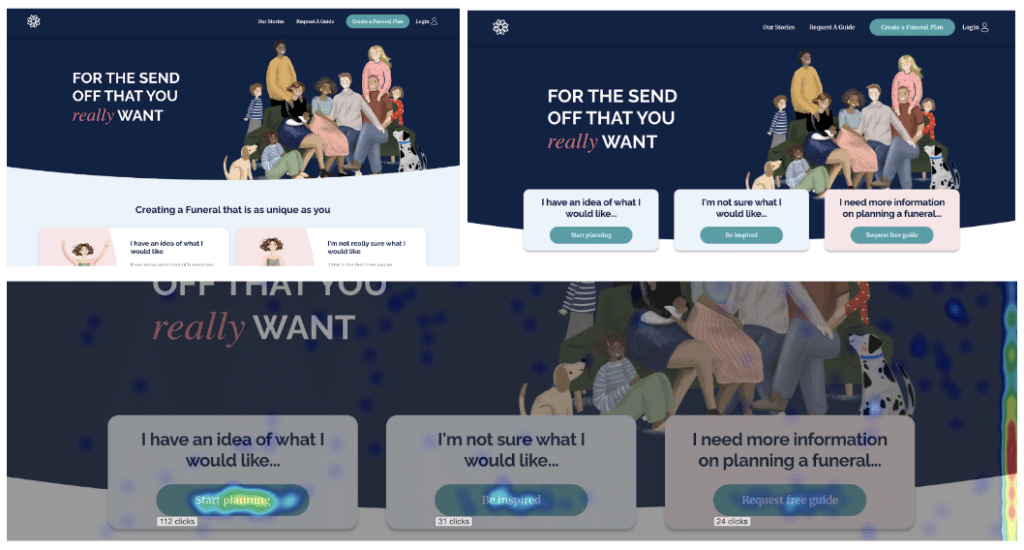
Simultaneously, Rawnet turned its attention to the homepage, where low engagement levels were stifling conversions. By A/B testing one hypothesis at a time, they crafted a revamped homepage design with clear call-to-actions that intuitively guided the users towards the key pages, making it much easier to progress through the planning journey. They also made sure that call-to-action buttons look clickable and are always visible above the fold, i.e. on the very first screen that the user sees upon opening the website.

Dignity’s Funeral Plan Website before (left) and after the revamp (right). The heatmap below shows how clicks are now focused on the 3 CTA buttons
This revision significantly improved the visibility and effectiveness of call-to-action buttons, resulting in a dramatic increase in user engagement across both desktop and mobile platforms.
| Click through rate (CTR) improvement after the homepage revamp | |||
|---|---|---|---|
| Visits to /planning page | Visits to stories page | Visits to the free guide page | |
| Desktop | 195% | 131% | 121% |
| Mobile | 384% | 591% | 222% |
Additionally, by looking at Mouseflow session recordings, Rawnet found out that users visiting the free guide page were not clicking on the button that triggered a popup with a form to download the free guide. So, they optimized the free guide page, offering the download form right on the page instead of in a popup. That resulted in a 60% increase of form completions.

Mouseflow helped us pinpoint and resolve user barriers to conversion. We swiftly identified digital product flaws and enhancement opportunities. The Mouseflow funnels feature was crucial for optimizing the complex product spread across multiple URLs.
Conclusion
The collaboration between Dignity, Rawnet, and Mouseflow led to transformative results:
- Page views for sections like “/planning,” “free guide,” and “stories” went up 285%, which helped significantly improve conversions.
- The previously concerning drop-off rate at the initial planning stage went down by 24 percentage points, which signaled that the user journey became much simpler.
- The downloads of the free guide went up by 60% thanks to simplifying the user interactions with the form.
These numbers represent a significant improvement in user experience. By doing so, Dignity has helped their website visitors reduce the amount of stress felt during the process of funeral planning or when considering it.
Company: Dignity
Agency: Rawnet (Certified Mouseflow Partner)
Tools used: Mouseflow, Heurix.io, Google Analytics 4
Features used in Mouseflow: Heatmaps, Session Replay, Conversion Funnels, Feedback Surveys.
