
The day a marketer says, “We’ve got enough conversions,” is the day the world might just stop turning—because let’s face it, that’s never happened before.
That’s why conversion rate optimization is one of the most widely used SaaS marketing strategies. We’re constantly optimizing and re-optimizing our websites, improving user experience and refining flows to guide users toward the desired actions. But there’s always more to do. Just when you finish fine-tuning one campaign, another one needs your attention, and the cycle continues. And on some pages, optimization just never stops.
Looking for ideas for winning conversion rate optimization (CRO) experiments? We’ve got you covered! Here are seven SaaS CRO experiment ideas, all backed by real-world tests from teams who’ve already been there – and these tests were major wins for them.
1. Adding a CTA to the Blog’s Hero Section
If you have a company blog, you know the struggle of getting it to actually drive results— and figuring out how to measure those . In trying to reach our goals, we often turn to big strategic shifts, like rethinking our blog topics or switching up distribution channels. But what if we told you that a simple CRO experiment can make a world of difference?
Think about a typical blog layout: a sticky navigation bar with a CTA at the top, a hero image with the title, the article content with CTAs sprinkled throughout or in the sidebar, and a big, bold CTA at the bottom.
What else can you do to get more conversions from such a page?
Here’s a tip: try adding a CTA right into your hero section.
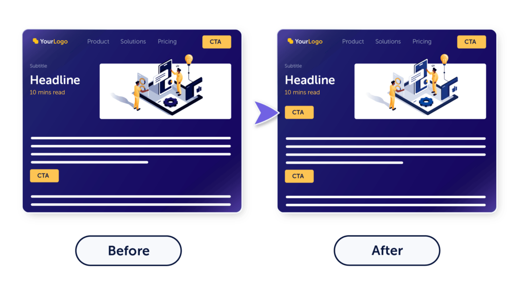
Success story: Lauren Funaro shared that at her previous startup, the content marketing team decided to A/B test adding a hero CTA at the top of their blog posts. They ran the experiment across all their top blogs for a few weeks and discovered that placing a CTA alongside the hero image significantly boosted free trial signups and even increased free-to-paid conversion rates.

“We found that having a CTA increased not just signups, but conversions to paid users by 15%. Sure thing, we kept the CTA!”
2. Including a CTA in the Most Engaged Content Sections
This was just one example of how better CTA placement could boost your website’s conversions. Now, imagine the impact of optimizing all your CTAs across the entire site.
So, how do we typically place CTAs? Often, we insert them throughout a page hoping to maximize their visibility—like throwing spaghetti at the wall and hoping something sticks.
The idea for the next CRO experiment involves understanding how your visitors interact with your content and placing CTAs in the sections where users are most engaged.
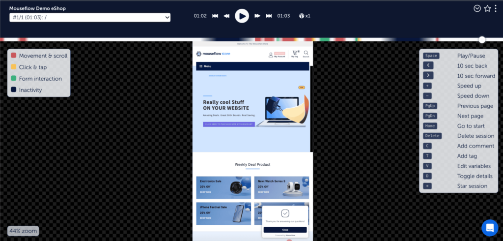
You can do this using a tool like Mouseflow Heatmaps and looking at attention heatmaps . They show exactly where on the page users spend the most time. Consider placing CTAs near these high-engagement areas to make them more visible to the readers – an easy SaaS CRO experiment to run that can yield significant results.
Note: While the following story focuses on optimizing CTAs in a company blog, you can apply the principle to your landing pages, too.
Success story: Mailtrap is an email delivery platform. Their marketing team produces educational, bottom-funnel content aimed at tech-savvy marketing teams and developers. Their challenge was determining the best placement for free signup CTAs within this type of content to maximize its performance.
To solve this, the team analyzed the performance of different topic clusters and noticed that articles within the same cluster exhibited similar user behavior. This way, they were able to identify the optimal spots for CTA placement within each cluster— driving a significant increase in conversions simply by positioning CTAs in the right spots.

“We create how-to guides for email sending across various technologies. After analyzing user engagement across tutorials dedicated to all the major backend technologies, we found that user flow was consistent across all those articles. By placing CTAs in the most engaged sections, we saw a significant boost in conversions.”
3. Removing Prices From the Pricing Page
You didn’t see this one coming, did you?
However counterintuitive it may sound, including too much information on your website can actually be harmful for your conversions.
Displaying prices to first-time visitors before they fully understand your product’s value can discourage them from booking a demo and discovering those benefits. That’s the reason only 45% of SaaS companies have pricing publicly available, and the other 55% do not.
This approach isn’t for everyone, though. If your business follows a fully self-service model aimed at small businesses, removing pricing could bite you in the ass.
However, if your sales process heavily depends on talking to prospects before they make a purchase decision, this is definitely worth trying!
Success story: When Contractbook, a SaaS brand that helps businesses organize contracts, shifted its ideal customer profile (ICP) from small businesses to mid-market companies, they noticed a drop in website conversions. To address this, the marketing team refocused the pricing page from cost to value.
Instead of displaying prices, Contractbook introduced an interactive ROI calculator that showcased potential annual savings for prospects after adopting the platform. Once visitors saw these impressive figures, a CTA to book a demo popped up.
While demo-to-opportunity conversions decreased by 15%, the overall impact of the experiment was significant. The new approach led to a 679% increase in SQL conversions across all company sizes and a 971% increase for their ICP.
4. Adding an Interactive Demo to Prevent Drop-Offs for Engaged Users
Are you struggling to get users to book a demo, and removing pricing info doesn’t seem sufficient ? That’s understandable—not every visitor is ready to talk to your team when they first land on your site (in fact, most aren’t, and more technical people usually don’t like to talk at all).
But that doesn’t mean you have to lose them.
When someone reaches your product demo booking page, it signals genuine interest in your offer. If they leave without scheduling a demo, you’ve potentially lost a qualified lead who just wasn’t ready to talk.
Our next CRO experiment suggests trying to capture the interest of visitors who are about to leave by offering an interactive demo. This allows them to get a feel for your product before committing to talking with sales—and who knows, they might even decide to sign up immediately if that fits your SaaS model.
Mind that we recommend augmenting your live demo with an interactive one, not entirely replacing it. Only 3% of SaaS companies rely on real-use demos, and for good reason. Many SaaS products are just too wide-range and complex to offer a one-size-fits-all demo flow.
Success story: At Mouseflow, we noticed consistently high drop-off rates on our book-a-demo page. We hypothesized that the majority of the visitors who left the page were looking for an on-demand demo instead.
We didn’t want to replace the live sales-rep-led demo with an interactive one (for the reasons mentioned above) , nor did we want to overwhelm visitors with two competing offers. So, we came up with a solution: an exit-intent popup that offers an on-demand demo to visitors about to leave the page.
The results were immediate—we got a 133% increase in the visits to our interactive demo page and a 40% increase in lead generation from people who we would normally lose track of after not filling out the demo form.

5. Adding Visual Cues to Landing Pages
Visual cues are a powerful yet often unnoticed tool in web design. They subtly guide users through your site, directing their attention and influencing their actions without them even realizing it.
For instance, an arrow pointing toward a sign-up button can naturally draw attention to it, increasing the likelihood of a click. Even the direction a character on an image faces can subtly guide users’ eyes to important content.
By incorporating these visual cues, you can create a more intuitive experience, encouraging users to take the actions you want.
Here are the most common applications of visual cueing:
- Arrow cueing. Simply adding an arrow pointing in a specific direction can significantly boost engagement and conversion rates. The (old but gold) experiment has uncovered that arrows are actually the most effective at guiding users’ attention to where you want it.
- Color cueing. Colors evoke different emotions and associations, and they can also guide users toward key destinations on your page.
- Gaze cueing. The direction a character is looking can influence where users focus their attention. The same research has revealed that when a person in an image looks away from a key element, it can distract users.
Success story: Canstar, the financial comparison platform, wanted to improve user interactions on their site and ran a series of first-click tests with Lyssna, a user research platform. By simply adding an arrow pointing to an input field, they were able to concentrate users’ attention around it and drive more interactions with the element.
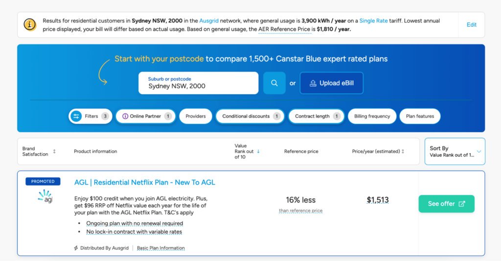

“In addition to A/B testing, there are a variety of usability tests that you can quickly implement to improve your SaaS CRO strategy. Take, for example, Canstar, one of our customers. They ran two first-click tests in Lyssna to compare the design for a web page listing different electricity plans. Both designs had the same microcopy, and one design had an arrow pointing to a CTA button prompting users to enter their postcode, and one didn’t.
By comparing the results of both tests, they found that 30% more users were successfully able to engage and enter their postcode on the design with the arrow compared to the one without.”
6. Display Personalized Offers to Engaged Users
Want to boost conversions from your existing traffic? Focus on those who have shown interest in your offer but aren’t ready to convert just yet.
This following experiment involves identifying highly engaged users who have visited your target pages but haven’t yet taken a desired action—like booking an event, signing up for a demo, or completing a purchase—and displaying personalized offers or messages to encourage them to convert.
Success story: Meetic, an online dating platform, wanted to increase participation in their events, which were a critical component of their user engagement strategy. The team hypothesized that the easiest way to do so would be by engaging users who had viewed event pages but hadn’t yet booked a spot. This indicated a clear interest in the events, yet something was holding these users back from committing.
To address this, Meetic started to display personalized, non-intrusive messages specifically targeting these users right on the homepage. The messages provided details about similar upcoming events based on users’ behavior, age, gender, and geographical location.
The results were impressive. The experiment led to a 3x increase in event bookings compared to traditional email invitations, and the click-through rate on the reminder messages doubled.
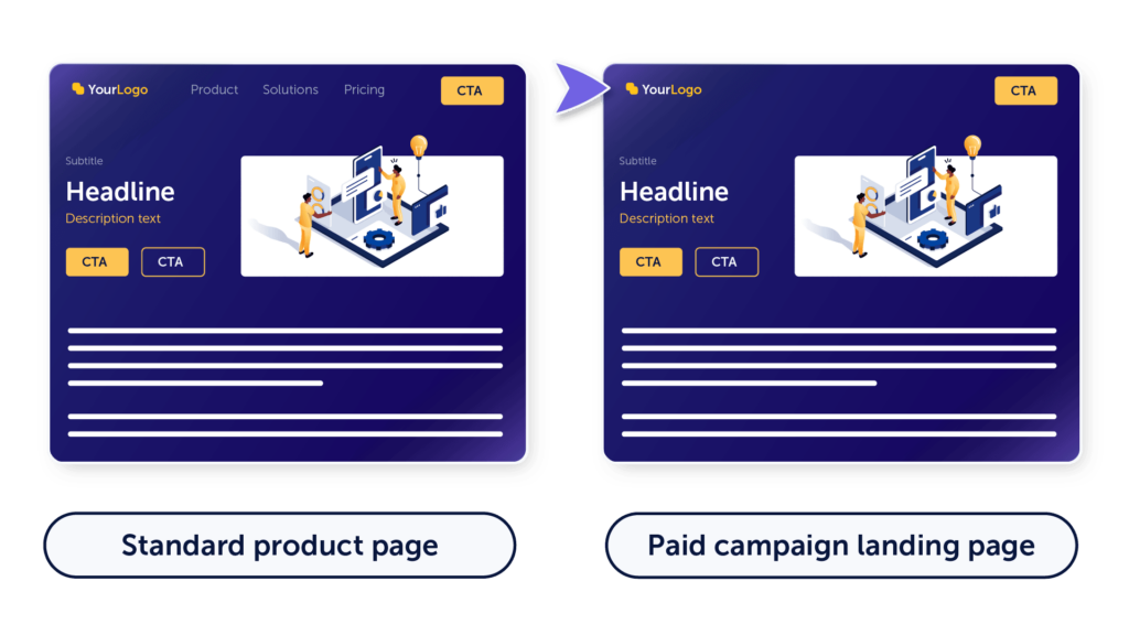
7. Removing a Navigation Bar From Landing Pages
Less is more. Somehow, we forget about it when we try to pack in all sorts of helpful information on our website.
A menu bar, sticky banner, multiple CTAs, and an exit popup on top—these are common elements of a typical landing page. While they can indeed add value, they can also pull users’ attention away from what you really want them to do.
Instead of thinking of what you could add to your page to increase conversions, try looking at what you can remove.
Success story: As we continued CRO experiments for the Mouseflow website, we were looking to improve conversion rates from our paid campaigns. We turned to click heatmaps of our own website for data to create a hypothesis. We hypothesized that while our standard feature page design worked well for organic visitors, it included too many distractions for paid users, who we had only one chance to convert.
So, as a part of our landing page optimization efforts, we removed the top menu bar from our landing pages and demo booking pages, so the campaign clickers had only two options: book a demo or sign up for a free trial. The simple fix resulted in a 2.3% improvement in conversion rates for demo bookings.
How Do You Know What to Test?
Boy, that’s a lot of SaaS CRO ideas (and that’s just the tip of the iceberg). But before you jump on to try any of these or develop your own experiments, set aside gut feelings and turn to the data.
Even if you think you can name all the performance issues of your SaaS website without logging into Google Analytics, or whatever analytics tool you use.
Knowing that issues exist doesn’t eliminate the need for a comprehensive performance analysis. You still need the data to identify and document these issues, prioritize the most critical ones, and uncover correlations between them.
For example, you might discover that your bottom-funnel performance issues are actually stemming from a lack of qualified leads at the top of the funnel. In that case, you wouldn’t need to make adjustments throughout the entire funnel—just focus on improving lead quality at the top.
So here’s what you need to do:
Identify bottom-line issues with a revenue analytics platform like ChartMogul (or whatever it is that you’re using):
- Clearly define your primary goal. Is it increasing MRR, boosting self-service sales, or generating more leads from your blog?
- Focus on the most pressing issue.
Analyze quantitative data with a website analytics tool like Google Analytics or Mixpanel (or whatever it is you are using):
- Examine key metrics related to your chosen goal. For example, if your target is MRR, look at conversion rates, average sale value, customer acquisition cost, and customer churn.
- Identify specific areas of underperformance, such as a high drop-off rate on the pricing page or a low conversion rate on blog content.
Uncover behavioral insights with qualitative data with behavior analytics software like Mouseflow :
- Understand your visitor’s journey to and from the target page. How many have dropped off on their way?
- Watch dropped sessions to spot where and why users disengage.
- Combine quantitative and qualitative data to form hypotheses about the root causes of performance issues.
Once you’ve developed your hypothesis, it’s time to act on it. Build a conversion funnel to track your progress. Follow our step-by-step plan for CRO experiments to guide you through setting up your own tests.
Don’t Stop Experimenting
Conversion rate optimization is just as valuable for SaaS brands as it is for eCommerce. Maybe even more so, because you can run experiments both on your marketing website and on your SaaS platform.
In this post, we’ve described real-life experiments, some of which led to doubling and tripling conversions for SaaS companies. If you haven’t yet embraced CRO or if you’ve been struggling with planning your next experiment and finding time for it, we hope this article gives you motivation to renew your efforts.
There are so many opportunities for SaaS conversion optimization out there! You only need to analyze data to know which ones are more likely to get you more happy engaged customers and let that knowledge drive your CRO strategy.
FAQ
For SaaS companies, there are several important conversions at different stages of the user journey that form the entire SaaS conversion funnel:
- Conversion from a website visitor to sign up/free trial. According to MADX, the industry average for free trial to sign up conversion is between 2-5%. If your conversion rate is within this range, you can say it’s good.
- Conversion from MQL to SQL. This is one of the most important lead lifecycle changes. According to FirstPageSage, for a B2B SaaS business, an average conversion rate from MQL to SQL lies between 26% and 51% depending on the acquisition channel. Paid conversion rate (from PPC) is the lowest, and from SEO is the highest.
- Conversion from demo to paying customer. According to SaaStr, a demo to customer conversion benchmark is 10-20%. Anything below that results in sales team burnout.
The most important conversion events for SaaS businesses are conversion rates from website visitor to trial, sign-up, or demo booking.
In addition to that, the conversion rate from website visitor to MQL allows marketing teams to assess the quality of the traffic the organization’s website gets. And the conversion rate from SQL to deal closed helps evaluate the efficiency of the sales team.
According to UserGuiding, the most converting companies spend 5% of their yearly budget on conversion rate optimization.
For small businesses, conversion rate from website visitor to lead are roughly 3 times higher than for enterprise companies, according to FirstPageSage. The lead conversion rate is also higher for a small SaaS company than for large enterprise B2B SaaS brands.