
- What Heatmaps Are
- How Heatmaps Can Help You Improve Your WordPress Website
- 1. Improve the Content with Attention and Scroll Heatmaps
- 2. Refine the Web Page Design with Click and Movement Heatmaps
- 3. Optimize CTA Placement Using All Types of Heatmaps
- 4. Get to Know Your Audience Better with Geo Heatmaps
- How to Install Mouseflow on Your WordPress Website
As someone who’s been working with WordPress websites for almost a decade now, I have a sort of love-hate relationship with this platform. Sure, it’s flooded with security issues and can be resource-intensive for maintenance; at a certain point, you just have to accept that to customize your website further, you really need a skilled developer.
However, at the same time, WordPress is user-friendly, has a vast community of users and developers, and, most importantly, its collection of plugins is simply unrivaled. This makes WordPress a natural choice when you’re just starting a website, and indeed a solid option even as your website grows.
Now, using plugins, you can do a lot of great things with your WordPress website, but here I want to focus on leveraging just one of them – behavior analytics. To narrow it down even further, this article is about how you can seriously improve your content performance – be it readability, conversions, or content engagement – with a website heatmap tool.
What Heatmaps Are
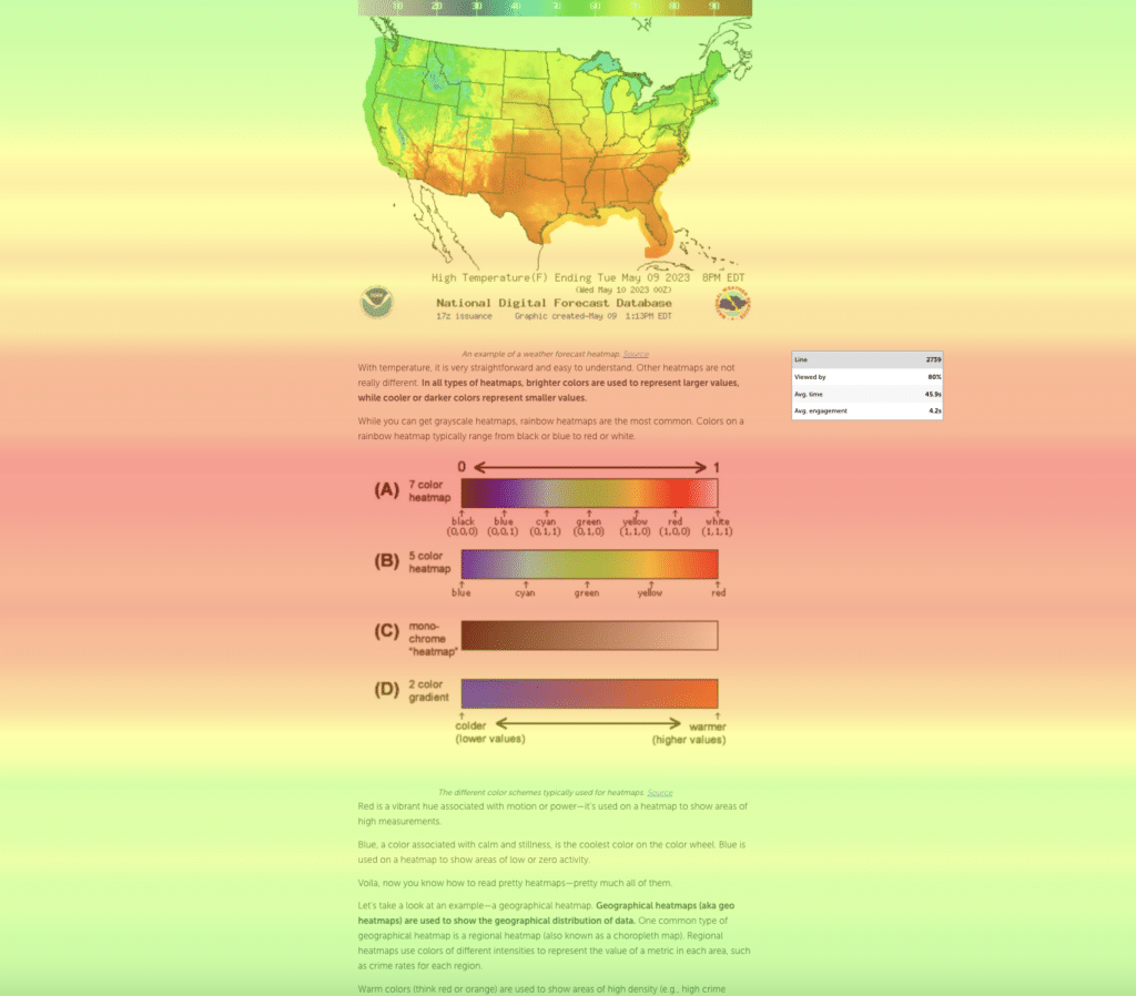
A heatmap, or heat map, is a visual representation of user interactions and behavior on a website. One of the distinguishing features of heatmaps is the use of gradients overlayed on top of the website page to highlight areas that receive the most user attention, interactions, or what have you.
By analyzing heatmaps, website owners can track user behavior, identify areas of high interest or frustration, optimize website design and content, and ultimately enhance the overall user experience and website performance.
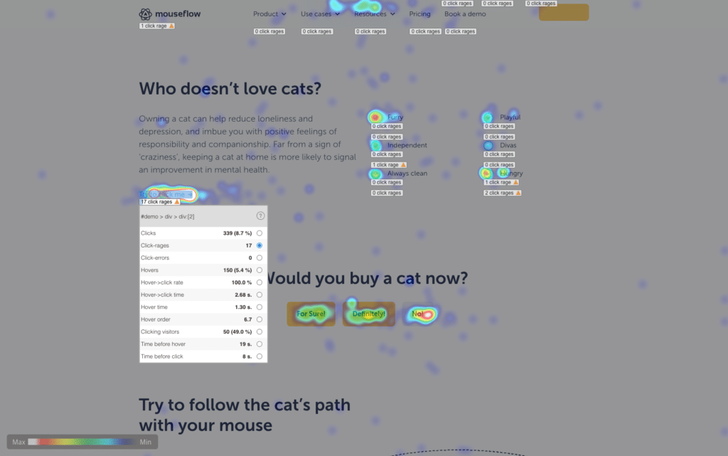
This is how a click heatmap looks
Quite a few varieties of heatmaps exist. In particular, Mouseflow, a popular behavior analytics tool, offers 6 types of heatmaps:
- Click heatmaps highlight the areas where users click the most on a webpage, providing insights into which links, buttons, or other elements are most used by visitors.
- Movement heatmaps visualize the mouse movement patterns of users, which can reveal areas of interest or confusion.
- Scroll heatmaps display how far down users scroll on a page, helping identify the most engaging content and the point where users lose interest.
- Attention heatmaps indicate the parts of a page where users spend the most time looking or focusing on.
- Live heatmaps do all of the above, but in dynamics; they are basically an overlay on your website, offering complete support for all dynamic elements. With live heatmaps you can switch between click, movement, scroll, and attention modes as you go.
- Geo heatmaps show where your website’s visitors are located on a world map, and you can also zoom in to explore it on a regional level.
As you can see, each of these heatmap types visualizes different aspects of user behavior, making them individually valuable for improving your website’s UX. That is to say, all of them can be highly useful in certain scenarios.
How Heatmaps Can Help You Improve Your WordPress Website
Now, let’s delve deeper into how specific heatmap types can cater to your particular needs as a WordPress website owner, helping you achieve your goals more effectively.
1. Improve the Content with Attention and Scroll Heatmaps
When I’m working on a content piece, I almost always find it exciting. But, of course, I often have doubts that the content will captivate readers in the same way when it is published.
What bugs me in particular are these little questions:
- Is the length OK for my average reader, or is the page too long?
- Does it keep the reader engaged, or should I put in more effort to improve specific parts?
- Is the formatting appealing, or does it feel too dull, requiring some improvements?
Sounds familiar? Been there, thought that? If so, you also know the problem: Traditional quantitative analytics won’t provide you with answers to these questions.
The best you can do is stare at the bounce rate numbers and wonder what is actually happening there. What’s even worse, any discussion regarding these questions turns into a battle of opinions, because everyone concerned is in the same position. And all there really is, is just that: opinions.
That’s where behavior analytics comes in handy: It shows you exactly how your visitors behave when they encounter your content. Which in turn helps you get the answer. Which in turn provides a solid basis when it comes to decision making.
Let’s take a look at a couple of examples.
Is the Article Too Long?
With a scroll heatmap, you can easily check how far down into your pages your visitors actually get. Additionally, the tool shows you how much time they spend on average at specific depths of the page and how engaged they are while they are there.
With this data, you can clearly see whether the page is too long or just the right length for your audience.
Is the Article Well Formatted
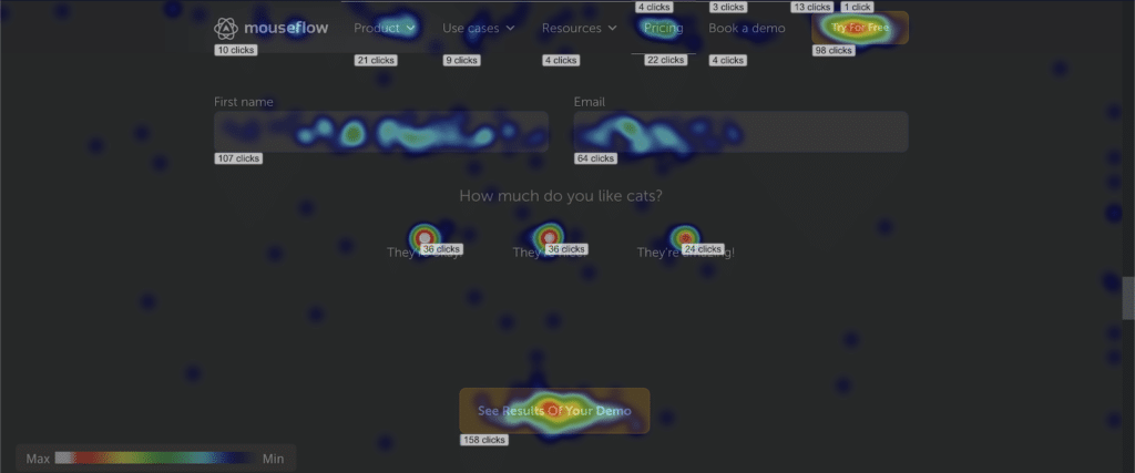
For addressing engagement and formatting issues, an attention heatmap is your ally. This tool highlights the parts of the page that visitors are genuinely paying attention to, as well as the areas they are merely scrolling through.
Armed with this valuable insight, you can either remove the less engaging sections or, if they are essential, make them more attractive with better formatting. Add eye candies, catchy subheadings, or perform any other improvements you can think of.
An example of an attention heatmap
2. Refine the Web Page Design with Click and Movement Heatmaps
All that has been said about content optimization holds even more truth when it comes to refining website design. Obtaining meaningful data to base your decisions on using only quantitative analytics can be awfully hard. On the other hand, click heatmaps and, to a lesser extent, movement heatmaps can be powerful tools in this pursuit, providing valuable insights into how users interact with your design elements.
Both click and movement heatmaps can uncover website layout issues. For example, if certain areas of your pages are receiving an unnaturally high number of clicks but are not directly related to your core content or objectives, it may indicate a confusing or misleading layout. Reorganizing the layout to align with user expectations can enhance user experience and reduce friction in navigation.
Let’s take a look at a couple of examples of how click and movement heatmaps can help you with answering some website redesign questions.
Are There Redundant Elements on the Website?
Click and movement heatmaps can reveal redundant elements on your website. If you find design elements such as buttons, links, or images that are not being interacted with, it’s a clear indication that they may not be relevant or valuable to your audience.
Removing or redesigning these elements can help declutter your interface and provide a more focused user experience, ultimately increasing the click-through rate (CTR).
Utilize click heatmaps to identify redundant elements on your website
Are Key Elements Being Ignored?
On the other hand, you may notice that important elements such as crucial CTAs or essential content are being ignored or do not receive much attention.
It’s a sign that they may not be prominent enough. Adjusting the placement, size, or color of these elements can help draw more attention and encourage user engagement.
By carefully examining click and movement heatmaps, you can refine your website’s design to optimize user engagement and satisfaction. Removing redundant elements, highlighting important ones, and addressing layout issues will result in a more streamlined and user-friendly interface, ultimately improving the overall effectiveness of your website.
3. Optimize CTA Placement Using All Types of Heatmaps
Whatever the purpose of your website, as an owner, your ultimate goal is likely to be converting traffic into something of value, whether it’s purchases, subscriptions, content sharing, donations, more traffic to other pages and websites, or any other desired outcome. Of course, to achieve this, it is crucial to strategically place call-to-actions (CTAs) throughout your website.
However, determining the most effective placement for CTAs can be no less challenging than improving content or refining UX. Again, this is where heatmaps come into play. By using attention heatmaps, you can identify the areas of your pages that receive the most focus from visitors, allowing you to position your CTAs in prominent and engaging locations.
Additionally, click heatmaps offer insights into which elements on your website are attracting the most clicks and which ones don’t get enough attention. By analyzing these heatmaps, you can optimize your CTAs to align with your visitors’ interests and expectations by improving and expanding the ones that are actually working and removing the ones that aren’t.
Movement heatmaps provide a glimpse into how users navigate your website. Understanding the scrolling and mouse movement patterns can guide you in placing CTAs where they are most likely to capture your visitors’ attention and encourage interaction.
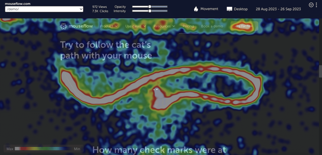
Observe mouse movement patterns of your website visitors with movement heatmaps
Finally, scroll heatmaps display how far down users scroll on your pages, revealing where users lose interest or engagement. Utilizing this information, you can strategically position CTAs to capture the attention of your audience before they bounce off.
By leveraging these types of heatmaps, you can fine-tune the placement — and design — of your CTAs, ultimately improving your WordPress website’s conversion rate and achieving your goals more effectively.
You can leverage our free Miro-board with a 5-step framework for web page optimization to have a process on your hands for this (and more).
4. Get to Know Your Audience Better with Geo Heatmaps
Figuring out who your website visitors actually are can be significant for performance improvement too. By visualizing visitor distribution on a world map, geo heatmaps provide a clear picture of where the majority of your website (or web page – if you want to go more granular) visitors are coming from, helping you better understand your audience.
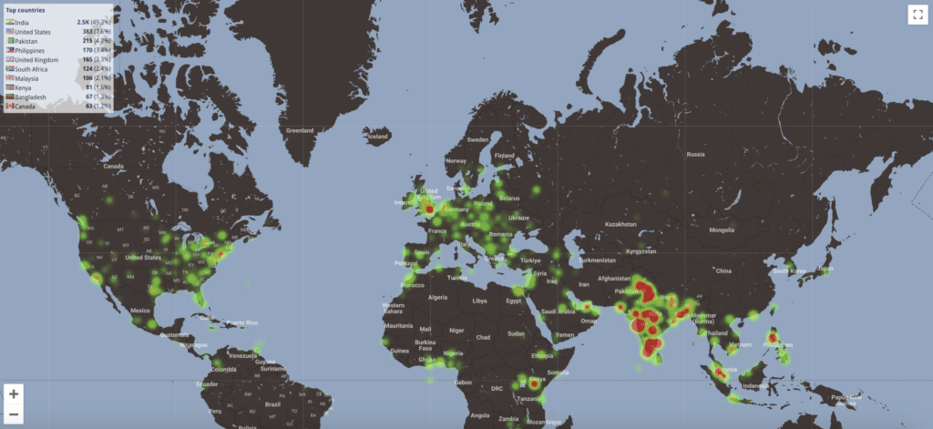
Get to know your visitors better with a geo heatmap
With geo heatmaps, you can identify regions with high visitor concentration and tailor your content accordingly. For instance, let’s say that while looking at geo heatmap, you notice a surprisingly high number of visitors coming from Japan. By investigating further, you discover that they are particularly drawn to a specific section of your website, indicating strong interest in certain topics that are, as it turns out, trending in Japan.
Armed with this valuable insight, you can capitalize on this success by creating dedicated content that caters to the interests of these visitors, such as blog posts or articles on those specific topics. You can even take it a step further by offering Japanese-language content to enhance their user experience. This targeted approach can not only increase engagement, but also build a stronger connection with your Japanese audience, potentially leading to increased conversions and overall website success.
Of course, this is just an example. The point is that geo heatmaps help visualize geographic information, allowing you to understand and cater to the preferences of your diverse audience from different regions around the world.
Speaking of geography, have I mentioned that Mouseflow is GDPR-compliant, making it a perfect match for websites with a significant number of visitors from the EU?
How to Install Mouseflow on Your WordPress Website
Now that you’re eager to unlock valuable behavior analytics insights and take your website’s performance to new heights, it’s time to install Mouseflow.
Don’t worry, we’ve got you covered with our native WordPress plugin, making the installation process a breeze. Additionally, we have a comprehensive guide in our help center that thoroughly describes how to install Mouseflow on your WordPress website. But basically, all you need to do is follow three easy steps:
- Log in to Mouseflow, open the websites list, and select the project for Mouseflow installation. Then choose the option titled “WordPress” and copy the tracking code.
- Install the free Mouseflow for WordPress plugin. After that, locate the Mouseflow plugin settings in your WordPress admin dashboard and insert the tracking code you copied on the previous step.
- Go back to the websites list in your Mouseflow dashboard and activate tracking.
Congratulations, you’re all set! Mouseflow will now automatically begin recording your visitors. It’s worth noting that, since a popular eCommerce platform WooCommerce is just a WordPress plugin, you can use Mouseflow together with it just as well. In the meantime, feel free to start testing your installation and exploring various behavior analytics tools that Mouseflow provides.
I recommend starting with heatmaps, of course, since you already have an idea what you can get out of them. However, I have a hunch that you could also be interested in the session recording tool that is also a part of Mouseflow. These two tools compliment each other perfectly.
