To analyze ecommerce user behavior, you need to combine quantitative metrics with qualitative insights, identify where performance drops, use heatmaps to see patterns, watch session recordings to understand user actions, and turn those observations into clear hypotheses and fixes. This step-by-step process helps you move from “what is happening” to “why it’s happening”, and what to do next.
Your analytics dashboard tells you what is happening. Behavior data tells you why. When you combine both, you stop guessing and start improving with precision.
To learn more, visit our Ecommerce Website Optimization page.
What is ecommerce user behavior analysis?
Ecommerce user behavior analysis is the process of understanding how visitors actually experience your online store, not just how they move through it numerically.
Traditional metrics like traffic and conversion rates give you signals, but they don’t reveal intent. Behavior analysis fills that gap by showing where users click, how far they scroll, what catches their attention, and where they hesitate or drop off.
In practice, this means you’re no longer optimizing based on assumptions. You’re reacting to real user behavior, which is what ultimately drives conversion improvements.
If you’re not already tracking the right numbers, start with these Foundational Ecommerce KPIs for Measuring Growth.
Metrics vs. behavior, what's the difference?
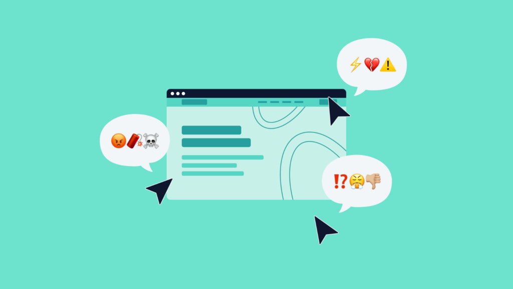
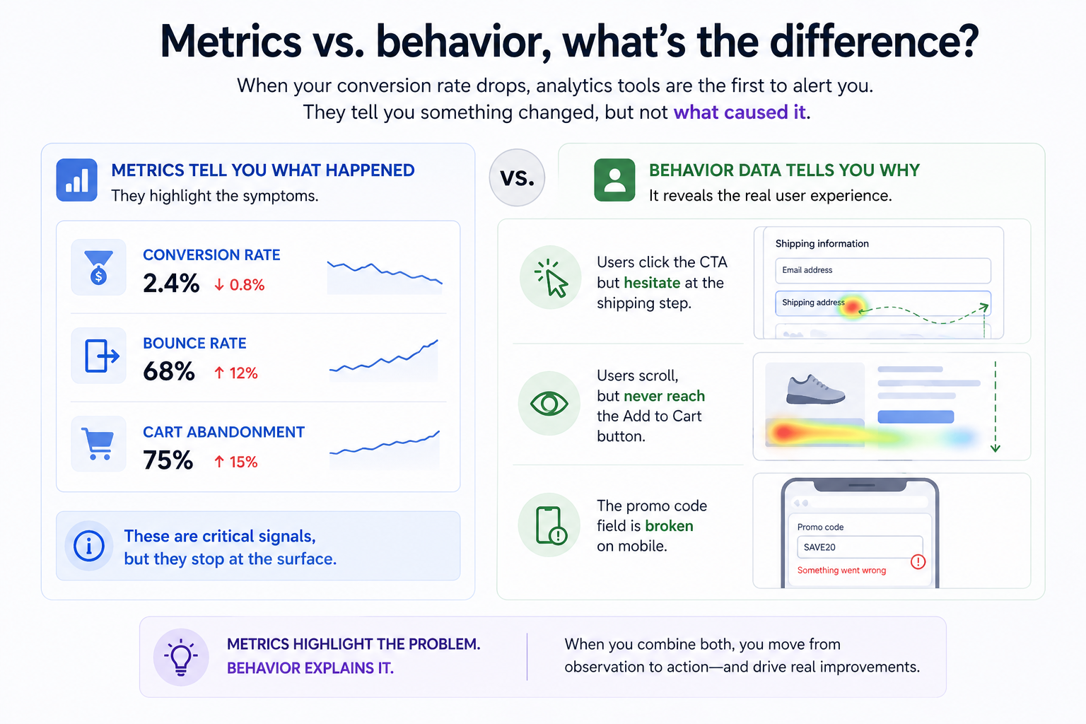
When your conversion rate drops, analytics tools are the first to alert you. They tell you something changed, but not what caused it.
You might see that conversion rate fell, bounce rate increased, or cart abandonment went up. These are critical signals, but they stop at the surface.
Behavior data adds context. It shows that users are clicking the CTA but hesitating at the shipping step, that they scroll but never reach the Add to Cart button, or that something as simple as a promo code field is broken on mobile.
A simple way to think about it is this, metrics highlight the problem, behavior explains it. You need both to move from observation to action.
What to look for in behavior data
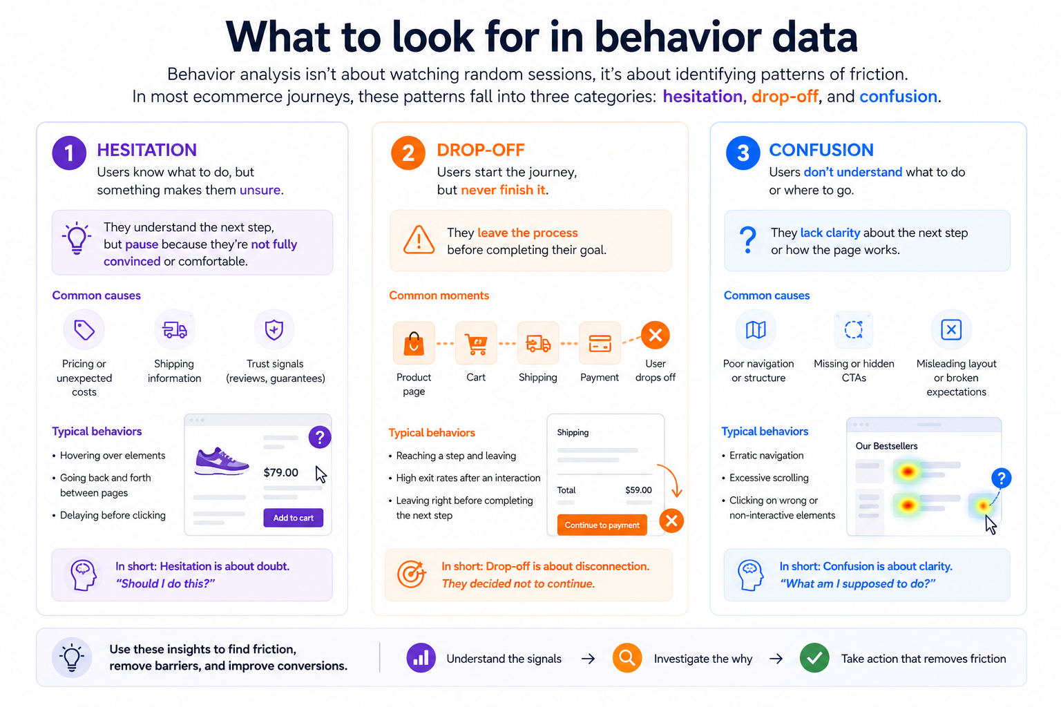
Behavior analysis isn’t about watching random sessions, it’s about identifying patterns of friction. In most ecommerce journeys, these patterns fall into three categories, hesitation, drop-off, and confusion.
- Hesitation is often subtle. Users hover without clicking, move back and forth between pages, or repeatedly interact with elements that don’t respond. This usually signals uncertainty, often around pricing, shipping, or unclear UI elements.
- Drop-off is more direct. While funnels tell you where users leave, behavior shows what happened right before. What they saw, what they tried to do, and what made them abandon the journey.
- Confusion tends to look chaotic. Users scroll excessively, navigate unpredictably, or spend too long on a page without taking action. This is often a structural problem, especially related to navigation or content hierarchy.
If navigation is part of the issue, improving structure can have an immediate impact. Learn more here.
Step-by-step, how to run a behavior analysis
A strong behavior analysis follows a clear sequence. The goal is to move from a vague problem to a precise, actionable insight.
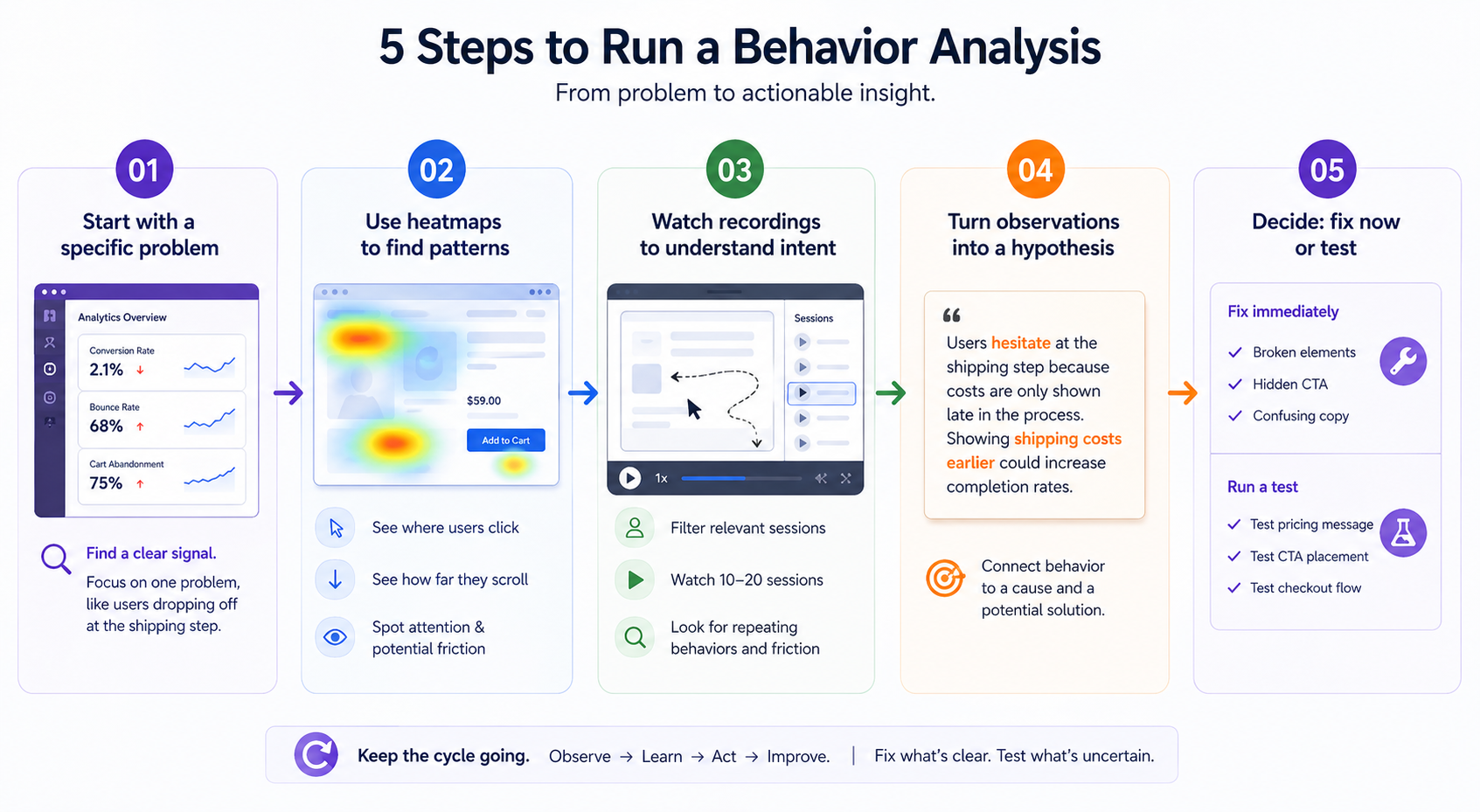
![]() Step 1: Start with a specific problem, not a general goal
Step 1: Start with a specific problem, not a general goal
Everything begins in your analytics platform.
You’re looking for a clear signal that something isn’t working as expected. This could be a high-traffic product page that doesn’t convert, a checkout step where users drop off, or a landing page with an unusually high bounce rate.
The key is focus. Instead of trying to “improve UX,” define the problem in concrete terms. For example, users reach the shipping step but abandon at a high rate. This gives your analysis direction.
![]() Step 2: Use heatmaps to identify patterns at scale
Step 2: Use heatmaps to identify patterns at scale
Once you know where the problem is, zoom out before zooming in.
Heatmaps help you understand behavior across many users at once. They show where people click, how far they scroll, and what elements attract attention.
This is where you start spotting mismatches. Maybe users aren’t seeing your CTA because it’s too far down the page. Maybe they’re clicking on something that isn’t interactive. Or maybe attention clusters around pricing or shipping, indicating hesitation.
At this stage, you’re not solving the problem yet. You’re narrowing down where friction exists.
![]() Step 3: Watch session recordings to understand intent
Step 3: Watch session recordings to understand intent
Now you go deeper.
Filter recordings based on the problem you’re investigating, such as users who dropped off at a specific step or sessions that included a key page.
Then watch a small number of sessions, usually 10 to 20 is enough. The goal isn’t to analyze every movement, but to identify patterns that repeat.
Pay attention to where users pause, what they try before giving up, whether they scroll past key elements, and how they move between steps.
For example, if multiple users reach the shipping step, hesitate, scroll, and then leave, that pattern is pointing to friction. It could be related to cost, clarity, or trust.
This is where you start understanding the experience from the user’s perspective.
![]() Step 4: Turn observations into a clear hypothesis
Step 4: Turn observations into a clear hypothesis
Insights only matter if they lead to action.
Combine what you saw in heatmaps and recordings into a specific explanation. A strong hypothesis connects behavior to a cause and a potential solution.
For example, users might hesitate because shipping costs are only revealed late in the process. That delay creates friction and leads to drop-off. Showing those costs earlier could improve completion rates.
Avoid vague conclusions. The more precise your hypothesis, the easier it is to act on it.
![]() Step 5: Decide, fix immediately or validate with a test
Step 5: Decide, fix immediately or validate with a test
The final step is deciding what to do with your insight.
If the issue is obvious, such as a broken element, a hidden CTA, or confusing copy, fix it immediately. There’s no need to delay with testing.
If the cause is less certain, then run an experiment. For example, test different ways of presenting pricing, adjust CTA placement, or simplify the checkout flow for mobile users.
The goal is to move quickly. Fix what’s clear, test what’s uncertain, and keep the cycle going.
From insights to action, what to fix, what to test
Not every insight should become an A/B test. Knowing when to act immediately and when to experiment is what keeps optimization efficient.
Clear usability issues should be fixed right away. These include broken functionality, hidden CTAs, or confusing microcopy that causes hesitation.
More complex patterns, where multiple explanations are possible, are better suited for testing. For example, hesitation around pricing might require testing different value propositions, while low engagement with CTAs could be solved through design or placement changes.
The balance between fixing and testing is what turns insights into results.
Putting it all together
Ecommerce behavior analysis isn’t a one-time project, it’s an ongoing practice.
The teams that consistently improve performance are not guessing. They’re continuously observing how users behave, identifying friction, and making informed changes.
When you combine metrics with behavior, you gain clarity. And with clarity, you can optimize faster, make better decisions, and create experiences that actually convert.