
At Mouseflow, we use our own product to review how the website is performing every quarter. No control groups. No statistical significance thresholds. What we do have is a consistent rhythm of looking at real visitor behavior with website heatmaps, session recordings, friction detection and user journeys, and letting that data shape what we do next. Over time, that loop is what drives improvement.
A/B testing gets a lot of airtime in the conversion optimization world, and for good reason. When you have the traffic, the tooling, and a clearly isolated variable, a controlled experiment is hard to beat. But most website teams aren’t running clinical trials. They’re making judgment calls, shipping changes, and hoping the numbers move in the right direction.
That’s not a failure. That’s just how website work actually happens.
Here’s what that looks like in practice, and what a web, design or any team can take from it.
The design doesn't end at launch
Most website work follows a familiar pattern: someone identifies a problem or opportunity, the team makes changes, they go live, and then the next thing gets prioritized. The feedback loop is at best a check-in a few weeks later, at worst a vague “seems fine” that no one challenges because the data is too high-level to tell you otherwise.
Traffic numbers won’t tell you that visitors are scrolling straight past your hero section. Bounce rate won’t tell you that people are repeatedly clicking on a non-interactive element because they expect it to link somewhere. Session duration won’t tell you that a small layout change quietly shifted how the whole page is being read.
Website behavior analytics will, but only if you’re set up to see it consistently. The point isn’t to instrument everything obsessively. It’s to look at the right signals, for the right pages, on a rhythm that makes the data meaningful over time.
When research, analysis, and behavior data work together
The best decisions we’ve made on the Mouseflow website came from combining two things that are often treated separately: upfront research and behavior data after launch. Each one does something the other can’t.
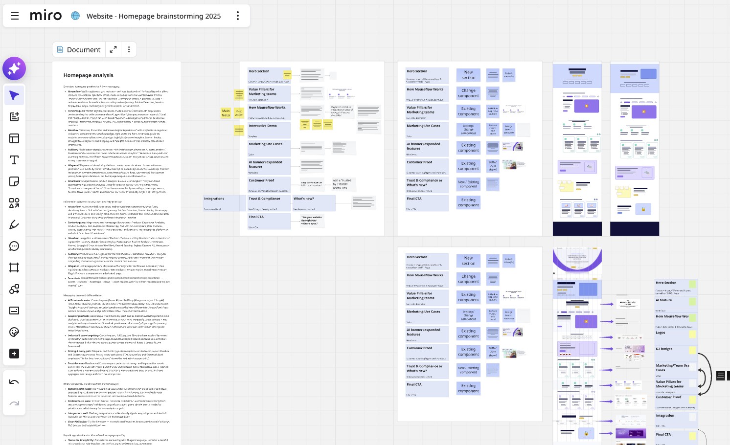
Mouseflow homepage redesign process
The /pricing page redesign is the clearest example. The change wasn’t a hunch. It was built on a proper research and user testing process, with a clear goal: simplify the tier structure and improve the path from the page to sign-up. The navigation redesign followed a similar pattern: before any wireframes, we audited navigation conventions, then used that as one input alongside what our own journey analytics was telling us about how visitors were actually moving through the site.
Research tells you what people say. Behavior data tells you what they actually do. Neither is enough on its own.
So for the pricing page, we defined in advance what we’d measure after launch: sign-up CTA clicks above the fold, scroll depth, time on page, engagement and friction score, all documented before a single change went live.
What we found was instructive. Scroll depth dropped from around 34% to 27%, which on the surface looks like a problem. But time on page went up from just over three minutes to more than four. Engagement increased meaningfully. Free tier CTA clicks more than doubled. Read together, those numbers pointed somewhere different than scroll depth alone would have suggested: people weren’t leaving early, they were finding what they needed faster and acting on it.
This is the thing behavior data is uniquely good at: not just reporting what happened, but giving you enough context to understand why, and whether it’s actually a problem worth solving.
What visitors do vs. what you designed them to do
Some of the most useful insights from our quarterly reviews are the ones we weren’t looking for.
When we added the /customers page to the top navigation, traffic to it jumped significantly, +200% views in a single quarter, which was expected. What wasn’t expected was seeing it start appearing naturally in user journey flows from the homepage, the pricing page, and even the book-a-demo page. Visitors had started treating it as a genuine stop in their exploration of the site, not just a page they occasionally stumbled on. That tells you something real about intent, and it shapes how you think about that page’s role going forward.
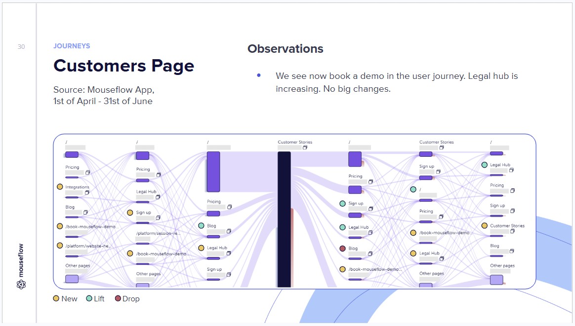
Mouseflow website performance quarterly review: Customers page
The opposite kind of signal is equally valuable. When session data showed that a meaningful percentage of visitors were going from the book-a-demo page to the interactive demo page, that wasn’t a conversion success. It was a navigation problem. Users thought “book a demo” meant they’d get to try something interactive. The design hadn’t made the distinction clear. That’s the kind of thing that’s genuinely invisible until you look at journey data.
Similarly, when we spotted rage clicks concentrated on the title and arrow elements on one of our cards component, visitors repeatedly tapping things that didn’t respond, that was a clear signal about expectation mismatch. The design was reading as interactive when it wasn’t. No amount of aggregate metrics would have surfaced that; it needed the friction detection data.
Mouseflow website performance quarterly review: Card component
How we turn data into design decisions
One of the more systematic examples of behavior data driving design work was the full pass on all our /feature pages.
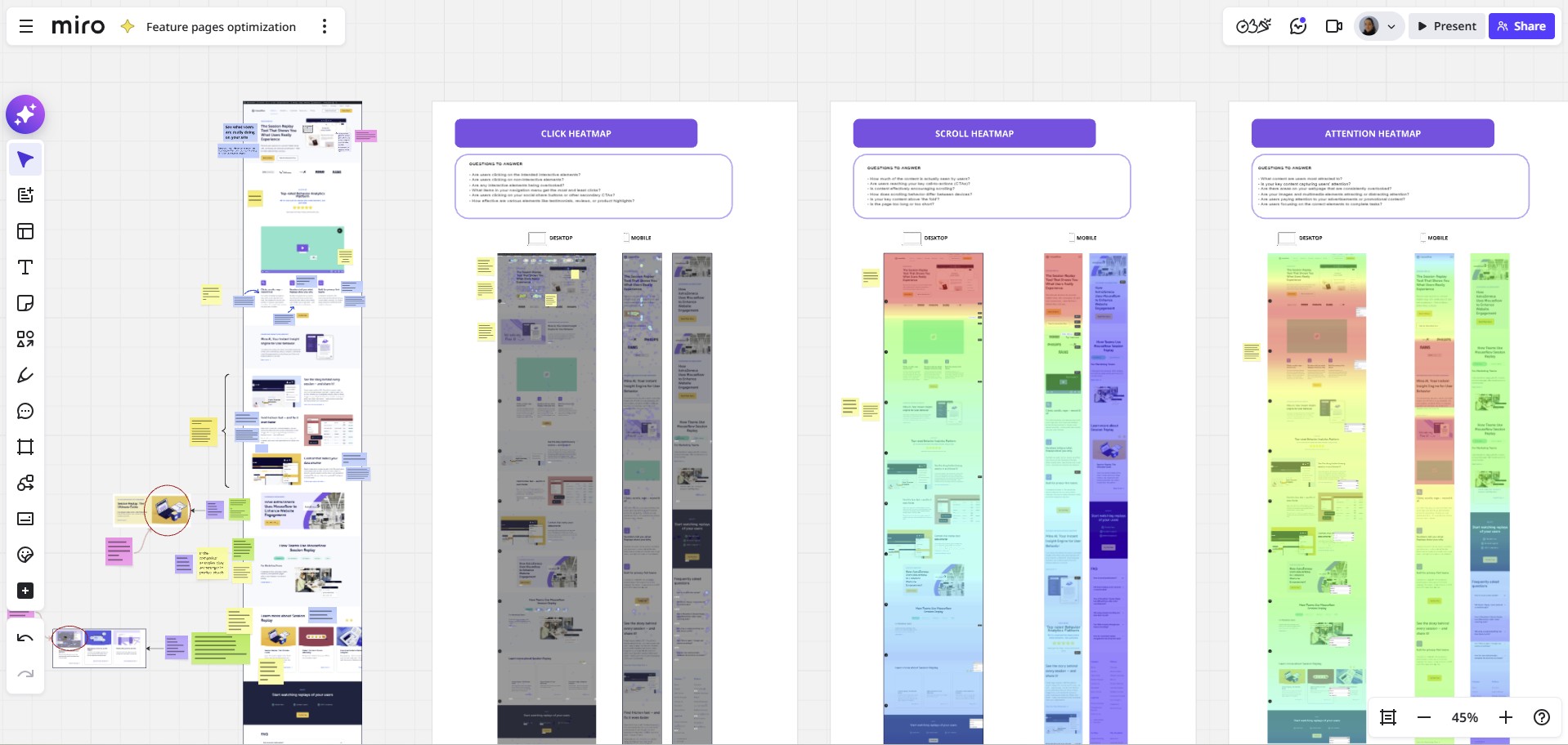
Mouseflow feature pages redesign procecss
Rather than redesigning from gut feeling or a top-down “these need refreshing” directive, the process started by going through heatmaps, session recordings, and conversion funnels for each page: identifying what visitors were engaging with most and least, and what was and wasn’t working in terms of moving people toward conversion. That audit then directly informed what changed: copy updates, layout adjustments, CTA placement, feature visuals. The changes were scoped to what the data actually pointed at, not a blanket visual refresh.
A similar approach shaped the /Contact Sales page redesign, where the process started with a proper gap analysis: identifying specific UX problems like the absence of any clear “why talk to sales” framing, lack of intent routing, and too much cognitive load below the fold. Behavior data informed what to look for in that analysis; the analysis then informed what to test and measure after launch. The sequence of “data shapes the research lens, research shapes the design brief, behavior data closes the loop” is the pattern that tends to produce the most grounded decisions.
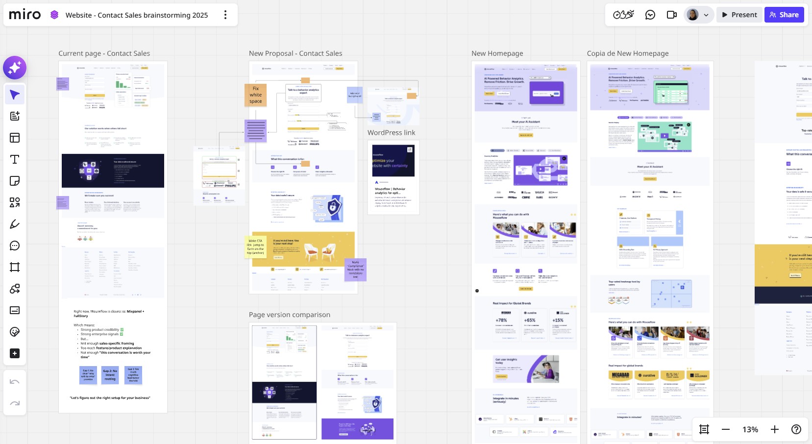
Mouseflow’s Contact Sales page redesign process
The discipline of not reacting too fast
One thing we’ve learned is that the quarterly rhythm is part of what makes this work. Looking at data too soon after a change is almost as bad as not looking at all.
When the funnels page and guides page were rebuilt mid-quarter, the note in the review was straightforward: “changed mid-quarter, wait for next quarter for a real read”. When the new navigation went live, we had three weeks of early data. Some signals were directional (customers page visits from the homepage roughly doubled) but we held off on conclusions and documented what we’d be watching instead.
That restraint matters for a few reasons. Pages that launch alongside a campaign spike look very different two months later. New layouts need time for visitor behavior to normalize. And some metrics (like the pricing page scroll depth drop) only make sense when you have multiple signals to read together, which takes time to accumulate.
There’s also an honest acknowledgment baked into how we run these reviews: not everything can be evaluated cleanly without a proper controlled test. When the pricing page launched, the notes explicitly said that a true A/B test of the old versus new page would have been the right way to isolate the effect. We didn’t have that set up, so we read what we had carefully, noted what couldn’t be attributed solely to the page change, and let that calibrate how confident we were in our conclusions.
That kind of intellectual honesty about data limitations is just as important as the data itself.
What this looks like as a practice
If you’re someone who wants to build this kind of feedback loop into your own work, the setup doesn’t have to be complex. What matters is consistency:
 |
Define your signals before a change goes live.
Scroll depth, click distribution, friction score, journey paths; choose the metrics that correspond to what the change was meant to do. Write them down. This forces clarity on what “success” looks like before you’re tempted to define it retrospectively. |
 |
Look at the same pages on the same cadence.
Monthly or quarterly, the regularity matters more than the frequency. You need a baseline before you can see movement, and you need movement over several periods before a trend is real rather than noise. |
 |
Read metrics in combination, not isolation.
Scroll depth paired with time on page tells a different story than either one alone. Friction score alongside session recordings tells you not just that something is wrong, but what. |
 |
Let journey data surprise you.
The most useful insights are the ones you weren’t looking for: a page appearing in flows you didn’t design for, a drop-off point that reveals a navigation gap, a path that tells you visitors are looking for something you haven’t given them yet. |
 |
Be honest about what the data can’t tell you.
Behavior data is powerful, but it’s not a substitute for a controlled test when you genuinely need to isolate a variable. Know the difference, and be upfront about it when the data is directional rather than conclusive. |
The goal isn’t to turn every design decision into a data exercise. It’s to stay connected to what visitors are actually doing, so when you make changes, you’re building on evidence rather than starting from zero each time. That continuity is what compounds.
Website design iteration FAQs
It depends on what the change was meant to do.
- A layout change aimed at improving engagement? Track scroll depth, time on page, and click distribution using heatmaps.
- A CTA change aimed at driving sign-ups? Track clicks above the fold and journey paths after the page.
Define the metrics before you ship, not after. Otherwise, you’ll find a way to declare success regardless of what happened.
Heatmaps give you an aggregate view: where people click, how far they scroll, which elements get attention across all sessions. Session recordings show you individual experiences, which is where you catch specific friction: a user repeatedly tapping a non-interactive element, a form field causing hesitation, a page that loads slowly for one segment. Use heatmaps to spot patterns, recordings to understand them.
Not necessarily. A/B testing is the most reliable way to isolate the effect of a single change, but it requires traffic, tooling, and a clearly defined variable. Most website teams improve continuously through a combination of research, behavior analytics, and documented iteration: defining what they expect to see, shipping a change, and checking whether the data matches. That’s not a workaround for A/B testing; it’s a different discipline with its own rigour.
And when you do run experiments, Mouseflow integrates directly with A/B testing tools so you can layer session replay, heatmaps, and friction data on top of your test results, giving you the why behind whichever variant wins.
By defining success criteria before it launches. Scroll depth, engagement time, friction score, journey paths, CTA clicks, etc. Pick the metrics that correspond to the goals of the redesign and document them upfront.
After launch, read them in combination rather than in isolation: a drop in scroll depth paired with an increase in time on page and CTA clicks tells a very different story than a drop in scroll depth alone.
Quarterly is a practical cadence for most teams: frequent enough to catch problems early, slow enough to let data accumulate into meaningful trends. Monthly works if you’re shipping changes constantly and need tighter feedback loops, but make sure you have enough traffic to distinguish signal from noise.
Conclusion: The feedback loop is the strategy.
Most website improvement efforts fail not because of bad design, but because of a broken feedback loop. Changes get made, the data gets skimmed or ignored, and the next decision starts from scratch. Over time, that’s how websites drift away from what their visitors actually need.
The alternative isn’t a bigger analytics stack or a formal testing program. It’s a consistent practice of asking the same questions, looking at the same pages, and letting what you find shape what you do next. Quarter after quarter, that compounds into a website that genuinely reflects how real visitors behave, not how you imagined they would.
That’s what using Mouseflow on our own site has taught us more than anything else.