A low ecommerce conversion rate is a clear signal that users are experiencing friction, finding unmatched expectations, or struggling with site navigation. Instead of randomly testing button colors, behavior analytics reveals the exact obstacles preventing sales so you can fix them fast.
To go deeper, explore our complete guide to ecommerce website optimization.
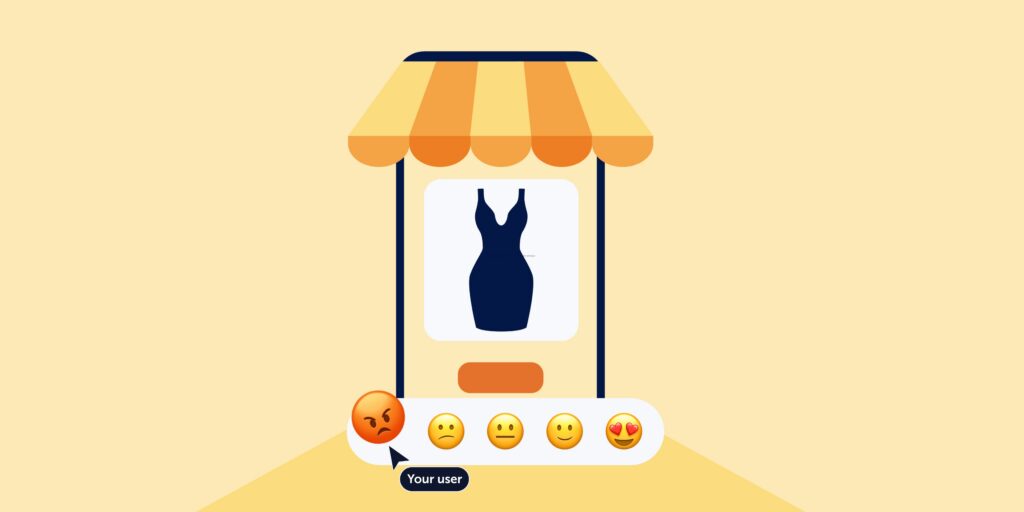
The core issue: Traffic vs. expectation mismatch
You can’t convert the wrong visitor. It sounds obvious, but traffic mismatch is one of the most common and expensive problems in ecommerce. When your ads or SEO promise one thing but your landing page delivers something else, users hesitate and leave. Behaviorally, this looks like high bounce rates, very short sessions, and zero scrolling or interaction. The real issue is a disconnect between intent and experience. Users arrive with a specific expectation. When it’s not met instantly, they don’t explore, they exit. Fix this by aligning intent with your landing pages. Match your messaging across ads, search results, and site pages. Make your value proposition immediately clear and remove ambiguity in the first screen.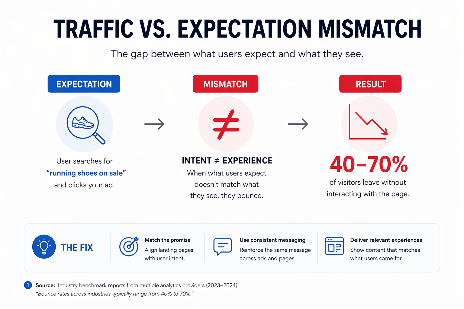
Navigation and discovery roadblocks
Users can’t buy what they can’t find. If products are buried, categories don’t make sense, and navigation feels like a maze, your conversion rate will plummet. In session replays, this looks like excessive clicking without progress, repeated back-and-forth navigation, and users abandoning category pages in frustration. The root cause is an information architecture that doesn’t match how your users actually think.
Learn how to structure your site for real user behavior by simplifying category structures, using clear and predictable labels, and reducing decision fatigue.
Weak product pages that fail to build trust
Even highly interested users won’t convert if your product page drops the ball. A lack of clarity, missing details, weak trust signals, and poor visuals are instant conversion killers. You’ll see users scroll but take no action, hovering around key elements, and repeatedly re-reading sections.
The page simply isn’t answering their core questions: Is this right for me? Can I trust this brand? What happens if I buy? See what high-converting product pages actually look like, covering value proposition, high-quality visuals, prominent reviews, and transparent pricing.
Experience friction: The silent conversion killer
This is where the majority of conversions are lost. Not because users don’t want to buy, but because something gets in their way before they can.
Friction is rarely one big, obvious problem. It’s an accumulation of small moments where the experience breaks down: a button that doesn’t look clickable, a form that throws an error without explanation, a page that loads just slowly enough to create doubt. Individually, each feels minor. Together, they kill conversions.
The tricky part is that friction is largely invisible in standard analytics. A high exit rate tells you users left. It doesn’t tell you why, where exactly, or what they were trying to do when they gave up.
What friction actually looks like
Friction shows up in four main ways:
- Hesitation is when users pause on a page longer than expected, not because they’re engaged, but because something isn’t clear. They’re trying to decide if they’re in the right place, whether to trust what they’re seeing, or how to move forward. Hesitation on a product page usually signals missing information or weak trust signals. On checkout, it often means unexpected costs or unclear next steps.
- Confusion is when users can’t figure out what to do next. They scroll up and down looking for an answer, they click elements that aren’t interactive, or they navigate away and come back. Confused users rarely convert, they give up.
- Rage clicks are one of the clearest behavioral signals you can capture. When a user clicks the same element repeatedly in rapid succession, it means they expected something to happen and it didn’t. A broken link, a non-clickable element that looks interactive, a CTA that doesn’t respond, each of these triggers frustration that’s directly measurable.
- Drop-offs are the end result of unresolved friction. Users don’t always rage quit. More often, they quietly leave at the exact point where the experience asked too much of them, a form with too many fields, a checkout step that introduced unexpected information, a page that simply didn’t load fast enough.
Why you can’t fix what you can’t see
The problem with friction is that it hides in plain sight. Your conversion rate drops, your cart abandonment climbs, but your standard analytics dashboard can’t show you the moment a user gave up or why.
This is where behavioral tools change everything.
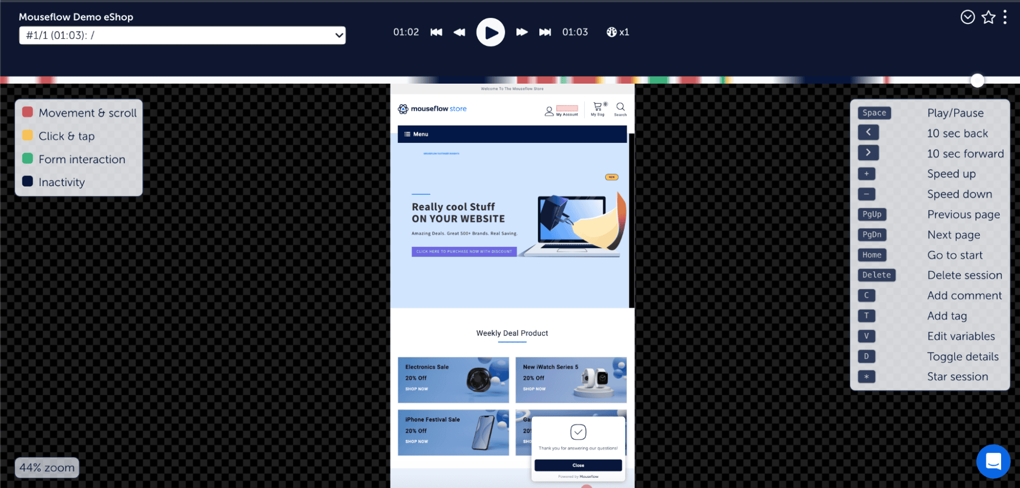
![]() Session replay let you watch real user sessions, exactly how individual users navigated your site, where they moved their mouse, where they paused, what they clicked, and where they left. It’s the closest thing to watching a customer walk through your physical store. Patterns that are invisible in aggregated data become obvious when you watch five sessions in a row from users who abandoned checkout.
Session replay let you watch real user sessions, exactly how individual users navigated your site, where they moved their mouse, where they paused, what they clicked, and where they left. It’s the closest thing to watching a customer walk through your physical store. Patterns that are invisible in aggregated data become obvious when you watch five sessions in a row from users who abandoned checkout.
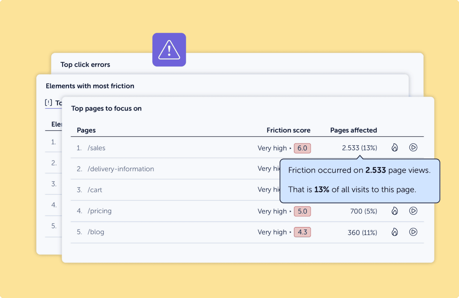
![]() Friction detection takes this further by automating the discovery process. Instead of manually reviewing hundreds of recordings, Mouseflow’s Friction Score continuously analyzes behavior across your site and surfaces the sessions and pages with the highest friction, rage clicks, error clicks, dead clicks, and unexpected drop-offs, so you can prioritize where to investigate first.
Friction detection takes this further by automating the discovery process. Instead of manually reviewing hundreds of recordings, Mouseflow’s Friction Score continuously analyzes behavior across your site and surfaces the sessions and pages with the highest friction, rage clicks, error clicks, dead clicks, and unexpected drop-offs, so you can prioritize where to investigate first.
The result is that you stop guessing and start knowing. Not “users seem to struggle with checkout” but “37% of users on the checkout page rage-clicked the promo code field before abandoning.” That’s a hypothesis you can act on immediately.
For a deeper breakdown of the specific friction patterns that appear most often in ecommerce and what causes users to drop off, it’s worth understanding each type before you start auditing your own site.
Checkout breakdowns at the finish line
You got the user to add an item to their cart, yet you still lost the sale. Unexpected costs, forced account creation, too many steps, and a lack of trust signals cause massive drop-offs at the payment step. Users backtrack and abandon their carts because the checkout introduces risk and effort at the worst possible moment.
This article on common checkout friction points and how to fix them breaks down how to streamline the experience from pricing transparency to guest checkout to reducing form fields with form analytics.
Mapping funnel drop-offs
Conversions rarely fail in just one place. They leak across the entire user journey. When users drop off between steps, it means there’s no clear progression and the journey feels disconnected. You’ll notice significant fall-off between pages and inconsistent engagement across steps.
Understanding how to map and analyze the full ecommerce funnel helps you identify the precise drop-off points and improve transitions between steps. Mouseflow’s Conversion Funnels makes this process visual and actionable.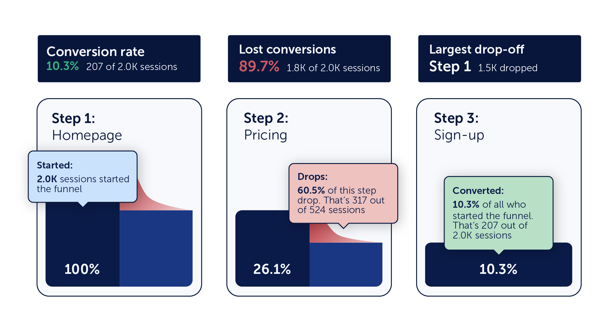
The missing link: A real optimization process
The root cause behind all these issues is a lack of structured testing. Teams rely on opinions, make changes without validation, and guess instead of learning. You need to build a structured CRO process, form hypotheses based on actual user behavior, test systematically, and iterate. These ecommerce CRO tests with immediate ROI are a practical starting point. And if you want a structured framework to pull it all together, this ecommerce optimization checklist brings everything into one place.
Most ecommerce teams don’t actually have a conversion problem; they have a visibility problem. When you watch real user behavior with session replay and heatmaps, problems become obvious, patterns emerge, and decisions become grounded in reality.