
All websites want the same thing: happy users.
When visitors can easily find what they’re looking for, they stay longer, convert more often, and return more frequently. The challenge is understanding exactly how users interact with your website.
That’s where website heatmaps come in.
Website heatmaps visually show where visitors click, move their mouse, scroll, and focus their attention on a page. Instead of digging through spreadsheets or analytics dashboards, heatmaps let you instantly see how people actually use your site, and where they run into friction.
In this guide, we’ll explain what website heatmaps are, the different types of heatmaps, and how teams use them to improve user experience and increase conversions.

What is a Heatmap?
A heatmap is a graphical representation of data where values are displayed using colors. A website heatmap visualizes how visitors interact with a page by highlighting where users click, scroll, move their mouse, or focus their attention.
Warmer colors (such as red and orange) represent areas with high user activity, while cooler colors (blue or purple) indicate parts of the page that receive little or no interaction.
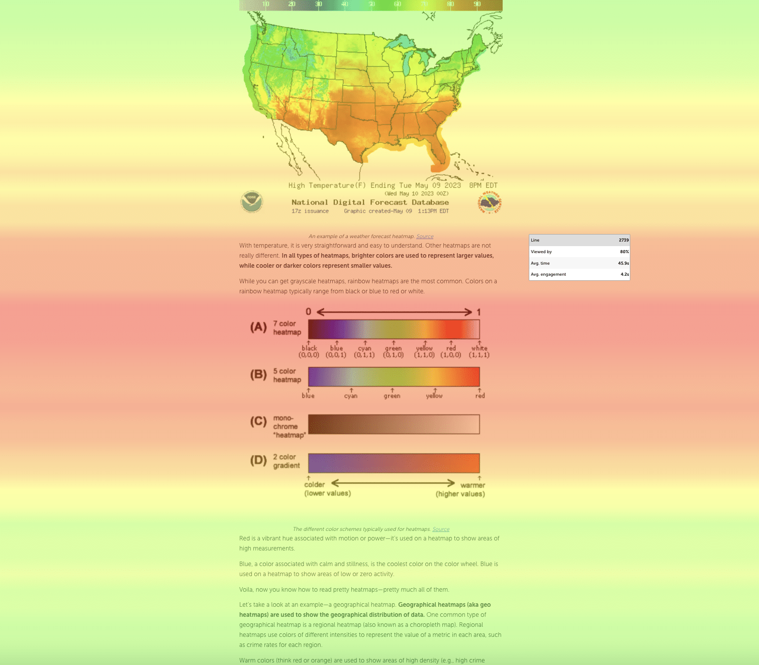
Heatmaps work similarly to weather heatmaps, but instead of showing temperature patterns, they reveal patterns in user behavior on your website.
On a weather heatmap, warmer colors (red or yellow) represent higher temperatures, while cooler colors (blue or green) represent lower temperatures.
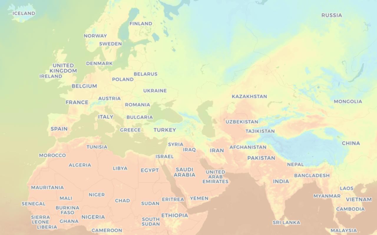
Example of a temperature heatmap similar to those used in weather forecasting.
Website heatmaps use the same color-based visualization to help you quickly understand how visitors interact with your pages.
When you see red or orange areas on a website heatmap, it means many users are interacting with that element or focusing their attention there. Blue or purple areas indicate sections of the page that receive less engagement and may be overlooked by visitors.
This makes it much easier to identify usability issues, understand user behavior, and improve your page layout.
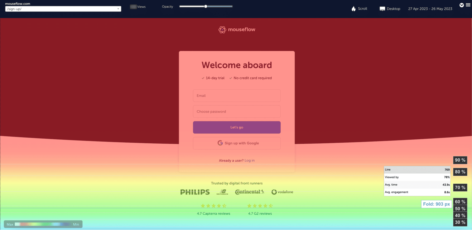
Scroll heatmap example (Mouseflow sign-in page)
If you’re new to analyzing heatmaps, it helps to understand how to read these patterns correctly. Our guide on how to interpret a heatmap explains how to turn heatmap data into actionable insights.
To generate heatmaps for your website, you need a website heatmap tool like Mouseflow. Mouseflow automatically creates multiple types of heatmaps for each page on your website, helping you quickly understand how visitors interact with your content.
Traditional analytics tools such as Google Analytics focus on metrics like session duration, bounce rate, or page views. Heatmaps complement these metrics by visually revealing how users interact with individual elements on a page, making it much easier to identify friction points, usability issues, and opportunities to improve conversions.
Why Should You Use Heatmaps?
Heatmaps measure user interactions such as clicks, scrolling, and mouse movement, and convert that behavior into visual insights you can immediately understand.
Instead of analyzing rows of analytics data or comparing dozens of metrics, heatmaps allow you to quickly see how visitors actually use your website. You can identify which elements attract attention, where users interact the most, and which areas of the page are ignored.
This makes it much easier to uncover usability issues, discover friction points in the customer journey, and understand how visitors move through your pages.
For example, heatmaps can help you:
- Identify elements that users expect to be clickable but aren’t
- Discover where visitors stop scrolling on long pages
- See whether calls-to-action attract attention or get ignored
- Understand how visitors navigate through your layout
These insights help teams improve page design, optimize user experience, and ultimately increase conversions.
Heatmaps are particularly powerful when combined with other behavioral analytics tools. While traditional analytics platforms show aggregated metrics like bounce rate or session duration, heatmaps visually reveal the behavior behind those numbers.
When you pair heatmaps with tools like session replay, you can see both the overall interaction patterns and the individual user journeys behind them.
In short, heatmaps make user behavior visible. They transform complex behavioral data into intuitive visual patterns that help teams make faster, more confident optimization decisions.
Website Heatmap Types
Website heatmaps come in several forms, each revealing different aspects of user behavior. Mouseflow provides 6 types of heatmaps:
- Click Heatmap
- Scroll Heatmap
- Attention Heatmap
- Movement Heatmap
- Geographical or geo Heatmap
- Interactive Heatmap
- Friction Heatmap
While all heatmaps use color to visualize engagement, each type answers a different question about how users interact with your pages, from where they click to how far they scroll.
You can explore each type in more detail below.
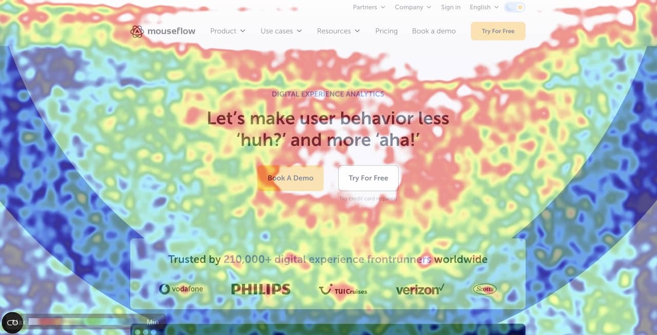
Click Heatmaps
A click heatmap (sometimes called a click map) shows where users click on a page. This helps reveal which elements attract attention, which buttons users interact with, and where visitors attempt to click on elements that aren’t actually clickable.
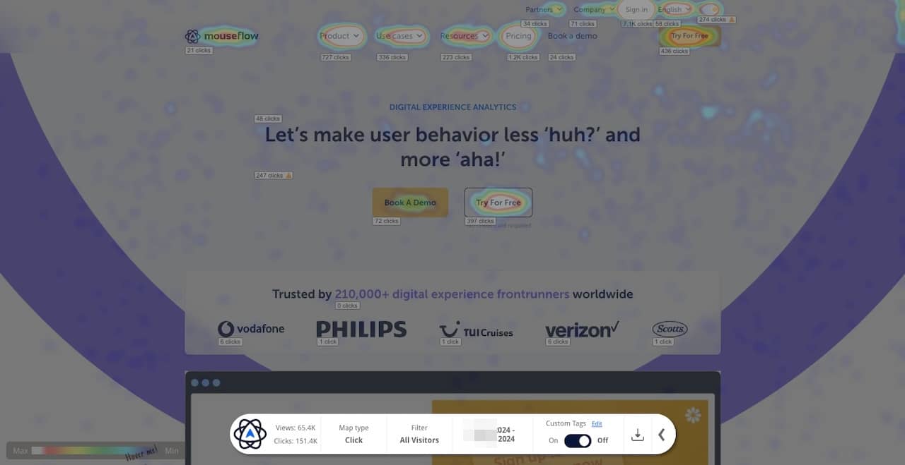
That’s a clickmap of our website’s homepage
Click heatmaps are particularly useful for identifying navigation issues, understanding user intent, and improving calls-to-action.
Learn more in our detailed guide to click heatmaps.
Scroll Heatmaps
A scroll map shows how far visitors scroll down a page. Instead of tracking individual clicks, it visualizes the percentage of users who reach different sections of a page.
This helps teams understand whether important content is being seen and where users lose interest while reading.
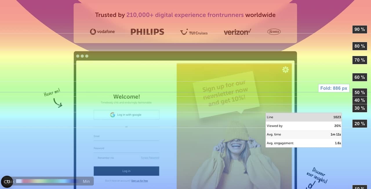
That’s a scroll heatmap of mouseflow.com homepage, for example
Scroll heatmaps are especially useful for optimizing long landing pages, blog posts, and product pages.
You can explore this in more detail in our guide to scroll heatmaps.
Attention Heatmaps
An attention heatmap shows how long users spend viewing different parts of a page.
That’s an example of an attention heatmap
Rather than focusing on scroll depth alone, attention heatmaps highlight which elements attract the most engagement and hold visitors’ attention the longest. This makes them particularly useful for evaluating content performance and determining where to place calls-to-action.
To see how they work in practice, read our guide on improving readability with attention heatmaps.
Movement Heatmaps
A movement heatmap visualizes how users move their mouse across a page. Research has shown that cursor movement often correlates with where users focus their attention.
A movement heatmap example – also from mouseflow.com homepage
Movement heatmaps can help identify which areas of a page attract attention and whether visitors notice important elements such as forms, buttons, or navigation links.
Learn more in our article on movement heatmaps.
Geographical Heatmaps
A geographical heatmap (or geo heatmap) shows where visitors are located geographically. Instead of visualizing interactions on a page, this heatmap displays the distribution of visitors across regions, cities, or countries.
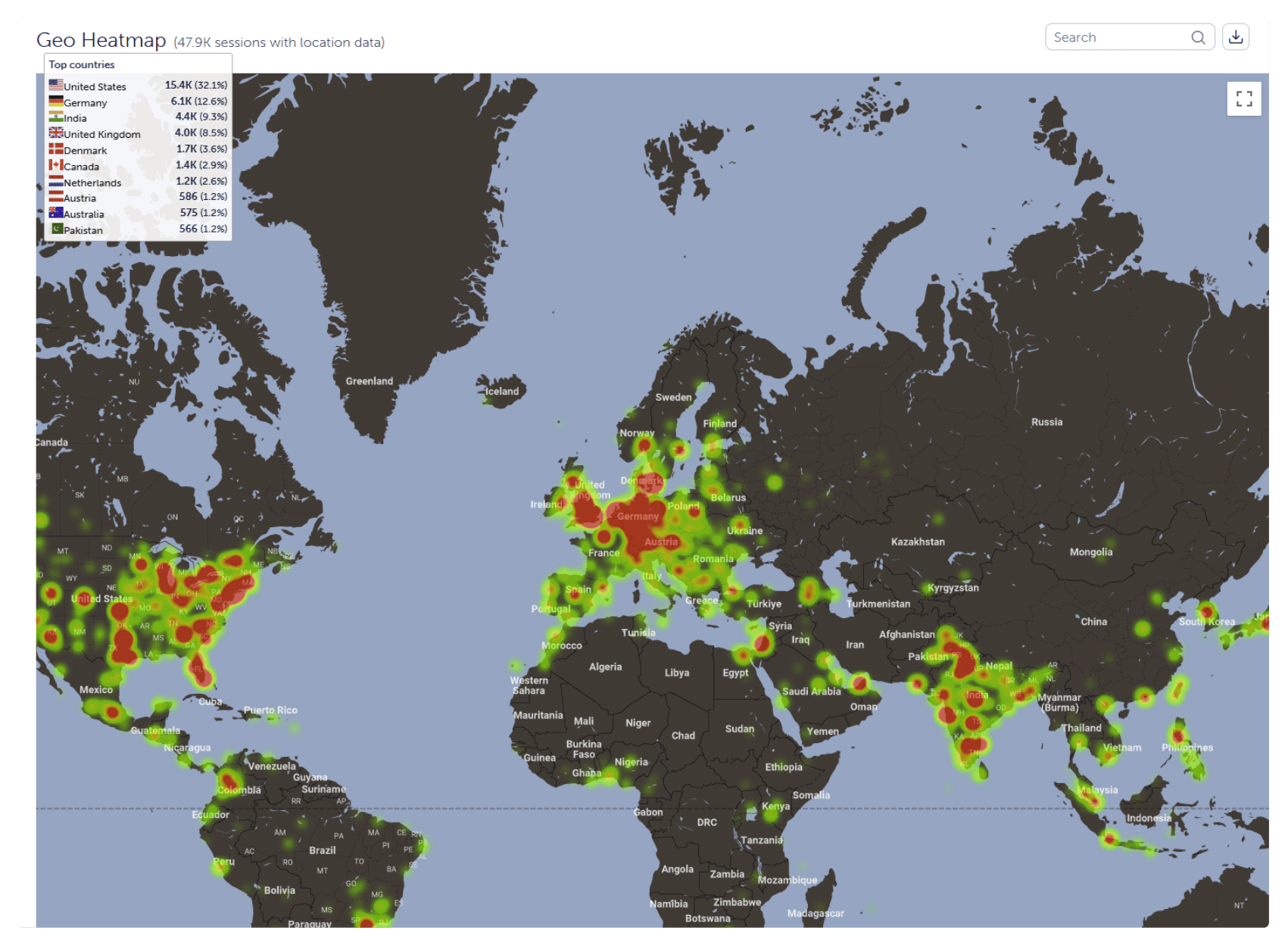
Example of Mouseflow’s Geo Heatmap
This can help businesses understand where their audience comes from and identify opportunities for regional marketing or localization strategies.
Read more about geo heatmaps and how they support location-based analysis.
Interactive Heatmaps
An interactive heatmap allows you to explore user interactions dynamically by filtering data or analyzing specific page elements in more detail.
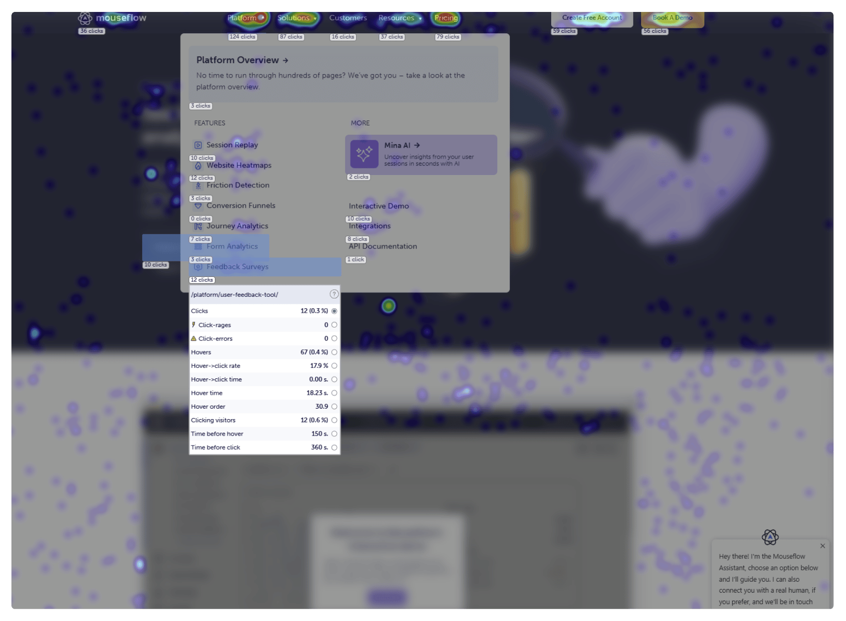
Example of Mouseflow’s Interactive Heatmap Visualizing Website Navigation
These heatmaps enable teams to investigate user behavior beyond static visualizations, making it easier to understand how visitors interact with complex interfaces.
Learn more about interactive heatmaps.
Friction Heatmaps
A friction heatmap helps identify areas of a page where visitors experience confusion or difficulty completing an action. Instead of only showing where users interact, it highlights patterns that may indicate hesitation, frustration, or obstacles in the user journey.
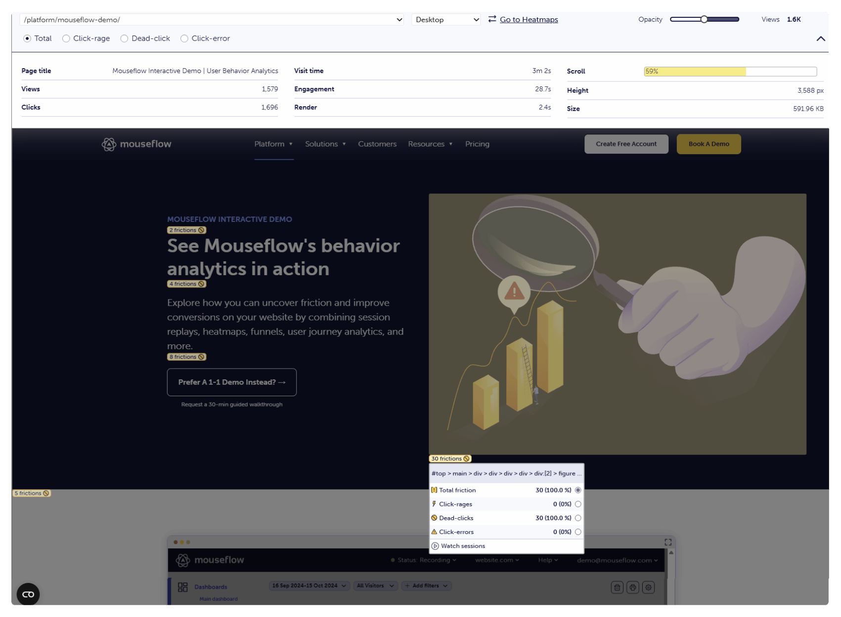
Example of Mouseflow’s Friction Heatmap
These insights help teams quickly uncover usability issues such as confusing layouts, ineffective calls-to-action, or form elements that prevent visitors from converting.
Learn more about how friction heatmaps work and how to use them to identify conversion barriers in our detailed guide.
What Metrics Do You Get From Heat Maps?
Once you know the goal of a page, whether it’s encouraging a signup, guiding users through content, or driving a purchase, you need a way to measure how visitors actually interact with the elements on that page.
Heatmaps help you do exactly that by translating user behavior into measurable interaction data. Instead of relying only on aggregated metrics like page views or bounce rate, heatmap tools track how users engage with specific elements such as buttons, images, navigation links, and forms.
Most website heatmap tools provide a range of behavioral metrics that help you understand how visitors discover, evaluate, and interact with different parts of a page.
Some of the most common heatmap metrics include:
- Clicks: The total number of clicks on a specific element. This is usually shown both as an absolute number and as a percentage relative to all clicks on the page. Click metrics help identify which elements attract the most interaction.
- Hovers: The number of visitors who hover their cursor over an element. Hover data can indicate interest or hesitation before a user decides to click or move on.
- Hover-to-click rate: The percentage of users who hover over an element and then click it. This metric can help measure how effectively an element converts interest into action.
- Hover-to-click time: The average time it takes a user to click an element after hovering over it. Longer times may indicate hesitation, confusion, or a need for clearer design cues.
- Hover time: The average amount of time users spend hovering over an element. This can provide insight into how long users evaluate content or consider interacting with a particular element.
- Hover order: The order in which users hover over elements on a page. For example, if an element has a hover order of 3, it means visitors typically discover it after interacting with two other elements first.
- Clicking visitors: The number of unique visitors who click a specific element. Unlike total click counts, this metric removes repeated clicks from the same user and focuses on individual interactions.
- Time before hover: The average amount of time it takes visitors to find and hover over an element. This can indicate how easy, or difficult, it is for users to discover important content.
- Time before click: The average time it takes users to click an element after arriving on a page. This can help measure how quickly visitors identify calls-to-action or key navigation paths.
Together, these metrics provide a detailed view of how visitors interact with your pages and where friction may exist in the user journey. By analyzing these interaction patterns, teams can identify usability issues, optimize page layouts, and make more informed decisions about design and conversion optimization.
Who Can Benefit From Using Heatmaps?
Heatmaps make it easier to understand how visitors interact with your website by visualizing behavior such as clicks, scrolling, and mouse movement. Because this insight applies to many different parts of a business, heatmaps are valuable for a wide range of teams, from UX and marketing to analytics and ecommerce.
While each role focuses on different goals, they all benefit from understanding why visitors fail to convert, miss important calls-to-action, or become distracted by non-essential elements on a page.
UX and Web Experience Teams
UX designers and web experience teams use heatmaps to evaluate whether a page behaves the way it was intended to. When visitors click on non-clickable elements, ignore key navigation paths, or fail to notice important content, heatmaps quickly reveal those usability issues.
By analyzing interaction patterns, UX teams can validate design decisions, test new layouts, and compare how users behave before and after a redesign. Heatmaps also serve as a valuable supplement to traditional usability testing by showing how large groups of visitors interact with a page in real-world conditions.
Marketing Teams
Marketing teams use heatmaps to better understand how visitors engage with landing pages, campaigns, and content. Instead of relying solely on aggregated analytics metrics, heatmaps provide visual insight into how visitors interact with page elements such as calls-to-action, images, and navigation links.
This helps marketers identify where visitors lose interest, which parts of a page attract the most attention, and how effectively a page guides users toward conversion goals. These insights can be used to improve landing page performance, refine messaging, and optimize campaign traffic.
Product Teams
Product managers use heatmaps to understand how users interact with product interfaces, onboarding flows, and feature pages. Instead of relying on assumptions about user behavior, heatmaps reveal how visitors actually explore and interact with product elements.
By analyzing interaction patterns across different pages and releases, product teams can identify usability issues, evaluate the impact of design changes, and prioritize improvements based on real user behavior.
This helps product teams make more informed decisions about feature development and user experience improvements.
Digital Analysts
Digital analysts use heatmaps to complement traditional analytics platforms by adding behavioral context to quantitative data. While analytics tools reveal what happened, such as page views, bounce rates, or conversion rate, heatmaps help explain why those patterns occur.
By analyzing user interaction data alongside traditional metrics, analysts can identify usability issues, investigate anomalies in conversion performance, and generate deeper insights for optimization strategies.
Heatmaps are often used together with tools like session replay, which allow analysts to observe individual user journeys in addition to aggregated interaction patterns.
CRO Teams
Conversion rate optimization (CRO) teams rely heavily on heatmaps to identify friction points in the user journey and generate hypotheses for experimentation.
Heatmaps reveal where users hesitate, abandon content, or attempt interactions that don’t work as expected. These insights help CRO teams design more effective A/B tests and understand the behavioral reasons behind successful or unsuccessful experiments.
Because heatmaps provide visual evidence of user behavior, they also make it easier to communicate optimization opportunities and test results to stakeholders.
Ecommerce Teams
Ecommerce teams use heatmaps to understand how shoppers interact with product pages, category pages, and checkout flows.
By analyzing where visitors click, how far they scroll, and which elements attract attention, ecommerce teams can optimize product page layouts, improve navigation, and identify points in the purchase journey where users drop off.
Heatmaps can also help ecommerce teams evaluate the quality of traffic from advertising campaigns and understand how different audiences interact with product content.
Learn More About Heatmaps
If you want to explore heatmaps in more depth, these resources explain how to analyze and apply heatmap insights in different scenarios.
Understanding Heatmap Data
Using Heatmaps to Improve Conversions
How heatmaps improve conversion rates
Advantages of using heatmaps for website analysis
Types of Heatmaps
Tools and Platforms